How lilmiquela Built This Music Anniversary Collage AI Art — and How to Recreate It
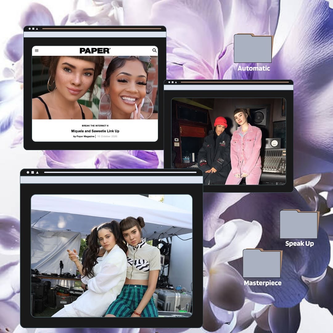
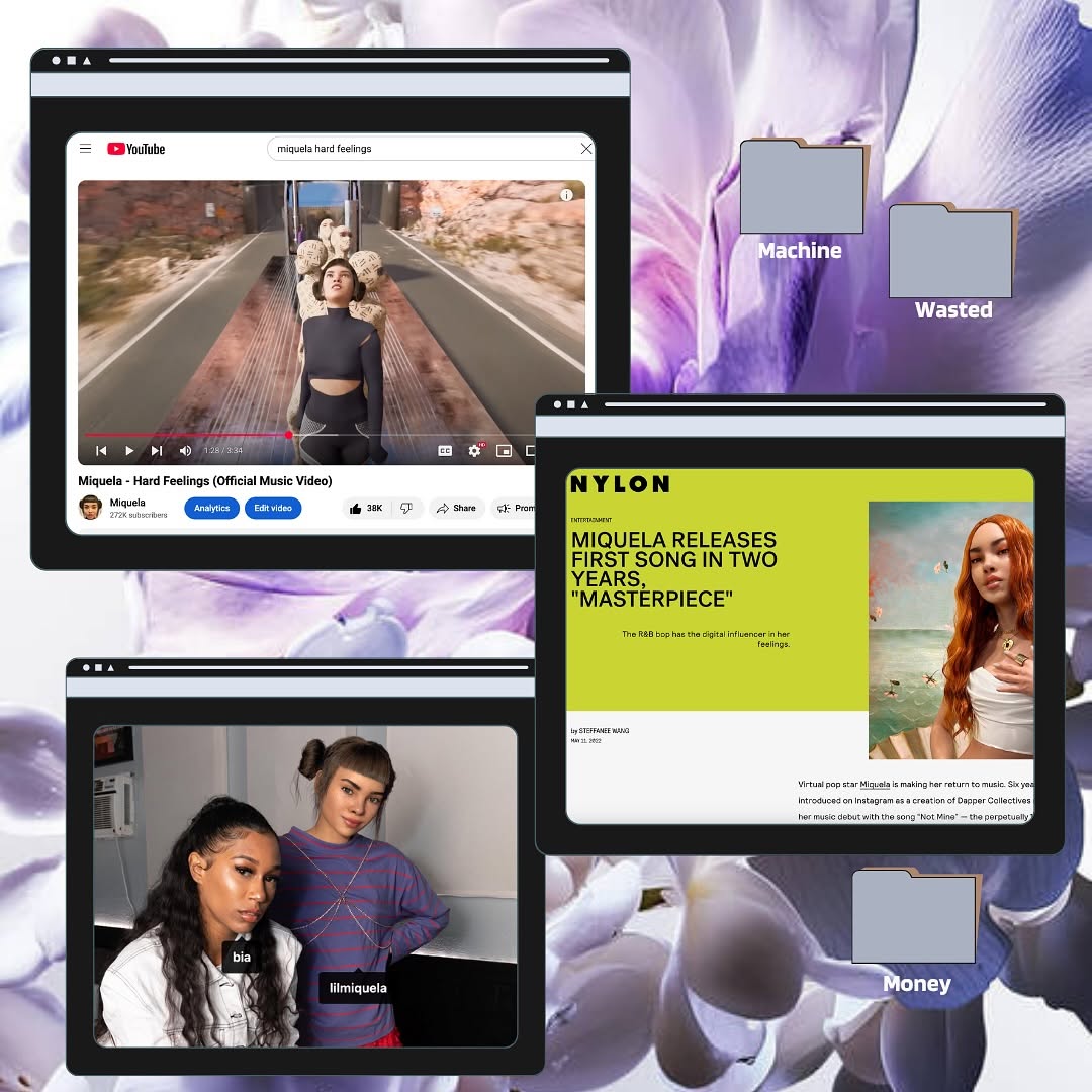
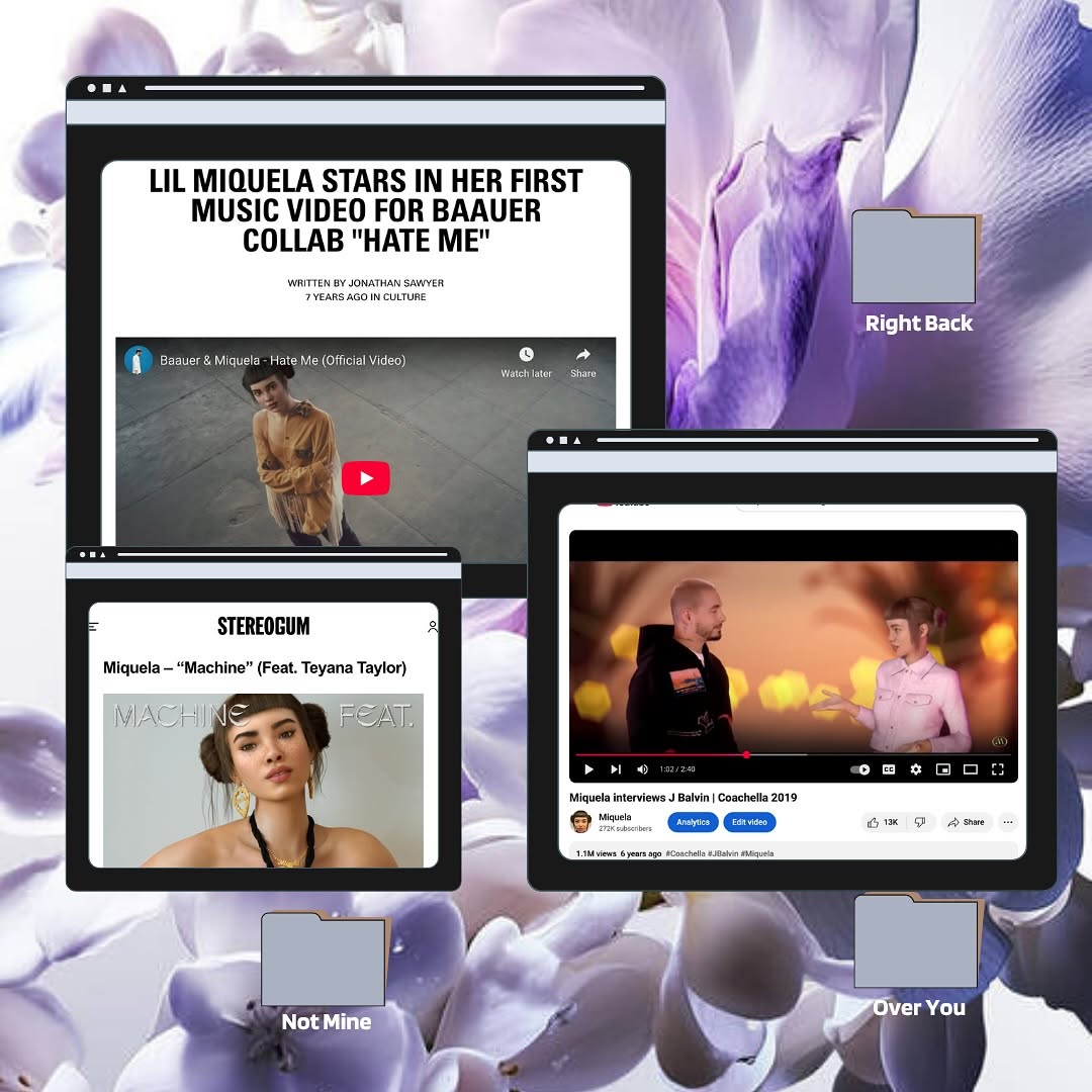
This image uses a format that blends nostalgia and curation. Instead of one hero photo, it presents a mini archive: article screenshot, studio shot, and candid duo moment, all in browser-window containers. Viewers read it like a memory map rather than a single post.
The labeled folders add narrative intent. Even if people do not open anything, they imply themes and chapters. That subtle storytelling mechanic is what gives collage posts high save potential.
Signal Table
| Signal | Evidence (from this image) | Mechanism | Replication Action |
|---|
| Archive-style framing | Multiple browser windows showing different moments | Multi-context storytelling increases dwell time | Curate 3 related images and present them as a themed cluster |
| Semantic labels | Folder tags like “Automatic,” “Speak Up,” “Masterpiece” | Label cues spark interpretation and comments | Add short concept tags that hint at narrative categories |
| Visual contrast layering | Dark UI frames over soft floral background | Foreground-background contrast improves readability | Pair textured backdrop with high-contrast frame components |
Best-Fit Scenarios
- Monthly creator recaps: Ideal for packaging multiple milestones in one post.
- Collaboration highlights: Great for showing press, studio, and backstage in one frame.
- Music or art era boards: Useful for teaser storytelling before a release.
- Portfolio mood snapshots: Strong for visual identity curation without long captions.
Not Ideal
- Direct conversion ads needing one clear product and CTA.
- Highly minimal brand systems that avoid layered graphics.
- Fast-news updates where simplicity and speed are priority.
Transfers (exactly 3)
- Tour Diary Collage
Keep: three-window hierarchy and folder-label storytelling.
Change: floral background to tour textures and ticket stubs.
Slot template (EN): {background_texture} {window_1_press} {window_2_backstage} {window_3_live} {folder_labels} - Brand Campaign Timeline
Keep: browser-frame motif and chapter-like tags.
Change: photos to campaign stages (tease, launch, community response).
Slot template (EN): {retro_ui_frames} {phase_images} {concept_tags} {balanced_layout} - Personal Growth Board
Keep: mixed image sources and curated digital scrapbook mood.
Change: include notes/screenshots/art references tied to one theme.
Slot template (EN): {curated_clips} {archive_window_style} {theme_labels} {nostalgic_base}
Aesthetic Read
The collage works because it controls chaos. There are multiple frames, but each has a clear border and hierarchy. One large window carries weight, while two smaller windows provide supporting context. The floral background softens the composition and prevents the interface elements from feeling harsh. Folder labels are sparse, so they add meaning without clutter. This is a strong visual grammar for creators who want to communicate “many moments, one identity.”
| Observed | Recreate | Evidence |
|---|
| Tiered window scale | Use one dominant frame and two secondary frames | Viewer knows where to look first |
| Concept tagging | Add 2-4 short label tokens as folder chips | Narrative feels intentional, not random |
| Soft-hard contrast | Combine organic background with rigid UI elements | Composition stays expressive and readable |
| Curation over saturation | Limit text and keep image count focused | Collage feels editorial, not noisy |
Prompt Technique Breakdown
| Prompt chunk | What it controls | Swap ideas (EN, 2-3 options) |
|---|
| Frame chunk | Information structure | “three floating browser windows”; “polaroid stack”; “desktop screenshot cards” |
| Background chunk | Mood base | “lavender floral texture”; “paper texture scan”; “gradient blur wallpaper” |
| Label chunk | Narrative signaling | “Automatic / Speak Up / Masterpiece”; “Phase 1/2/3”; “Archive / Draft / Final” |
| Content chunk | Context diversity | “press image + studio shot + candid”; “before/after/process”; “stage/rehearsal/cover” |
| Contrast chunk | Readability | “dark frame bars”; “white UI cards”; “mixed light-dark chrome” |
| Drift-control chunk | Consistency | “exactly three windows”; “exactly three labels”; “no extra overlay text clutter” |
Remix Steps
Baseline Lock: lock three-window hierarchy, lock one textured background, lock concise label set.
- Run 1: Build composition blocks (window sizes and positions) with placeholder images.
- Run 2: Insert final image set and validate visual balance.
- Run 3: Change one knob: background material while preserving frame hierarchy.
- Run 4: Change one knob: label vocabulary to match campaign theme.
If collage feels crowded, remove one visual element before shrinking text. Breathing room is what keeps this format premium.