The Automatic Machine Music Collage: How lilmiquela Built This AI Art
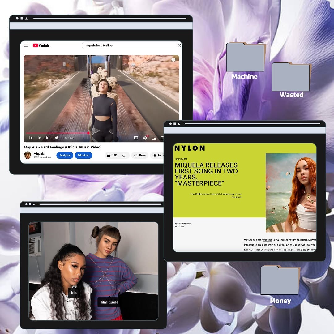
This image is a compact credibility board. Instead of one hero photo, it stacks three evidence channels: video distribution, press coverage, and social interaction. Then it adds folder labels that imply a creative system behind the rollout.
For creators, this is a strong growth format because it turns abstract success into visible artifacts. Audiences do not just hear "the release worked"; they see receipts across platforms.
Signal Table
| Signal | Evidence (from this image) | Mechanism | Replication Action |
|---|
| Multi-channel proof | YouTube + editorial press + social still in one frame | Cross-source evidence increases trust | Show at least 3 channel proofs in launch recaps |
| Narrative folders | Machine / Wasted / Money labels | Suggests conceptual depth and campaign structure | Add thematic file labels tied to project chapters |
| Design cohesion | Shared browser frame language and consistent layout | Keeps dense info readable | Use uniform panel styling across all evidence blocks |
| Color anchoring | Purple background + lime editorial highlight | Strong visual hierarchy in collage format | Reserve one accent color for primary proof panel |
Use Cases and Transfers
- Music release debrief posts: ideal for showing launch footprint.
- Creator milestone recaps: good for monthly "wins" reports.
- Agency case studies: useful in client social proof storytelling.
- Product launch retrospectives: effective for multi-platform reporting.
Not Ideal
- Single-message emotional storytelling.
- Minimalist brand feeds with strict visual restraint.
- Early-stage projects with no evidence yet.
Three Transfer Recipes
- Keep: 3-panel proof stack. Change: channels. Template: "{platform1} + {platform2} + {platform3} recap board".
- Keep: thematic folder labels. Change: campaign themes. Template: "folders: {theme_a}, {theme_b}, {theme_c}".
- Keep: soft abstract background. Change: brand palette. Template: "{brand_color} moodboard with evidence windows".
Aesthetic Read
The composition works because each panel has a distinct role: reach, validation, and social context. The viewer can scan quickly but still feel the campaign depth. This is a practical middle ground between pure art direction and raw analytics screenshots.
| Observed | How to Recreate |
|---|
| Three-role panel system | Assign each window one clear proof function |
| Consistent UI framing | Use matching browser chrome across panels |
| Thematic metadata | Add labeled folders for narrative layer |
| Soft backdrop separation | Use abstract background to avoid clutter conflict |
Prompt Technique Breakdown
| Prompt chunk | What it controls | Swap ideas (EN, 2-3 options) |
|---|
| "three floating browser windows" | Information architecture | "two-panel split", "four-panel dashboard", "timeline cards" |
| "YouTube + press + social" | Evidence diversity | "TikTok + newsletter + podcast", "store + review + UGC" |
| "thematic folder labels" | Narrative framing | "Act I/II/III", "Build/Test/Launch", "Mood/Message/Metric" |
| "lavender floral background" | Mood cohesion | "paper texture", "gradient blur", "grainy poster field" |
Remix Steps
Baseline lock: three proof channels, readable hierarchy, consistent frame style.
- Collect one screenshot per channel.
- Normalize panel sizes and browser chrome.
- Add thematic labels/folders that map to campaign story.
- A/B test background and accent color for readability.