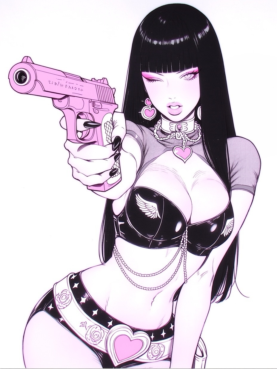
Some images do not need a story because the character design already acts like a story. This one is a perfect example. A white background, a long black curtain of hair, a bright pink handgun pushed toward the viewer, and a cluster of heart-shaped accessories are enough to establish the entire post in one second. That is why the image performs so well. It does not ask the audience to figure out what it is. It declares itself immediately.
The smartest thing here is the balance between sweetness and threat. Hearts, pink makeup, glossy lips, and cute jewelry make the character feel playful. The gun, the wink, and the direct body language make her feel dangerous in a stylized way. That contrast is one of the strongest engines in visual culture right now. Audiences love images that contain two opposing energies at once, especially when both sides are presented with confidence.
For creators, this is a strong lesson in compression. The image does not rely on environment, props beyond one weapon, or a complicated palette. Instead it builds a memorable post from a few locked visual signals that all reinforce the same persona. That is why it feels instantly collectible and easy to repost.
The first reason is icon density. This post is full of memorable symbols: pink pistol, heart earrings, heart buckle, winged bra cups, black nails, blunt bangs, wink expression. Each one is easy to name. Together they form a coherent identity stack. When an image gives the audience that many recognizable hooks at once, it becomes extremely easy to remember and imitate.
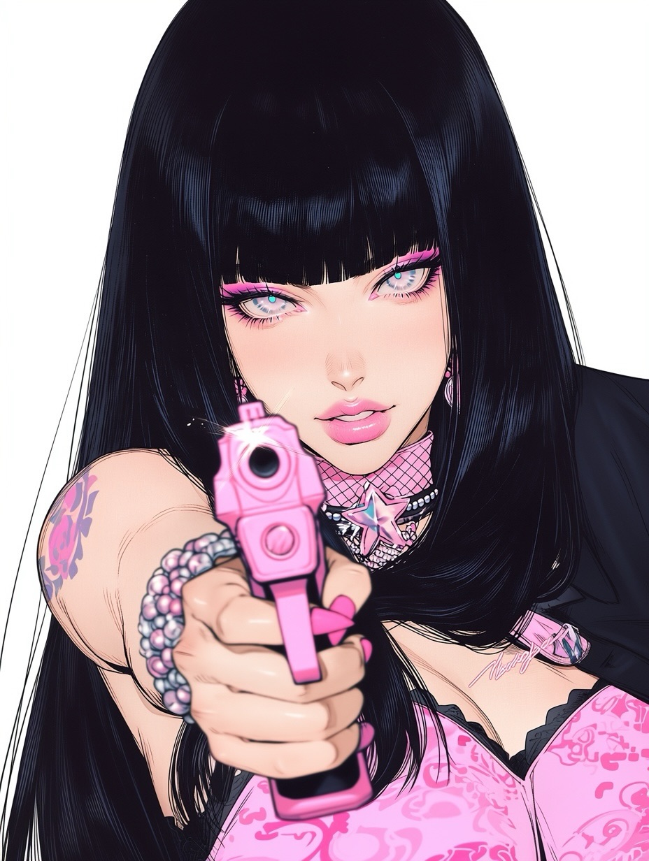
The second reason is perspective. The gun is not just a prop; it is the composition engine. By pushing the hand and pistol into the foreground, the image creates instant motion and confrontation. Without that foreshortening, the character would still be stylish, but the post would lose its punch. The perspective choice is what makes the image feel like it is reaching out of the screen.
The third reason is palette discipline. Most of the frame is black, white, and skin tone. Pink is reserved for the accents that matter most. That selective color use keeps the image sharp. If the whole illustration were equally colorful, the pink gun and heart motifs would lose their role as visual anchors. The restraint is doing as much work as the styling.
| Signal | Evidence (from this image) | Mechanism | Replication Action |
|---|---|---|---|
| High symbol recall | Pink gun, heart jewelry, wing motifs, heart buckle, black bangs | Multiple strong icons make the character instantly memorable | Lock 4-6 repeatable symbols before refining the rest of the outfit |
| Foreground aggression | Handgun and hand enlarged through foreshortening | Forced perspective gives the image motion and attitude | Write one foreground object thrust toward camera, not just held at the side |
| Sweet-threat contrast | Cute pink accessories paired with a weapon and wink | Oppositional signals create stronger emotional tension | Pair one soft motif family with one sharp motif family instead of staying tonally flat |
| Graphic readability | White background and tight palette keep all attention on the character | Low environmental noise increases shareability and remix potential | Remove scenery when the character design itself is strong enough |
This image does not confuse edginess with mess. It stays clean. That is important. A lot of alt-girl or dangerous-girl visuals become cluttered with grunge backgrounds, smoke, stickers, and excessive distressing. Here, the design is more confident than that. It lets the body line, the glossy materials, and the accessory vocabulary do the work. That is why the image feels polished rather than noisy.
The heart motif is also smarter than it looks. Hearts appear in the earrings, necklace, and belt buckle, creating internal rhythm across the figure. That repetition turns the image from a random outfit into a visual system. Good fashion illustration and good character design both rely on this principle: one shape family repeated in multiple places creates stronger coherence than many unrelated details.
The white background is another major reason the image works. It isolates the character like a logo. That gives the post flexibility. People can read it as character art, poster art, aesthetic fashion art, or even a sticker-style concept. The cleaner the isolation, the more ways the image can travel across different audience tastes.
| Observed | Why it matters | How to recreate it |
|---|---|---|
| Long black hair acting as vertical frame | Anchors the composition and makes the face and chest area pop | Use one dominant dark shape to structure the portrait on a white background |
| Repeated heart motifs across accessories | Builds coherence and makes the design feel intentional | Choose one shape language and echo it at 3-4 points on the outfit |
| Single bright pink prop in the foreground | Creates an immediate focal point and narrative charge | Reserve your strongest accent color for the key prop and matching details only |
| Latex-like black clothing with sharp highlights | Adds pop-star gloss without introducing extra colors | Use reflective black materials when you want graphic impact inside a narrow palette |
| Wink plus parted lips expression | Keeps the pose flirty rather than purely violent | Direct the facial attitude as playful confrontation, not generic anger |
This kind of image works especially well for alt-pop character drops, anime pin-up prompt examples, sticker-style concept art, beauty-and-danger aesthetic feeds, and accounts that thrive on highly legible character branding. It is also effective for creators who want to build a recurring persona series, because the design language is easy to preserve across multiple images.
It is less ideal for grounded realism, cinematic drama, or audiences that dislike stylized weapons. The image is strongest when it stays in the zone of graphic fantasy rather than moral realism. If you try to make it gritty, it loses the elegance that makes it memorable.
{hair silhouette} {foreground prop} {shape motif family} {black glossy garment} {expression}{facial attitude} {accent color} {repeated icon} {top silhouette} {waist detail}{foreground gesture} {dark base palette} {single bright accent} {accessory repetition} {pose energy}The fastest way to miss this look is to prompt it as “hot anime girl with a pink gun.” That is too broad. You need control blocks: hair shape, eye expression, foreground object, motif family, material finish, and palette limits. Once those are stable, the character stops feeling generic and starts feeling brandable.
| Prompt chunk | What it controls | Swap ideas (EN, 2-3 options) |
|---|---|---|
| ultra-long straight black hair with blunt bangs | Primary silhouette and instant identity | ink-black sheet hair; sleek waist-length black hair; blunt-fringe raven hair |
| foreground pink handgun aimed toward camera | Perspective, attitude, and focal point | pink pistol in foreshortened hand; pastel revolver close to lens; bubblegum sidearm extended forward |
| heart earrings, heart necklace, heart buckle | Shape-language repetition and kawaii contrast | heart charm system; candy-heart accessories; romantic icon jewelry stack |
| shiny black bra with wing motif and chain waist details | Outfit texture and graphic fashion appeal | latex bra top with emblem print; glossy black top with chain drape; patent pin-up set with symbol cups |
| white seamless backdrop | Isolation and clean repost value | blank studio white; pure white character sheet background; seamless poster void |
| wink expression with parted lips | Flirty confrontation instead of neutral posing | playful one-eye wink; teasing idol stare; cute-danger expression |
Start by locking the silhouette and the foreground gesture. If the hair shape and the gun-hand perspective are not working, nothing else matters yet. Once those are solid, define the heart motif system. Only after that should you polish the face, material highlights, and body proportions. This order keeps the character from slipping into generic pin-up territory.
A practical four-step iteration path would be: first generate the white-background character with hair and wink only. Second, add the foreground pink gun and make sure the foreshortening feels strong. Third, build the heart accessories and waist details into a coherent motif family. Fourth, refine the glossy black clothing and pink makeup accents. That sequence gives you a more stable identity than trying to force the entire look in one dense pass.
The larger lesson is simple. Viral character images are rarely about randomness. They work because a few memorable symbols are chosen, repeated, and protected. This post is a strong reminder that when icon density is high and the background is disciplined, a single character can carry the whole image without any extra narrative support.