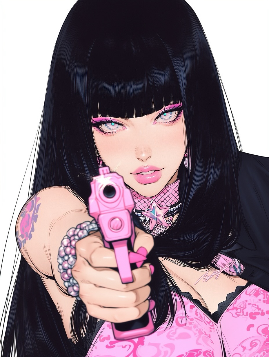
This image does something smart that a lot of edgy portraits miss: it turns confrontation into graphic design. The gun is not treated like a realism detail. It is treated like a pink shape that locks the whole composition together. That shift matters. Instead of reading as generic action art, the portrait feels like glam attitude, Y2K styling, and controlled provocation packaged into one extremely readable frame. For creators, that is the lesson worth stealing.
The reason it stops the scroll so fast is obvious once you study the layout. The foreground prop is aimed directly at the viewer, which creates instant tension, but everything around that tension is polished rather than chaotic. The black hair is glossy and smooth, the makeup is bright pink and clean, the jewelry is decorative, and the background is almost empty. That combination keeps the image sharp instead of noisy. It feels dangerous in pose, but luxurious in finish.
This is why the image has broad share potential. It can sit inside alt-fashion boards, character moodboards, feminine power edits, or Y2K remix collections without needing any extra context. It is legible as attitude first. The prop only intensifies the message. When creators build images that rely on a confrontational gesture, the surrounding styling has to be even more disciplined. This portrait understands that rule.
| Signal | Evidence (from this image) | Mechanism | Replication Action |
|---|---|---|---|
| Foreground dominance | The pink handgun and hand are pushed close to the lens and become the largest shape after the face | Extreme foreshortening creates instant drama and makes the image feel interactive | Place one key prop very near the camera and design the whole pose around it |
| Palette discipline | Pink repeats across the gun, nails, makeup, jewelry, and outfit accents while black anchors the hair and clothing | Repeated color accents make the image feel intentional rather than random | Choose one loud accent color and echo it across 4-5 details without introducing new competing hues |
| Beauty finish under tension | The lighting, hair gloss, and skin rendering stay polished despite the confrontational pose | Luxury finish broadens audience appeal and prevents the image from becoming niche-only violence art | Keep beauty lighting and cosmetic clarity even when the pose is aggressive |
The portrait works because the visual language is split into two layers that support each other. Layer one is hard attitude: direct aim, close weapon, intense stare. Layer two is soft glam: glossy lips, smooth hair, candy pink accessories, decorative choker. Neither layer would travel as well alone. Together, they create a more memorable contradiction. That kind of contradiction is often where repost-worthy visuals live.
Another strong choice is that the background contributes nothing except breathing room. There is no bedroom set, no club lighting, no city scene, and no story clutter. That means every visual cue points back to the character. Small creators should pay attention to that. If the concept is already strong, the background often needs to get quieter, not louder.
| Observed | Why it matters for the look |
|---|---|
| Extreme near-camera prop perspective | Makes the viewer feel addressed directly and adds immediate tension |
| Long jet-black hair with mirror-like highlights | Provides a sleek luxury frame around the face and balances the aggressive pose |
| Pink makeup and pink prop repetition | Creates a coherent Y2K glam identity rather than a random edgy aesthetic |
| Layered choker with star pendant | Adds character styling without crowding the composition |
| Empty white background | Keeps the portrait clean and preserves fast readability in a social feed |
Where it is less ideal: grounded realism, cinematic crime drama, or tactical action art. This image succeeds because it is stylized and controlled. If you push it too far toward realism, the charm starts to fall away and the balance becomes harder to hold.
Three transfer recipes work particularly well here. Keep the near-camera prop perspective, the clean backdrop, and the one-accent-color repetition. Change the prop, accessory language, or fashion category. Template one: {accent prop} aimed or presented near camera, {accent color} repeated in makeup and jewelry, plain studio background. Template two: glam confrontation portrait, long dark hair, beauty lighting, one loud color family, minimal backdrop. Template three: {character archetype} close-up, foreground prop distortion, polished anime fashion rendering, decorative choker, high-contrast palette.
To build this well, do not prompt it as violence first. Prompt it as a glam portrait with a confrontational prop. That order changes the result. When the pose is the first priority and the styling is second, the output often turns messy. Here, the styling and palette should be equally locked.
| Prompt chunk | What it controls | Swap ideas (EN, 2–3 options) |
|---|---|---|
| pink handgun dominating the foreground | Primary tension device and perspective drama | pink flip phone near lens; heart-shaped compact mirror close-up; chrome microphone in foreground |
| long glossy jet-black hair with blunt bangs | Luxury framing and silhouette identity | sleek silver hair; dark auburn waves; black bob with blunt ends |
| bubblegum pink and black palette | Overall brand identity and visual repetition | red and black; lavender and black; silver and hot pink |
| plain white studio background | Readability and isolation of the subject | light gray background; pale blush seamless wall; soft cream backdrop |
| layered choker with star pendant | Secondary character styling cue | heart pendant choker; cross pendant collar; rhinestone ribbon necklace |
| polished anime glam rendering | Finish quality and audience appeal | editorial manga gloss; high-shine digital character art; clean cel-shaded beauty portrait |
Lock three things first: the foreground prop perspective, the black-hair silhouette, and the pink-black palette. Those are the structural controls. After that, apply a one-change rule. Change only one or two variables per pass or you risk losing the precise balance between glam and confrontation.
The practical takeaway is that edgy portraits perform better when they are designed like fashion imagery. If you want this kind of visual to spread, sharpen the silhouette, repeat the accent color with discipline, and let the confrontational gesture sit inside an otherwise immaculate frame.