How rioaigc Made This Street Fighter 1994 Chun Li E Honda Scene — and How to Recreate It
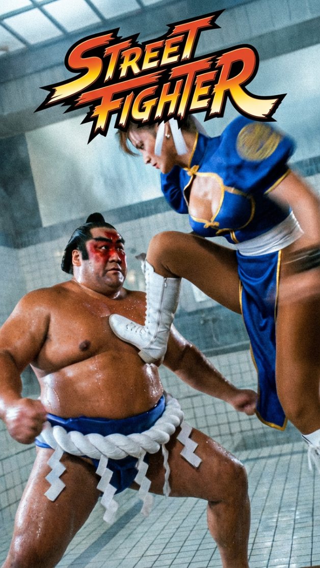
This image works because it immediately announces its identity. It is not trying to be a subtle character study or a vague martial-arts scene. It is a full-on franchise-style action poster rooted in the visual language of 1990s video-game adaptations. The title treatment, costume design, exaggerated combat pose, and enclosed set all combine to produce something the viewer reads instantly as nostalgic, theatrical, and highly referential. That clarity is one of the biggest strengths of the image.
If you want to recreate this kind of poster successfully, you need to think in terms of recognition systems rather than isolated details. The audience should understand the world, the character archetypes, and the tone of the image in a fraction of a second. That means the costumes must be iconic, the pose must be decisive, and the composition must feel like a printed movie poster rather than a random fight still. The appeal comes from the union of camp, action, and brand memory.
Why nostalgia is doing so much of the work
Retro adaptation posters succeed because they do not only show action. They reactivate media memory. A viewer who has seen fighting games, VHS-era martial-arts films, arcade cabinets, or 90s studio action posters will recognize the coding immediately. The oversized logo, the bright stage-like lighting, and the stylized costume silhouettes all point toward a familiar cultural category. This gives the image emotional speed. It does not need much explanation.
For prompt writing, this means you should use language that locks the style into a period and media tradition. Phrases such as 1990s live-action fighting-game poster, retro arcade-movie adaptation aesthetic, VHS-era martial-arts energy, and campy studio action realism help the model understand that this is not supposed to be sleek contemporary cinema. It should feel louder, more direct, and more theatrical.
Why the character contrast is so effective
The confrontation works because the two fighters have radically different body logic. The blue-qipao fighter is agile, airborne, and directional. The sumo-inspired opponent is grounded, broad, and weight-heavy. This creates immediate kinetic contrast. Even before the viewer registers facial features or costume specifics, the collision of body types tells the story of the frame.
Prompt writers should preserve this contrast at all costs. Describe one fighter as fast, elevated, kicking or kneeing in with diagonal motion, and the other as rooted, wide, braced, and heavy. Action posters become much stronger when the bodies communicate opposition through shape alone. This is one of the oldest and most reliable visual rules in fighting-game and combat-cinema design.
The role of iconic costume shorthand
The blue qipao, white boots, hair buns, ribbons, mawashi belt, and exposed upper body are not small decorative choices. They are recognition signals. In franchise-inspired imagery, costume shorthand often matters more than realistic costume engineering. The viewer should be able to identify the archetype instantly from silhouette, color, and one or two signature details.
That is why prompts should be explicit about the most important costume traits while avoiding unnecessary clutter. Blue qipao with gold trim, white boots, classic side buns with ribbons, sumo mawashi, rope details, bare chest, and poster-clean silhouettes are enough to anchor the identity. Too much accessory detail can make the image less readable rather than more accurate.
Why the indoor set helps the poster feel authentic to the era
The tiled interior, cool walls, glossy floor, and enclosed bathhouse-or-dojo feeling give the scene a distinctly studio-built quality. That quality is important because many 1990s action adaptations felt like they were happening inside constructed sets rather than hyper-realistic worlds. Instead of reducing the image, that artificiality is part of its charm. It gives the poster a recognizable production identity.
When recreating this style, you should not over-modernize the environment. If the setting becomes too cinematic, too realistic, or too slick, the poster loses the slightly campy studio texture that makes it appealing. Terms like tiled fight set, enclosed arena interior, cool lit bathhouse environment, retro action-movie stage, and glossy set-floor reflections help preserve the right atmosphere.
Lighting as a nostalgia amplifier
The bright overhead lighting is central to the look. It gives skin and fabric a glossy, readable finish while preserving the exaggerated cleanliness associated with studio action photography. This is not gritty underground lighting or moody cinematic noir. It is high-visibility, high-energy, almost promotional lighting. That matches the poster format perfectly.
Prompting should therefore emphasize bright studio action lighting, cool ambient overhead glow, crisp highlights on costume and skin, and clean readable fight-poster contrast. This supports the live-action adaptation mood. If the lighting becomes too dark or too subtle, the frame may lose the toy-like, iconic intensity that retro franchise posters depend on.
How diagonal motion gives the poster impact
The attacking figure enters at a diagonal, and that diagonal is what makes the image feel explosive. Diagonal shapes almost always increase the feeling of speed and collision in still images. In this case, the airborne body slices across the frame while the heavier opponent absorbs the threat. The resulting geometry creates drama without needing excessive effects.
Prompt writers can protect that by specifying flying knee or kick attack, diagonal entry from one side, grounded defender, impact-oriented body line, and low-to-mid camera angle. These phrases produce more dynamic compositions than generic words like fighting. Specific spatial direction is often what separates a good action image from a forgettable one.
The title logo as a structural anchor
The large franchise-style logo at the top is doing more than naming the property. It balances the image compositionally. The fight action takes place below, but the logo controls the upper frame and makes the whole image feel like key art rather than a screenshot. This is essential to poster identity. A true franchise poster needs both a fight image and a branding block.
In prompts, you can describe bold title logo at top center, large franchise wordmark, poster-key-art structure, and clean hierarchy between logo and action. Even if generated text is imperfect, the compositional instruction still helps. The model begins to allocate space the way a designer would rather than filling the frame with uncontrolled motion.
How to balance homage and originality
Images like this often draw from obvious cultural references, but they still need visual discipline to avoid feeling like low-effort parody. The best homage images preserve the broad signals people recognize while composing them with care. The body positions, logo hierarchy, lighting, and set construction all need to feel intentional. That is what turns reference into style.
Prompt writing should therefore lean into inspired-by structure rather than messy collage energy. Keep the tribute clear, but keep the composition professional. Use terms such as franchise tribute poster, retro adaptation realism, energetic but readable combat composition, and polished camp action aesthetic. That helps the final image feel celebratory instead of careless.
Prompt framework for this kind of poster
A practical framework starts with the fighters, then the pose relationship, then the environment, then the title structure, and finally the rendering style. For example: a retro 1990s live-action arcade-fighter movie poster featuring a blue-qipao martial artist launching a flying kick into a large sumo-inspired opponent inside a tiled indoor arena, bold title logo at the top, bright studio action lighting, cool gray walls, glossy floor, campy but polished adaptation-poster realism. This sequence helps the system prioritize the right visual hierarchy.
The order matters. If you begin only with costume references, the poster may lose energy. If you focus only on motion, the franchise identity may weaken. If you skip the title structure, the image can become a fight still instead of proper poster art. Clear hierarchy is what makes tribute posters feel convincing.
Common mistakes to avoid
The most common mistake is making the image too modern. Sleek modern grading, hyper-real action effects, or overly cinematic realism can strip away the retro adaptation charm. Another mistake is losing the costume shorthand that identifies the archetypes. A third mistake is overcrowding the environment with too many props or background fighters, which weakens the one-on-one confrontation that gives the poster its clarity.
It is also easy to ruin the design by flattening the body contrast. If both fighters feel equally slim, equally airborne, or equally posed, the confrontation loses impact. Keep one fast and diagonal, the other broad and rooted. That visual difference is one of the poster’s core engines.
Who should use this visual direction
This style is ideal for retro media essays, prompt libraries, nostalgic franchise moodboards, creator breakdowns of adaptation aesthetics, and blog headers about the relationship between games and cinema. It is also useful for people exploring how to generate recognizable poster energy without depending entirely on realism or abstraction.
Because the visual language is so clear, it works well in social previews and thumbnails too. The logo block, costume coding, and explosive pose all survive small sizes. That makes the style particularly valuable for digital publishing where instant recognition matters.
Final takeaway
The power of this image comes from its commitment to genre memory. It knows it is a retro game-adaptation poster, and every decision supports that identity. The costuming is iconic, the motion is readable, the environment is studio-built, and the logo structure locks the frame into franchise territory. Nothing is accidental.
If you want to recreate this effect, prompt with clarity and restraint. Build the body contrast, the set logic, the poster hierarchy, and the 1990s tonal cues first. Once those foundations are solid, the image will feel less like a random fight render and more like lost promotional art from a very specific era of pop culture.