How rioaigc Made This Shaw Brothers Naruto Rock Lee Poster Breakdown — and How to Recreate It
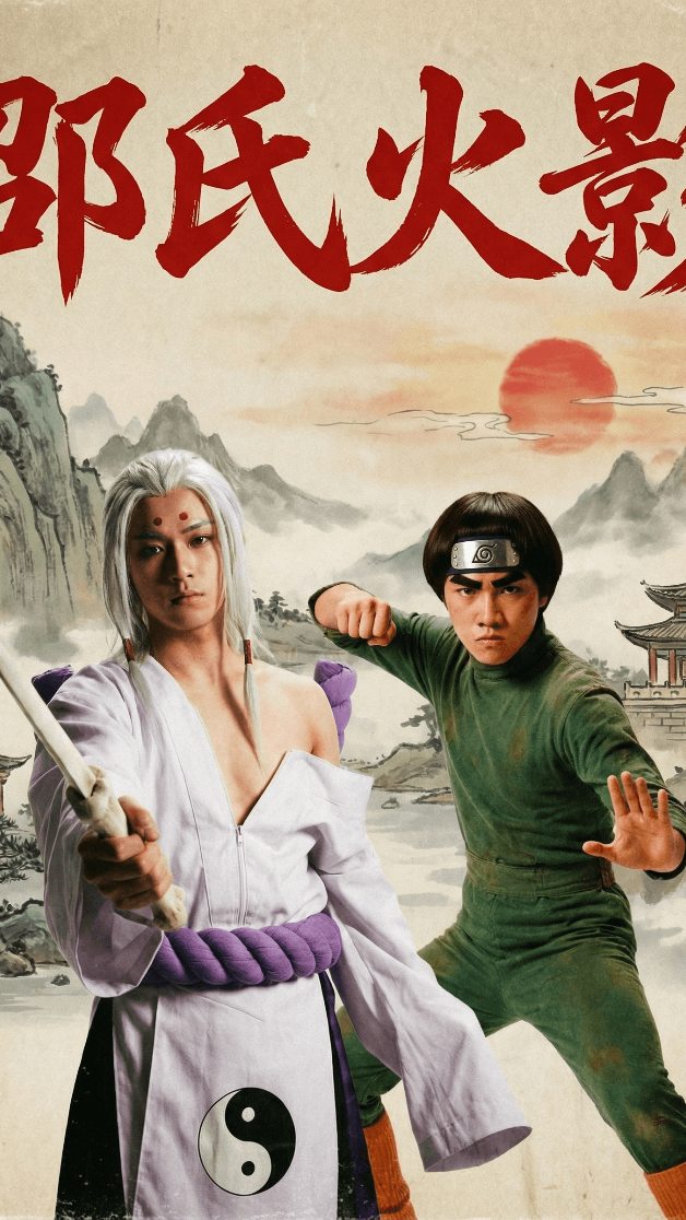
This image succeeds because it does not just cosplay Naruto characters. It translates them into the visual language of a completely different film tradition: the vintage Hong Kong kung fu poster. That shift gives the image both novelty and structure. Viewers get franchise recognition and genre surprise at the same time.
Why the Image Feels Fresh
The crossover is doing real creative work here. Instead of dropping anime characters into a generic live-action frame, the poster commits to an old-school print identity. The giant red Chinese title, painted landscape background, and character-forward composition all evoke a Shaw Brothers-style promotional sheet rather than a modern fan edit.
That matters because remix culture is stronger when the visual translation is specific. This is not just “Naruto but realistic.” It is “Naruto reinterpreted through 1970s kung fu poster grammar.” That extra layer is what makes the concept more memorable.
Signal Table
| Signal | Evidence (from this image) | Mechanism | Replication Action |
|---|---|---|---|
| Genre collision | Naruto-inspired costumes placed inside a vintage kung fu poster layout | Unexpected genre fusion creates novelty fast | Translate one known franchise through the design language of another medium or era |
| Character contrast | White-robed sage figure left, green-suited martial fighter right | Distinct costumes and poses prevent visual blending | Assign different silhouette logic and color roles to each subject |
| Poster credibility | Large red title text and scenic painted background | Typography and environment make the crossover feel complete | Build the frame like a finished one-sheet, not just a portrait montage |
| Readable iconography | Purple rope belt, bowl cut, Leaf headband, staff, red forehead dots | Franchise shorthand preserves recognition inside the remix | Keep a few unmistakable visual tokens when reinterpreting characters |
| Old-print atmosphere | Cream paper tones and mountain painting backdrop | Texture gives the concept period identity | Add aged paper, ink-wash scenery, and restrained lighting rather than glossy realism |
Aesthetic Read
The strongest part of this image is that it respects both source languages. It borrows Naruto iconography, but it also understands the spacing, title dominance, and theatrical seriousness of old martial-arts posters. The crossover is funny, but it is not careless.
The background is especially useful. The mountains, sun, and pavilion are not there just to fill space. They shift the emotional register from anime action to wuxia legend. That transforms the characters into something broader: they look like heroes from a rediscovered dubbed-era cult film.
Prompt Technique Breakdown
| Prompt chunk | What it controls | Swap ideas (EN, 2–3 options) |
|---|---|---|
| “Naruto-inspired live-action characters staged as a vintage Shaw Brothers kung fu movie poster” | Main crossover concept and tonal framing | “anime heroes reimagined as 1970s kung fu stars”, “retro Hong Kong poster version of a ninja franchise”, “martial-arts exploitation poster remix” |
| “painted mountain backdrop, pale parchment-toned sky, red sun” | Period scenic identity | “ink-wash landscape”, “faded pulp cinema background”, “wuxia poster scenery” |
| “giant red Chinese headline text stretched across the top” | Poster authenticity and top-weight balance | “oversized brush-calligraphy masthead”, “bold title block”, “red pulp-movie title treatment” |
| “white-haired sage-mode Naruto figure” | Hero identity in remixed form | “mystic ninja master”, “wandering martial-arts sage”, “white-robed chakra warrior translated into wuxia styling” |
| “Rock Lee in a green jumpsuit with martial strike pose” | Secondary subject energy and recognition | “disciplined kung fu student”, “green-suited challenger”, “bowl-cut fighter in leaf insignia” |
Why This Formula Is Reusable
This image structure is reusable because it is built on a simple but powerful remix engine:
1. Choose a famous franchise with clear character silhouettes.
2. Choose a second visual tradition with a strong poster grammar.
3. Translate, do not merely combine.
4. Preserve a few iconic markers from the original.
5. Let typography and background complete the world.
That formula works for anime, comics, video games, tokusatsu, and even celebrity culture. The trick is to commit hard enough that the new format feels real.
Remix Playbook
Franchise remix: try One Piece, Bleach, Street Fighter, Mortal Kombat, or Avatar-inspired casts.
Era remix: swap Shaw Brothers for VHS horror, Soviet poster art, spaghetti western one-sheets, Bollywood masala posters, or French New Wave lobby cards.
Character remix: move from Naruto and Rock Lee to Kakashi and Guy, Sasuke and Itachi, or a villain-versus-hero pairing.
Palette remix: lean toward sun-faded reds, jade greens, sepia paper, indigo inks, or gold-and-black prestige martial tones.
Mood remix: push it comedic, tragic, grindhouse, kid-friendly, or faux-epic depending on the typography and expression direction.
Execution Advice
The easiest failure mode here is modern overpolish. If the image becomes too glossy, too cinematic, or too loaded with anime effects, the retro poster identity collapses. What makes this work is that the frame remains poster-first, not VFX-first.
When making crossover art, the best results usually come from respecting layout as much as costume. If the title, background, palette, and spacing all belong to the target genre, viewers will accept even wild mashups much more readily. That is the difference between a joke image and a convincing crossover artifact.