Fave look? 💃🏿 #aibaddie
Fave look? 💃🏿 #aibaddie
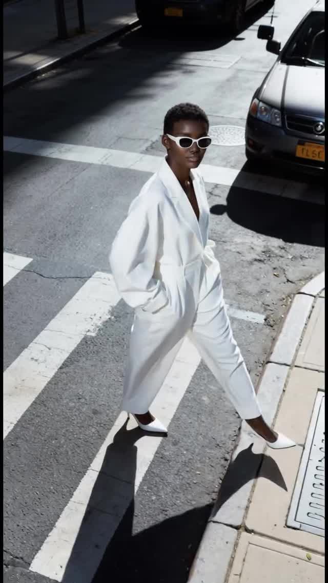
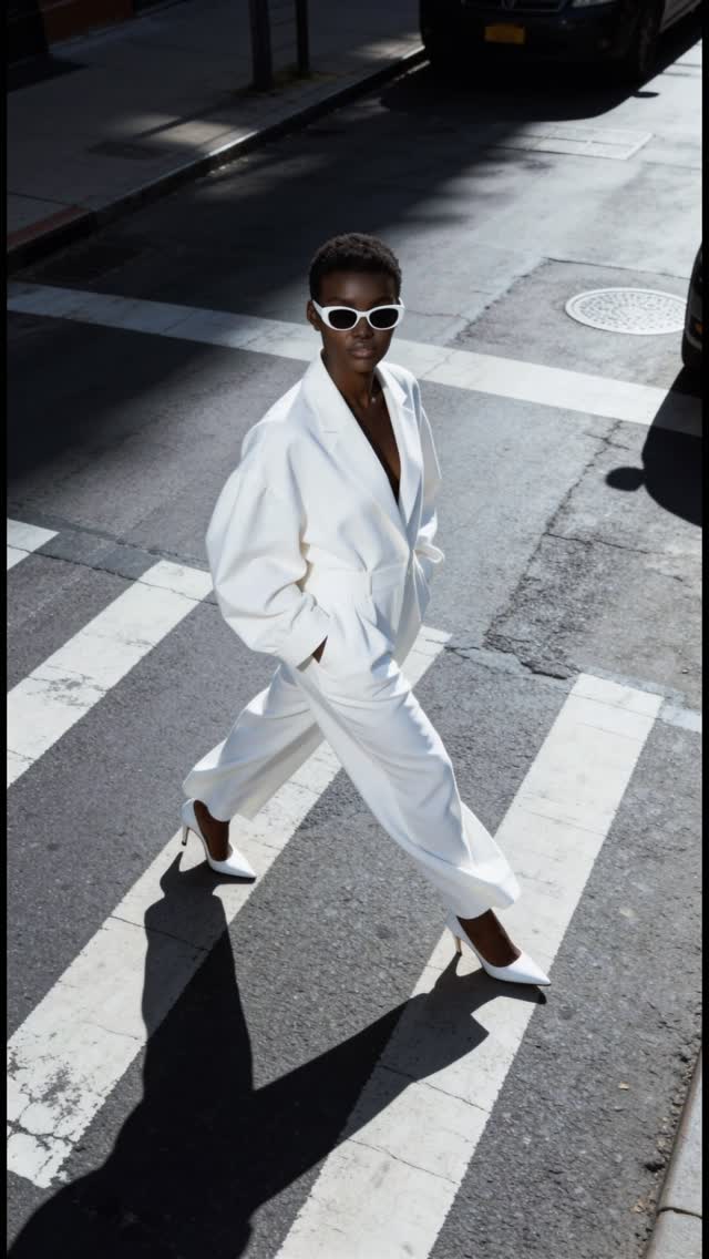
This image looks simple: one person crossing a street. But the performance is in the controls. The overhead angle turns the crosswalk into graphic design. The all-white outfit turns the subject into the brightest shape in the frame. And the hard sun turns shadow into composition. That is why it reads like a campaign, not a random street photo.
It is instantly readable at thumbnail size. The subject is a single, clean silhouette, and the crosswalk stripes act like built-in leading lines. Your eye lands on the white outfit, then follows the diagonal movement across the frame. The long shadow is the second subject: it adds drama without adding clutter.
There is also a “copyability” factor. Creators love formats they can reproduce. This is a format: overhead angle, monochrome wardrobe, strong midday sun, one urban geometry element (crosswalk). You can run it ten times with different outfits and locations and still look consistent.
| Signal | Evidence (from this image) | Mechanism | Replication Action |
|---|---|---|---|
| Thumbnail clarity | Single subject, bold crosswalk stripes, empty scene | Low cognitive load increases scroll-stop | Remove extra people and props; keep one geometric background element |
| Graphic composition | High-angle view + diagonal walk + hard shadow | Turns a real street into a designed poster | Lock camera height/angle first; use hard light to create a second shape (shadow) |
| One-color dominance | All-white outfit against gray asphalt | Strong figure-ground separation improves memory | Pick one dominant wardrobe color (white/black/red) and keep the environment neutral |
| Series potential | Repeatable setting (crosswalk) and simple pose | Consistency builds recognition across posts | Run a 7-post series: same angle, new outfit or new crosswalk each time |
This is not about a fancy location. It is about controlled geometry. The crosswalk stripes act like a design grid. The curb and sidewalk edge create a second set of lines. The outfit stays monochrome so the image does not fragment into noise. And the sunglasses add one crisp, iconic detail that reads even when compressed.
The key aesthetic choice is the hard light. Many creators avoid harsh sun, but here it is the point: the shadow becomes a graphic element. If you want this look, you do not “fix” the shadow. You use it.
| Observed | Recreate | Why it matters |
|---|---|---|
| High-angle overhead framing | Raise camera height; shoot down to flatten geometry | Turns streets into graphic layouts |
| Single dominant color (white) | Monochrome wardrobe; neutral environment | Improves thumbnail separation |
| Crisp directional shadow | Midday sun; keep shadow readable and long | Adds drama without props |
| Bold line system | Crosswalk stripes; curb edge; keep lines clean | Provides built-in leading lines |
| Prompt chunk | What it controls | Swap ideas (EN, 2–3 options) |
|---|---|---|
| camera angle | Graphic vs candid feel | high-angle overhead; eye-level street; low-angle hero shot |
| wardrobe palette | Thumbnail separation | all-white; all-black; monochrome red |
| environment geometry | Built-in design grid | crosswalk stripes; stair steps; tiled sidewalk pattern |
| lighting hardness | Shadow as a compositional element | harsh midday sun; late-afternoon long shadow; diffused overcast |
| signature detail | Memorability | white sunglasses; bold earrings; bright bag |
Baseline Lock: (1) overhead camera angle, (2) hard sun shadow direction, (3) monochrome wardrobe dominance.
One-change rule: change only 1–2 knobs per run. Example sequence: