How tapewarp.ai Created This 4X Faster Desert Run Poster AI Art — and How to Recreate It
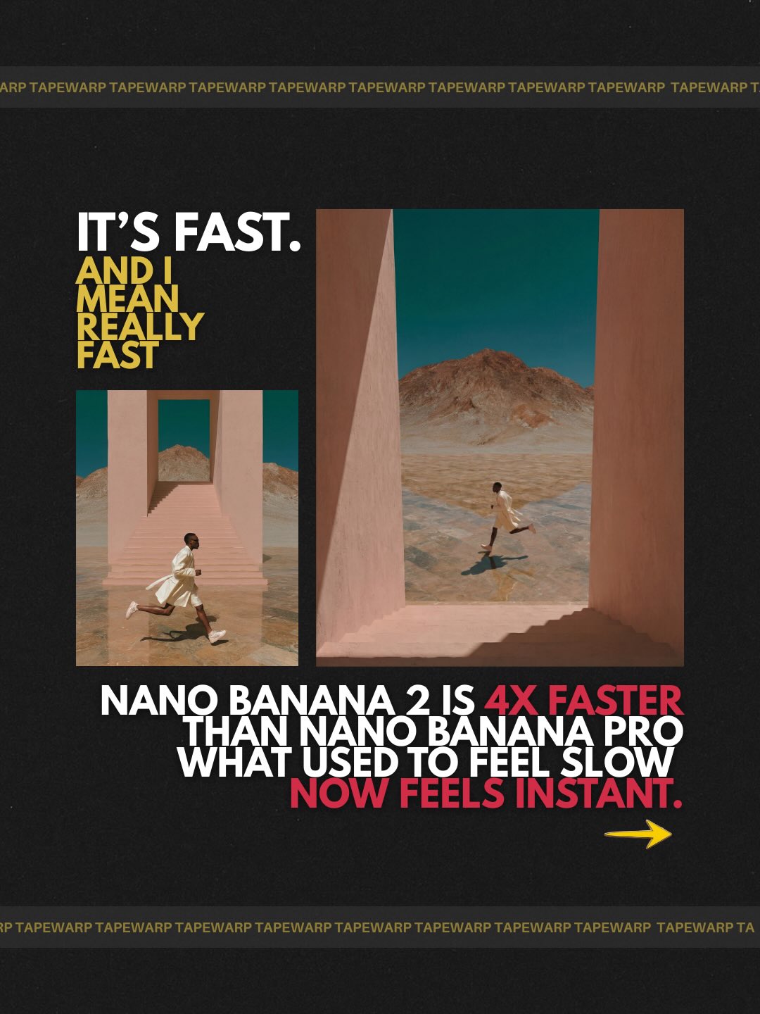
This image works because it understands that in a marketing poster, the layout itself often matters more than any single image element inside it. The runner, the architectural desert frames, the stacked headline, the border strips, and the dense promotional copy are all arranged to communicate one main idea: acceleration. The poster is not trying to tell a cinematic story. It is trying to persuade quickly and clearly. That is why the design succeeds. Every visual choice is organized around message hierarchy rather than visual decoration.
That hierarchy-first mindset is what gives the piece its campaign quality. The two inset panels do not function as standalone images. They are evidence in a larger graphic argument. The larger right panel suggests scale or improvement, the smaller left panel sets up comparison, and the typography binds the entire composition into a performance narrative. The poster reads less like a scene and more like a structured claim. In product-adjacent design, that is often exactly the right approach.
Why the Poster Behaves Like a Marketing Object First
The most useful thing about this piece is that it does not confuse illustration with communication design. The image knows it is a promo poster. The black field, the framed comparison panels, the headline placement, and the lower text block all prioritize advertising logic. This is a strong lesson because many generated poster prompts fail by becoming too image-led and not layout-led. They may produce attractive visuals, but they do not actually communicate like a campaign asset.
Here, the layout is doing the heavy lifting. The eye is first pulled to the large stacked headline, then to the two inset images, and then downward into the supporting copy block. That reading order is deliberate. It gives the viewer a controlled path through the poster. In ad design, that path is crucial. If the viewer does not know where to look first, the message weakens immediately.
For prompt builders, the takeaway is straightforward: if the goal is a marketing poster, the prompt has to define hierarchy explicitly. You cannot just ask for a cool design with text. You need to specify what dominates, what supports, and how the frame should be read in sequence.
The Role of the Two Inset Desert Panels
The two framed running scenes are highly effective because they function as comparison devices rather than random decorative inserts. The runner in motion provides a human metaphor for speed, while the clean architectural corridors make the action feel controlled and directional rather than chaotic. The fact that the two images are similar but differently scaled helps the viewer understand them as part of a single message system.
The right panel being larger is especially important. It creates an immediate sense of emphasis and progression. In marketing layouts, scale differences often imply upgrade, acceleration, or hierarchy without needing explicit explanation. That is exactly what happens here. The viewer reads the larger panel as the stronger or more advanced state, even before fully reading the text.
This is a valuable prompt design lesson. Comparison panels should not be identical in importance. One should lead, the other should support. When that relationship is made visible through size and placement, the layout becomes easier to understand and more persuasive.
Why the Desert Architecture Supports the Speed Theme
The geometric desert corridors are more than aesthetic choices. Their rectilinear walls and open perspective lines help visualize direction, movement, and controlled forward travel. If the runner were placed in a cluttered urban street or soft organic landscape, the speed message would be less sharp. Here, the architecture works like a funnel, guiding both the runner and the viewer’s eye through the frame.
This is an elegant way to use environment metaphorically in a design poster. The pale pink walls, sandy ground, and distant mountain remain visually clean enough that the runner silhouette stays readable, while still creating enough spatial depth to make the motion believable. The environment supports the concept without competing with the layout.
For creators, this is a useful reminder that inset imagery in promo design should reinforce the message structurally. It should not just look good. It should embody the claim. In this case, the architecture helps turn “speed” from abstract copy into a visual experience of direction and momentum.
How the Black Background Creates Premium Contrast
The matte black background is one of the strongest choices in the entire composition because it creates contrast, focus, and a sense of premium restraint. Black allows the inset desert panels to pop immediately. It also gives the white, yellow, and red typography enough separation to feel bold and legible. If the entire poster were lighter, the hierarchy would weaken and the design might feel more like a brochure than a campaign poster.
Black backgrounds in marketing design often work best when they are kept clean and confident. This piece understands that. The black field is not overloaded with textures or unnecessary gradients. It acts as a controlled stage for the layout. That simplicity is what allows the framed images and bright accents to feel expensive rather than chaotic.
This is another useful lesson for prompt writing. A dark field can be a framing device, not just a mood choice. If the goal is to create contrast and make hierarchy more forceful, a clean black background is often more effective than a decorative one.
Why Typography Is the True Lead Character
The typography is arguably the real protagonist of the poster. The headline, emphasis words, border strip text, and lower copy block together create the logic of the design. Without them, the inset runner panels would still be visually attractive, but the poster would lose its advertising identity. The type transforms the composition from a mood board into a message-driven asset.
That is one of the most important ideas in this piece. In promo layouts, typography is not an accessory added after the images are complete. It is one of the primary storytelling systems. Here, large white and yellow text establishes urgency and impact, while red accents add selective emphasis. The typography does not merely sit on top of the design. It structures it.
For prompt builders, this means text hierarchy has to be described like composition, not like decoration. Define the scale, position, contrast, and role of the headline. Define how the supporting copy anchors the lower half. Define how border strip text reinforces branding without overwhelming the center. That level of clarity is what makes this kind of design plausible.
Color Strategy: Limited But Aggressive
The color palette is controlled, which is why the poster feels sharp instead of noisy. Black, white, yellow, red, sand pink, and teal are all used for distinct jobs. Black creates the field. White carries clarity. Yellow marks impact. Red adds urgency and emphasis. The sand pink and teal remain mostly inside the inset images, preserving environmental identity without bleeding into the full layout. Because each color has a purpose, the design feels coordinated.
This is a strong marketing principle. Color works best when it is assigned roles. A poster becomes weaker when every accent color tries to do the same kind of work. Here, yellow and red are used sparingly enough that they remain meaningful. That sparseness gives the layout a more expensive and editorial feel.
For similar prompts, keeping the palette role-based is often more important than increasing visual variety. A few disciplined colors can create more authority than a much broader but less controlled palette.
How the Lower Copy Block Stabilizes the Poster
The heavy text block in the lower half is doing more than providing information. It stabilizes the whole composition. Without it, the poster might feel top-heavy because the headline and image panels dominate the upper and middle zones. The copy block gives the lower section visual weight and completes the reading journey. It tells the viewer that the poster is not just an announcement. It is a message system with substance and explanation.
This is especially useful in comparison-style marketing layouts. Once the viewer sees the main visual claim, they need somewhere to land. The lower copy block provides that landing zone. It creates a satisfying conclusion to the hierarchy while also reinforcing seriousness and legitimacy. The piece feels more complete because the bottom is not left visually empty.
From a prompt perspective, this is another reminder that text blocks can be structural, not just informational. When used properly, they help control balance and pace in a poster composition.
Why the Runner Stays Small
The runner is intentionally not oversized, and that is the correct decision. In this poster, the runner is a metaphor, not the main identity object. The design wants the viewer to understand motion and acceleration, but it does not want to become a sports action poster. By keeping the runner relatively small inside the panels, the image preserves the primacy of layout and messaging.
This is a useful lesson because many prompts overemphasize the human figure even when the design is supposed to be product- or message-led. Here, the runner’s role is to activate the environment and embody performance. The figure is important, but not dominant. That proportional restraint keeps the poster aligned with its marketing function.
When building similar designs, it helps to ask whether the figure is the star or the proof. In this case, the runner is proof. The headline and comparison structure are the star. That distinction should always be reflected in scale.
How to Rewrite This Prompt More Effectively
A stronger rewrite would preserve the key design systems: black premium field, stacked bold headline, two geometric desert comparison frames, larger right panel, border strip branding, and heavy lower copy block. Those are the structural anchors of the piece. Everything else should support them. The runner should remain clear and purposeful, but never become the center of attention.
It is also important to define the tone properly. This poster should feel like a tech-promo or performance campaign, not like a cinematic still. That means the design must stay typographic and graphic. The inset images should be crisp and geometric. The headline should dominate. The accent colors should be sparse and strategic. Any extra visual embellishment that does not reinforce speed messaging should be excluded.
The best rewrite should sound like a layout brief, not just an art prompt. That is how you keep the design operating as a persuasive object rather than a decorative one.
The Main Takeaway
The most valuable lesson from this image is that marketing posters become stronger when framing and hierarchy tell the story more clearly than the images inside them. The runner, the architecture, the desert palette, and the comparison panels all matter, but they matter because the layout gives them roles. The poster does not rely on raw visual drama. It relies on deliberate message structure.
If you want stronger speed, product, or performance promo posters, start with hierarchy before aesthetics. Decide what the viewer should read first. Decide what image proves the claim. Decide how comparison is encoded through scale. Decide how color marks emphasis. This image succeeds because it makes all of those decisions clearly, and that clarity is what turns a good design into a convincing campaign asset.