tapewarp: Improved Character Consistency Poster AI Art

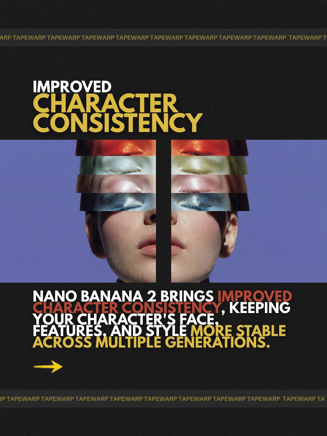
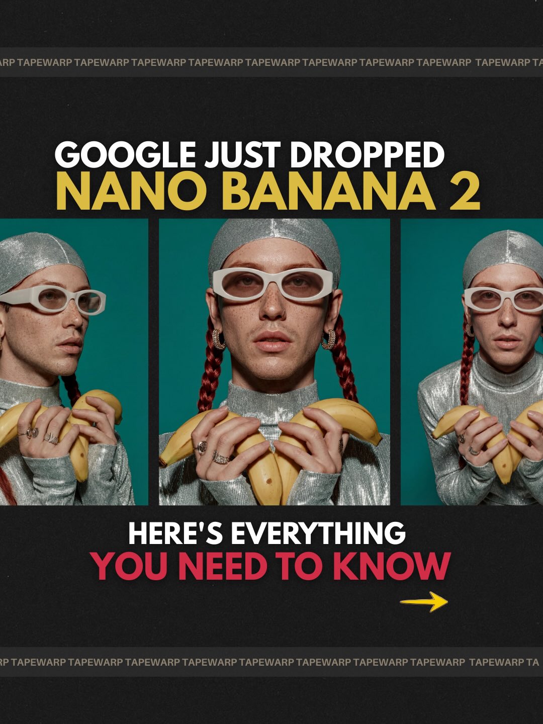
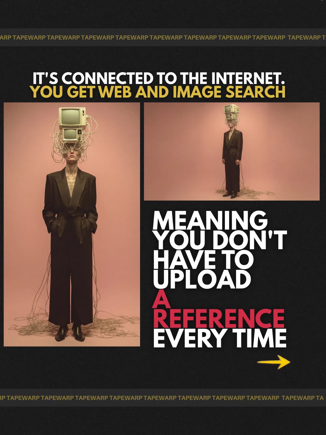
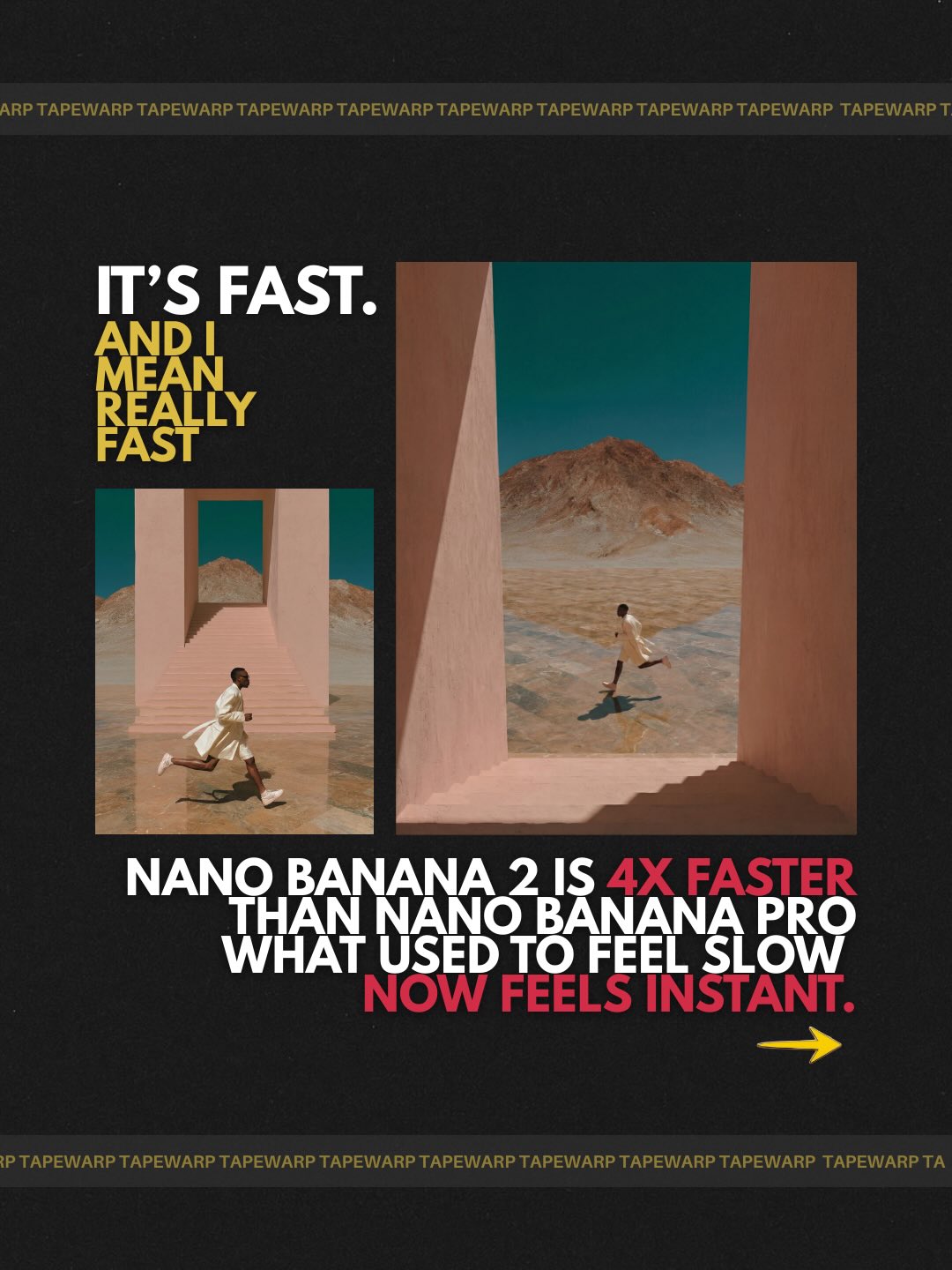
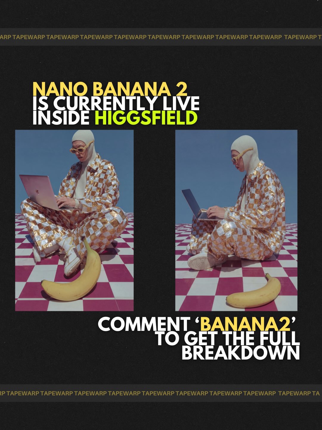
Nano Banana 2 is Google’s newest image generation model and it is now becoming the default across Gemini-powered tools. Here is what matters: Nano Banana 2 can generate high resolution visuals up to 4K while maintaining stronger detail, lighting accuracy, and texture realism compared to previous versions. It can handle: • up to 5 consistent characters • up to 14 objects in a single scene • multiple aspect ratios • sharper text rendering inside images All while producing more accurate outputs and following instructions better than before. Unlike earlier image models that relied only on static prompts, Nano Banana 2 integrates real-time knowledge and image understanding to recreate subjects with higher fidelity to reality. This makes it particularly powerful for: AI advertising product visuals brand storytelling social media campaigns creative direction workflows Speed is another major shift. The model is powered by Gemini Flash architecture, designed specifically for faster response times and real-time creative iteration. What used to take multiple tools, reference uploads, and repeated edits can now be done in a single workflow with consistent outputs across scenes. Earlier versions of Nano Banana attracted millions of users and generated billions of images within months of launch, showing massive demand for conversational image creation tools. Nano Banana 2 builds on that momentum by combining: better consistency higher resolution stronger instruction-following and wider accessibility For creators and brands, this marks a shift from prompt-heavy workflows toward more fluid, production-ready visual generation. Nano Banana 2 is currently live inside higgsfield Comment “BANANA2” to get the full breakdown. #nanoBanana2 #generativeai #aiimagegenerator #higgsfieldpartner

This poster works because it translates an abstract product promise into a visual metaphor that can be understood in seconds. “Character consistency” is not an inherently cinematic phrase, but the design turns it into something concrete by slicing repeated color bands across the same face. That instantly tells the viewer the message is about stability across variations.

The central idea is clarity through reduction. The layout does not rely on screenshots, UI panels, or technical diagrams. Instead, it uses one face, one disruption zone, one headline, and one block of supporting copy. That economy is what gives the concept its authority. It feels like a campaign asset, not a crowded explainer.

SignalEvidence (from this image)MechanismReplication Action
Conceptual metaphorStacked colored slices crossing the same faceThe repeated strips imply multiple generations while the aligned features imply identity retentionBuild one strong visual metaphor instead of trying to show the whole technical process
Marketing hierarchyLarge headline on top, body copy below, image in the middleThe viewer understands the message order immediatelyUse headline, visual proof, and support copy in a strict top-to-bottom reading path
Premium restraintBlack background, limited accent palette, minimal graphic noiseRestrained color and spacing make the poster feel higher-value and more credibleReduce the palette and let negative space carry part of the design load
Face-first communicationLarge centered portrait with clean symmetryHuman identity becomes the anchor for a technical feature claimWhen selling consistency, make the face itself the proof object

What is especially effective here is the balance between human softness and graphic hardness. The portrait is smooth, elegant, and believable, while the surrounding typography and panels are rigid and assertive. That contrast helps the poster feel both creative and product-oriented at the same time.

If you want to recreate this style, think like a campaign designer rather than a prompt engineer. Start by asking what single visual move can stand in for the product benefit. Then build the layout around that move with as little extra explanation as possible. The stronger the metaphor, the less the poster needs ornament.

Prompt chunkWhat it controlsSwap ideas (EN, 2–3 options)
“centered woman’s face with horizontal color-sample slices across the eyes”Creates the main consistency metaphor“portrait interrupted by aligned generation strips”, “face overlaid with repeated color bands”, “editorial portrait with stacked output slices”
“matte black poster background with lavender portrait field”Locks the premium campaign palette“black campaign frame with muted violet center panel”, “dark editorial poster with soft purple portrait block”, “high-contrast black layout with cool pastel face field”
“bold uppercase sans-serif headline and dense support copy”Defines the SaaS marketing voice“launch-poster typography hierarchy”, “bold product campaign type system”, “editorial ad copy layout”
“graphic editorial AI marketing poster aesthetic”Prevents the image from slipping into generic illustration“premium creative-tech brand poster”, “high-end SaaS campaign key visual”, “modern product-ad editorial design”

The practical takeaway is that technical claims become much more memorable when they are attached to a single human-centered visual proof. In this case, consistency is not described first. It is shown first. That is why the poster feels sharp, modern, and easy to reuse as a template for other feature-led campaign visuals.