Comment ‘AI’ to get the prompts in your DM’s 👀 Soul 2 by @higgsfield.ai just made AI UGC a whole lot easier. - #aitools #aicommunity #aiugc #higgsfieldai #ai
Comment ‘AI’ to get the prompts in your DM’s 👀 Soul 2 by @higgsfield.ai just made AI UGC a whole lot easier. - #aitools #aicommunity #aiugc #higgsfieldai #ai
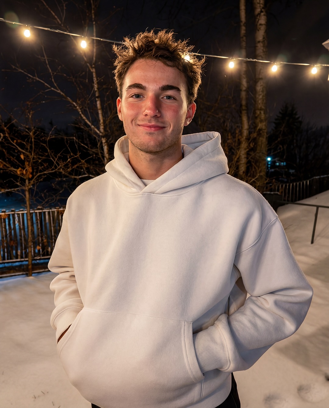
This portrait works because it feels lived-in instead of manufactured. A clean oversized white hoodie, relaxed posture, and a late-night snowfall create a scene that is simple on paper but emotionally specific in the frame. The string lights do a lot of the heavy lifting: they arc across the upper background, add warmth to the composition, and keep the winter setting from reading as cold or empty. The result is a portrait that feels personal, seasonal, and easy to reuse as a creator-friendly example of understated lifestyle photography.
The strongest thing about this image is the contrast between comfort and weather. Snow covers the deck, the trees are bare, and the background is dark, but the subject still feels approachable because the light source is practical and warm. That tension is what gives the photo its emotional pull. It does not rely on a dramatic pose or a complex location. Instead, it uses a small set of cues very precisely: white hoodie texture, soft face light, blurred bulbs overhead, and a neutral winter palette that still feels intimate.
For a blog aimed at small creators, this kind of image is useful because it shows how restraint can feel premium. You do not need a busy set, a heavy color grade, or elaborate props to get a strong result. What matters is the alignment between posture, background, and lighting. If those three pieces are locked, the image reads as intentional. If any one of them gets too loud, the portrait stops feeling like a quiet seasonal moment and starts feeling staged.
The portrait has a built-in social logic. It is bright enough to feel friendly, dark enough to feel private, and simple enough to understand in a single glance. That combination matters on platforms where the viewer is deciding in a fraction of a second whether the image deserves attention. The hoodie acts like a visual anchor, the string lights act like a mood signature, and the snow acts like context without taking over the frame.
The image also has a natural rhythm. The body stays centered, the light sources sit above the subject, and the background falls away just enough to keep the face and clothing readable. That rhythm is why the composition feels calm instead of static. Even though nothing dramatic is happening, the portrait still has structure. The viewer can sense a space, a temperature, and a time of day without being overloaded with detail.
If you are trying to recreate this kind of result, the goal is not to make the image louder. The goal is to make each cue more deliberate. The hoodie should stay crisp, the bulbs should glow softly, and the snow should give the scene texture without flattening the skin tones. When those elements are balanced, the image becomes easy to package as lifestyle content, seasonal social art, or a quiet personal-brand portrait.
| Signal | Evidence (from this image) | Mechanism | Replication Action |
|---|---|---|---|
| Warm practical lights | Soft bulbs arc across the top and glow above the subject | They create intimacy and stop the snow scene from feeling harsh | Keep the bulbs warm, small, and slightly out of focus |
| Clean white hoodie | The hoodie is bright, oversized, and visually dominant | It becomes the anchor that separates the subject from the dark background | Lock a crisp hoodie silhouette and preserve visible fabric folds |
| Snow plus darkness | The deck and trees are snow-covered while the background stays dim | The contrast adds seasonal atmosphere and depth without clutter | Keep the snow bright but the background subdued |
One reason this structure is so reusable is that it creates a clear emotional recipe. You can keep the same winter framework and still change the mood slightly by shifting the color temperature, bulb spacing, or crop height. The image stays recognizable because the logic is simple: person first, atmosphere second, background third. That order is useful for creators who want to build repeatable portrait systems without making every post look identical.
This setup fits any content lane that benefits from quiet seasonal authenticity. It is especially strong when the goal is to make a portrait feel comfortable, human, and slightly cinematic without leaning on studio perfection. The image can support a winter diary post, a casual fashion feature, a creator profile, or a reflective end-of-year post. In each case, the key question is not whether the scene is dramatic enough, but whether it feels emotionally readable at a glance.
It is not ideal for high-energy action content, heavy product illustration, or a scene that needs strong narrative movement. The image works best when it remains still and observational. If you turn the bulbs into a dramatic feature or make the subject too animated, you lose the quiet strength that makes the portrait readable. The scene is built for softness, not spectacle.
Recipe 1
Keep: hoodie texture, warm bulb glow, snowy night mood
Change: subject identity, outdoor location, hand position
Slot template: {subject} in a white hoodie under warm winter lights
Recipe 2
Keep: centered crop, relaxed posture, dark background contrast
Change: garment color, weather severity, background props
Slot template: {subject} in a {garment} on a {season} night
Recipe 3
Keep: candid feeling, practical lights, natural skin tone
Change: location type, age group, styling details
Slot template: {subject} in a {location} with {light source}
Observed closely, the image is built from a small number of visual decisions that reinforce each other. The white hoodie acts like a bright block against the darker winter surroundings, so the figure stays prominent even if the scene is simplified. The string lights form a loose arc, which gives the composition a subtle frame without making the subject look boxed in. Snow on the ground adds texture and seasonality, but it remains secondary to the face and torso. That hierarchy is important because the portrait is not trying to prove realism through detail overload; it is trying to preserve mood through economy.
The lighting direction is equally disciplined. Warm practical bulbs are balanced by cool ambient bounce from the snow, which keeps the skin tones natural and prevents the entire scene from turning amber. That kind of balance is the difference between a cozy portrait and an overcooked festive render. The subject’s expression stays understated, which helps the image feel candid. If the smile became broader or the lighting more theatrical, the portrait would instantly read more like a posed campaign image than an intimate winter moment.
The composition also benefits from negative space. The dark trees and night background give the hoodie room to breathe, and the soft blur around the bulbs prevents the upper frame from becoming visually noisy. The viewer gets enough information to understand setting, but not so much that the portrait loses focus. That is why the image feels useful as creator reference material: it teaches restraint, not excess. It shows that a simple winter frame can still look polished if the subject, light, and background are kept in the right order.
Another thing worth noting is the emotional temperature of the portrait. It is warm without being cheerful, private without being isolated, and casual without feeling unfinished. That middle ground is hard to create on purpose, which is why the image is interesting. It demonstrates that a few carefully held variables are often more powerful than a long list of decorative additions. For creators trying to build a recognizable visual style, that is a valuable lesson: hold the composition still, and let the texture do the work.
| Prompt chunk | What it controls | Swap ideas (EN, 2–3 options) |
|---|---|---|
| subject | Who the portrait is about and how approachable the presence feels | young creator / winter lifestyle subject / candid portrait subject |
| wardrobe | The main visual anchor and emotional temperature | white hoodie / cream sweatshirt / oversized knit layer |
| scene | Seasonal context and story environment | snowy backyard / rooftop deck / quiet patio at night |
| lighting | Warmth, softness, and skin tone handling | warm string bulbs / soft practical lanterns / cool snow bounce |
| composition | How the viewer reads the portrait quickly | centered mid-thigh crop / waist-up portrait / vertical social frame |
| texture | Whether the image feels natural and tactile | snow texture / fabric folds / subtle skin detail |
The best way to use these chunks is to think of them as control knobs instead of prose fragments. If the portrait feels too cold, adjust the lighting chunk. If it feels too busy, simplify the scene chunk. If it feels too generic, change the wardrobe chunk. That mindset turns prompt writing into a repeatable process instead of a guess-and-check exercise.
Baseline lock: keep the centered portrait crop, the warm string-light direction, and the white hoodie as the main anchor. Those three elements define the image’s identity. Once they are locked, you can make the picture feel different without losing the core seasonal look. The most common mistake is changing too many things at once. That is how a quiet winter portrait turns into an incoherent night scene.
One-change rule: move only one or two controls per run. For example, you might first raise the bulb warmth while keeping the same crop. On the next pass, you could loosen the hoodie fit or shift the snow tone slightly cooler. On the third pass, you might alter the camera height by a small amount. On the fourth pass, you can test a different hairstyle or facial expression while leaving the atmosphere intact. That sequence keeps the image family recognizable while still producing real variation.
If you want a cleaner version, reduce the visible background and let the face carry more of the frame. If you want a more atmospheric version, brighten the bulbs and deepen the blue night field. If you want a more editorial version, keep the same lighting but tighten the crop and sharpen the fabric texture. The point is to preserve the mood architecture while allowing the portrait to evolve.