
Comment ‘AI’ to get the prompts in your DM’s 👀 Soul 2 by @higgsfield.ai just made AI UGC a whole lot easier. - #aitools #aicommunity #aiugc #higgsfieldai #ai
Comment ‘AI’ to get the prompts in your DM’s 👀 Soul 2 by @higgsfield.ai just made AI UGC a whole lot easier. - #aitools #aicommunity #aiugc #higgsfieldai #ai
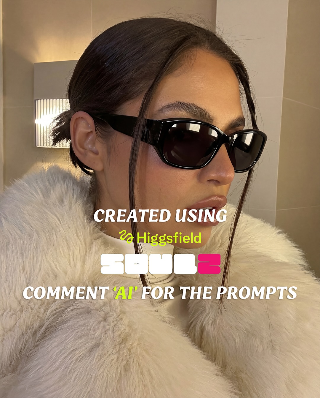
This image works because it understands the difference between luxury and excess. There is no overloaded glam styling, no crowded background, no theatrical pose. Instead, it relies on a few premium signals placed exactly where they matter: black fashion sunglasses, a soft oversized faux-fur coat, warm neutral architecture, and a face that does not overperform. That combination creates status without feeling loud.
What makes the post especially smart is that it merges a fashion portrait with a software promo. The model image is strong enough to stop the scroll on its own, but the text overlay gives it an immediate function. That dual purpose is important for creators. A promotional post tends to perform better when the creative asset is desirable even before the viewer processes the call to action.
The first reason is texture contrast. Smooth skin, glossy sunglasses, and plush fur all respond differently to the same warm light. That makes the image feel materially rich even though the palette stays restrained. In a practical sense, this is one of the easiest ways to make AI-assisted beauty or fashion content feel more expensive: do not add more objects, add more meaningful material behavior.
The second reason is controlled coolness. The expression is calm, almost detached, and the framing is intimate without becoming vulnerable. That gives the image social authority. The viewer is not being invited into a personal diary moment; they are being invited to admire a polished point of view. That subtle emotional distance is often what makes fashion-adjacent posts feel more aspirational.
| Signal | Evidence (from this image) | Mechanism | Replication Action |
|---|---|---|---|
| Luxury texture stack | Glossy black sunglasses, creamy faux fur, smooth skin, matte stone wall | Material contrast makes the portrait feel expensive without visual clutter | Build the image around 3-4 distinct material finishes instead of adding props |
| Quiet palette | Black, cream, beige, and warm skin tones dominate the frame | Restrained color improves perceived sophistication and makes the CTA less spammy | Use mostly neutrals and let one dark accessory create the visual anchor |
| Tight crop | The portrait stays chest-up and leaves little empty space around the subject | Close framing makes the image immediately readable in-feed | When promoting a style or tool, crop tightly enough that the main fashion signal reads instantly |
| Integrated promo text | Brand and CTA text sit directly inside the portrait rather than below it | The message inherits the desirability of the image instead of competing with it | Layer promotional text over the hero image, but only when the image can support it cleanly |
This approach is strongest for prompt promos, model launches, beauty-tool announcements, fashion-adjacent creator content, and premium-feeling CTA posts. It is especially effective when the product being promoted benefits from an aura of quality, curation, or elevated taste.
It is less ideal for story-heavy posts, playful meme content, or tutorials that need multiple comparison examples. This image language is about elegance and immediate desirability, not explanation density.
The strongest part of this frame is its refusal to overexplain itself. The image lets the coat, the glasses, and the warm architecture build the mood. That silence is powerful. In many promotional posts, the desire to communicate everything at once destroys the luxury feeling. Here, the image leaves room for elegance by keeping the visual vocabulary small.
The sunglasses matter more than they first appear to. They do not just accessorize the portrait; they create distance. They keep the subject slightly unreachable, which is a core part of aspirational fashion imagery. The viewer can see the look, but not fully access the interior emotion. That controlled withholding is often what gives premium portraiture its charge.
The fur is doing the opposite job. It softens the image, warms it, and makes the portrait physically inviting. Together, the sunglasses and fur create a useful tension: coolness and comfort, hardness and softness, polish and warmth. That tension is what keeps the frame from becoming generic beauty content.
| Observed | Why it matters for recreation |
|---|---|
| Black sunglasses create the darkest and sharpest shape in the image | This gives the face a strong focal anchor without requiring heavy makeup or expression |
| The faux-fur coat fills most of the lower frame | Large soft texture makes the image feel tactile and expensive |
| Background stays minimal and architectural | Neutral interiors are what let the styling feel elevated rather than busy |
| Warm practical light shapes the skin softly | Even flattering light helps the portrait feel premium and believable |
| Overlay text sits on top of an already desirable portrait | The promotional message inherits visual value from the image itself |
If you want to recreate this style, write for material hierarchy and emotional temperature. The image is not carrying complexity through narrative. It is carrying complexity through texture, restraint, and crop.
| Prompt chunk | What it controls | Swap ideas (EN, 2–3 options) |
|---|---|---|
| close-up fashion portrait of a woman in black sunglasses | Subject framing, attitude, accessory anchor | “tight luxury beauty portrait with dark sunglasses”; “close chest-up fashion crop”; “intimate portrait with one dominant eyewear element” |
| voluminous cream faux-fur coat | Main texture field and luxury cue | “plush ivory faux-fur wrap”; “oversized cream fur collar”; “soft textured outerwear filling the frame” |
| warm beige tiled luxury interior | Background quality and understated setting | “minimal hotel interior”; “neutral architectural backdrop”; “clean warm-toned upscale interior” |
| soft indoor beauty lighting with practical wall sconce glow | Skin rendering and mood warmth | “flattering warm ambient light”; “soft hotel-lobby beauty light”; “indoor luxury portrait lighting” |
| clean promo text overlay for model or prompt drop | Commercial function and social formatting | “centered campaign CTA typography”; “branded software promo text”; “minimal educational launch overlay” |
Lock three things first: the black sunglasses, the cream fur texture, and the warm minimal interior. Those are the image’s status signals. If any one of them weakens, the portrait quickly drops from premium promo to ordinary lifestyle content.
Then use the one-change rule. Change one or two variables per run.
If you want a CTA portrait to feel premium, let the image carry desire first. The text should feel like an invitation into the look, not a layer fighting against it.