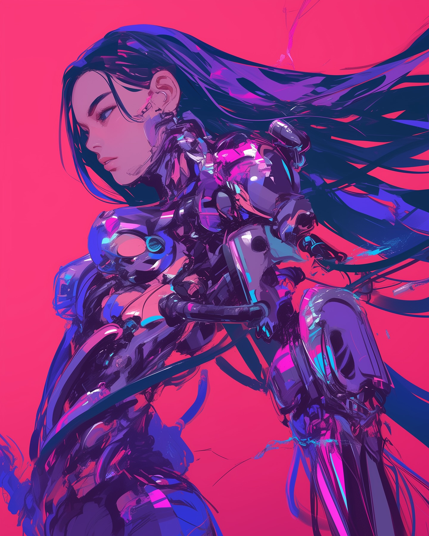
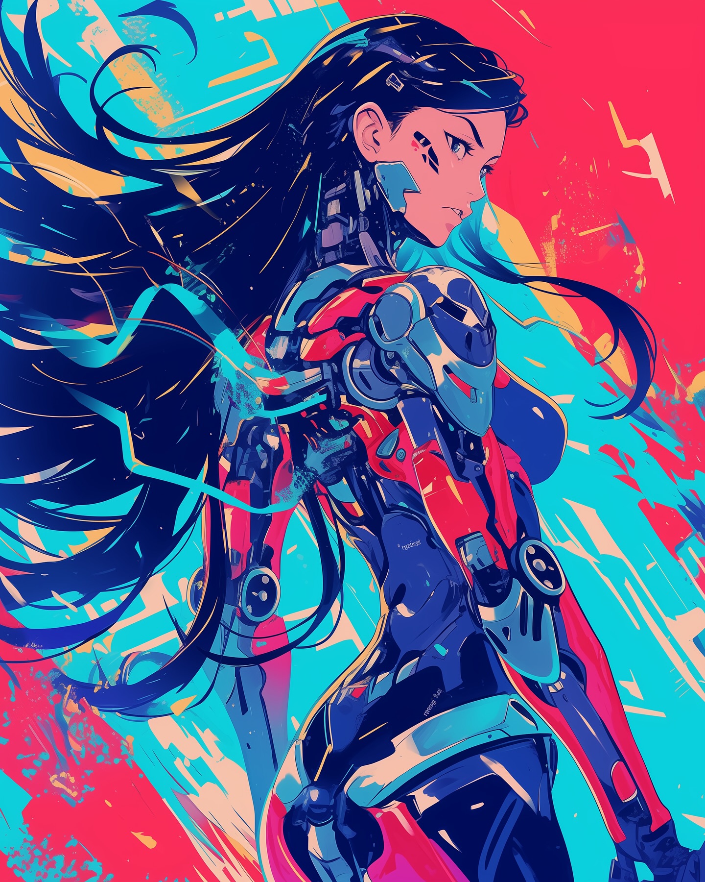
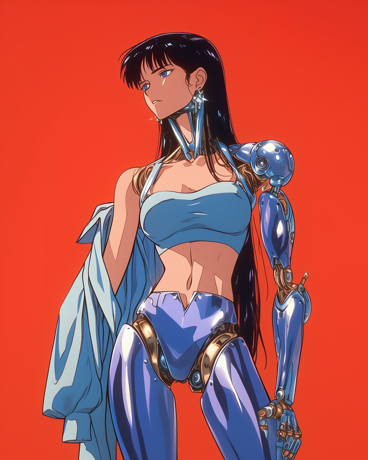
How feedthekittys Made This Retro Anime Cybernetic Side-Profile AI Portrait - and How to Recreate It
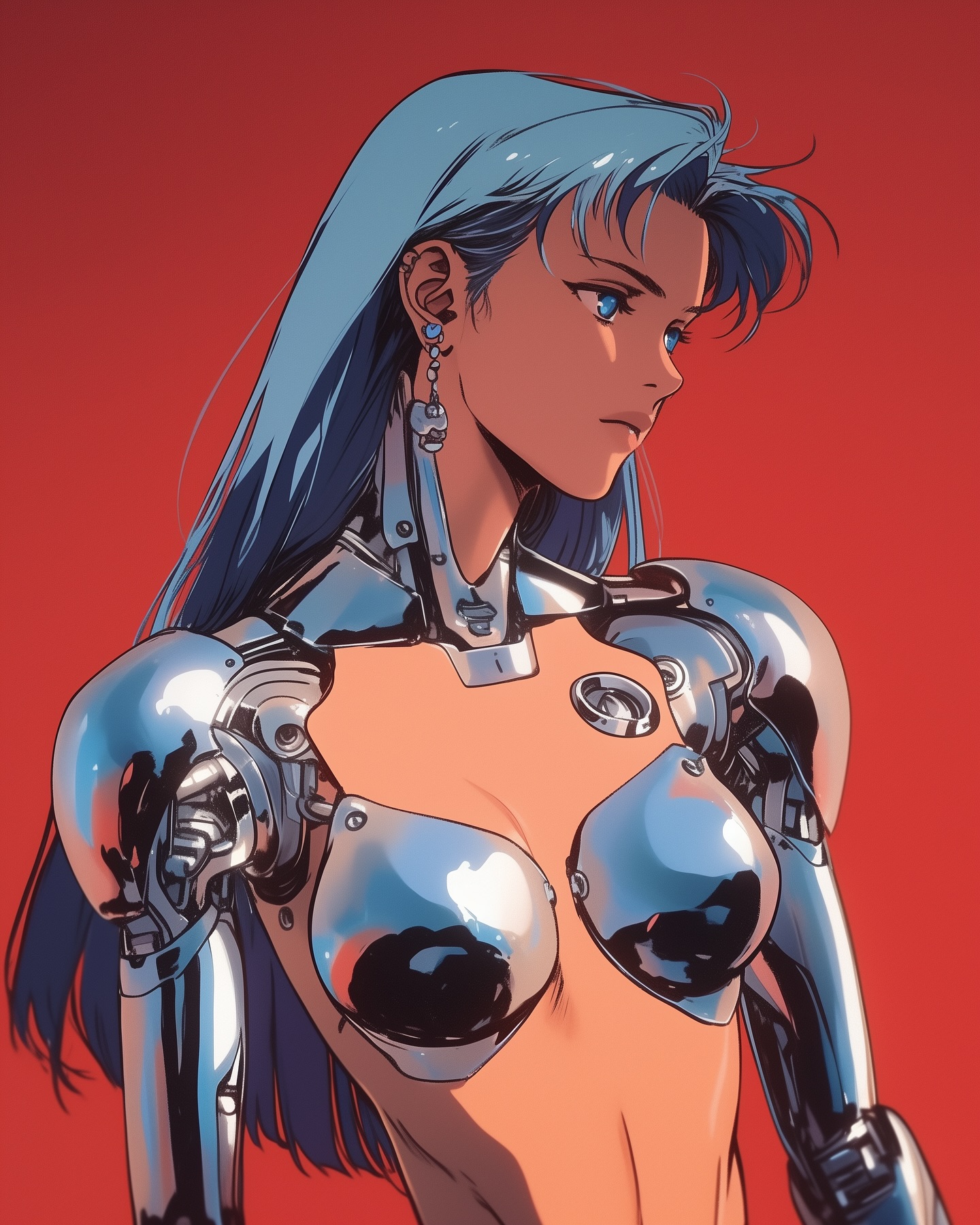
This image succeeds because it commits to one idea without softening it: a calm, elegant anime character pushed into full chrome android territory, framed against an aggressive flat red background. The result is not just "sci-fi girl art". It is a controlled poster composition built around silhouette, contrast, and material tension.
Visual breakdown
| Element | What it does |
|---|
| Side profile | Removes narrative noise and turns the face into a strong graphic contour. |
| Chrome torso | Creates the image's main material event and gives the portrait a premium machine quality. |
| Flat red background | Pushes the figure forward and gives the composition immediate poster-level contrast. |
| Blue hair | Balances the warm backdrop and makes the silhouette feel cooler and more futuristic. |
| Minimal crop | Keeps attention on expression, material, and shape instead of world-building. |
What the aesthetic is really doing
The image is using a very old illustration trick: reduce the scene until the subject becomes the entire message. That matters here because the subject has two conflicting identities, human and machine, and the art gives each identity a clean visual language. Skin remains warm and organic. Chrome stays cold, mirror-like, and engineered. The red background is the pressure field that makes both read clearly at once.
The profile angle also matters more than it first appears. A front-facing portrait would make this image about eye contact and personality. A profile portrait makes it about structure. That shifts the reading from "character illustration" into "designed object", which is exactly why the chrome armor feels convincing rather than decorative.
Why the color palette is disciplined
| Color | Function |
|---|
| Red | Acts as a visual amplifier, not a background. |
| Blue | Separates hair and identity from the field behind it. |
| Silver | Signals machinery, reflection, and high-spec fabrication. |
| Warm skin tone | Prevents the image from becoming too cold or sterile. |
Because the palette is tightly restricted, every highlight matters. There is no color waste. Each tone is doing job-specific work: red for force, blue for silhouette, silver for technology, skin for humanity.
Best-fit uses and transfer paths
- Reference for futuristic character portraits with a premium poster finish.
- Basis for AI prompt engineering when you want chrome materials to remain elegant rather than noisy.
- Useful as a visual benchmark for profile compositions that need to feel iconic instead of merely pretty.
- Good inspiration for album covers, cyber-fashion editorials, and concept art moodboards.
How to adapt the idea without losing it
If you reuse this direction, keep three things intact: the profile silhouette, the flat high-contrast background, and the disciplined chrome material treatment. You can change the hair color, body design, or background hue, but if you add too much environmental detail the image stops reading like a poster and starts reading like a scene. That would weaken the original effect.
The safest adaptation path is to preserve the subject's calm expression and strict crop, then vary only the material language. For example, the chrome torso could become matte ceramic, brushed titanium, or iridescent polymer while the composition stays essentially the same.