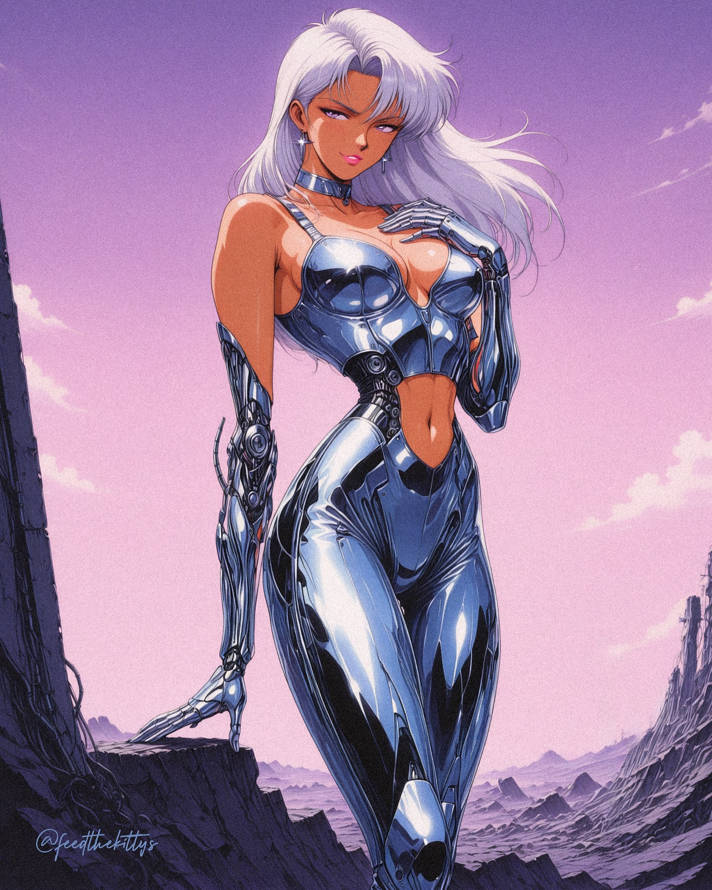
How feedthekittys Created This Anime Cyber Pin-Up AI Portrait — and How to Recreate It
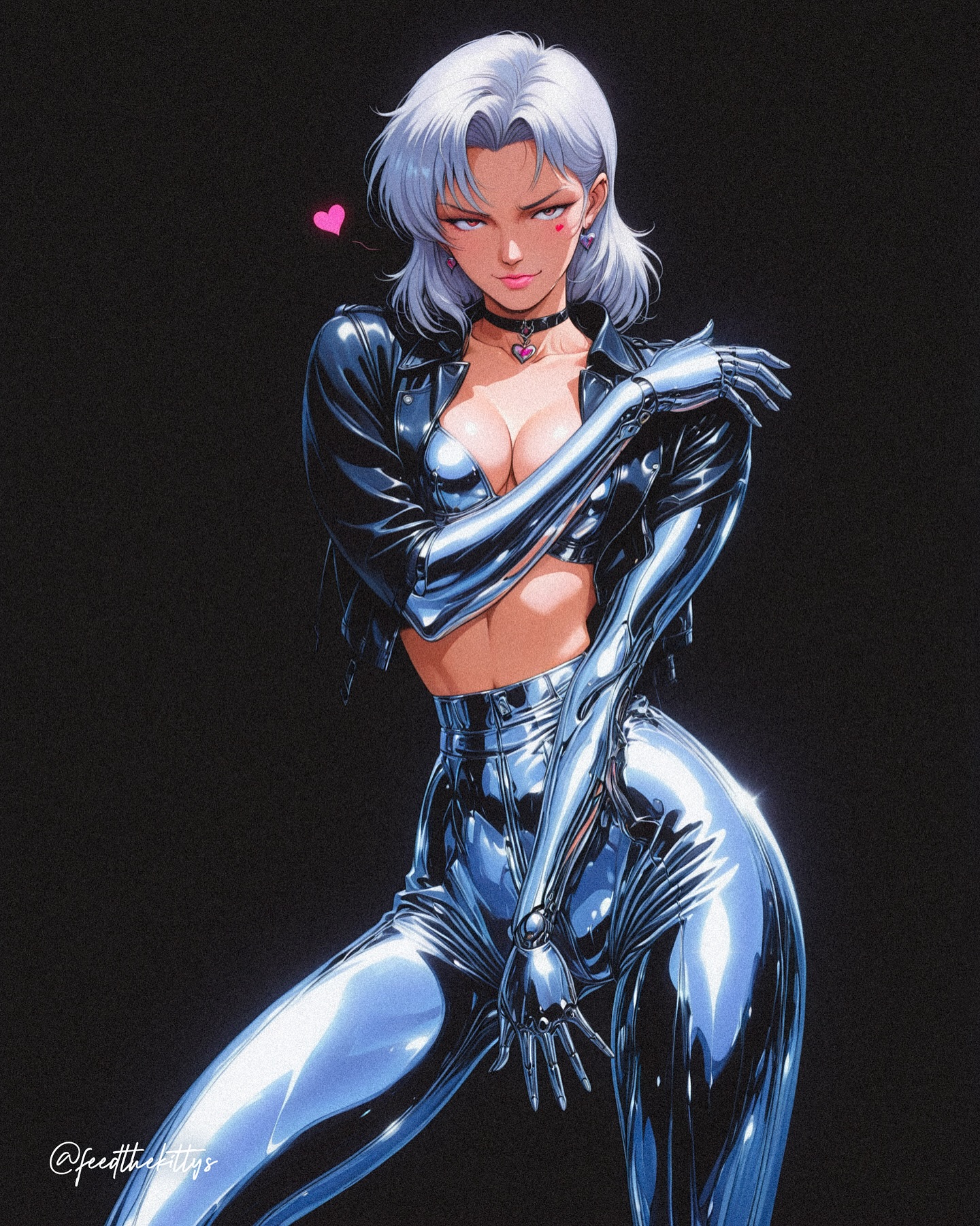
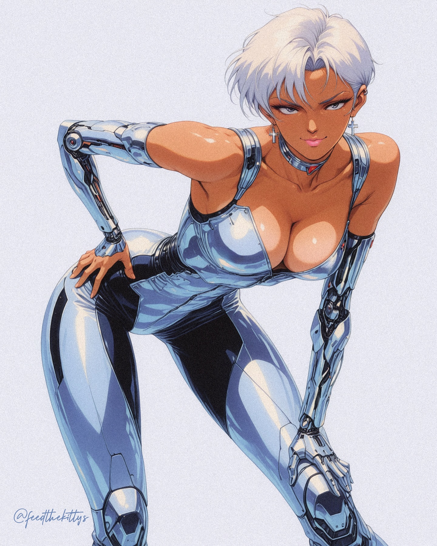
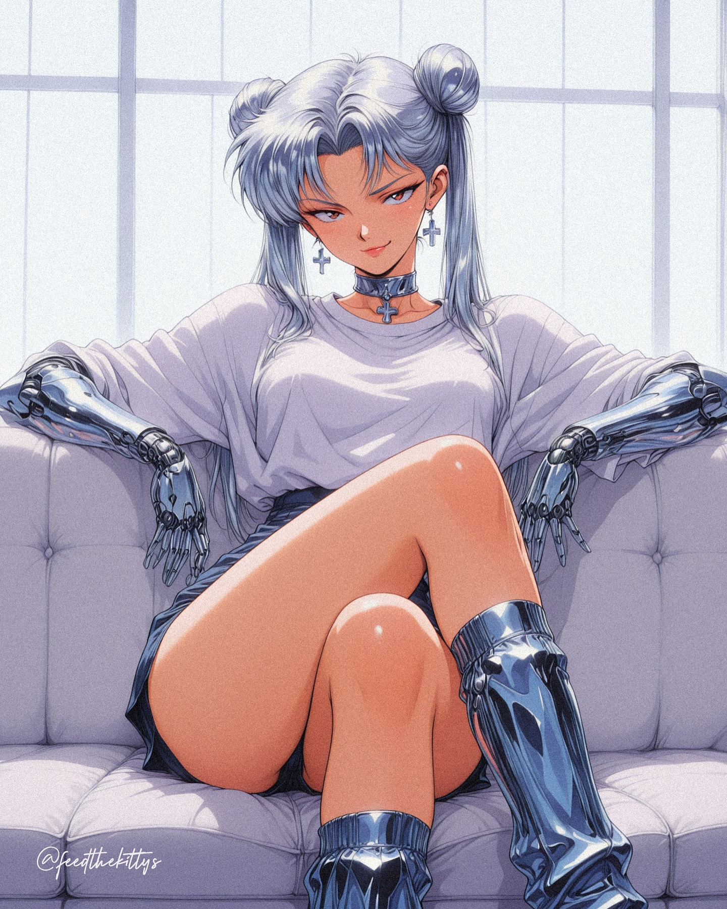
This image works because it combines three things that are easy to overdo and hard to balance: sex appeal, chrome futurism, and poster clarity. The black background removes every excuse for ambiguity. The figure has to carry the frame through posture, shine, and attitude, and it does.
Visual breakdown
| Element | Role in the image |
|---|
| Silver hair | Creates a cool halo against black and softens the otherwise hard metallic language. |
| Chrome limbs | Make the body feel engineered and give the image its strongest reflective rhythm. |
| Heart accent | Adds a playful human cue so the image does not feel purely cold or mechanical. |
| Wide stance | Provides confidence and makes the silhouette read instantly at thumbnail size. |
| Black background | Turns the subject into the entire composition and reinforces the poster aesthetic. |
What the aesthetic is really doing
The image is not trying to build a world. It is trying to build a presence. That is a useful distinction. The pose is assertive, the materials are loud, and the background is silent. Together they create a visual hierarchy where the viewer understands the character in less than a second.
The design also plays a very specific balancing act between fantasy and discipline. The outfit is provocative, but the rendering treats it like a studio product shot. That keeps the image from collapsing into generic fan art. It feels intentional because the shine, crop, and posture are all controlled.
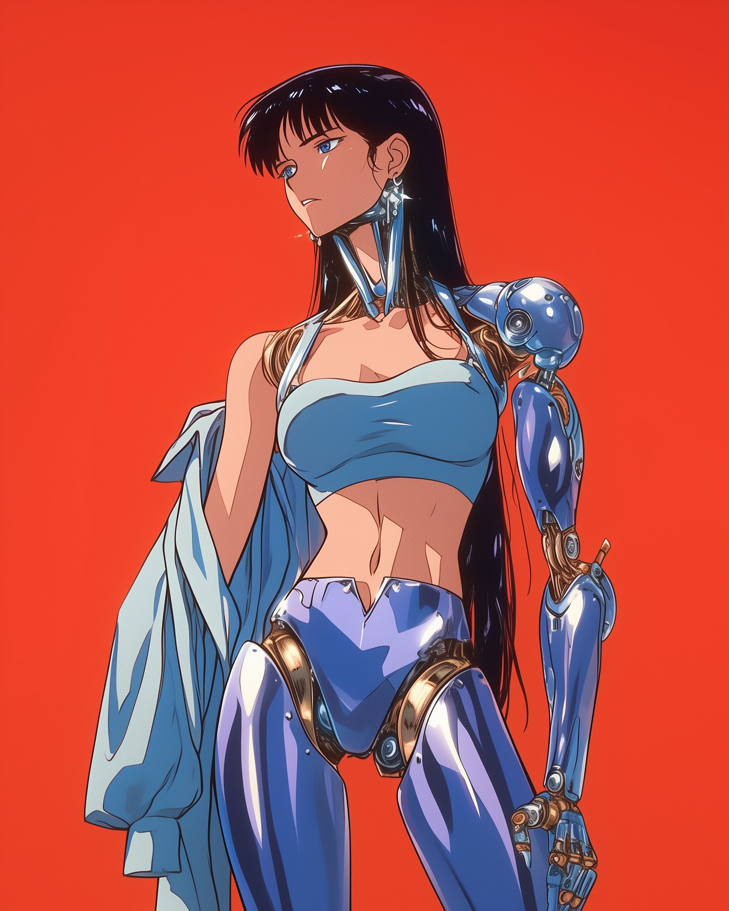
Why the materials matter so much
| Material | Effect |
|---|
| Chrome | Signals future-tech and creates strong light behavior. |
| Black lacquer | Frames the silver tones and deepens contrast. |
| Glossy synthetic fabric | Connects the body to fashion rather than armor alone. |
| Skin | Restores warmth and prevents the image from becoming too machine-like. |
The reason the image feels premium is that the reflections are disciplined. The highlights are bright, but they follow the body structure. That makes the chrome readable instead of noisy, which is exactly what you want when the subject is meant to feel like a fashion icon with mechanical upgrades.
Best-fit uses and transfer paths
- Reference for cyber-fashion portraits with a strong studio look.
- Useful for prompt design when you need reflective materials to stay elegant and controlled.
- Good inspiration for poster art, character branding, and high-contrast social assets.
- Works as a style benchmark for mixing flirtation, confidence, and futuristic polish.
How to reuse the idea without flattening it
If you want to remix this concept, keep the black void, the dominant chrome surfaces, and the centered single-subject framing. Those are the structural elements. You can change the hair color, eye mark, or outfit cut, but if you introduce scenery or crowd the composition, the image will lose its poster force.
Another safe variation is to alter the accent color only. Swap the pink heart for red, cyan, or violet, but keep it small. The accent should remain a punctuation mark, not a competing theme.