How feedthekittys Made This Lavender Hair Tattoo Portrait — and How to Recreate It
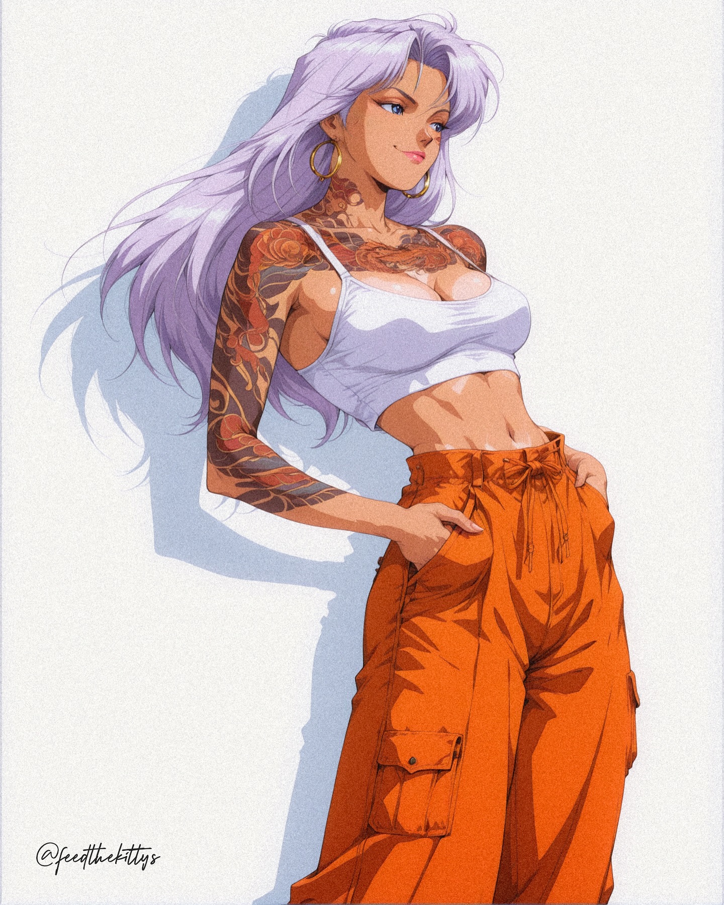
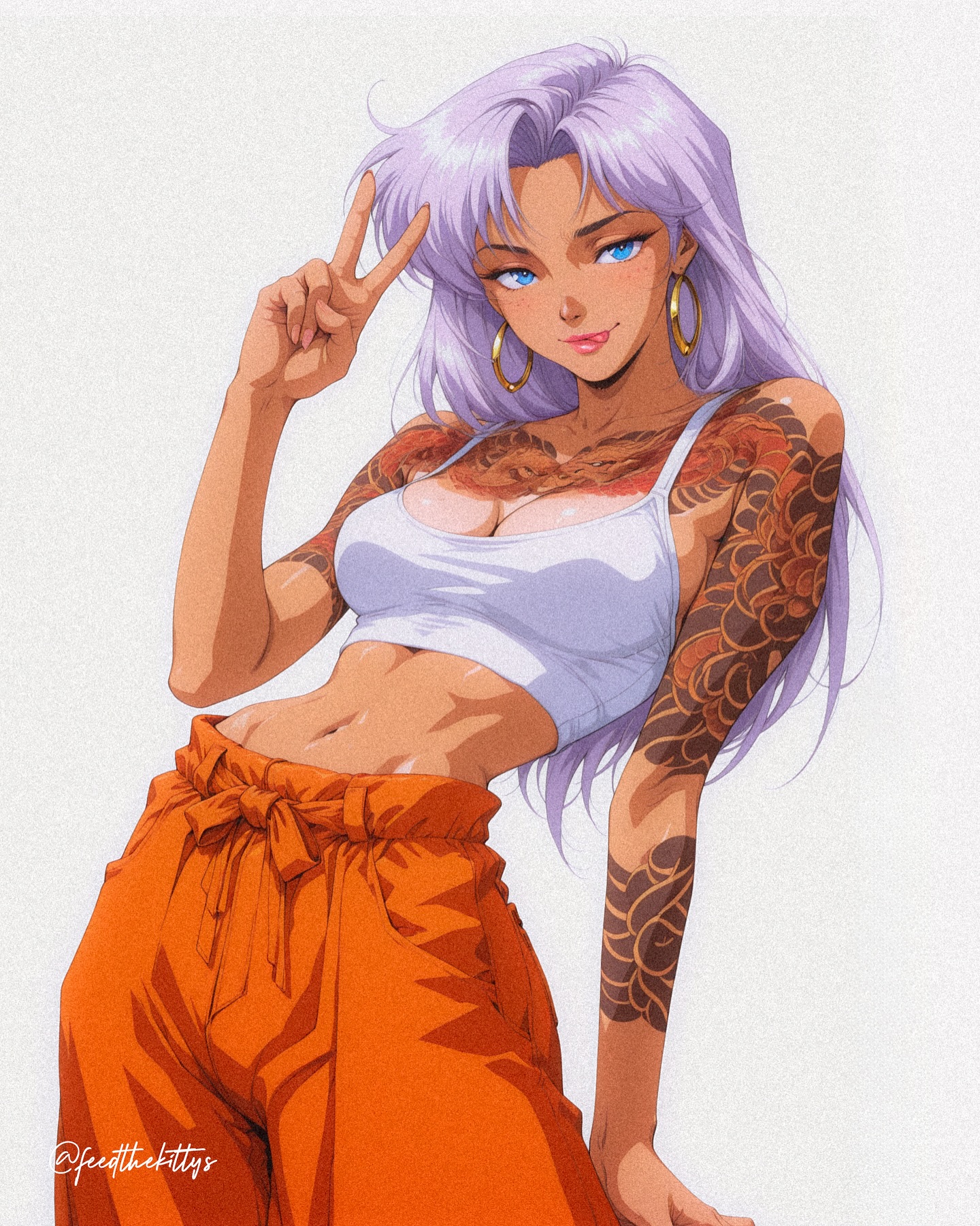
This image works because it treats minimalism as a force multiplier rather than as an absence of ideas. A confident woman with long lavender hair, extensive tattoo work, a fitted white cropped tank, and bright orange cargo pants stands against a clean white wall under strong natural light. The scene has almost no environmental distraction. There are no props, no furniture, and no narrative clutter. Because of that, every decision in styling, pose, and shadow becomes more visible and more meaningful. The portrait feels deliberate, graphic, and fashion-forward precisely because so little is allowed into the frame.
The image reads immediately from a distance. The pale lavender hair catches the eye first, the orange cargo pants anchor the silhouette second, and the tattoo coverage adds density and personality on a third read. This hierarchy is extremely useful for prompt builders. Instead of relying on complex backgrounds or theatrical effects, the prompt uses color contrast, skin-to-ink texture, and clean daylight geometry to create impact. That is one of the best lessons in the whole piece: a fashion portrait can feel high-concept without becoming visually crowded.
What makes the image especially strong is the way it balances softness and hardness. The hair color is light and almost dreamy, while the tattoos are dense and assertive. The white tank is simple and bright, while the orange pants are oversized and bold. The white wall is neutral, yet the hard sunlight cuts across it with confidence. The result is a portrait that feels modern, cool, and self-possessed rather than merely decorative.
Why the Styling Holds the Entire Frame
Because the background is nearly blank, the wardrobe and body styling must do all of the narrative and compositional work. The white tank top functions as a stabilizing element. It is simple, clean, and bright enough to keep the upper body from feeling visually overloaded by the tattoos. The orange cargo pants then take over as the dominant color mass in the lower frame, bringing streetwear weight and a sharper attitude. Together, these two garments create a balanced silhouette that feels intentional rather than random.
The tattoos are what stop the image from becoming too clean or generic. They introduce complexity, visual edge, and personality across the arm and upper chest. In prompt terms, this matters because tattoos are not just decorative details here. They are a texture system. They help fill the frame with visual information while preserving the simplicity of the wall and clothing. If those tattoos fade in a generation, the image loses a large part of its editorial character.
Lavender Hair as Identity Marker
The lavender hair is one of the smartest decisions in the design because it softens the portrait without weakening it. A stronger or more neon hair color might push the image toward fantasy or cosplay. Lavender stays expressive while still working inside fashion-editorial logic. It also creates a subtle bridge between the white background and the warm orange pants, giving the image a color rhythm rather than a simple two-tone split.
For prompt writing, this means the hair should be protected early and clearly. Specify long pale lavender hair with soft movement and directional flow. In this particular composition, the hair moves leftward and adds motion against the rigid vertical plane of the wall. That matters because the rest of the pose is relatively still. The hair is one of the few elements that introduces visual movement, so it should not be left vague or reduced to generic purple styling.
Tattoos, Skin, and Surface Complexity
The tattoo coverage gives the image its edge. Floral and black graphic motifs spread across one arm and the upper chest, breaking up the clean skin areas and making the portrait feel much more authored. Without the ink, the image would still be competent, but it would lose a lot of its tension between elegance and toughness. The tattoos allow the portrait to feel polished and gritty at the same time.
There is also a practical prompting lesson here. In minimalist images, surface complexity matters more because there are fewer objects to hold attention. The tattoos become one of the main reasons the viewer keeps looking after the first read. This is why the prompt should not simply say tattooed arm. It should establish dense visible tattoo coverage with readable floral structure and strong contrast against warm skin. That extra specificity improves consistency and prevents the ink from becoming muddy decoration.
| Element | Role in the Image | Why It Matters in the Prompt |
|---|
| Lavender hair | Creates immediate identity and soft contrast | Needs to remain pale, long, and directional so the portrait keeps its signature look |
| Tattoo coverage | Adds complexity and attitude | Should be described clearly to preserve the editorial edge |
| White cropped tank | Balances the upper frame | Keeps the styling clean and prevents visual overload |
| Orange cargo pants | Anchor the lower silhouette | Provide bold color mass and streetwear character |
| Hard wall shadow | Creates graphic geometry | Turns a blank background into an active compositional tool |
| Hands in pockets pose | Defines attitude and ease | Supports the self-possessed editorial mood |
Why the Background Is So Important
A blank white wall sounds simple, but in this image it acts like a precision instrument. It gives the subject maximum separation and lets the cast shadow become a second compositional shape. That shadow is not just a by-product of lighting. It is part of the design. It sharpens the image and gives the portrait architectural discipline. This is why the wall should remain truly clean. Once you add background props or environmental storytelling objects, the image loses the exact quality that makes it work.
In prompt construction, a minimal wall background is most effective when paired with hard directional light. Soft flat light would make the white wall feel boring. Hard sunlight transforms it into a graphic stage. This is a useful principle for editorial prompts generally: if the background is minimal, lighting should contribute structure. Here, the shadow becomes almost as important as the clothing in defining the image’s tone.
Lighting and Temperature
The sunlight is hard, clean, and decisive. It creates a bright high-key atmosphere while still allowing enough shadow contrast to sculpt the face, torso, and clothing folds. The overall temperature feels warm and hot rather than dreamy or moody. That is exactly right for this kind of white-wall streetwear editorial image. The subject feels photographed in real sun, not under soft studio fill, and that realism gives the portrait energy.
Prompt-wise, it helps to define the sunlight in physical terms: directional daylight from upper left, clear skin highlights, crisp-edged cast shadow, strong separation against the wall, and no overcast softness. If the light becomes diffused, the image loses bite. If it becomes too glossy, the portrait risks drifting into artificial beauty advertising. The sweet spot is strong outdoor realism with graphic control.
Pose and Editorial Attitude
The pose is a lesson in efficiency. Both hands are tucked into the pockets, the torso angles slightly, and the chin lifts just enough to suggest confidence without aggression. There is no exaggerated motion or stylized contortion. The effect is cooler and more convincing than a highly performative pose would be. This is exactly the kind of body language that works in fashion-editorial prompt design: relaxed, controlled, and aware of the camera without begging for attention.
That quality is worth protecting in the prompt. If the model drifts toward a cheerful smile, exaggerated sensuality, or dramatic fantasy gesture, the image changes category entirely. The intended emotional lane is poised and slightly distant. The subject should feel self-contained, not eager. This is a subtle distinction, but it often determines whether an editorial portrait feels premium or generic.
How to Write This Prompt Well
A strong prompt should begin with the subject and silhouette: a confident woman with long lavender hair, tan skin, heavy tattoo coverage, a white cropped tank, and bright orange cargo pants. Then establish the setting: standing against a clean sunlit white wall with hard directional daylight and a clear cast shadow. After that, define the pose: slight lean, hands in pockets, chin lifted, torso in three-quarter profile. Finally, establish style: anime streetwear editorial illustration, crisp cel-shaded rendering, minimalist fashion poster energy, clean negative space.
Notice the order. Subject first, environment second, pose third, style fourth. That sequence prevents the generator from misreading the image as fantasy character art, casual outfit photography, or soft influencer portraiture. It tells the system that this is controlled editorial styling inside a highly reduced environment. Prompt order often acts like invisible direction, and here that direction matters a great deal.
Negative Prompt Priorities
The negative prompt should actively protect the frame from unnecessary additions. Remove extra characters, background clutter, soft overcast light, muddy orange fabric, reduced tattoo detail, exaggerated anatomy, and moody interior settings. The portrait depends on clarity, so anything that weakens clarity should be explicitly excluded. This is especially true with white backgrounds, because many systems will try to invent texture or props when given too much freedom.
It is also smart to prevent tonal drift. This should not become a dark club image, a fantasy battle scene, or a hyper-glam beauty shot. The best version remains firmly inside modern streetwear editorial territory. The tattoos, hair, and cargo pants supply enough personality already. The prompt does not need additional drama layers. In fact, those extra layers usually dilute the original strength.
Reusable Editorial Template
A reusable version of this prompt might read like this: a stylish woman with long pale lavender hair, visible black floral tattoos across one arm and upper chest, a white cropped tank, and vivid orange cargo pants stands against a clean white wall under hard natural sunlight, casting a strong shadow, rendered as a minimalist streetwear editorial illustration with crisp high-contrast detail and confident body language. Then append a negative section removing clutter, extra props, soft lighting, and washed-out color.
This template is flexible because it can be adapted one variable at a time. You can keep the wall and change the wardrobe, keep the styling and change the hair color, or keep the silhouette and move from cel-shaded anime editorial to a more painterly digital look. As long as the key relationships stay intact, the image remains recognizably built from the same visual logic.
Final Creative Lesson
The key lesson in this portrait is that minimal backgrounds demand stronger internal contrast. If you strip the environment down to almost nothing, then color, silhouette, surface texture, and attitude must become more precise. This image meets that challenge beautifully. The lavender hair, orange pants, tattoos, and sharp wall shadow each carry their share of the composition. None of them are accidental, and none of them feel interchangeable.
For prompt writers, that is the big takeaway. Strong editorial imagery does not always come from adding more. Often it comes from reducing everything except the elements that truly matter, then describing those elements with precision. This portrait is a sharp example of how controlled color, deliberate styling, and clean spatial design can create a fashion image that feels bold, memorable, and complete.