How feedthekittys Made This Silver Buns Black Sofa Portrait — and How to Recreate It
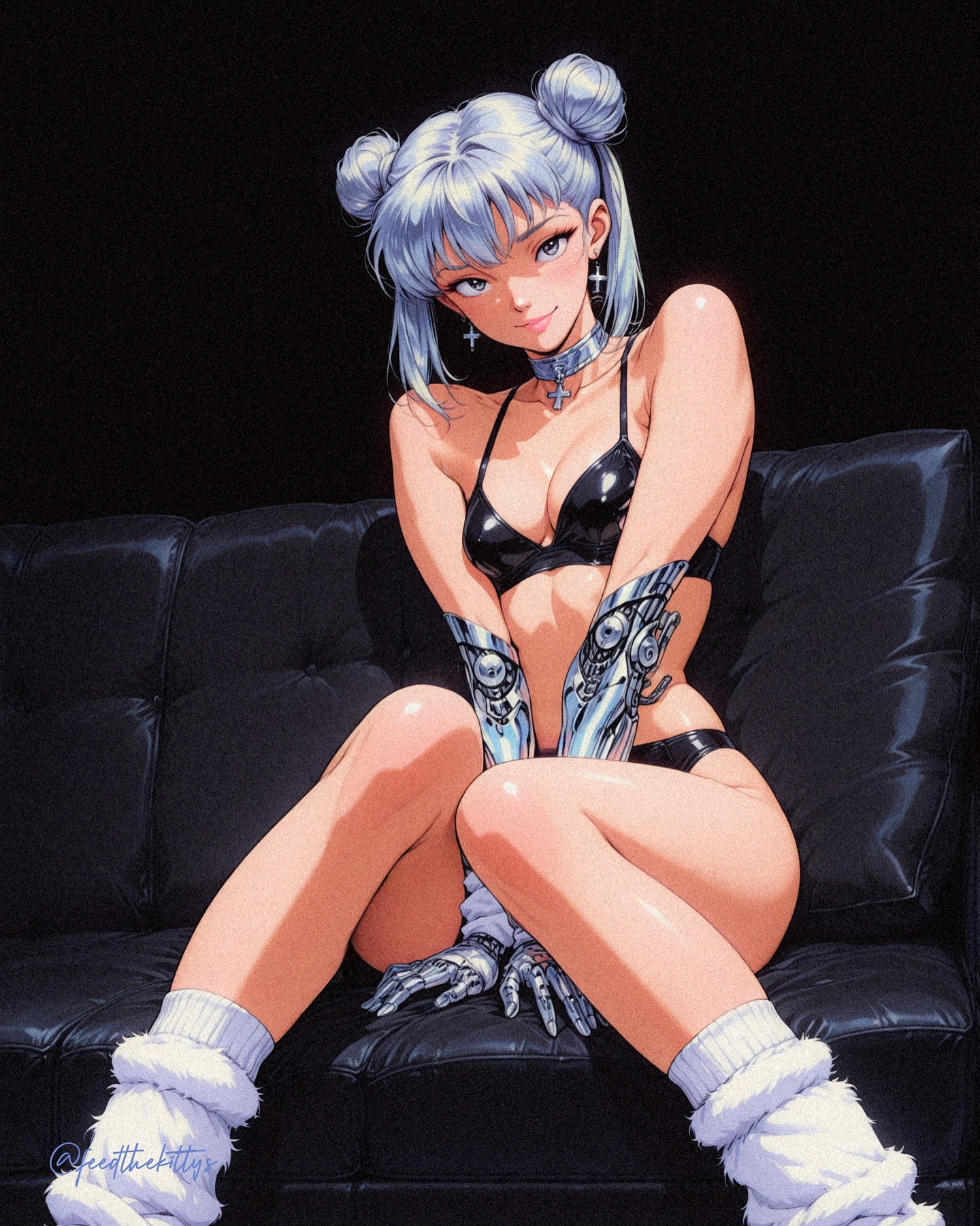
This image stands out because it combines fashion-poster clarity with retro-futurist character styling. The subject is framed in a simple studio-like setting, seated against a dark background with a black leather couch acting as the main environmental anchor. Instead of relying on narrative chaos or oversized worldbuilding, the image builds its identity through styling choices: cool silver-blue hair, chrome prosthetic forearms, glossy dark costume elements, and a strongly controlled contrast between soft and hard materials. The result feels like character key art, collector-print illustration, and fashion-oriented anime poster design all at once.
The most useful takeaway from this image is how efficiently it uses material contrast. Chrome metal, leather upholstery, smooth fabric, soft skin lighting, and plush white leg warmers all appear in the same frame, but they do not fight for attention. They are organized in a clear visual hierarchy. The metallic forearms immediately signal retro sci-fi influence, while the couch and dark background keep the composition grounded. Because the environment stays minimal, the viewer reads the character styling first and the setting second. That order is exactly why the image feels controlled rather than noisy.
The hairstyle is another major strength. The icy silver-blue twin-bun arrangement gives the character a silhouette that is memorable even before the eye reaches the smaller details like jewelry or gloves. In AI prompt writing, hair shape is often one of the easiest ways to keep a design recognizable across multiple generations. Here, the buns, the soft bangs, and the cool color all contribute to a visual identity that can survive costume adjustments or pose changes. That makes the image useful not only as a finished piece, but also as a template for future variations.
The chrome prosthetic forearms are what transform the image from simple anime glamour portrait into retro cyber character art. They create a sharp tonal interruption. Without them, the piece would still be polished, but it would belong more clearly to fashion illustration. With them, the image shifts into speculative design territory. The prosthetics imply a different world, a different technology level, and a more deliberate genre mix. This is a good lesson for creators: one strong design element can redefine the entire category of an image if it is placed prominently enough.
Lighting is handled with equal care. The scene is dark, but not unreadably dark. Controlled highlights separate the black couch from the darker clothing and keep the chrome arms legible. This kind of lighting discipline is especially important in black-on-black compositions. If the highlights are too weak, everything collapses into mush. If they are too bright, the image loses atmosphere. Here, the balance is good enough that every major material remains identifiable while the overall mood stays sleek and cinematic.
Why The Image Feels Premium
Premium-looking character images usually have three qualities: confident silhouette design, clear material hierarchy, and intentional negative space. This portrait has all three. The seated pose is stable and graphic, the twin-bun hairstyle is easy to identify, the couch creates a clean horizontal base, and the prosthetic arms catch enough light to structure the center of the frame. Nothing feels accidental. Even the minimal backdrop contributes to the premium feeling because it prevents visual clutter from diluting the styling decisions.
The color palette is another reason the image feels refined. It is limited but not dull. Cool silver-blue hair provides an upper-frame accent, chrome arms provide reflective highlights, the black couch and costume create a strong neutral body, and the white leg warmers introduce softness and visual lift. That palette structure is effective because each element has a role. The hair catches attention, the metal suggests genre, the blacks provide weight, and the whites stop the frame from becoming too heavy. In prompt work, that is a useful model for building contrast without adding unnecessary colors.
The composition also works because it is poster-minded. The subject sits centered, the body remains readable, the dark background leaves room for graphic emphasis, and the overall frame feels like something that could be used as character branding, key art, or print merchandise. Many AI generations become too scene-heavy to function in this way. This one succeeds because it understands that strong poster images often need restraint more than complexity.
| Design Choice | What It Does | Why It Matters | Prompting Lesson |
|---|
| Silver-blue twin buns | Creates a strong character silhouette | Makes the subject memorable at first glance | Use hairstyle shape and color as a stable character anchor |
| Chrome forearms | Introduces retro cyber identity | Shifts the image from fashion portrait into speculative design | One major genre-defining accessory can carry the theme |
| Black leather couch | Provides a grounded staging element | Keeps the composition centered and visually stable | Choose one simple environmental prop rather than many small ones |
| Controlled black background | Preserves mood while reducing clutter | Lets costume and materials dominate the image | Background simplicity often strengthens character readability |
| White leg warmers | Add softness and tonal lift | Prevent the lower frame from becoming too visually dense | Add one soft contrast element to balance metal and leather |
Prompt Writing Lessons From The Piece
If you want to generate something similar, the most important lesson is to write for controlled contrast. A vague cyber anime girl description is not enough. The image becomes distinctive because the prompt would need to specify silver-blue twin buns, chrome prosthetic forearms, glossy dark fashion styling, black leather couch, white fluffy leg warmers, and a dark minimal studio backdrop. Those are not random extras. They are the architecture of the image. Without them, the generation would lose the specific retro-cyber fashion identity that makes it work.
Another lesson is to control tone through presentation rather than through narrative overload. This image does not need futuristic city skylines, glowing holograms, or giant neon signs to feel sci-fi. The sci-fi influence is carried by the character design itself. That is more efficient and often more stable in image generation. When a scene tries to express genre through both complex setting and complex character design at the same time, the output can become visually fragmented. This image proves that a single prop, a few high-signal costume decisions, and the right materials can do enough work on their own.
The seated composition is also a strong reminder that good character art often uses calm poses rather than extreme movement. Dramatic action poses can be useful, but they are not always the best option when the goal is fashion readability and design inspection. Here, the seated posture keeps the viewer focused on silhouette, surface, and styling logic. That is why the image could function well in a character blog, a prompt breakdown article, or a design-analysis piece. It is easy to read and easy to explain.
A practical prompt structure inspired by this image would begin with the subject identity, then the hairstyle, then the cyber prosthetics, then the dark couch environment, then the lighting, and finally the finish. For example: retro-futurist anime character portrait, silver-blue twin-bun hairstyle, chrome prosthetic forearms and hands, dark leather couch, minimal black studio background, glossy dark fashion styling, soft cinematic spotlight, high-end cel-shaded poster polish. That order helps the generation build a readable hierarchy rather than a pile of disconnected visual motifs.
How To Iterate The Design Successfully
There are several strong directions for variation, but each one works best if the core silhouette and cyber-fashion contrast remain intact. One route is to push the image further into character-sheet territory by simplifying the pose and changing the background to a neutral gray or soft parchment-style display setting. That would make the design feel more like presentation art for a game or collectible property. Another path is to intensify the retro-futurist mood through lighting by introducing colored edge lights, but keeping the couch and hairstyle consistent.
A third route would be to shift the outfit styling while preserving the mechanical arms and hairstyle. This works because the identity is not based on one costume piece alone. It is based on a combination of silhouette, chrome augmentation, cool-toned hair, and polished presentation. If those remain stable, the look can flex between catalog-fashion, sci-fi heroine, stylized poster, or alt-universe idol imagery without losing cohesion.
This is also a useful reference for prompt writers who want to blend softness with hardware. Too often, cyber prompts push everything toward armored aggression, while fashion prompts strip away the mechanical interest. This image demonstrates a middle path. The prosthetics are prominent, but the overall mood is polished rather than hostile. That makes the image more versatile. It can be read as stylish, character-driven, and futuristic without turning into a battle scene or tech demo.
| Variation Direction | What To Change | What To Preserve | Result |
|---|
| Character-sheet version | Swap the dark backdrop for a neutral display background | Hair silhouette, chrome arms, centered pose | Feels more like official design presentation art |
| Editorial cyber version | Add stronger edge lighting and cleaner surface reflections | Minimal set, couch anchor, cool palette | Feels more fashion-magazine and poster-oriented |
| Collector print version | Increase graphic framing and border treatment | Twin buns, chrome prosthetics, premium polish | Feels more merchandise-ready and iconic |
| Soft sci-fi lounge version | Introduce deeper ambient color and richer upholstery detail | Character-first composition and restrained environment | Feels more atmospheric without losing clarity |
Why This Works As A Blog-Worthy Reference
This image is valuable because it is easy to study. Every major decision is visible and structurally important. Nothing feels wasted. The hair gives identity, the chrome gives genre, the couch gives staging, the dark background gives focus, and the material contrast gives premium finish. It is the kind of image that teaches prompt discipline through example. Rather than relying on huge environments or overloaded effects, it shows how a small set of consistent signals can produce a memorable result.
For creators maintaining prompt libraries, this image offers a repeatable framework: a strong head silhouette, a single bold genre-defining accessory or body modification, one stable environmental anchor, and a limited but contrast-rich material palette. That framework is easy to transfer to other characters. Replace chrome arms with mechanical wings, or twin buns with a sharp bob, or couch with a minimal chair, and the same structural logic still holds.
The image also demonstrates that retro anime glamour and sci-fi design can coexist without one overwhelming the other. That balance is rare and useful. It means the image can appeal to multiple visual audiences at once: anime art fans, design-study readers, cyber-fashion prompt writers, and poster collectors. In practical terms, that makes the concept highly reusable for blog articles, prompt marketplaces, and visual reference systems.
Ultimately, the success of the image comes from constraint. It does not try to tell every story in one frame. Instead, it tells one story clearly: a sleek, retro-futurist character presented with confidence, polish, and memorable styling. That is why the picture holds attention. It has enough detail to feel rich, but enough restraint to feel authored. For AI prompt work, that balance is one of the most useful targets to aim for.
If you are building similar content, preserve that balance. Keep the background simple, let materials do the heavy lifting, give the character one unforgettable silhouette trait, and anchor the genre with one unmistakable design decision. This image proves that when those pieces are aligned, even a quiet seated portrait can become highly distinctive and blog-worthy.