How feedthekittys Made This Black Haired Tattoo Pose — and How to Recreate It
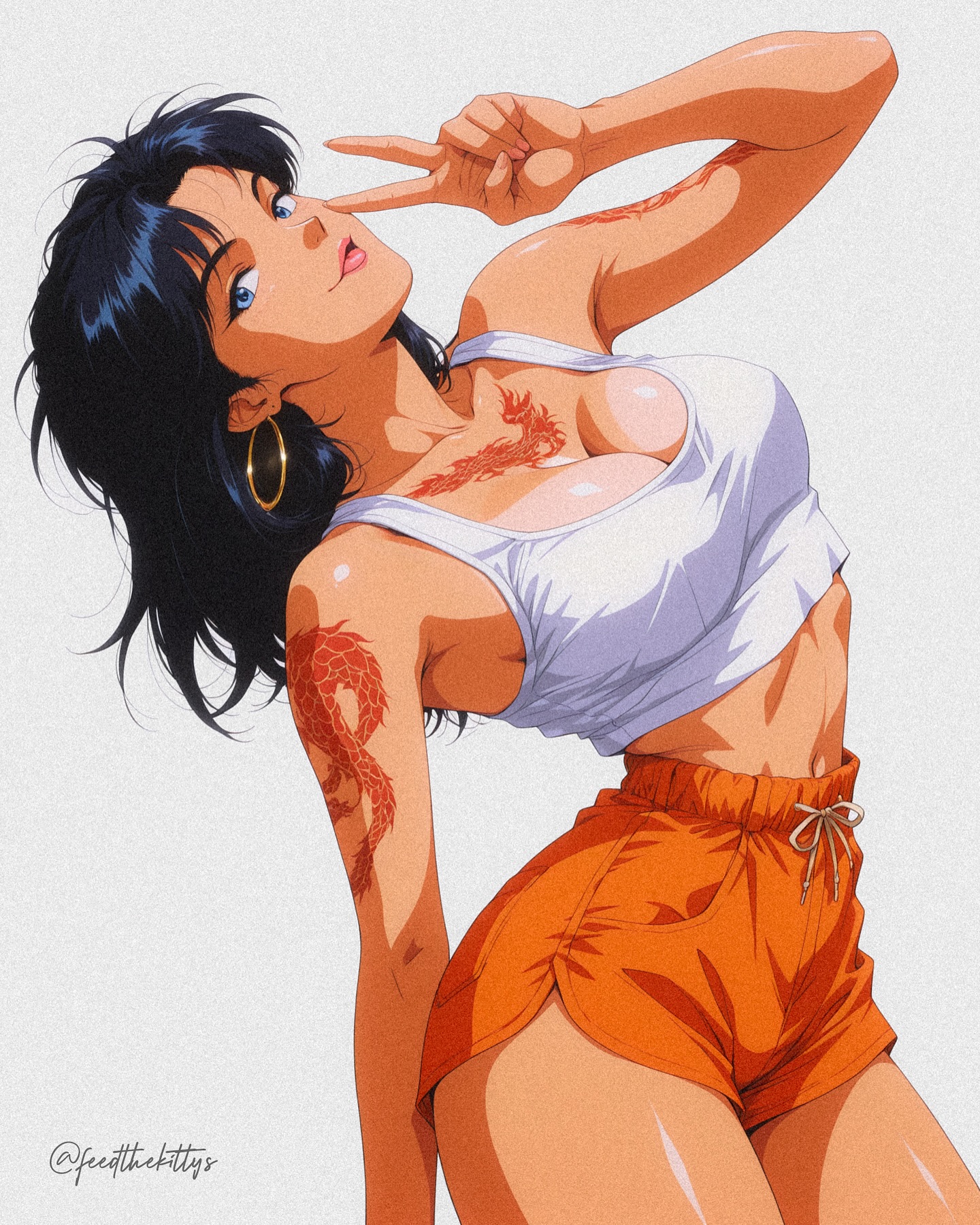
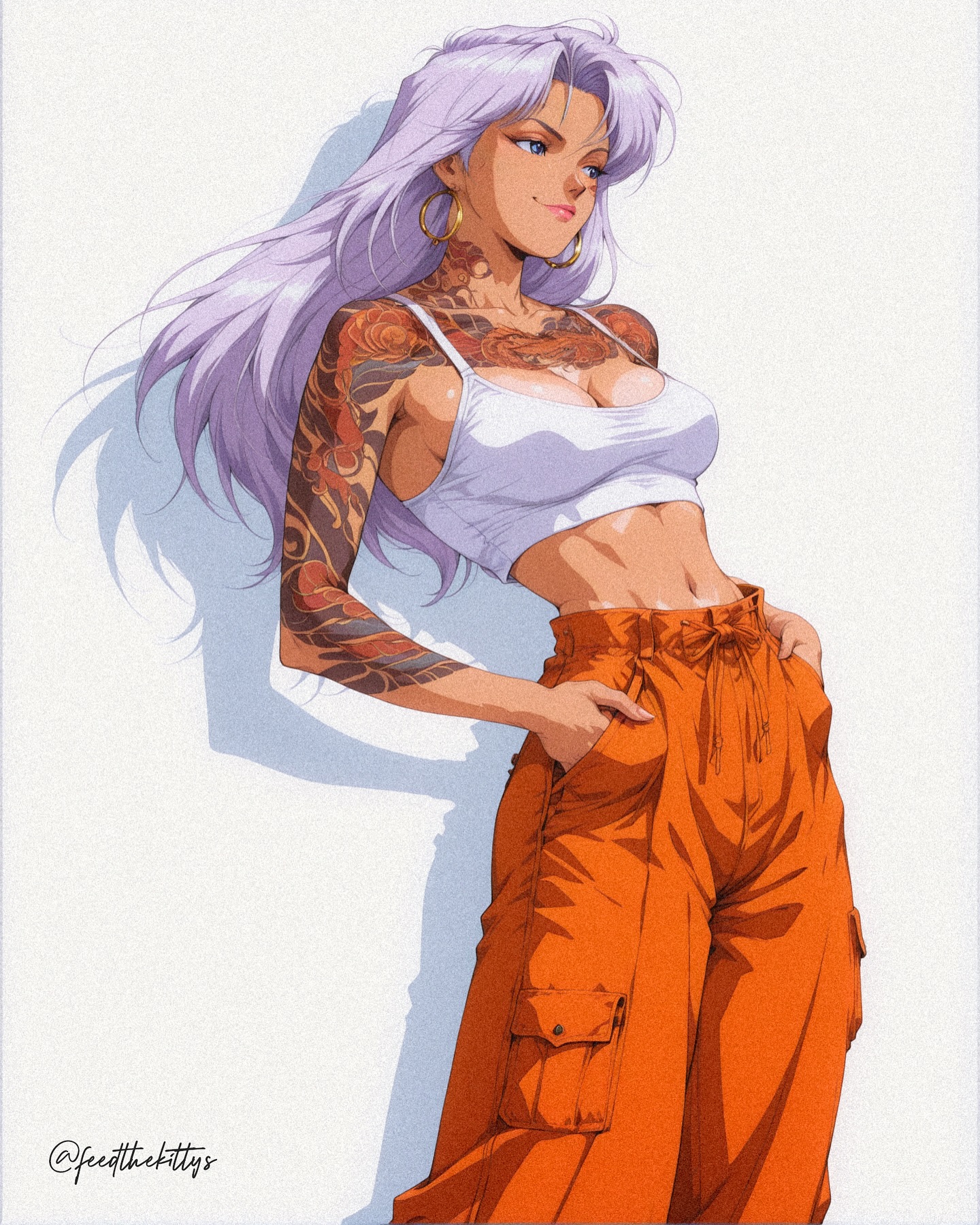
This illustration succeeds because it understands that attitude is often more important than complexity. The character is not surrounded by a dramatic environment, cinematic weather, or complicated storytelling props. Instead, the image relies on pose, styling, line rhythm, and color blocking to create a poster-quality presence. A black-haired anime woman leans backward in a twisting, playful posture, wearing a fitted white cropped tank top, vivid orange drawstring shorts, large gold hoop earrings, and visible red dragon tattoos. The scene is set against a clean white background, which means every design decision has to work harder. There is nowhere for weak posing, muddy color, or confused anatomy to hide.
That is exactly why the image is effective. It chooses a small number of strong visual ideas and commits to them completely. The pose is not neutral. The colors are not passive. The tattoos are not incidental decoration. Each one contributes directly to the final impact of the frame. This is what makes the image feel like retro anime editorial art rather than a random character study.
The most obvious strength is the body angle. The torso twists and leans back instead of facing front in a static, symmetrical way. That gives the composition movement, but it is not action movement in the combat sense. It is fashion movement. The figure feels like she knows she is being seen. That self-aware performance quality is central to pin-up and editorial character art. The image is not pretending to capture an accidental candid moment. It is deliberately staged to look bold, playful, and poster-ready.
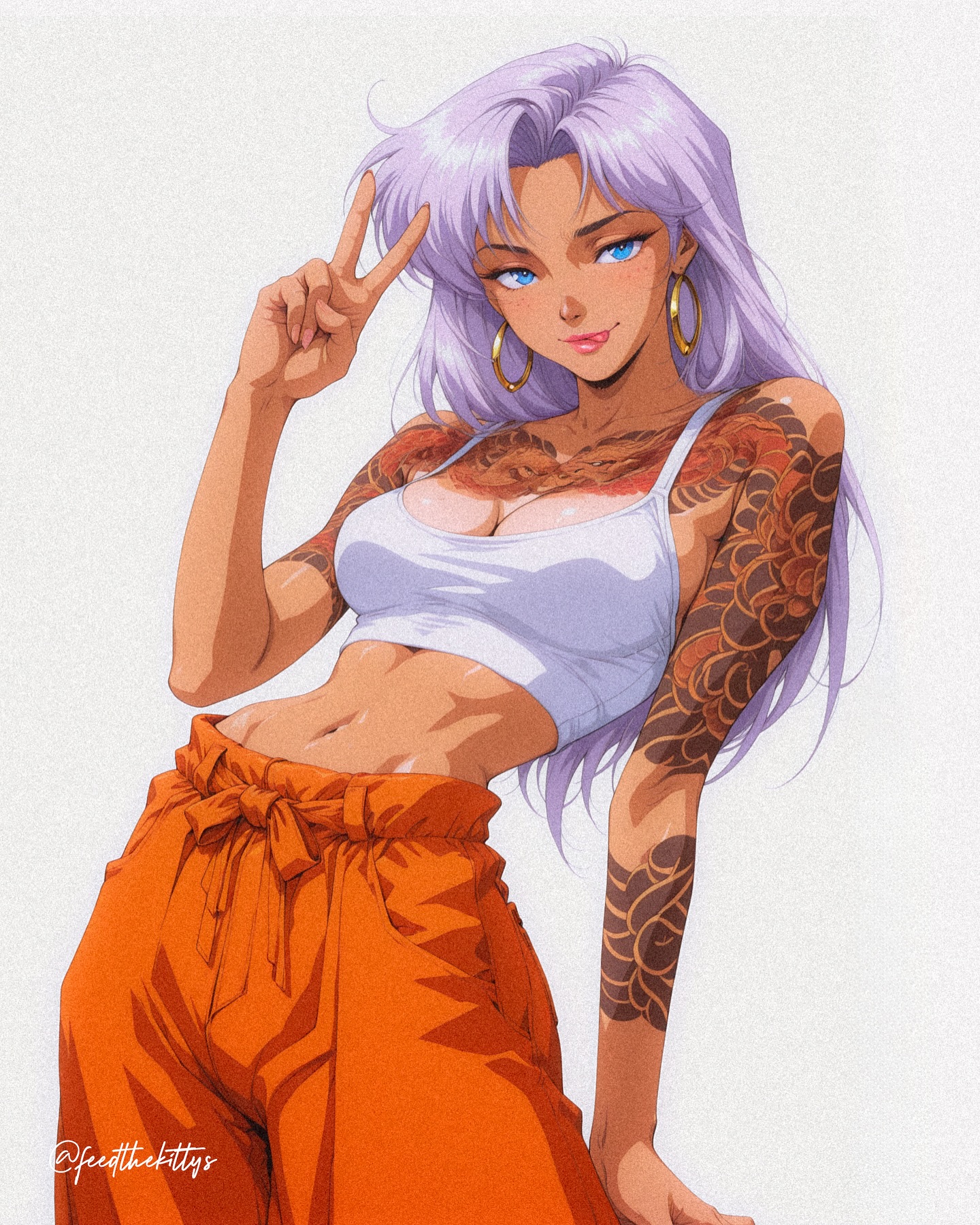
The lifted V-sign hand gesture reinforces that attitude. It adds a note of teasing confidence without overcomplicating the read. In prompt terms, this is important because small gestures often determine whether an image feels alive or generic. A neutral hand at the side would have reduced the energy dramatically. By placing the gesture near the face, the composition also creates a secondary focal connection between expression and pose.
Color is another key reason the image works. The white top and bright orange shorts create a highly legible contrast even before the viewer notices finer details. White reads clean and graphic. Orange brings heat, youth, and pop. Against a white background, these colors could easily flatten if handled poorly, but the illustration avoids that by using linework, careful shading, and pose separation to preserve the clothing shapes. This gives the costume a poster-like clarity that works especially well in vertical editorial layouts.
Why the Pose Matters More Than the Background
Minimal-background character posters live or die by body language. When there is no environment to supply mood or motion, the figure has to generate the entire emotional temperature of the image. In this artwork, the backward lean, torso twist, lifted arm, and angled hips create a chain of directional movement that keeps the frame from feeling static. The body line becomes the composition.
This is a useful lesson for prompt writing. Many people try to increase visual impact by adding more effects, props, or scenery. But in fashion-forward anime illustration, stronger pose design often accomplishes more than a more elaborate setting. A blank white background can actually increase the image’s power if the figure is posed with confidence and clarity. The viewer is forced to pay attention to the subject because there is nothing else competing for attention.
Another advantage of the white background is that it makes shape design obvious. The silhouette of the hair, shoulders, torso, shorts, and raised hand all need to read cleanly. In weak compositions, a plain backdrop exposes structural flaws immediately. Here, the pose survives that test. The shape language is readable at a glance, which is why the image could function effectively not only as an illustration but also as poster art, merch art, or cover-style promotional work.
| Composition choice | Visual effect | Why it works |
|---|
| Backward lean | Adds dynamic asymmetry | Prevents the poster from feeling stiff or front-facing. |
| Raised V-sign near face | Creates attitude and rhythm | Builds personality with a simple but memorable gesture. |
| White background | Increases focus on the figure | Forces pose and styling to carry the whole image. |
| Mid-thigh vertical crop | Keeps emphasis on torso and expression | Supports editorial pin-up framing rather than full-body distance. |
| Clear torso twist | Generates motion inside a still pose | Makes the image feel staged and deliberate instead of static. |
Because the background is empty, balance becomes even more important. The artist has to make sure the character does not drift visually to one side or lose weight in the frame. The twist and the hand gesture create enough tension to keep the composition energized, while the shorts and tattoos anchor the lower half so the image does not become too head-heavy. This is subtle, but it is a major reason the poster feels complete.
The Role of Tattoos, Accessories, and Styling Signals
The red dragon tattoos are one of the image’s strongest identity markers. Without them, the outfit would still be bold, but the character would feel less specific. The tattoo shapes add graphic complexity that contrasts with the clean blocks of the clothing. They also pull the eye across the shoulder and upper torso, increasing the sense of motion created by the twist. In other words, the tattoos are not just decorative. They function compositionally.
Gold hoop earrings perform a similar role on a smaller scale. Accessories like this can easily be lost in a prompt if they are treated as optional details, but here they matter because they reinforce the glamour-and-attitude direction. They help the image feel styled rather than merely dressed. In editorial illustrations, this difference matters. Styled images suggest intention, persona, and cultural flavor.
The hair is also working harder than it might appear at first glance. Tousled shoulder-length black hair with a bit of spread around the head softens the clean white background and prevents the image from becoming too geometric. If the hair were too flat, the composition would lose some of its playfulness. If it were too wild, it would start to compete with the tattoos and shorts. The current balance is strong because it feels lively without overwhelming the rest of the design.
Expression completes the styling system. The face needs to read as playful, cool, and self-assured rather than passive. That emotional tone is consistent with the V-sign, the body angle, and the pin-up framing. A mismatched expression would damage the image more than people often expect. For example, a blank stare or overly dramatic shouting face would push the illustration away from editorial glamour and toward a different genre entirely. This image stays controlled.
| Detail | Function in the image | Prompting takeaway |
|---|
| Red dragon tattoos | Add graphic identity and body-direction emphasis | Use tattoos as structural motifs, not just decorative notes. |
| Gold hoop earrings | Strengthen fashion and pin-up styling | Accessories can define tone when the background is minimal. |
| Tousled black hair | Add softness and motion around the face | Hair should support rhythm and silhouette clarity. |
| Playful expression | Connects pose to personality | Expression should match the intended genre energy. |
| Orange shorts | Anchor the lower composition with bold color | High-contrast clothing can do structural work in simple posters. |
Prompt Lessons From This Retro Anime Glamour Poster
If you wanted to recreate this type of image, the best approach would be to begin with body language and style identity, not with general words like “beautiful anime woman” or “retro glamour poster.” Those phrases are too broad. What makes this image distinct is the combination of very specific elements: black shoulder-length tousled hair, large hoop earrings, white cropped tank top, vivid orange athletic shorts, red dragon tattoos, a dramatic backward lean, and a raised V-sign gesture close to the face. Each of those details narrows the result toward the final image language.
A practical prompt would also define the framing clearly. Vertical poster composition, mid-thigh crop, editorial pin-up posture, clean white background, and polished cel-shaded anime rendering are all essential. Without those controls, a generator might drift into a beach scene, urban fashion portrait, or ordinary character lineup. The image works because it is stripped down and intentional.
Negative prompting is equally helpful here. You would want to avoid cluttered props, photoreal textures, low-detail hands, muddy orange tones, missing tattoos, stiff anatomy, or dark moody cinematic backgrounds. All of those would move the result away from the clean poster logic that makes the current version succeed. Simplicity is not the absence of design. It is the result of design discipline.
Another useful lesson is that retro anime glamour does not need elaborate nostalgia filters to work. You do not need fake film grain, yellowed paper textures, or excessive halation to make something feel retro-inspired. What really creates the effect here is the combination of cel-shaded clarity, bold linework, high-key studio lighting, graphic costume design, and a confident pin-up pose. Style is carried by form and presentation, not by after-effects alone.
| Prompt priority | Best phrasing strategy |
|---|
| Subject identity | Describe hair, eyes, tattoos, earrings, and outfit exactly. |
| Pose energy | Specify backward lean, torso twist, and hand-raised V-sign. |
| Background control | Demand a minimal pure white poster background. |
| Style direction | Use retro anime glamour poster, cel-shaded pin-up fashion illustration. |
| Rendering quality | Request strong line clarity, crisp highlights, and high-key editorial lighting. |
| Failure prevention | Exclude clutter, warped limbs, tattoo loss, and photoreal drift. |
Why This Image Feels Poster-Ready
Poster-readiness comes from fast readability. This image can be understood from far away because the big decisions are simple and bold. Dark hair against white background. White top against skin. Orange shorts against the rest of the figure. Red tattoos breaking the upper body. A diagonal body line creating motion. Nothing is buried. Nothing relies on tiny detail for meaning. This is one reason the composition feels stronger than many more “complex” illustrations.
It also feels poster-ready because it has a coherent emotional tone. The image is playful but controlled, glam but not overloaded, graphic but still character-focused. That consistency is what makes it useful as a model for similar fashion-editorial anime prompts. You could change the tattoo motif, color palette, or gesture, but the basic framework would still hold if you preserved the same clarity of intent.
The white background deserves one more note here. Empty backgrounds are often misunderstood as easy. They are not easy. They remove excuses. Any uncertainty in the anatomy, pose, or styling becomes instantly obvious. So when a minimalist fashion illustration works, it usually means the artist solved the hard parts first. This piece feels successful because the subject can carry the frame without relying on environmental support.
Another reason it feels premium is the relationship between glamour and graphic design. The image is sexy in posture and styling language, but it remains clean, composed, and readable enough to function as merchandise art, social promo art, or a fashion-poster graphic. That balance between expressive character appeal and disciplined layout is difficult, and it is one of the image’s biggest strengths.
Final Takeaway
This retro anime pin-up fashion poster demonstrates how much can be achieved with a small set of carefully chosen elements. A twisting pose, a hand gesture, a bold white-and-orange outfit, red dragon tattoos, large gold hoops, tousled black hair, and a clean white backdrop are enough to produce a high-impact editorial character image. The illustration proves that strong anime poster art does not always need spectacle. Sometimes it only needs clarity, attitude, and a composition that understands exactly what it wants the viewer to see first.
For prompt writers, the central lesson is simple: build from pose, silhouette, and identity before you worry about decoration. If those foundations are strong, even a minimal background can feel complete and premium. If they are weak, no amount of extra scenery will save the image. This artwork gets the foundations right, and that is why it feels memorable.