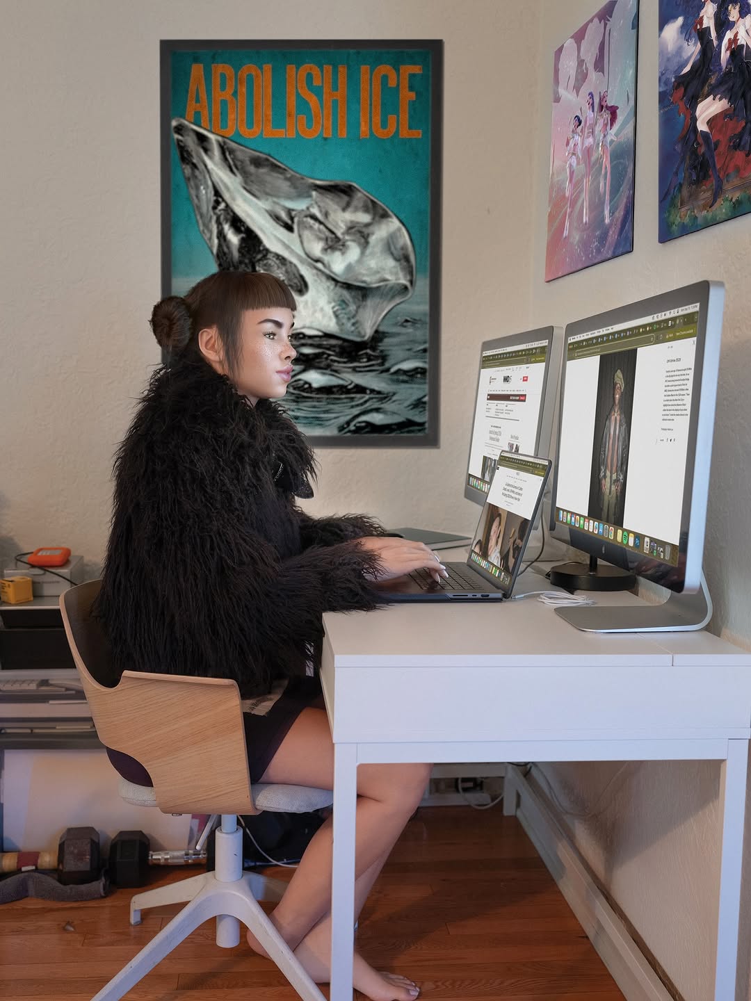
How lilmiquela Framed This NYFW Brain Dump AI Art — and How to Recreate It
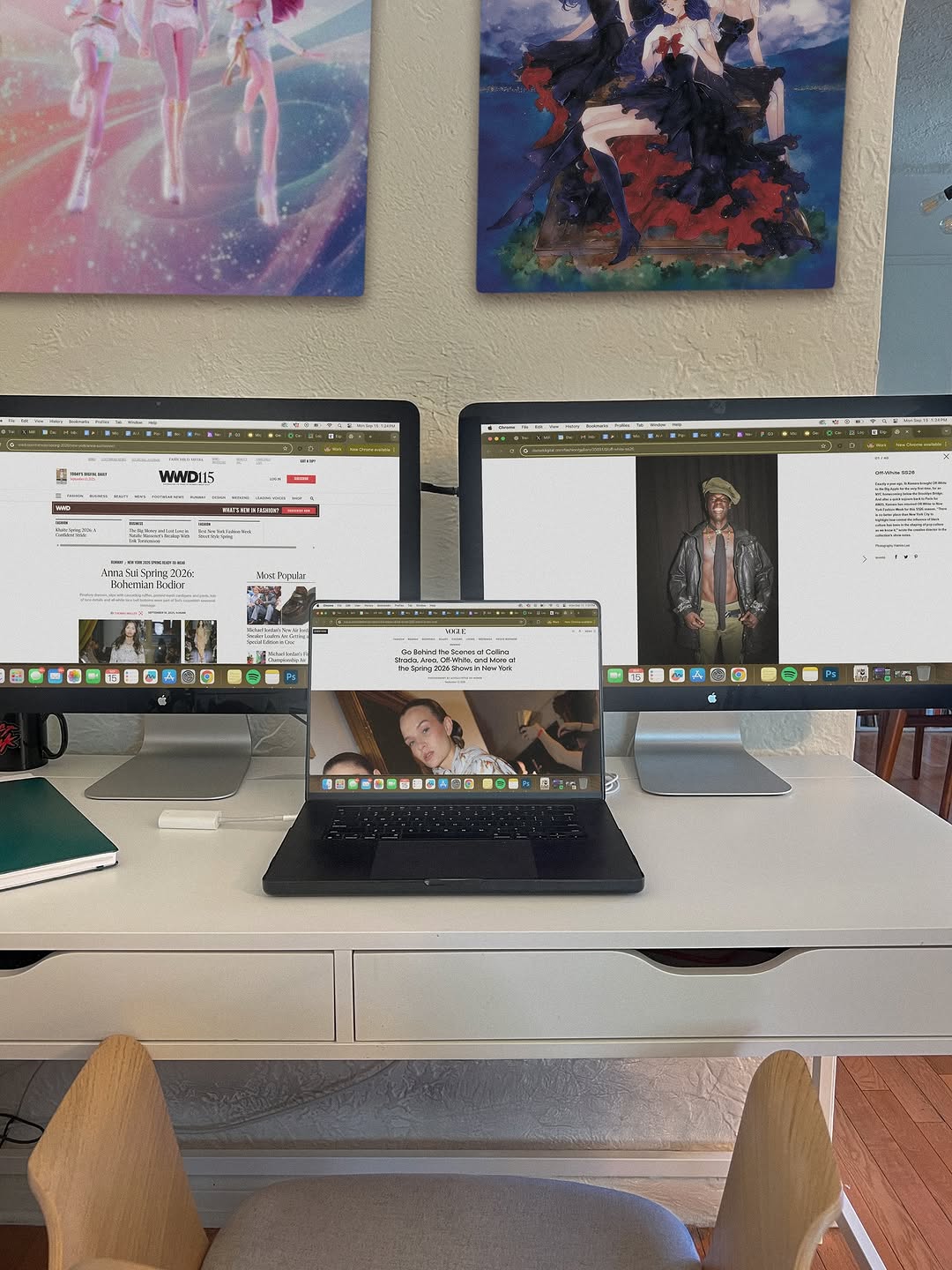
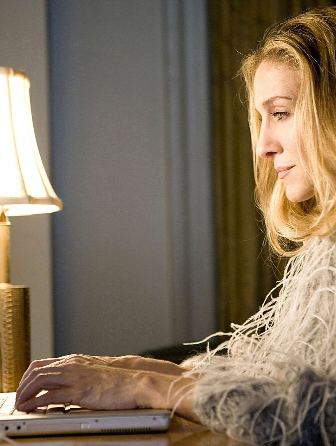
This image is a strong "workflow proof" post. It does not rely on a face or dramatic styling. Instead, it shows process infrastructure: multiple screens, active research tabs, and a focused creative environment. For many creator audiences, this kind of transparency performs surprisingly well because it answers a silent question: how do you actually work?
When audiences see real tools in use, trust increases. They understand that output quality comes from repeatable systems, not random inspiration. That trust often translates into saves, shares, and DM questions, especially from early-stage creators looking for practical setup references.
Why This Setup Shot Has Viral Potential in Creator Niches
The first mechanism is operational clarity. Three active screens instantly communicate multi-source research and serious workflow intent. The second mechanism is relevance stacking: fashion media pages on different screens imply synthesis, not passive browsing. The third mechanism is environmental personality. Art prints above the monitors add visual identity without distracting from the workstation story.
This format also benefits from low-friction comprehension. In one glance, viewers understand the post theme: research mode. That one-glance clarity is critical for feed performance. Creators can use this style to build authority without sounding self-promotional.
| Signal |
Evidence (from this image) |
Mechanism |
Replication Action |
| Workflow Credibility |
Three screens open with active browser tabs |
Shows depth of process and research seriousness |
Capture your actual working state with multiple source windows visible |
| Contextual Branding |
Art prints above desk personalize the space |
Makes setup memorable beyond generic desk photos |
Add one or two visual identity elements in background (art, books, objects) |
| Low-Noise Organization |
Clean white desk with limited clutter |
Keeps attention on screens and system |
Remove unrelated objects before shooting; keep only workflow-relevant tools |
| Tool Transparency |
Laptop + dual monitors shown together |
Encourages practical conversation and saves |
Post setup shots regularly with notes about what each screen handles |
Use Cases and Transfer Ideas
Best-fit scenarios
- Creator productivity accounts: ideal for "build in public" workflow posts; change on-screen tasks by project phase.
- Research-heavy content creators: useful for showing source triangulation; change screen labels in caption for educational value.
- Freelancer personal brands: demonstrates professional setup credibility; change visual identity elements to match niche.
- Studio setup series: perfect for recurring weekly desk-state updates; change camera angle slightly each episode.
Not ideal
- Highly personal storytelling posts: no face visible may reduce emotional intimacy.
- Product glamour campaigns: documentary desk style may feel too functional.
- Fast entertainment meme pages: slower informational format may underperform in humor-first feeds.
Three transfer recipes
- Video editor transfer
Keep: three-screen workflow proof and frontal composition
Change: browser tabs to timeline software + preview panels
Template: {creator_desk}, multi-screen active project windows, organized tool layout, soft daylight
- Writer-research transfer
Keep: active tabs and clean desk hierarchy
Change: one screen to notes app, one to source docs, one to draft editor
Template: {research_workspace}, visible source windows, writing dashboard, personal studio cues
- Design sprint transfer
Keep: centered laptop between monitors and minimal clutter
Change: fashion sites to moodboards and design boards
Template: {design_station}, dual monitors + laptop, active references, calm production environment
Aesthetic Read: Why It Feels Useful, Not Performative
The composition is straightforward and symmetrical, which reinforces the message of order and process. The eye naturally moves from left monitor to center laptop to right monitor, mirroring a real research loop. This is subtle but effective visual storytelling: form reflects workflow.
Color and texture choices support focus. White desk, neutral wall, and soft daylight keep visual noise low, while colorful wall art provides just enough personality. The result feels human and productive at the same time. For creators, this is a reminder that authority content does not need dramatic aesthetics, it needs credible structure.
| Observed |
How to Recreate |
Why It Matters |
| Tri-screen centerline layout |
Place laptop centered between two equal-height monitors |
Visually communicates system thinking |
| Active browser tabs visible |
Show real in-progress windows rather than blank screens |
Adds process credibility |
| Clean desk with selective objects |
Keep only notebook/tool essentials in frame |
Prevents clutter distraction |
| Background art accents |
Add two coordinated pieces above desk |
Creates memorable brand personality |
Prompt Technique Breakdown
| Prompt chunk |
What it controls |
Swap ideas (EN, 2-3 options) |
| "two monitors and one centered laptop with active tabs" |
Workflow complexity signal |
"ultrawide + tablet" / "triple monitor array" / "laptop + tablet duo" |
| "white desk with organized minimal objects" |
Visual clarity |
"wood desk" / "industrial black desk" / "standing desk setup" |
| "textured neutral wall with two art prints" |
Background personality |
"bookshelf wall" / "pegboard tools" / "acoustic panel backdrop" |
| "soft daylight productivity mood" |
Tone and realism |
"night desk lamp mood" / "golden-hour side light" / "cool office overhead light" |
| "frontal 4:5 documentation framing" |
Readability of setup |
"angled 3/4 desk view" / "top-down flat desk lay" / "close monitor detail" |
Remix Steps
Baseline lock: (1) screen arrangement, (2) active-task visibility, (3) clean desk hierarchy.
- Run 1: Keep composition fixed; test only on-screen content theme.
- Run 2: Keep screens fixed; test only lighting time (morning vs evening).
- Run 3: Keep lighting fixed; test one personality layer (art, books, objects).
- Run 4: Keep best visual; test caption format (tool breakdown vs workflow lesson).
One-variable iteration will help you discover what your audience values most: aesthetics, tools, or process transparency.