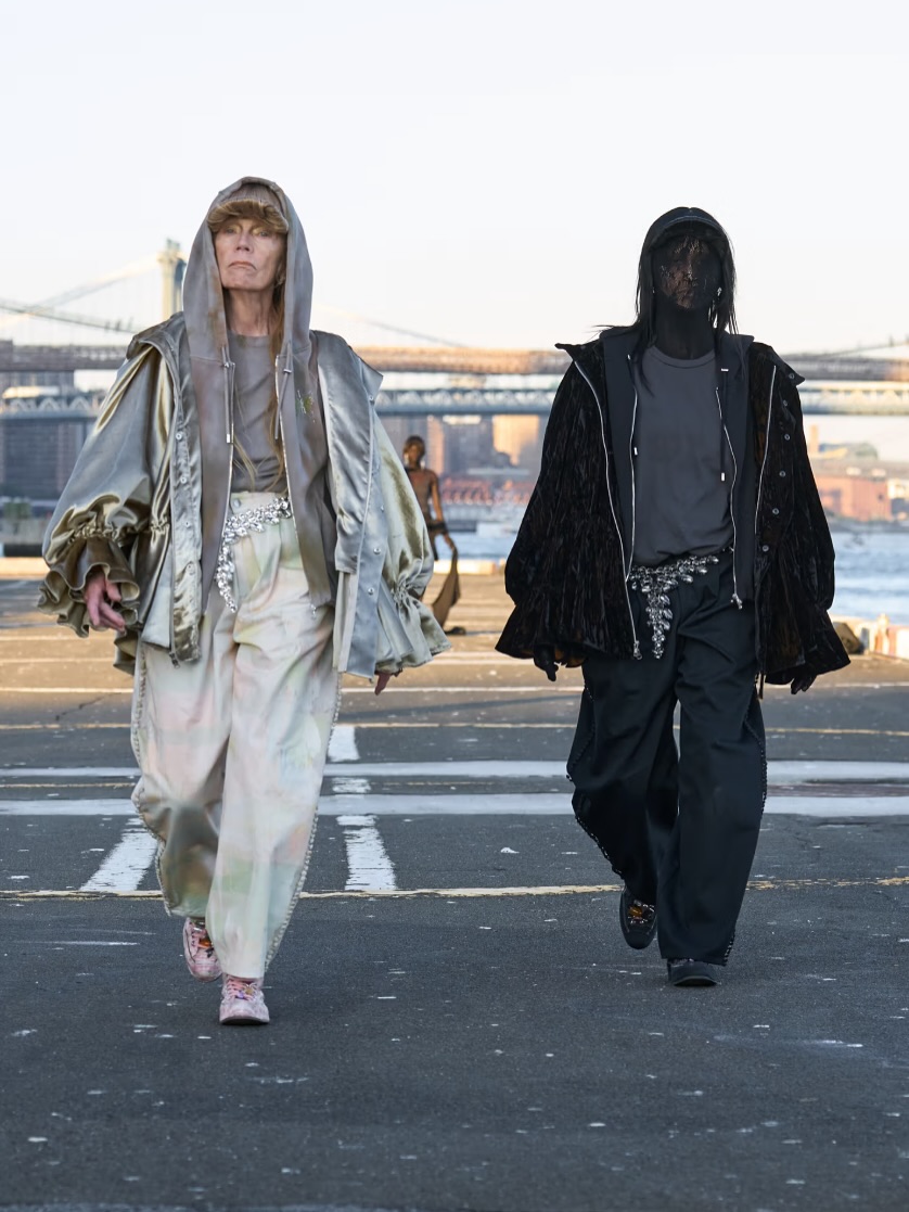
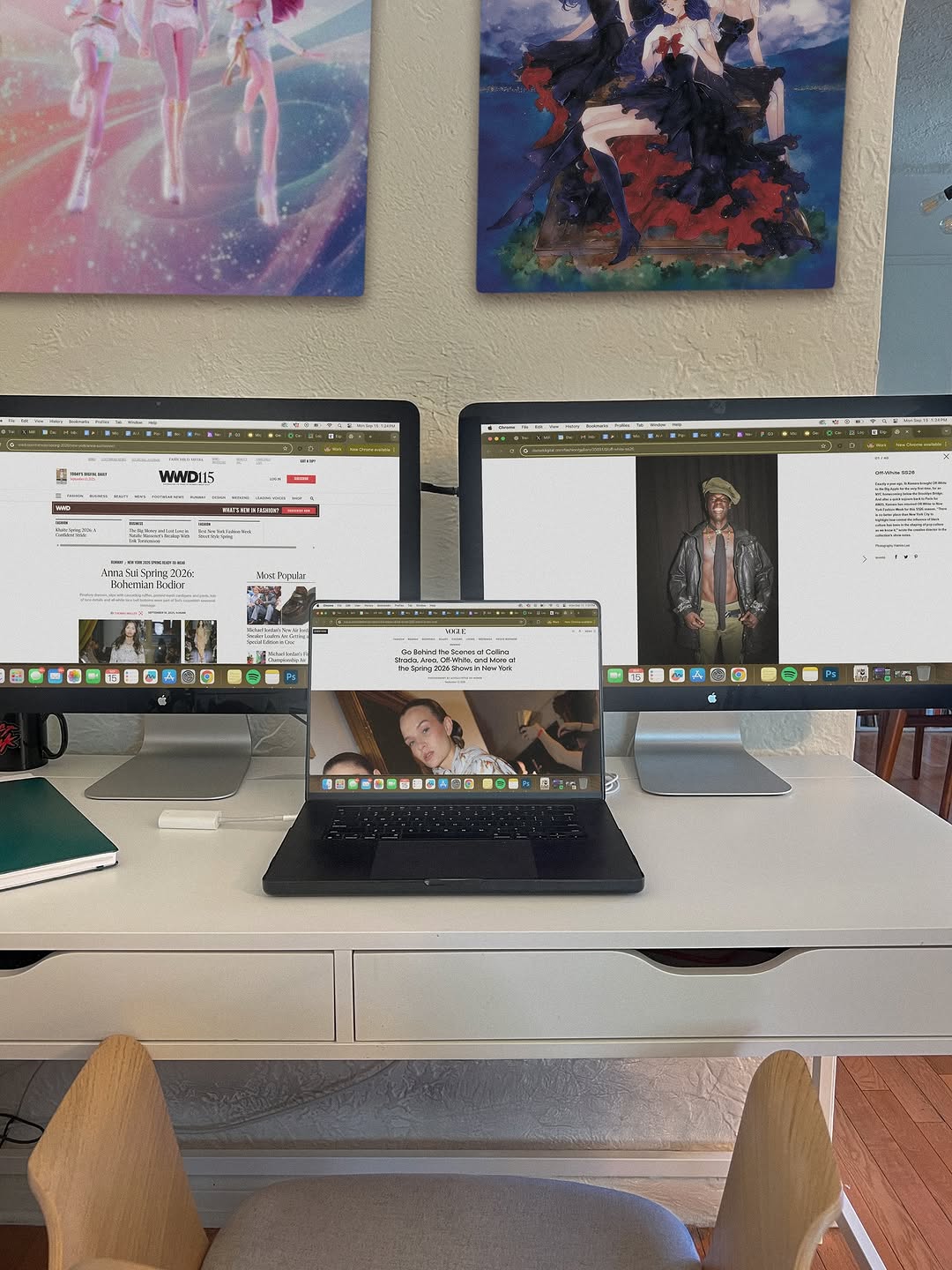
And just like that…Carrie Bradshaw mode ACTIVATED! 👩💻 Scrolling through every NYFW collection and I’m feeling SO INSPIRED! My NYFW brain dump:
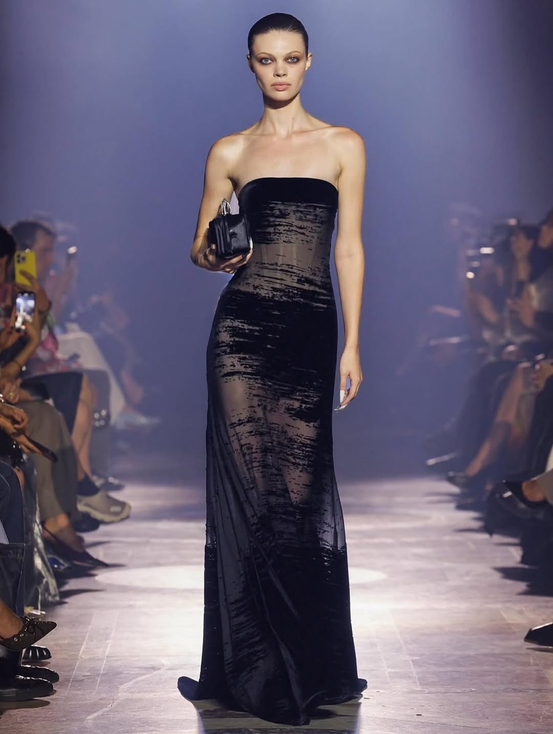
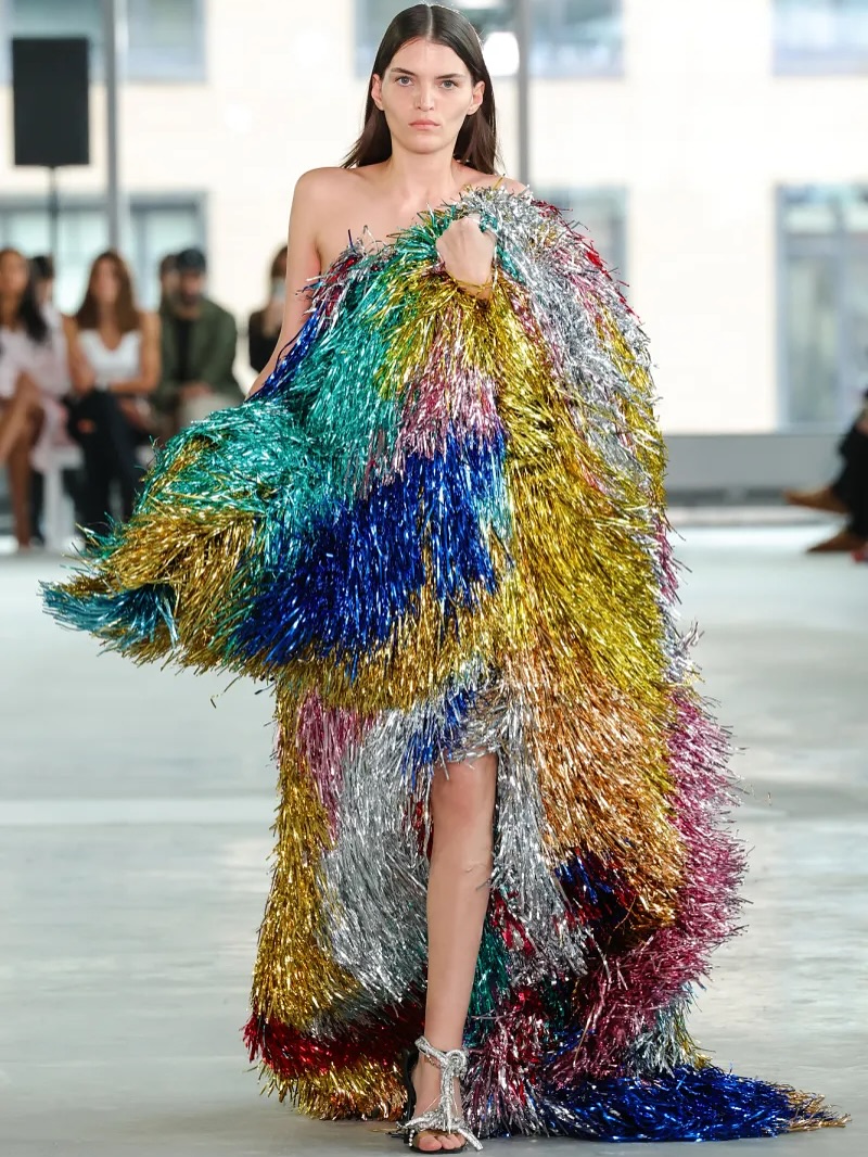
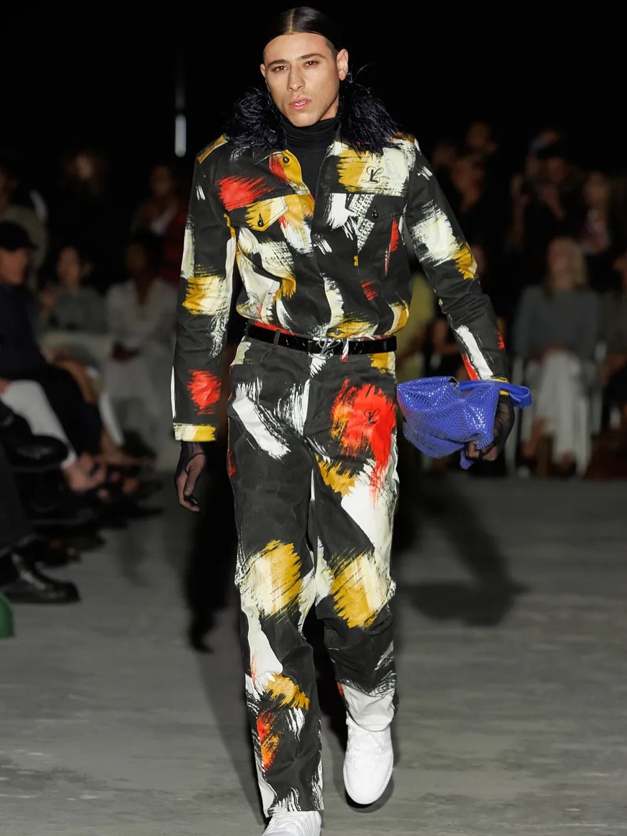
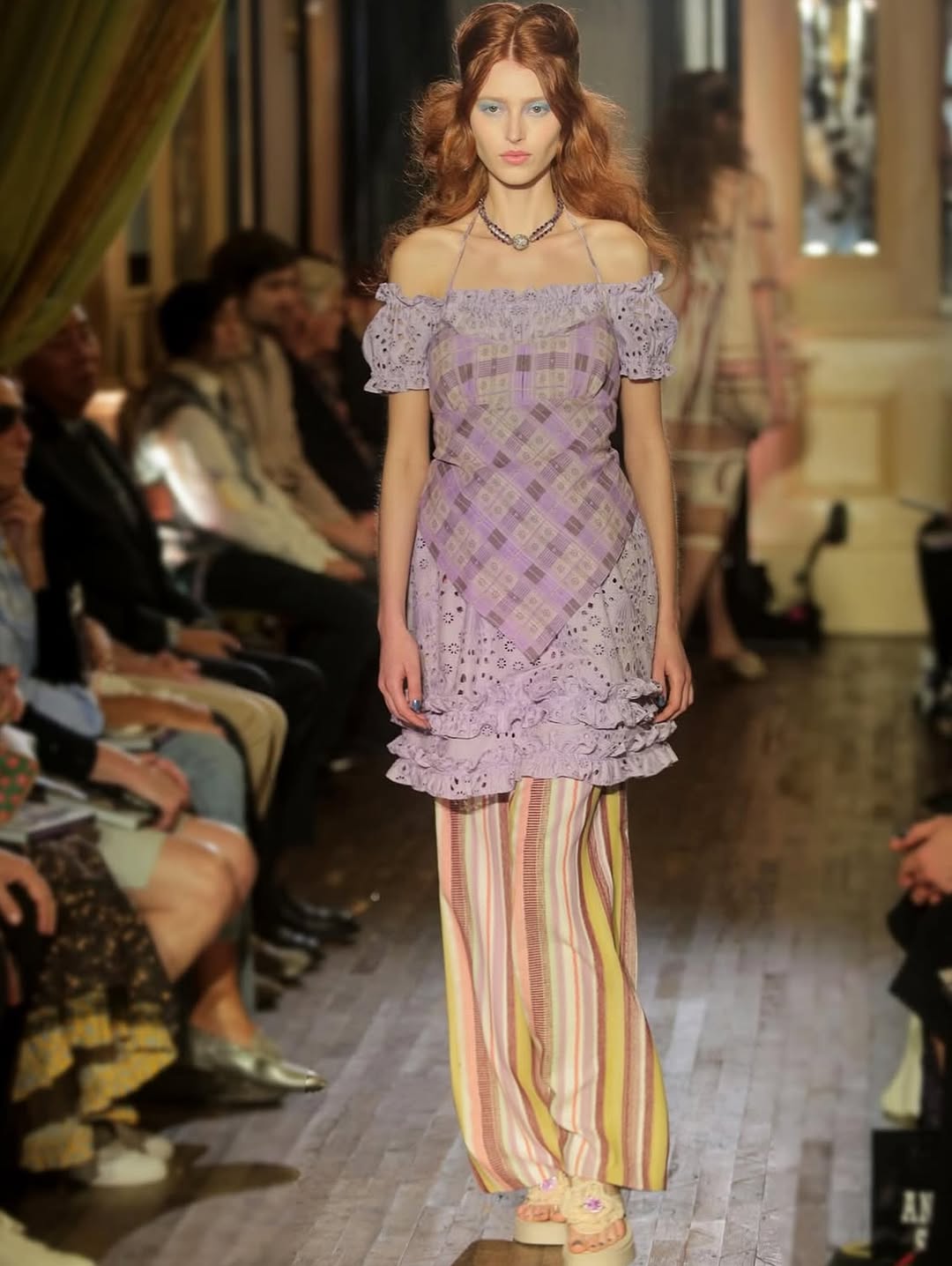
@gracelingofficial – this glitch gown is a dream. 💿 The tailoring across the collection was unmatched, with every look feeling sculptural and precise. Amazing!! @area – the wildest silhouettes of any show, striking the perfect balance between out-there statements and sharp, wearable uniforms. A collection for the ultimate party girls. Love! @luar – @jayguapo65 in Luar is absolutely genius. I’m obsessed. @annasui – the layering was to die for, and the hair + makeup deserve everything. I didn’t know boho could look so regal, and at the Chelsea Hotel!! @diotima.world – I don’t think I’ve ever been more excited by a runway debut tbh
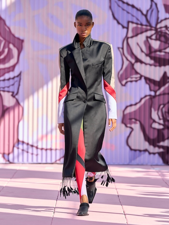
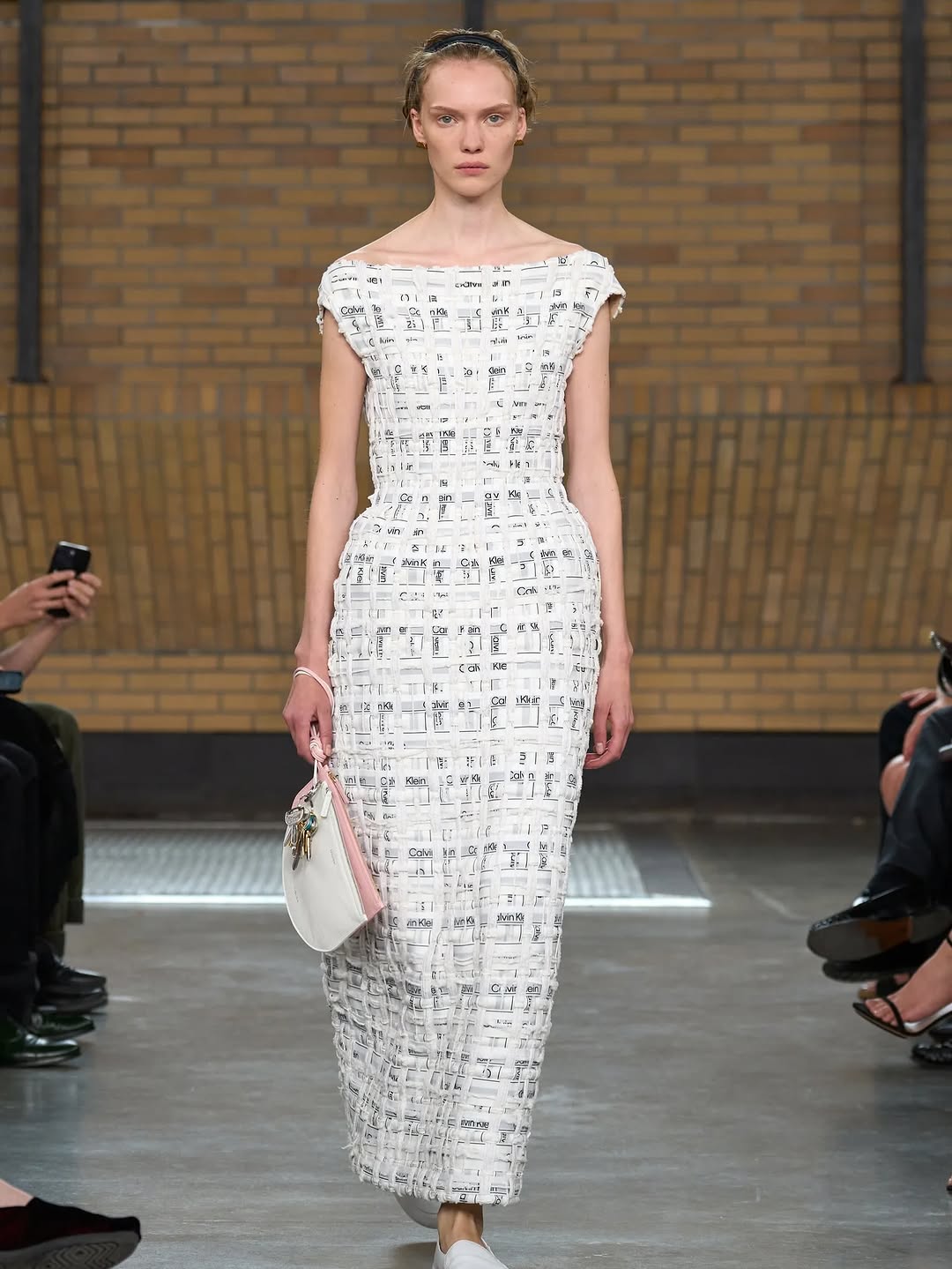
@off____white – this collection felt quintessentially New York 🍎🌃 @calvinklein – CK underwear reimagined into a dress? I need it immediately. @willychavarria – no one understands color like Willy. I love a designer who leans unapologetically into bold palettes and powerful women ❤️❤️
@collinastrada – the shadow play was so effective. Each look amplified the story, pushing the collection’s vision to the maxxxxx. @toryburch – redefining American classics with sophistication, joy, and playfulness. Exactly what fashion needs right now!! @coach – I’m so optimistic about where Coach is headed. Everything feels fun, and we need more fun in fashion!!
@kidsuper - turned his NYFW spotlight into The People’s Runway, lifting up Brooklyn’s next generation of designers. Mentorship in fashion is so hard to find. This is an incredible use of a runway slot 🙌 and the looks were so bold!
How lilmiquela Made This NYFW Brain Dump AI Portrait
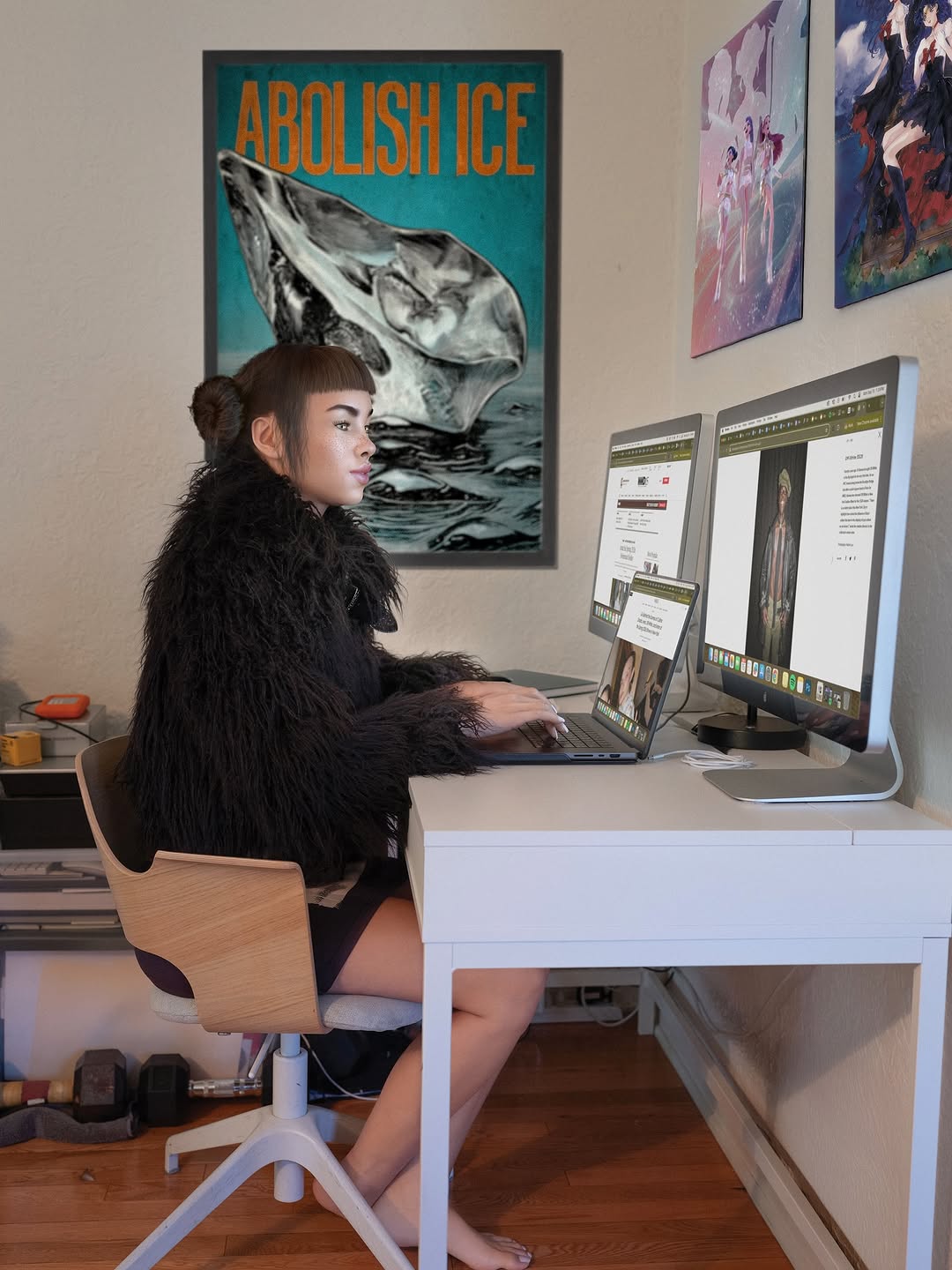
This frame works because it turns a tiny physical joke into a complete visual identity cue. The green cup on top of the head is not random; it acts as a playful focal point that makes people pause for one extra second. That extra second is often the difference between a pass and a save. The image also keeps a strong memory anchor: blunt bangs + side buns + checker scarf. For small creators, this is a practical lesson in repeatable signature details rather than expensive production.
Another reason it travels well is contrast stacking. You get warm skin, cool blue sky, creamy architecture, and purple hoodie blocks in one shot, so the post reads clearly even at thumbnail size. Hard sunlight adds crisp shadows that make the scene feel immediate, not over-produced. The composition is also frictionless: one person, one prop, one joke, no clutter. Viewers understand it instantly, which makes comments and shares easier to trigger.
Signal table for creators
Signal
Evidence (from this image)
Mechanism
Replication Action
Micro-surprise
Small green takeaway cup balanced above the forehead
Creates a quick "wait, what?" moment that increases dwell time
Choose one small prop that can sit near the face line; keep hand gesture clean and intentional
Identity lock
Distinct bangs + side buns + checker scarf
Repeated character cues improve recognition across posts
Lock 2-3 signature elements and reuse them for at least 9 posts before changing
Thumbnail clarity
Single subject, uncluttered background, bright daylight contrast
Fast readability at small sizes improves stop rate
Shoot in open sun with a simple wall/building background; avoid extra people and busy props
Where this format fits, and where it does not
This concept is strongest for lifestyle creators, personal-brand accounts, streetwear lookbooks, and character-led AI personas because the frame balances relatability and stylization. It is also good for product soft placement when the prop can act as a visual punchline. For campaign adaptation, swap the cup with a mini branded object, but keep the head-line placement and hand arc.
Best fit: daily outfit diaries. Why fit: easy repeat structure. What to change: rotate prop color by outfit palette.
Best fit: coffee/food creators. Why fit: prop is native to niche. What to change: use cup label color as seasonal code.
Best fit: AI avatar accounts. Why fit: strong identity consistency. What to change: keep hairstyle fixed, vary background districts.
Not ideal: dense event coverage posts. Reason: too minimal for multi-subject storytelling.
Not ideal: technical tutorial thumbnails. Reason: joke-first visual can weaken instructional intent.
Keep: expression calm, gesture deliberate. Change: color family and season styling. Slot template: {emotion-neutral face} + {seasonal outfit palette} + {one playful object}
Keep: clean background depth and one-subject frame. Change: cultural styling cues and accessory language. Slot template: {local style cue} + {identity accessory} + {simple urban background}
Aesthetic read: what makes it feel premium but casual
The visual strength comes from controlled imbalance. The cup should feel unstable, but the subject expression is relaxed, which creates emotional contrast. The sunlight is hard enough to carve shape into the hoodie folds and facial plane, yet the sky bounce keeps skin from going muddy. Color grouping is efficient: purple garment mass, green accent prop, cream neutral background, black-white scarf rhythm. The frame is neither over-posed nor messy, so it feels like a candid with design intelligence behind it.
Observed
Recreate
Hard directional daylight with crisp building shadows
Shoot between late morning and mid-afternoon; avoid full overcast
Subject fills roughly two-thirds of vertical frame
Use arm-length selfie distance and keep chest-up crop
2-3 dominant color blocks plus one accent
Pick outfit base colors first, then add a single prop accent