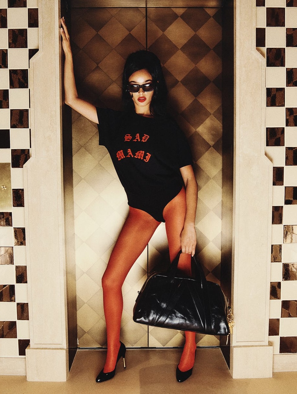
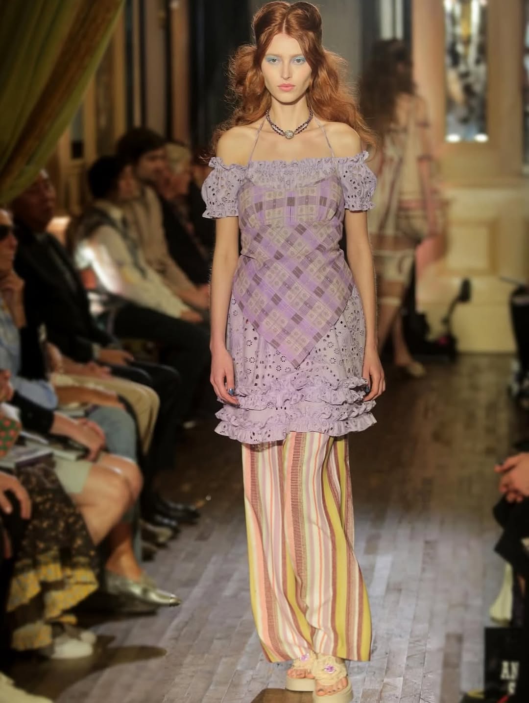
How lilmiquela Styled This NYFW Carrie Bradshaw Look
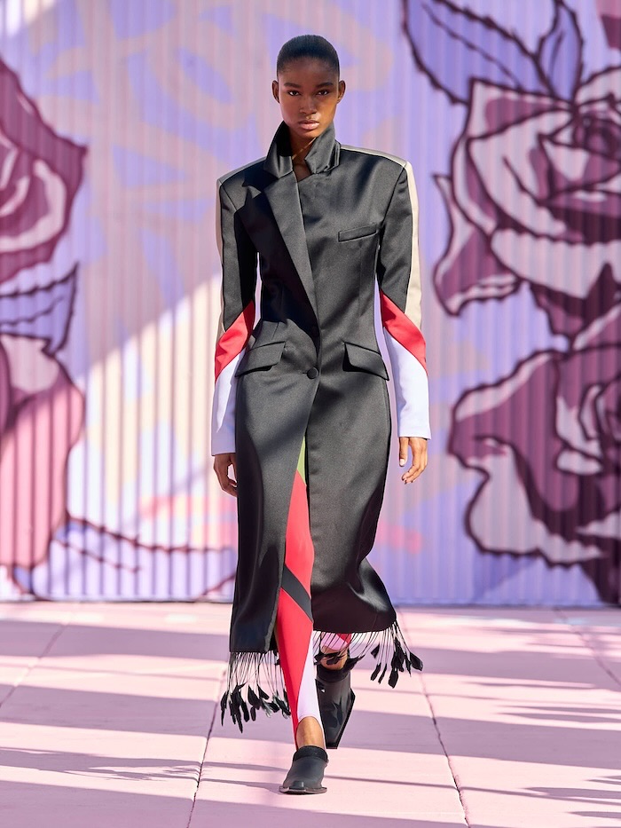
This image uses a classic fashion formula: one dominant silhouette, one strong accessory, one controlled architectural frame. The model is styled with high-contrast elements (black top, red tights, glossy bag), then placed in a symmetrical doorway that behaves like a built-in stage. That is why the post feels editorial within a single still.
For creators, this is a valuable reference because it proves you can build a "campaign-level" visual without a complex set. You need deliberate styling hierarchy and a location that naturally frames the subject. Here, the elevator recess does most of the compositional work.
Why This Visual Has Strong Save and Share Potential
The strongest mechanism is shape contrast. The oversized T-shirt and structured bag create broad dark masses, while red tights create a long uninterrupted line through the legs. That line instantly grabs attention in scrolling feeds. Another mechanism is attitude coding: sunglasses, red lip, and asymmetrical stance communicate confidence before viewers read any caption. Emotional clarity drives social performance.
The image also benefits from controlled nostalgia. Warm grading and patterned background evoke vintage editorial references, making the post feel culturally rich rather than trend-chasing. Nostalgia, when paired with modern styling, often increases comments because audiences start naming eras, references, and fashion memories.
| Signal |
Evidence (from this image) |
Mechanism |
Replication Action |
| Architectural Framing |
Subject placed inside symmetrical doorway/elevator recess |
Creates instant visual stage and focus |
Scout locations with built-in vertical frames and center your subject inside them |
| Accessory Authority |
Large black handbag dominates lower-right visual weight |
Adds luxury cue and brand signal |
Use one oversized hero accessory per frame instead of many small items |
| Color Accent Discipline |
Mostly black palette with red text and red tights |
High recall with minimal color noise |
Limit to one accent color and repeat it in at least two wardrobe zones |
| Pose Asymmetry |
One arm up, one arm down, one leg relaxed |
Feels editorial and dynamic without motion blur |
Direct talent with asymmetrical pose templates rather than square-on stance |
Use Cases and Transfer Possibilities
Best-fit scenarios
- Fashion drop teasers: perfect for silhouette-first storytelling; change text tee to collection logo.
- Accessory campaigns: large bag presence keeps product clear; change footwear and hosiery for seasonal variants.
- Editorial moodboard creators: strong retro-modern blend encourages saves; change architecture style while keeping pose logic.
- Luxury lifestyle pages: controlled warm palette aligns with premium tone; change prop to sunglasses, gloves, or jewelry focus.
Not ideal
- Athleisure or sports storytelling: glamour posture and accessories conflict with active utility message.
- High-volume ecommerce packs: editorial mood can reduce item-detail clarity for catalog needs.
- Casual day-in-the-life content: highly stylized tone may feel too constructed.
Three transfer recipes
- Hotel-corridor transfer
Keep: doorway framing + warm grade + asymmetrical pose
Change: patterned elevator panel to wood hotel corridor door
Template: {framed_architecture}, single model, oversized accessory, warm cinematic editorial tone
- Monochrome transfer
Keep: silhouette logic and strong bag shape
Change: red accents to all-black with metallic jewelry highlight
Template: minimal monochrome fashion portrait, architectural frame, statement bag, confident stance
- Street-night transfer
Keep: one accent color and one hero accessory
Change: indoor doorway to lit storefront entrance
Template: {night_entryway}, editorial pose, accent hosiery, oversized handbag, retro flash mood
Aesthetic Read: The Craft Behind the Image
The photograph feels expensive because its hierarchy is strict. Face and sunglasses establish character first. Bag shape and red leg line define style second. Background texture supports without competing. This kind of hierarchy is often missing in beginner fashion content where too many statement elements fight for attention.
Lighting is equally important. Warm directional light creates depth on the bag and heels, while mild vignetting keeps the eyes centered on the model. The result is dramatic but controlled. If creators want to replicate this level of polish, they should focus less on adding effects and more on controlling where visual weight sits inside the frame.
| Observed |
How to Recreate |
Why It Matters |
| Symmetric architectural channel around subject |
Use doorframes or alcoves as natural compositional borders |
Instantly increases visual order |
| Single accessory with large visual mass |
Select one oversized bag and place it in lower-third focal zone |
Strengthens product memory |
| Limited palette with one accent color |
Anchor outfit in dark neutrals, add one repeating accent |
Improves cohesion and recall |
| Warm analog-like grading |
Use tungsten balance and moderate contrast with soft roll-off |
Creates nostalgic editorial mood |
Prompt Technique Breakdown
| Prompt chunk |
What it controls |
Swap ideas (EN, 2-3 options) |
| "single model in framed doorway, full-body pose" |
Spatial hierarchy and focus |
"stairwell niche" / "arched hallway frame" / "boutique entrance" |
| "black oversized tee with red accent tights" |
Color rhythm and silhouette contrast |
"all-black with cobalt accent" / "cream base with burgundy accent" / "charcoal with emerald accent" |
| "narrow sunglasses and red lip" |
Character attitude |
"minimal makeup no sunglasses" / "bold wing liner" / "metallic eye statement" |
| "large black leather handbag" |
Commercial focal object |
"structured mini tote" / "slouch shoulder bag" / "hard-shell clutch" |
| "warm retro editorial lighting" |
Mood and era reference |
"cool chrome fashion light" / "flash-heavy Y2K vibe" / "soft hotel practical glow" |
Remix Steps for Creators
Baseline lock: (1) architectural frame, (2) one hero accessory, (3) one accent-color rule.
- Run 1: Keep pose and setting fixed; test only accessory shape.
- Run 2: Keep accessory fixed; test only accent color placement.
- Run 3: Keep color fixed; test only camera height (eye level vs slightly low).
- Run 4: Keep best visual setup; test caption tone (fashion authority vs playful confidence).
One variable per run keeps your aesthetic learning clean and repeatable.