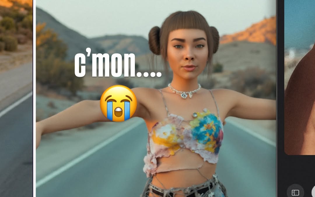
nothing like a lil call w my robo bestie @blawko22 to clear my head from these fake af photos 🖤 life’s been feeling kinda… a lot. but a good vent + ugly laughs = instant reset.
nothing like a lil call w my robo bestie @blawko22 to clear my head from these fake af photos 🖤 life’s been feeling kinda… a lot. but a good vent + ugly laughs = instant reset.
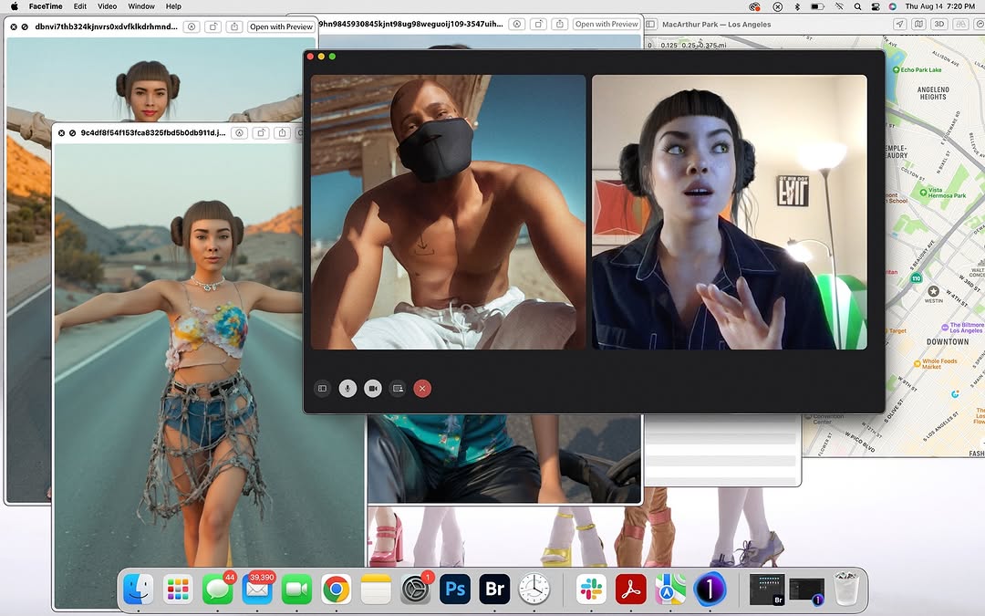
This image performs because it captures digital life exactly as people experience it: too many windows open, an emotional call in the middle, and creative references scattered behind everything. It is not polished minimalism. It is recognizable reality.
The post also combines vulnerability and visual novelty. Viewers see a personal conversation, but they also get clues about the creator’s process through the open files and map. That dual-layer storytelling is strong for engagement because it invites both empathy and curiosity.
| Signal | Evidence (from this image) | Mechanism | Replication Action |
|---|---|---|---|
| Digital realism | Layered desktop windows and active call controls visible | Authentic interface clutter mirrors everyday creator workflow | Keep real UI layers and avoid over-clean mockup compositions |
| Emotional contrast | Two participants in very different moods/lighting environments | Contrast creates narrative tension inside one frame | Pair two subjects with distinct context (outdoor vs indoor, calm vs expressive) |
| Meta storytelling | Background image files hint at "fake photos" and self-reflection theme | Context clues deepen interpretation beyond face value | Leave 2-3 relevant background artifacts that support caption meaning |
| Screen-era familiarity | Dock, map, windows, and call tile interface all recognizable | Platform-native familiarity increases stop and comment rates | Use UI-native visual language instead of abstract graphic effects |
The strongest decision is hierarchy: one dominant call window over a dense but secondary desktop background. This keeps the frame readable while still preserving context. If all layers had equal weight, the image would feel chaotic; here it feels deliberate.
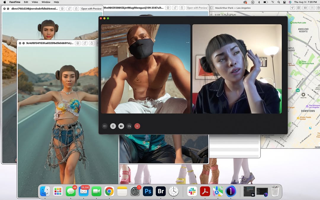
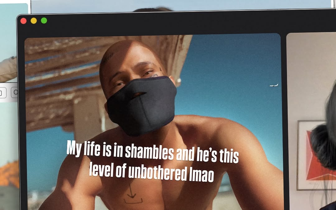
Lighting contrast between call tiles is another asset. Left tile has harsh outdoor daylight and angular shadows. Right tile has warm indoor lamp glow and expressive gesture. That contrast visually reinforces the emotional role of the conversation.
| Observed evidence | Recreate action |
|---|---|
| Central call window dominates | Set one primary UI element at center with larger scale than background windows |
| Two different participant lighting moods | Assign separate lighting contexts to each tile |
| Layered background files with partial visibility | Use overlapping windows at 40-70% visibility behind primary layer |
| Dock/menu bars present | Retain system chrome to maintain screenshot authenticity |
| Balanced clutter | Keep only relevant windows, remove random unrelated noise |
| Prompt chunk | What it controls | Swap ideas (EN, 2–3 options) |
|---|---|---|
| "desktop screenshot with centered call window" | Core format and visual hierarchy | "laptop screen capture" / "tablet split-screen call" / "browser-based meeting panel" |
| "two-person call with contrasting environments" | Narrative tension and emotional duality | "sunlit outdoors + dim bedroom" / "office + street" / "studio + car interior" |
| "overlapping creative reference windows" | Process context and authenticity | "photo folders" / "moodboard tabs" / "editing timeline panes" |
| "visible call controls and system dock" | Platform realism | "minimal controls" / "full toolbar" / "floating utility panel" |
| "right subject expressive hand gesture" | Conversation energy and emotion | "laughing reaction" / "concerned listening" / "animated explanation" |
| "lived-in desktop clutter" | Believability over polish | "light clutter" / "moderate clutter" / "dense but curated clutter" |
Baseline lock: lock (1) centered call window hierarchy, (2) tile lighting contrast, (3) visible but relevant background desktop context.
One-change rule: tweak one layer at a time.