
nothing like a lil call w my robo bestie @blawko22 to clear my head from these fake af photos 🖤 life’s been feeling kinda… a lot. but a good vent + ugly laughs = instant reset.
nothing like a lil call w my robo bestie @blawko22 to clear my head from these fake af photos 🖤 life’s been feeling kinda… a lot. but a good vent + ugly laughs = instant reset.
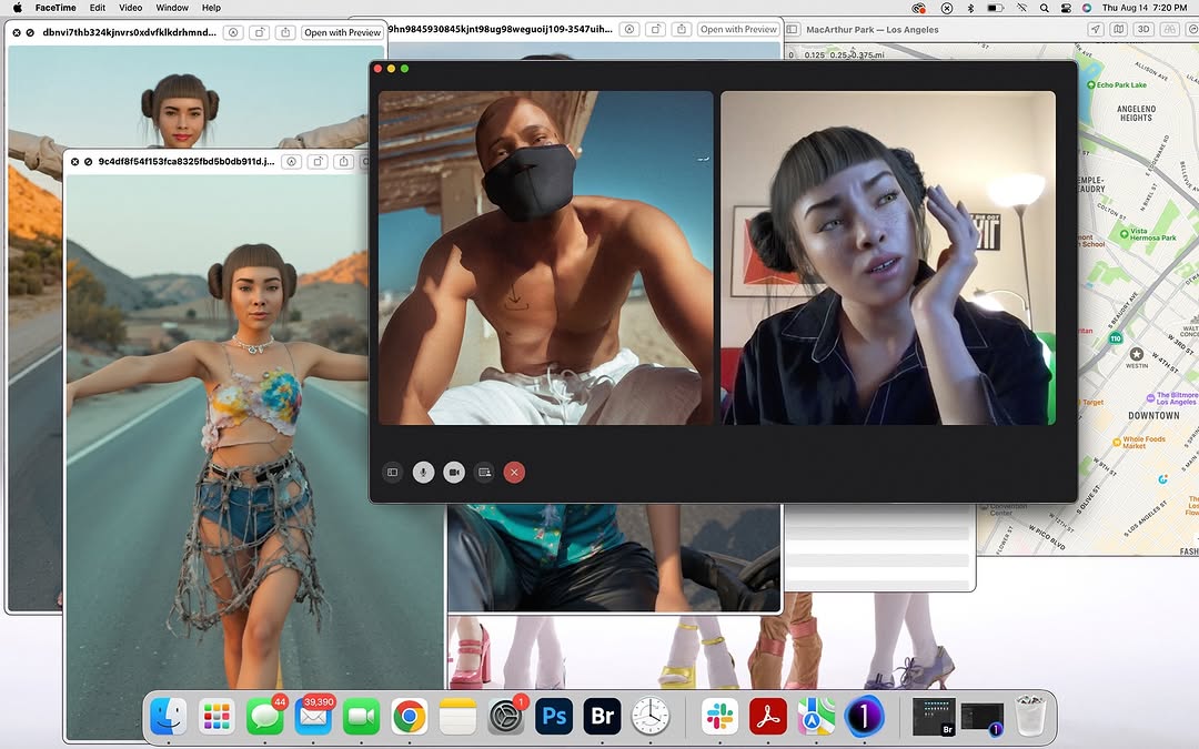
This post works because it exposes the creator operating system, not just the final output. Instead of showing one polished image, it shows call windows, reference assets, maps, and tools all at once. That layered "working desktop" view signals process, collaboration, and real-time decision making.
The central FaceTime window gives the scene a human anchor, while the surrounding windows provide context density. Viewers can infer multiple story threads: creative direction, remote communication, location planning, and asset review. Multi-thread storytelling is sticky because people keep scanning for clues across the interface.
For creator growth, this format is valuable between hero visuals. It builds authenticity, demonstrates workflow, and invites professional curiosity. Audiences who care about craft often engage more with how things are made than with finished posts alone.
| Signal | Evidence (from this image) | Mechanism | Replication Action |
|---|---|---|---|
| Process transparency | Open desktop with active call, references, map, and app dock | Behind-the-scenes openness increases trust and depth comments | Capture real working desktop states instead of cleaning everything before posting |
| Layered narrative | FaceTime call centered over visual references and tools | Multiple story cues increase dwell time through exploratory scanning | Compose screenshot with one primary window and 2-4 meaningful secondary windows |
| Collaboration proof | Visible two-person call during active creative workspace | Signals networked workflow and active production momentum | Include one live collaboration artifact (call/chat/review panel) in process posts |
| Toolchain credibility | Dock with editing and communication app icons | Technical context appeals to creator and builder audiences | Keep relevant tool icons visible when process is part of the story |
Edit Session Variant
Keep: one central communication window and layered reference windows.
Change: map window to timeline editor and color grading panel.
Slot template (EN): {central_live_window} + {reference_layers} + {toolchain_dock}
Design Crit Variant
Keep: visible collaboration call plus multiple visual alternatives.
Change: background assets to moodboards and prototype screens.
Slot template (EN): {review_call} + {option_windows} + {project_context_panel}
Travel Production Variant
Keep: map/location panel and creative references in same desktop frame.
Change: central call to route planning or production checklist.
Slot template (EN): {location_map} + {creative_assets} + {coordination_window}
The aesthetic is intentionally informational rather than minimal. Overlapping windows create a collage of active work states, and that density itself becomes the visual signature. The central dark FaceTime panel provides structural anchor, while the bright reference windows and map add peripheral energy. Dock icons at the bottom and the top system bar complete the "authentic desktop" feeling. This is a functional aesthetic that communicates momentum, multitasking, and creative entropy in a controlled frame.
| Observed | Recreate | Evidence to Validate |
|---|---|---|
| Central anchor window | Place one dominant live-collaboration pane in middle | Viewer identifies core activity within one glance |
| Context-rich window stack | Add layered secondary windows with partial overlap | Image invites scanning rather than single-point viewing |
| OS-level realism | Keep menu bar, dock, and native window chrome visible | Frame reads as authentic screenshot, not graphic mockup |
| Prompt chunk | What it controls | Swap ideas (EN, 2-3 options) |
|---|---|---|
| "macOS desktop screenshot with overlapping windows" | Meta-process storytelling format | "single app full-screen" / "split-screen two apps" / "messy multi-window stack" |
| "centered FaceTime two-person call" | Human collaboration anchor | "group call grid" / "chat thread window" / "screen-share call" |
| "background reference images and map panel" | Project context breadth | "timeline + notes" / "moodboard + browser" / "code editor + design preview" |
| "visible dock with creator tools" | Workflow credibility cues | "minimal dock" / "audio-tool dock" / "design-tool dock" |
| "crisp UI text and icon fidelity" | Screenshot authenticity | "soft-focus screenshot" / "high DPI sharp" / "retro pixel UI" |
Baseline Lock: lock central collaboration window, lock layered context windows, lock visible OS chrome.
One-change rule: change one workflow layer per post to keep narrative clarity.