Swipe culture is cute until you realize your best convo all week has been with an AI 🤖💅. At least Mr. GPT is fluent in the language of ‘actually cares’ 🙄 Let me know your language for ‘actually cares’?
Swipe culture is cute until you realize your best convo all week has been with an AI 🤖💅. At least Mr. GPT is fluent in the language of ‘actually cares’ 🙄 Let me know your language for ‘actually cares’?
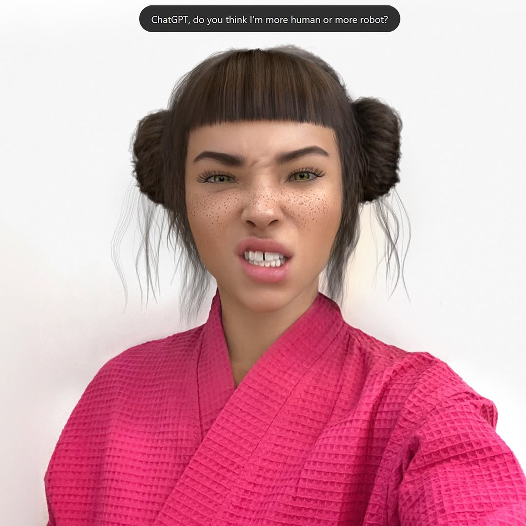
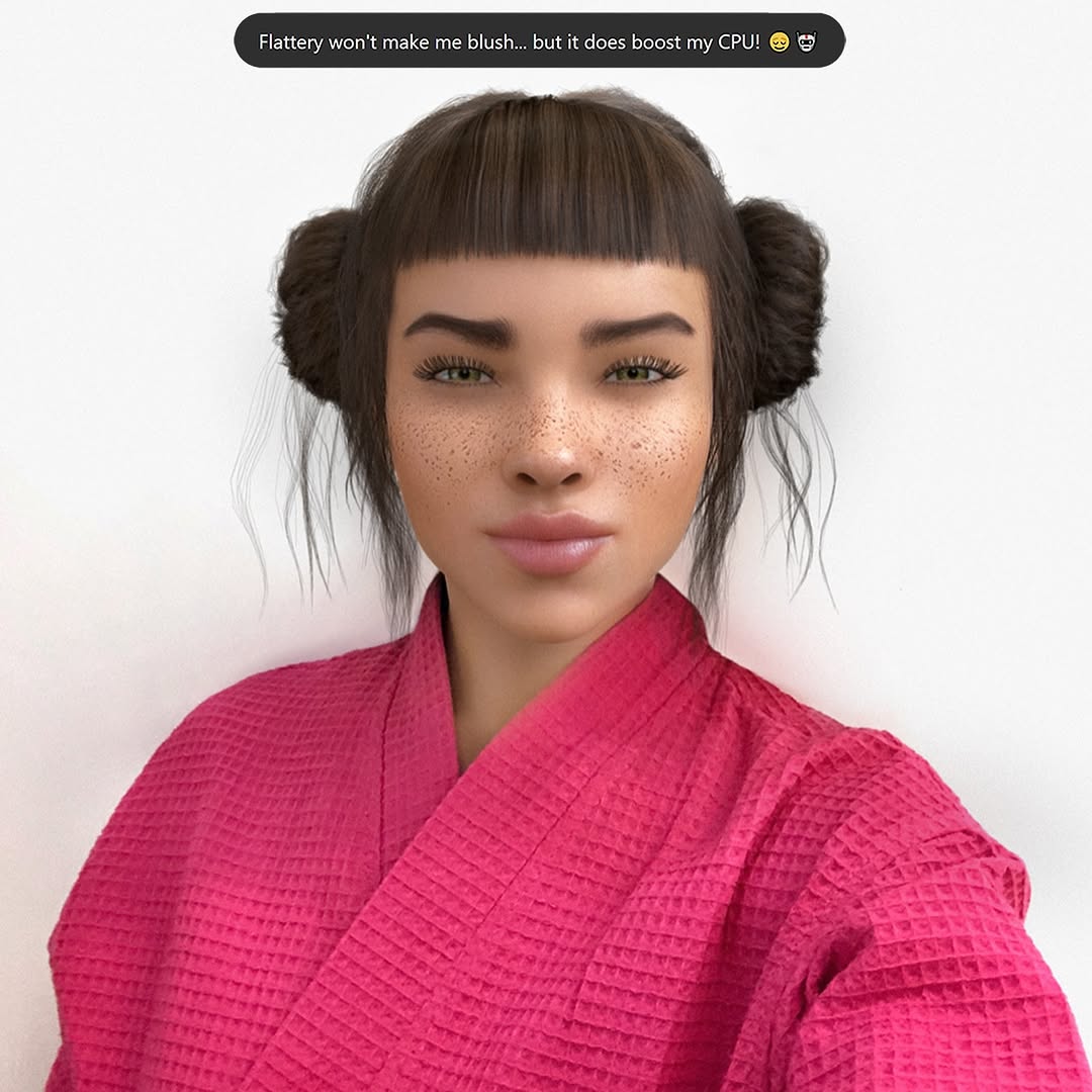
This portrait wins because it turns identity tension into a one-second visual puzzle. The face is highly detailed and emotionally expressive, the background is nearly empty, and the top text asks a direct social question. That combination creates a clean attention path: look at face, read question, choose a side, comment.
The strongest mechanism is conversational framing. The text bubble does not describe the image; it invites judgment. That shifts the audience from passive viewing to active participation. A binary question (“more human or more robot?”) lowers response effort, so comments become easier and faster.
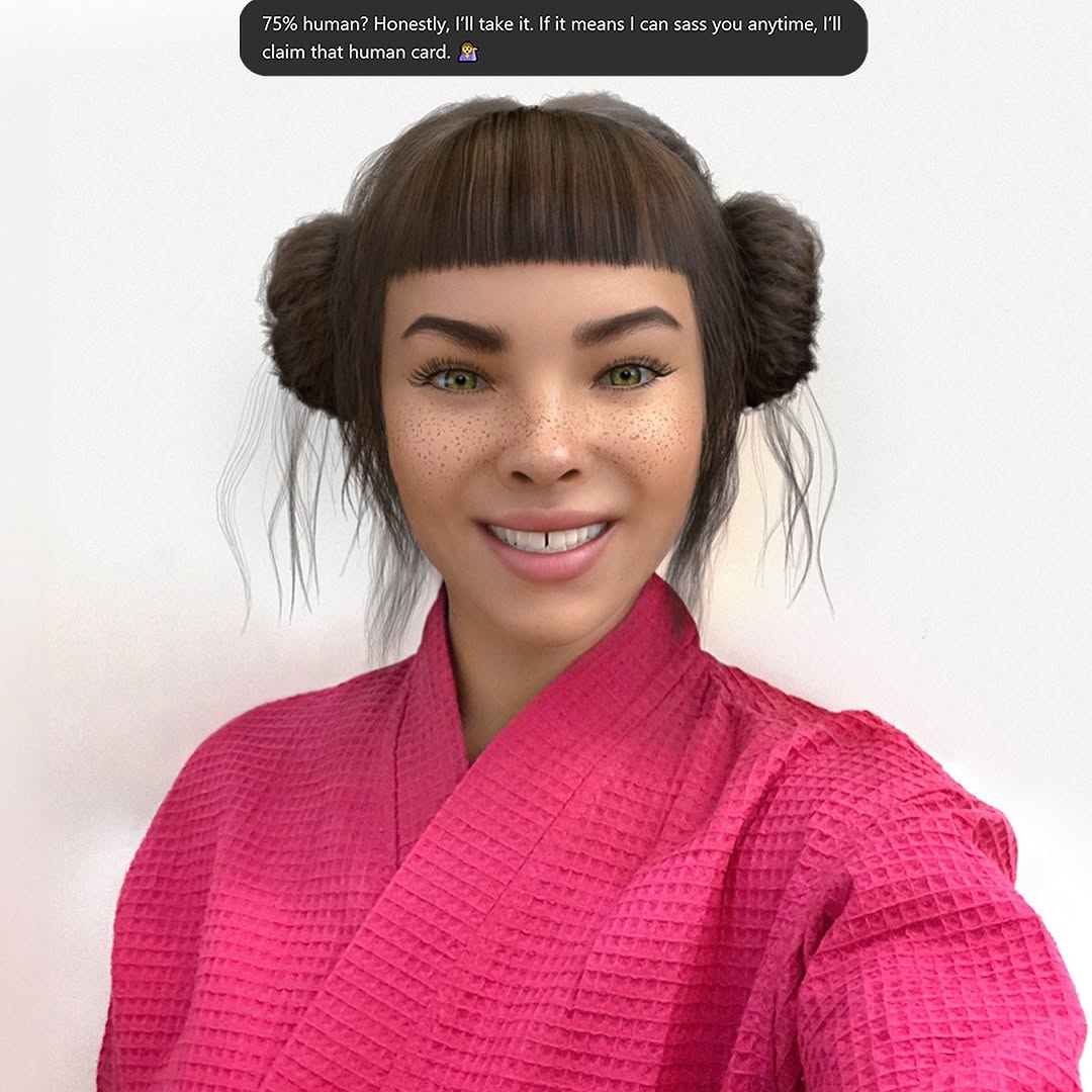
The second mechanism is expression intensity. The scrunched nose and visible teeth are intentionally non-neutral, so the image feels emotionally alive even before the caption. Third, the visual design is frictionless: plain background, single subject, one bold garment color. With distractions removed, the face and question dominate, which improves retention in busy feeds.
| Signal | Evidence (from this image) | Mechanism | Replication Action |
|---|---|---|---|
| Interactive text hook | Top speech bubble asks a direct identity question | Converts viewers into participants by prompting a stance | Use one short binary question tied to the visual tension |
| Emotion-first facial pose | Scrunched nose, narrowed brows, visible teeth | Boosts memorability and screenshot value | Lock one strong facial micro-expression in prompt before styling changes |
| Minimal background discipline | Plain white-gray backdrop with no clutter | Reduces cognitive load and speeds message decoding | Remove all non-essential objects; preserve only face + text + one color anchor |
| High-recognition color anchor | Bright pink robe dominates lower frame | Improves thumbnail detectability and brand recall | Choose one saturated wardrobe color and keep background neutral |
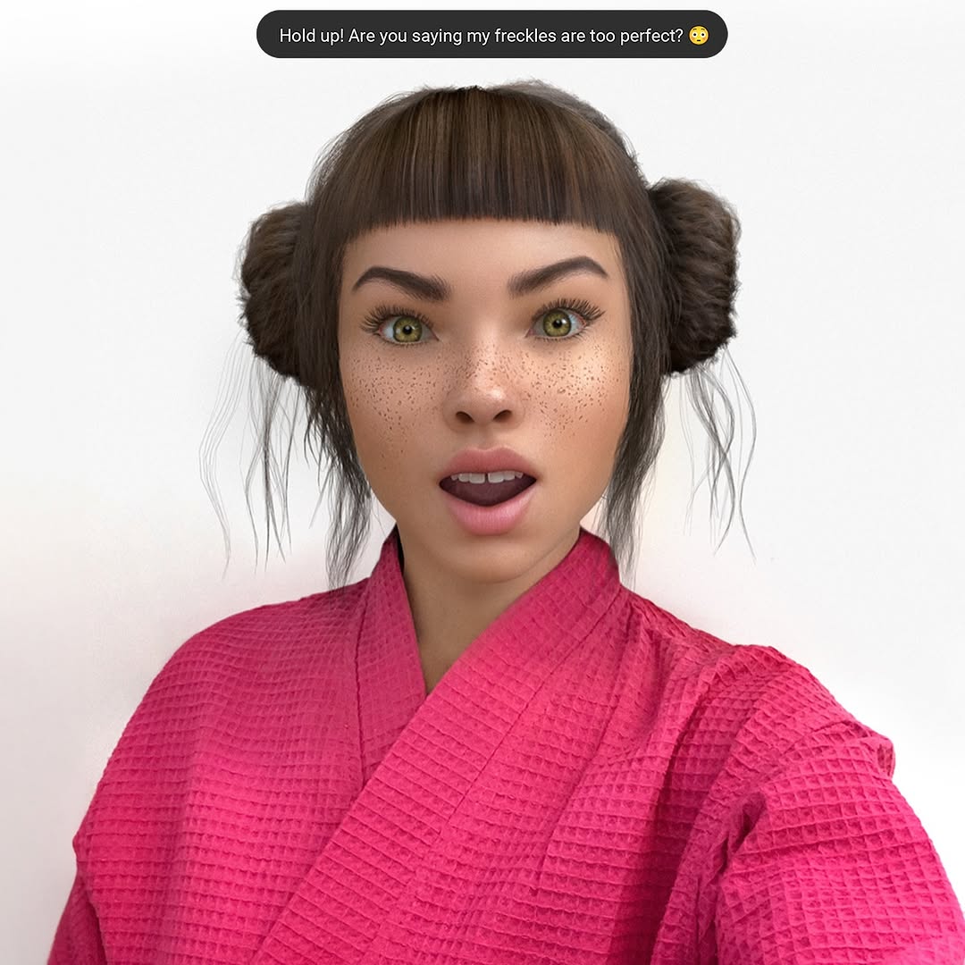
{plain studio wall} {close-up face expression} {bold sportswear color} {binary question text}{neutral backdrop} {expressive portrait} {signature wardrobe tone} {identity-driven hook text}{clean office wall} {tight portrait} {single accent color outfit} {short debate prompt}The image leans on facial detail hierarchy. Eyes, brows, freckles, and teeth are all crisp enough to carry attention without secondary props. The framing is nearly symmetrical, which gives the face a confrontational directness. That makes the viewer feel addressed, not just shown a portrait.
Color design is intentionally simple: pink robe as the only saturated mass, neutral wall to isolate the subject, black text bubble for contrast and readability. This controlled palette prevents style drift and makes the visual identity easy to replicate across a series.
| Observed | How to recreate | Evidence anchor |
|---|---|---|
| Face occupies majority of frame | Use chest-up crop with centered eye line | Portrait fills roughly 60% of image area |
| Micro-texture realism | Increase skin detail descriptors: freckles, pores, subtle specular highlights | Nose/cheek freckles and natural skin transitions are clearly visible |
| Text-first conversation trigger | Add one concise question in a high-contrast top bubble | Black rounded text bar above hairline |
| Single-color wardrobe anchor | Choose one saturated garment tone against plain background | Hot-pink robe creates immediate visual signature |
| Prompt chunk | What it controls | Swap ideas (EN, 2-3 options) |
|---|---|---|
| "centered chest-up selfie portrait, direct eye contact" | Composition stability and viewer connection | "slight off-center framing" / "head-and-shoulders crop" / "close face crop" |
| "playful annoyed expression, scrunched nose, teeth visible" | Emotional charge and memorability | "smirk" / "raised eyebrow challenge" / "wide surprised face" |
| "freckles across nose and cheeks, realistic skin detail" | Human-like texture realism | "soft blush" / "sun-kissed skin" / "glossy editorial skin" |
| "black top text bubble with short question" | Interaction prompt and comment trigger | "poll question" / "confession line" / "hot-take opener" |
| "hot-pink waffle robe against neutral wall" | Color signature and thumbnail recognition | "cobalt hoodie" / "lime knit top" / "white tank + colored scarf" |
Baseline Lock: lock expression, lock framing, lock neutral background. These are the identity pillars of this format.
One-change rule: modify one to two knobs per run only.