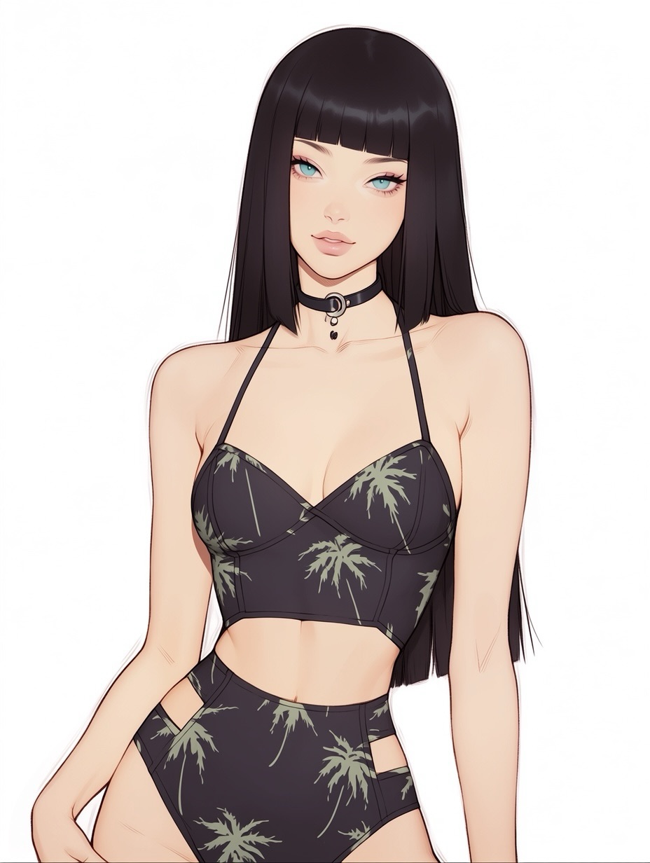
This image works because it does not confuse simplicity with blandness. On paper, the ingredients are minimal: a white background, a dark printed two-piece set, a straight black hairstyle, and a beauty-led face. But the way those ingredients are arranged makes the portrait feel precise and polished instead of empty. That is exactly why this kind of image tends to perform well for creators. It is easy to read, easy to save, and easy to remix.
The strongest hook is the contrast map. The hair and outfit create a dark frame, the background stays bright and silent, and the eyes provide the one small burst of saturated color. That means the viewer knows where to look instantly. In a crowded feed, speed matters. Portraits that explain themselves in one second usually outperform portraits that require scanning. This one is immediate.
There is also a subtle commercial feeling here. Even though it is an illustration, it behaves like a clean fashion lookbook shot. The subject is centered, the styling is uncluttered, and the pose is neutral enough that the outfit and face share attention rather than compete. For small creators, that is a useful lesson. If the goal is reach, polished restraint often wins over unnecessary scene-building.
| Signal | Evidence (from this image) | Mechanism | Replication Action |
|---|---|---|---|
| Immediate readability | White background and centered subject remove all visual noise around the figure | The audience understands the image in one glance, which improves stop power in fast-scrolling feeds | Use a plain backdrop and center the figure before adding any styling extras |
| Single accent color | The bright aqua eyes stand out against black hair, black outfit, and pale skin | One color accent creates memorability without making the image chaotic | Choose one small high-saturation feature and keep the rest of the palette restrained |
| Fashion clarity | The two-piece set has a readable silhouette and subtle print rather than noisy detail overload | Clear wardrobe structure makes the image easier to save and adapt for fashion or character use | Lock outfit silhouette first, then add only one secondary pattern or texture |
The answer is controlled detail placement. The artist does not try to make every inch of the frame interesting. Instead, interest is concentrated in four places: the bangs, the eyes, the neckline and choker area, and the printed swimwear. Everything else is allowed to stay calm. That makes the image feel designed. Creators often lose this quality by adding too many accessories or by replacing a clean background with mood lighting that does not actually improve the portrait.
The outfit print is especially useful. It breaks up the black fabric just enough to avoid flatness, but it does not overwhelm the body lines. That is an ideal middle ground for social visuals. If a garment is too plain, the portrait can feel generic. If a garment is too complex, the face loses priority. This image chooses the better balance.
| Observed | Why it matters for the look |
|---|---|
| Long blunt black hair with straight bangs | Creates a strong vertical frame and a recognizable silhouette |
| High-key white studio background | Boosts readability and makes the portrait feel modern and editorial |
| Bright blue eyes as the only strong accent | Gives the viewer a memorable focal point without destabilizing the palette |
| Printed two-piece with clean seams and side cutouts | Adds fashion interest while keeping the outfit shape easy to read |
| Simple black choker with metal ring | Introduces personality and styling identity without clutter |
This approach is less ideal for cinematic fantasy, dramatic romance scenes, or environment-led storytelling. The image wins through cleanliness and directness. Once you add too much narrative scenery, the formula stops being what makes it effective.
Three transfer recipes are easy to apply. Keep the white background, the straight centered pose, and the one-accent-color logic. Change the garment category, print language, or accessory type. Template one: {hair silhouette} + {minimal fashion set} + {single accent eye color} + white seamless background. Template two: clean editorial anime portrait, centered pose, restrained palette, one small metallic accessory, no scenery. Template three: {summer or fashion archetype} portrait, plain studio backdrop, high-key lighting, simple garment pattern, polished render.
To recreate this kind of image well, think in layers: silhouette, palette, one accent, then accessory. Do not start with vibes alone. Minimal fashion portraits break when the prompt stays too abstract.
| Prompt chunk | What it controls | Swap ideas (EN, 2–3 options) |
|---|---|---|
| long straight jet-black hair with blunt bangs | Silhouette strength and frame around the face | sleek silver hair; dark brown blunt bob; navy-black waist-length hair |
| plain white seamless studio background | Readability, negative space, and editorial cleanliness | light gray backdrop; pale cream wall; soft off-white studio paper |
| black printed two-piece fashion swimwear | Wardrobe identity and texture complexity | solid black bikini; tropical green print set; monochrome geometric pattern set |
| bright aqua-blue eyes as the only accent | Memorability and focal point hierarchy | amber eyes; cool gray eyes; emerald eyes |
| black ring choker | Small styling signal that adds identity | thin silver necklace; ribbon choker; minimal collar pendant |
| soft high-key beauty lighting | Skin softness and overall polished commercial feel | diffused studio light; softbox frontal light; cloud-soft daylight |
Lock three things first: the background cleanliness, the hair silhouette, and the outfit shape. Those three controls define most of the image. Then iterate with a one-change rule so you do not accidentally destroy the balance that makes the portrait feel premium.
The practical lesson is simple: minimal portraits succeed when every detail has a job. If you want this style to travel, keep the scene clean, protect the accent hierarchy, and let one or two well-chosen fashion details carry the personality.