How timtadder Made This Water Reflection Fashion Portrait AI Art -- and How to Recreate It
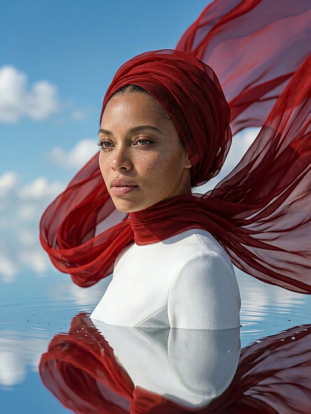
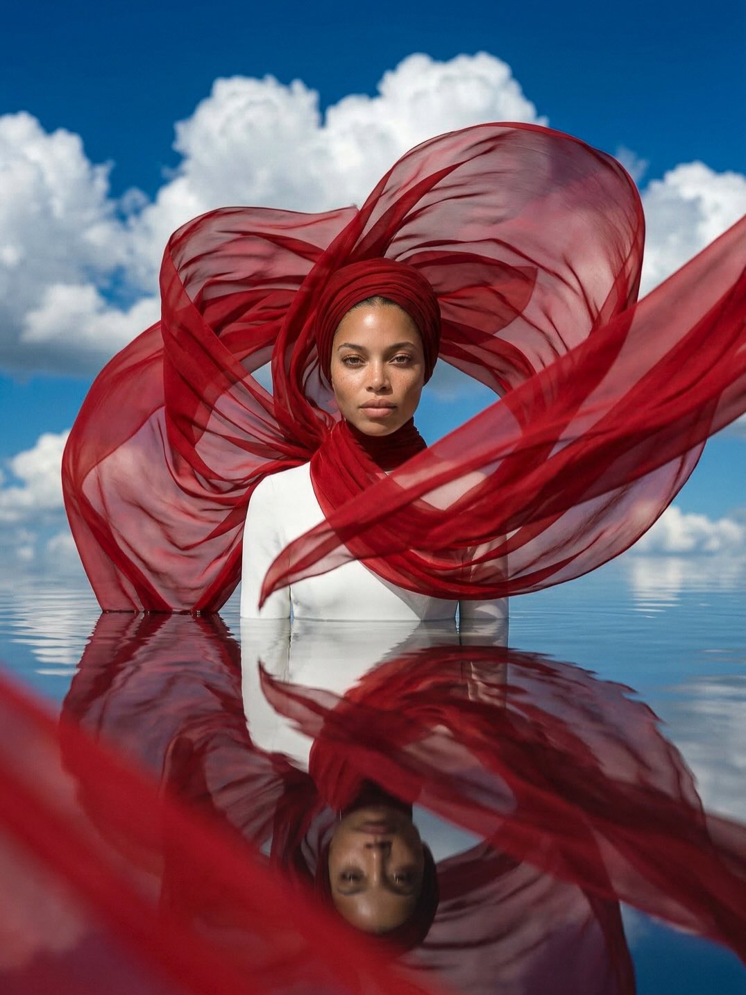
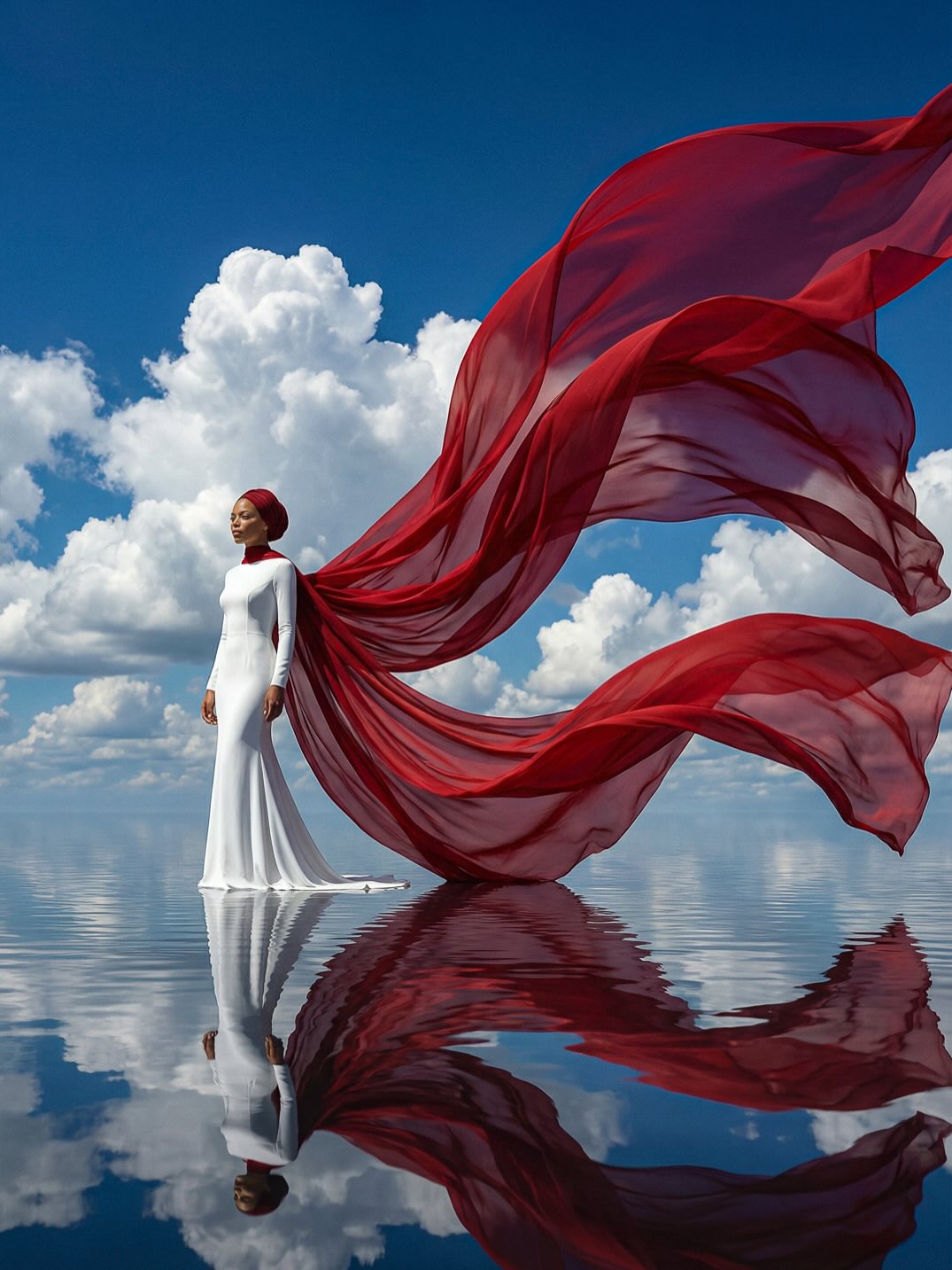
This image is built on subtraction. It removes nearly everything except face, fabric, water, and sky. That reduction is what gives it power. With so few elements in play, every decision matters: the color of the scarf, the angle of the gaze, the placement of the waterline, and the way the fabric moves behind the head.
Visual breakdown
| Element | What it contributes |
|---|
| Deep red scarf | Provides motion, emotion, and the frame's strongest graphic shape. |
| White garment | Keeps the composition pure and structurally calm. |
| Water reflection | Adds surreal stillness and doubles the visual rhythm. |
| Blue sky | Creates openness and gives the red fabric maximum clarity. |
| Neutral expression | Makes the image feel editorial rather than narrative. |
What the image is really doing
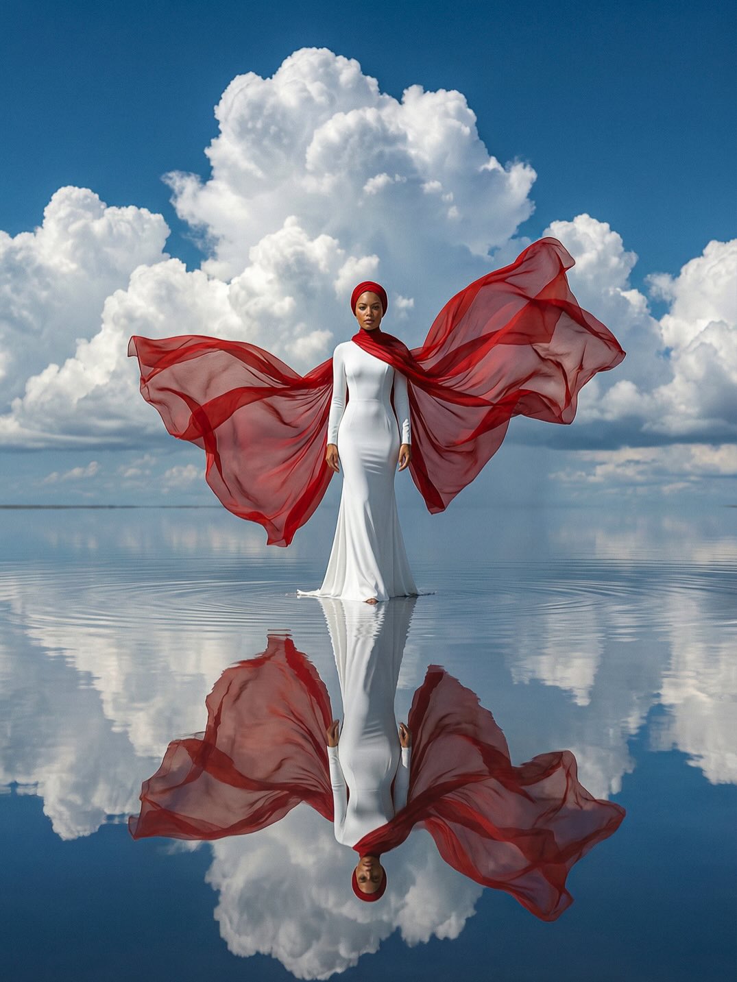
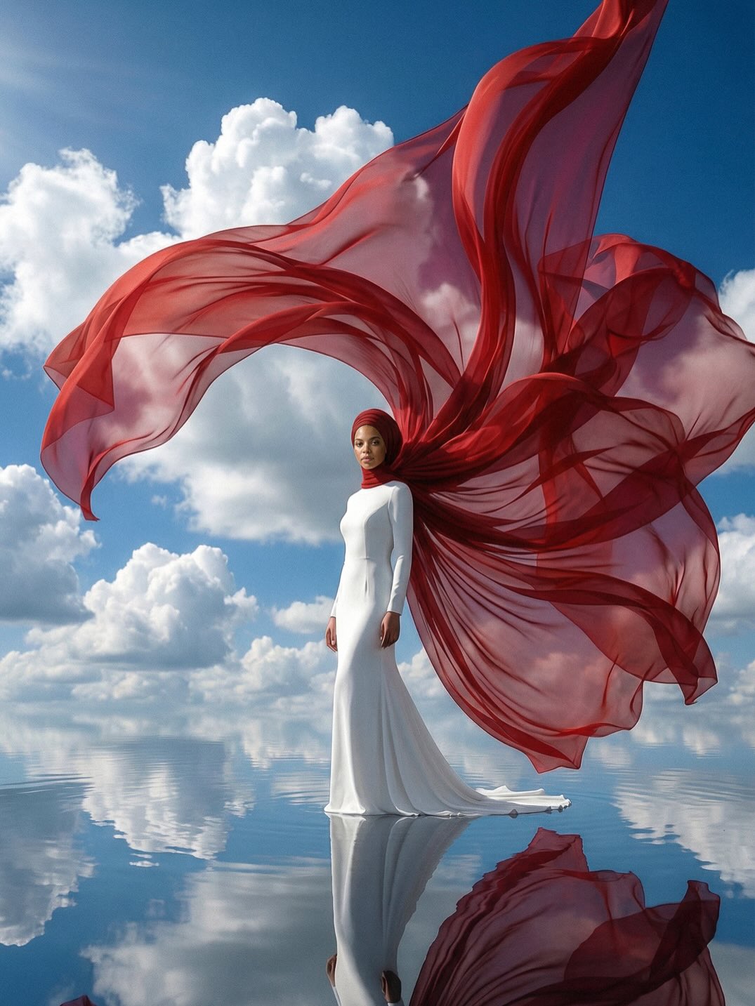
The portrait balances two opposing energies: stillness and motion. The body is calm, upright, and nearly static. The scarf is fluid, wind-driven, and expansive. Because the body holds still, the moving fabric becomes the emotional voice of the image. That is why the portrait feels composed but not cold.
The waterline is equally important. It turns a straightforward portrait into something more conceptual. Reflection introduces a second reading of the figure, but it remains soft and incomplete, which keeps the frame poetic rather than literal.
Why the palette is so effective
| Color choice | Effect |
|---|
| Crimson red | Acts as the emotional and graphic center of the image. |
| White | Creates purity, restraint, and visual breathing room. |
| Blue sky and water | Support the scene without competing with the scarf. |
| Natural skin tones | Keep the portrait human and accessible. |
The image feels refined because it avoids palette complexity. Red does not have to fight for attention. It dominates by design, which is exactly what gives the frame its memorable quality.
Best-fit uses and transfer paths
- Reference for minimalist editorial portraits built around one strong styling gesture.
- Useful for AI prompt work involving reflective surfaces, wind-blown fabric, and sparse composition.
- Good inspiration for beauty campaigns, fragrance visuals, and conceptual portrait branding.
- Strong benchmark for using bold color in a restrained high-fashion frame.
How to adapt the idea without weakening it
If you want to reuse this structure, keep the element count low. That is the point of the image. You can change the scarf color or replace water with another reflective plane, but the composition must stay quiet enough for one accent to dominate.
A reliable variation path is to preserve the calm portrait and the single flowing textile gesture while shifting the background to desert sky, fog, or architectural minimalism. The image works when one strong shape does the emotional work for the whole frame.