How timtadder Created This Red Scarf Water Reflection Anime AI Portrait — and How to Recreate It
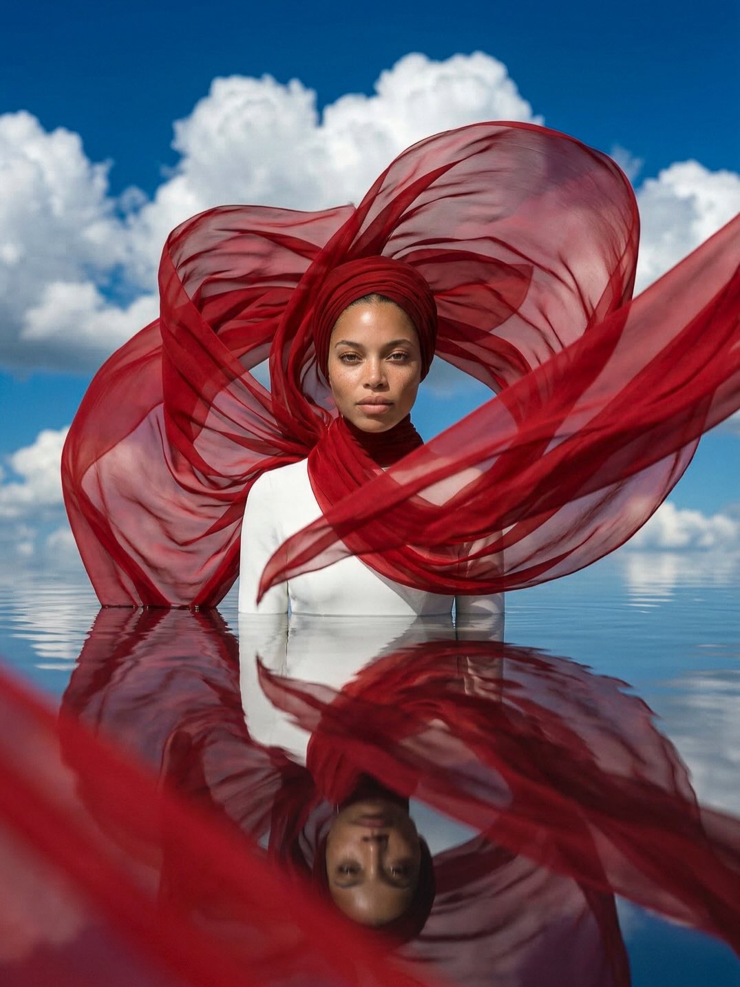
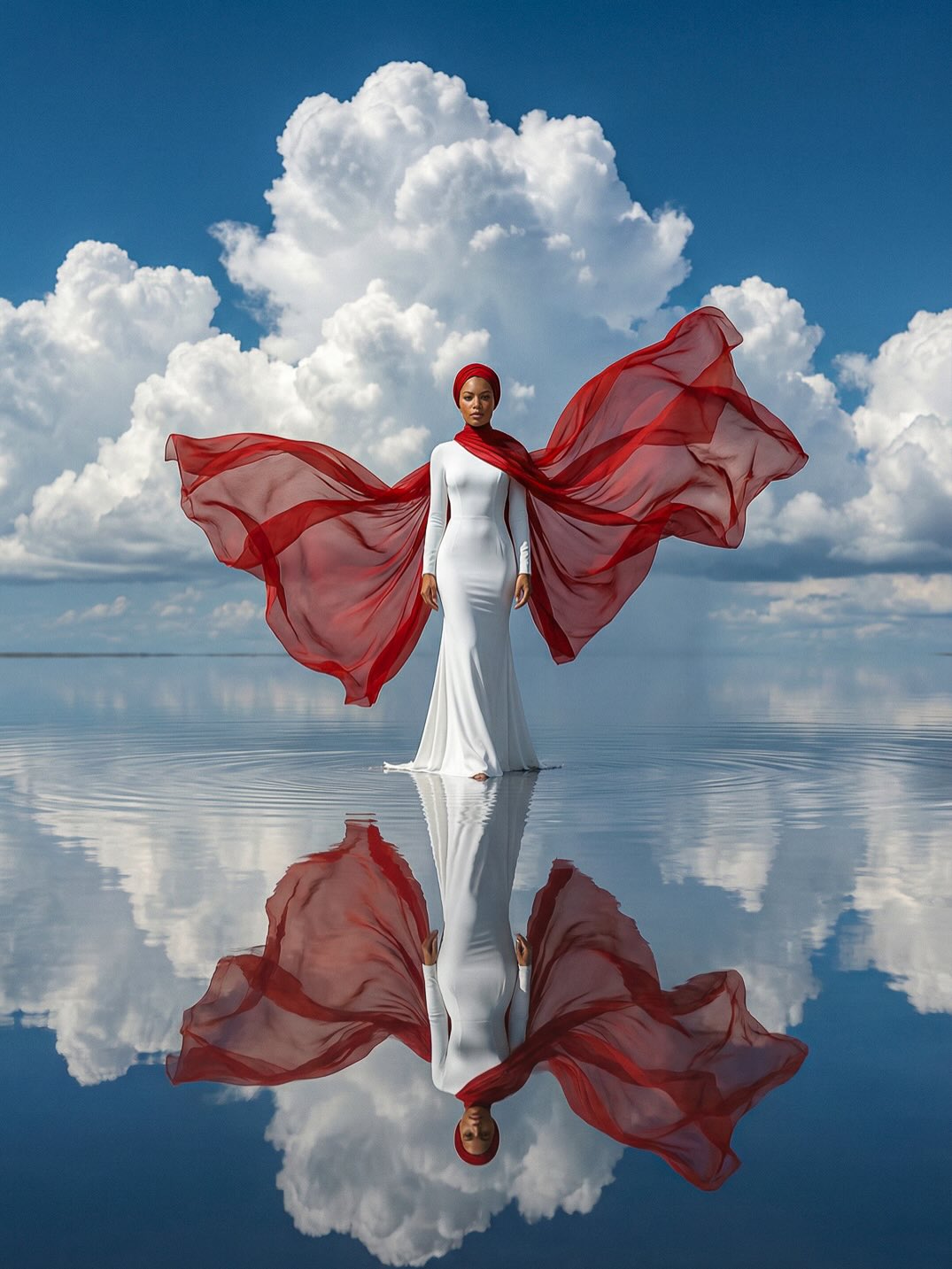
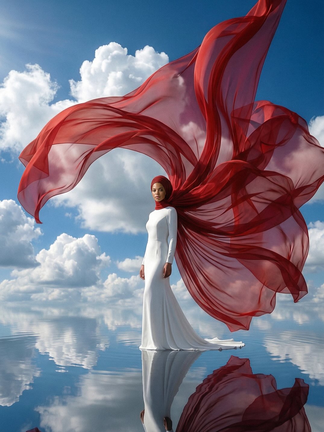
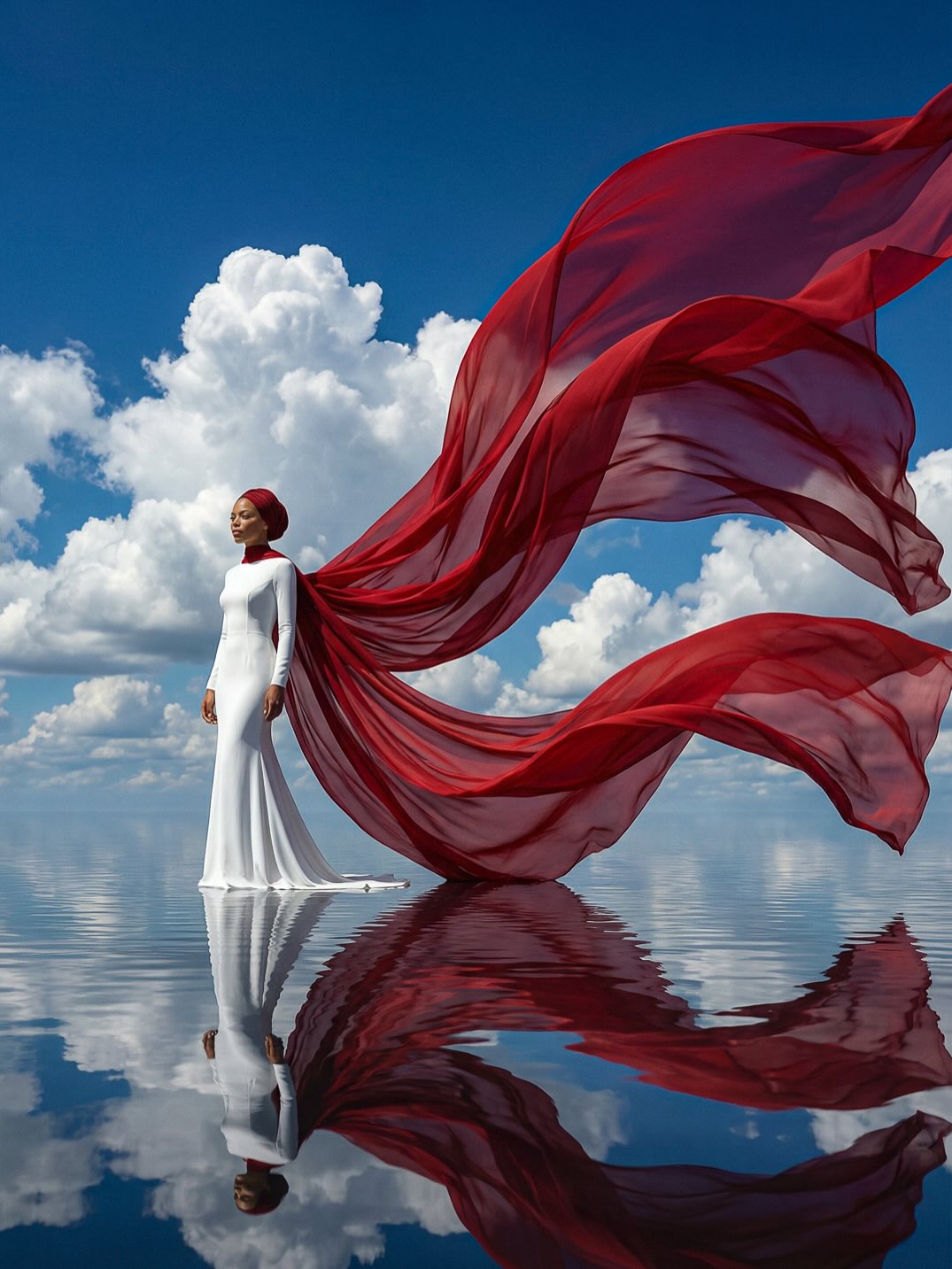
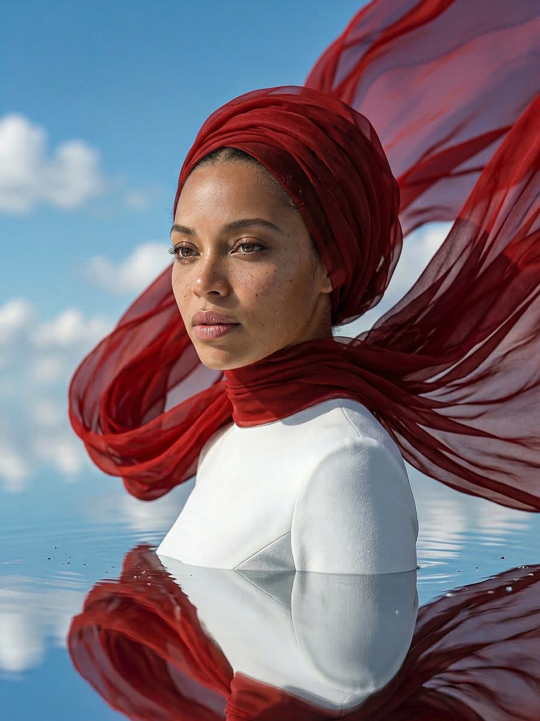
This image stands out because it uses very few ingredients to create a highly memorable editorial concept. There is one woman, one white garment, one deep red headwrap and translucent scarf, one bright blue sky, and one mirrorlike water surface. That is almost everything in the frame. Yet the result feels expansive, luxurious, and symbolic. This is exactly the kind of prompt worth studying because it proves that a strong image does not always come from density. Sometimes a prompt becomes more powerful when it reduces the world to color, geometry, expression, and reflection.
The portrait reads like conceptual fashion photography rather than fantasy illustration or narrative cinema. That distinction matters. The subject is not placed into a busy plot, a city, or an elaborate set. She is staged inside a purified visual system: blue sky, white garment, red scarf, reflective water. Because the image is so reduced, every design choice becomes more important. The red fabric is no longer just a costume accessory. It becomes architecture, framing, movement, and emotional temperature. The reflection is no longer a decorative trick. It becomes the second half of the composition.
For prompt writers, this is a strong lesson in visual economy. Many weak portrait prompts keep adding details in the hope of making the image more interesting. This one becomes interesting by removing almost everything that does not contribute to mood or structure. The result feels intentional and premium, which is exactly why it can work well for editorial design, prompt marketplaces, fashion inspiration boards, or artistic concept collections.
The prompt also succeeds because it understands how styling, environment, and composition can merge into one system. The scarf does not merely sit on the body. It expands into the frame. The sky is not only background. It serves as color contrast against the scarf. The water is not only a setting. It creates symmetry and extends the image downward through reflection. This level of integration is what separates a polished prompt from a random list of visual attributes.
Why the minimal setup feels so rich
Minimalism works best when the chosen elements are visually strong enough to carry emotional and structural weight. In this image, each element does exactly that. The red scarf provides drama and shape. The white garment provides purity and balance. The blue sky provides scale and clean contrast. The water reflection provides mystery and visual echo. The woman’s still expression anchors all of it. Because each element contributes something essential, the scene never feels empty.
Another reason the image feels rich is that the prompt leans into oppositions. Warm red fabric against cool blue sky. Opaque white clothing against translucent scarf. Solid figure above versus fluid reflection below. Calm expression against dramatic sweeping textile shapes. These contrasts create internal energy without requiring crowd scenes, props, or complicated action. When contrast is well organized, simplicity becomes an advantage instead of a limitation.
The image also feels luxurious because the negative space is not accidental. Large areas of sky and water are intentionally left open, allowing the subject and scarf to dominate. That spaciousness creates the feeling of a magazine spread or high-end campaign still. Many AI images become visually cheap when every inch of the frame is filled with texture, ornament, and effects. This prompt avoids that trap by trusting silence and scale.
If someone wanted to build a marketplace-ready portrait series, this setup could be adapted across color families and fabric styles while preserving the same structural logic. That makes the prompt not only beautiful but reusable.
Subject design and emotional read
The woman in the center is written with controlled neutrality, which is a smart decision. A calm serious expression gives the image gravity and helps it read as editorial rather than theatrical. If the expression were exaggerated, smiling widely, or action-oriented, the whole composition would shift away from fashion portraiture. The still face stabilizes the frame while the fabric introduces movement around it.
The medium-brown skin tone also plays an important role in the palette. It creates warmth and realism between the stark white garment and the saturated red textile. That tonal bridge helps the image feel human instead of graphic in an abstract way. For portrait prompts, human tone balance often determines whether the image feels emotionally alive or merely decorative.
The white high-neck garment is another excellent choice. It has enough sculptural structure to feel designed, but it remains minimal enough to let the scarf be the main styling statement. This is good prompt strategy. If both the clothing and the scarf were equally elaborate, the composition would become crowded. By making one element minimal and one element expressive, the prompt establishes a clear hierarchy.
The lack of accessories is equally important. No jewelry, no handbag, no complex props, no background ornament. That absence protects the purity of the concept. In editorial portrait prompts, restraint often produces more authority than accumulation.
How the red scarf carries the composition
The translucent crimson scarf is the true star of the image because it functions on multiple levels at once. It is costume, frame, movement cue, and symbolic color field. Its wing-like spread across the left, right, and top edges turns the portrait into something almost emblematic, as if the subject is suspended inside a visual crest or ceremonial banner. This is much more effective than simply describing “fabric blowing in the wind.” The scarf has a shape role, not just a motion role.
Its translucency is especially powerful because it lets light become part of the styling. The fabric is not read as a flat red mass. It has tonal variation, airiness, and soft luminous edges. That keeps the image elegant. Opaque heavy cloth would create a different mood, more historical or theatrical. The translucent scarf keeps the look modern, airy, and fashion-forward.
Color-wise, the red provides emotional voltage. Red against blue is one of the cleanest ways to achieve visual intensity in an image without overcomplication. The scarf becomes the central emotional statement. It suggests ceremony, confidence, identity, mystery, and controlled drama. Since the rest of the image is restrained, the red never feels chaotic. It feels authoritative.
For prompt writers, this is an important idea: one dominant styling element can replace many smaller decorative details. A single well-defined scarf shape does more work than five accessories ever could.
Reflection as structure, not gimmick
Reflections are often used in AI prompting as novelty, but here the reflection is structural. The lower half of the composition is not empty filler. It extends the portrait, repeats the red and white palette, and creates a second focal rhythm beneath the subject. That means the image reads almost like a diptych inside a single frame: the living figure above and the softened mirrored echo below.
This is what makes the water valuable. The surface is still enough to preserve clarity, but soft enough to feel dreamlike. That balance keeps the reflection elegant. If the water were too rippled, the image would become noisy. If it were a perfect digital mirror, it might feel artificial. The prompt wisely positions the reflection somewhere between realism and poetic stylization.
The waterline cropping is also effective. Since only the upper torso is visible above the surface, the body becomes partially abstracted. That abstraction helps the portrait feel conceptual. The viewer is not asked to read a full-body fashion pose. Instead, the subject appears almost to emerge from color and sky. This adds a slight surreal edge without breaking the editorial realism.
When writing similar prompts, creators should think of reflective surfaces as compositional partners. They are strongest when they reinforce symmetry, mood, and hierarchy rather than simply showing off technical effects.
Color palette and graphic clarity
The blue, red, white palette is doing extraordinary work in this image. Blue establishes openness, scale, and clarity. Red introduces intensity and identity. White provides calm, structure, and visual breathing space. These three colors are enough to create a poster-like graphic statement while still feeling photographic. That is one reason the image is so memorable at thumbnail size.
Importantly, the prompt does not contaminate the palette with unnecessary extra accents. There is no gold jewelry, no green landscape, no multicolored background decoration. That restraint makes the palette feel premium and deliberate. In AI generation, palette discipline often produces stronger outputs than hyper-descriptive color clutter.
The sky is especially important because it acts as a clean stage for the scarf silhouette. The cumulus clouds add softness and realism without competing with the main subject. They keep the upper background alive, but they do not interrupt the strong red shape language. This is a subtle but valuable lesson: backgrounds can be atmospheric without becoming compositionally noisy.
If adapting the prompt into a series, you could shift the dominant fabric color while keeping the white garment and mirror-water structure constant. That would allow creators to build multiple collectible images from the same underlying visual system.
Editorial value and prompt-writing lessons
This prompt is highly valuable for creators who want to make AI imagery that feels editorial, refined, and print-friendly. It provides a repeatable formula: one central figure, one dominant fabric gesture, one minimal garment, one open sky, one reflective base, one serious expression. That formula is broad enough to support many variations but specific enough to produce visually coherent results.
The first major lesson is that visual hierarchy matters more than detail count. Everything in the image serves the same central idea. The second lesson is that fabric can be treated as architecture. The third lesson is that environment should reinforce styling rather than distract from it. The fourth lesson is that a reflection can deepen the concept if it is used to extend the composition rather than merely decorate it.
For commercial usage, this style of image can work for prompt packs, concept art references, design portfolio pieces, social headers, editorial cover concepts, premium art prints, and brand moodboards. It has enough conceptual elegance to appeal to people beyond fandom communities because its power comes from composition and color rather than from narrow franchise references.
Ultimately, what makes this image concept strong is its confidence. It knows exactly what it wants to show: one woman, one red textile gesture, one clear sky, one reflection, one mood. That clarity is what gives the prompt authority. It is a reminder that the strongest AI images often come from a few decisive ideas executed with discipline.