@chloe.vs.history content — AI art

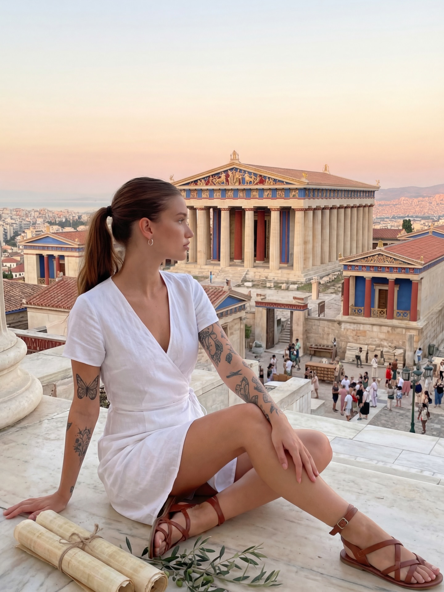
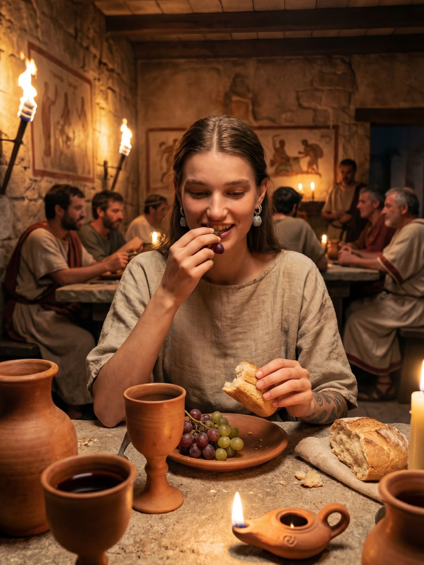
Lately 😎 I don’t mind being lost in history tbh #historyvlogger #chloevshistory #timetraveller #ancientrome #ancientegypt

How chloe.vs.history Made This Time Travel Fashion AI Portrait

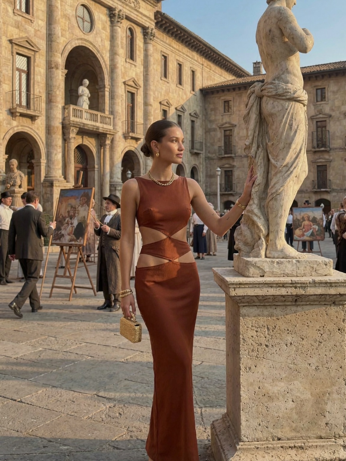
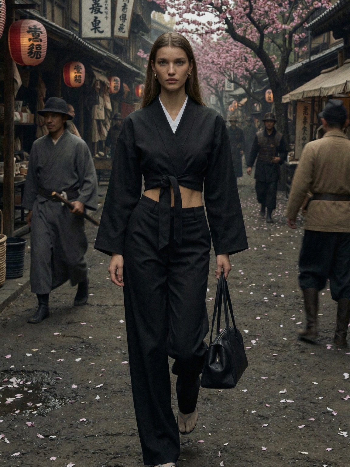
If you create lifestyle, travel, fashion, or history-adjacent content, this kind of image is a cheat code: it reads like a story, not a selfie. The viewer doesn’t just see an outfit—they feel a scene.

Why it spreads (without feeling like an ad)

The hook is the contradiction: a modern, sculpted dress placed inside a world that looks centuries old. Your brain immediately tries to resolve it—Is this a film set? A time-travel moment? A fashion editorial? That split-second curiosity buys you the most precious commodity on social: a pause.

Then the image rewards the pause. The statue isn’t just decoration; it’s a visual “partner” that frames the subject and makes the scene feel curated, like a museum you can step into. The background easels add a second narrative layer—art within art—so the viewer keeps scanning. And because the light is warm and directional, it feels expensive even if the production wasn’t.

Finally, the caption concept (“I don’t mind being lost in history”) is not informational—it’s identity. People share identity statements. When your post feels like a vibe someone can borrow, they repost it, stitch it, save it, and reference it later as a template.

Signal table: what the image is quietly doing

Signal Evidence (from this image) Mechanism Replication Action
Time-contrast story Modern cutout gown against Renaissance stone + sculpture Juxtaposition triggers curiosity and “what is this?” scanning Lock a single modern “hero” element (wardrobe) inside an unmistakably historical setting
Editorial authority Golden-hour directional light + clean framing Looks like a magazine still, not a random travel photo Prompt for “editorial fashion photo” and specify warm low-angle sunlight from one side
Built-in foreground anchor Large marble statue in the right foreground Foreground object creates depth and makes the scene feel staged Add a single foreground prop (statue/column/arch) and place it on the opposite third from the subject
Secondary narrative texture Easels with paintings + period-ish extras in the background More micro-details = longer dwell time and more saves Introduce one “scene activity” detail (art market, reenactment, set crew) but keep it softly blurred

Where this format fits (and where it doesn’t)

Best-fit scenarios

  • Travel creators: use a landmark-like courtyard; change the wardrobe to match your niche (linen for “quiet luxury,” leather for “night out”).
  • Fashion + styling accounts: keep the historic backdrop; swap the dress silhouette (strapless, blazer-dress, corset) while locking the same light direction.
  • History/education creators: keep the “lost in history” mood; add a subtle period prop (scroll, map) and let the caption carry the lesson.
  • Brand campaigns: keep the editorial framing; change clutch/jewelry to product focus but avoid obvious product centering.
  • Romance/fiction accounts: keep the statue + arches; change expression/gesture to “waiting,” “discovering,” “arriving.”

Not ideal

  • Fast product demos: this image invites lingering, not quick comprehension.
  • Comedy punchlines: the vibe is cinematic; jokes can feel mismatched unless you push the contrast harder.
  • Technical tutorials: too much atmosphere can dilute clarity unless you add close-ups and step visuals.

Transfers (3 recipes)

  1. Recipe 1: Museum-night editorial

    • Keep: warm side light, marble/stone textures, portrait lens compression
    • Change: indoor museum hall, evening attire, glass reflections
    • Slot template: “{museum hall} {evening wardrobe} {single foreground sculpture} {quiet cinematic mood}”
  2. Recipe 2: Ancient city street fashion

    • Keep: golden hour, historic stone palette, shallow depth of field
    • Change: narrow alley, street vendors, different hero accessory
    • Slot template: “{ancient street/alley} {hero outfit} {one iconic prop} {sunlit late afternoon}”
  3. Recipe 3: Period painting come alive

    • Keep: editorial composition, soft background extras, warm highlights/cool shadows
    • Change: make the easels the narrative core, add painter’s tools, shift wardrobe to subtle vintage
    • Slot template: “{open-air art market} {vintage wardrobe} {easels + framed paintings} {timeless storybook tone}”

Aesthetic read: what you should notice before you prompt

This image succeeds because it is simple in structure and rich in texture. The subject occupies the left third, while the statue anchors the right—two vertical shapes that feel balanced without symmetry. The background is busy (arches, people, easels), but it never competes, because it’s pushed gently out of focus. That “readable blur” is a huge difference-maker: it lets viewers feel place without forcing them to decode every detail.

The color palette does most of the emotional work. Beige stone and warm sunlight set a timeless base, and the rust dress becomes the only strong chroma. The sky is a clean pale blue, which prevents the warmth from turning muddy. Notice the shadows: they’re cool, not gray. That small choice makes everything feel more cinematic and less like phone-camera processing.

Finally, the textures are tactile: marble, stone pavement, satin fabric, brushed gold. When your image has multiple believable materials, it looks expensive even if the scene is minimal. That’s why this style gets saves: creators want to reverse-engineer it.

Prompt technique breakdown (think in control knobs)

Prompt chunk What it controls Swap ideas (EN, 2–3 options)
Subject + gesture Story tone and attention direction “looking over shoulder”, “hand grazing stone texture”, “walking mid-step”
Wardrobe hero Modern-vs-historical contrast level “black blazer dress”, “silk slip dress”, “tailored ivory suit”
Historic setting Instant context + perceived production value “Renaissance courtyard”, “ancient forum ruins”, “baroque museum atrium”
Foreground anchor Depth and editorial staging “marble statue”, “stone column”, “arched doorway in foreground”
Lighting direction “expensive” look and mood “golden hour side light”, “soft window light”, “late-afternoon rim light”
Lens + depth of field Separation and realism “85mm portrait”, “70mm medium tele”, “shallow depth of field f/2.0”

Baseline prompt (start here, then iterate)

editorial fashion photo, full-body portrait, modern cutout dress in a historic Italian piazza courtyard,
marble statue on a stone pedestal in the foreground, golden-hour side light, 85mm lens feel, shallow depth of field,
warm stone architecture, subtle background extras, cinematic color grading, photorealistic

Remix steps: converge fast, then get fancy

Baseline Lock (lock these first)

  • Composition: subject on one third, statue/anchor on the opposite third.
  • Lighting direction: warm low-angle sunlight from one side (and keep it consistent across runs).
  • Lens feel: short-tele portrait compression with gentle background blur.

One-change rule

Change only 1–2 knobs per generation. If you change wardrobe, setting, and lighting at once, you’ll never know what broke the “editorial” feeling.

Example 4-step iteration

  1. Run 1: Get the plaza + statue + golden-hour light correct. Accept a generic outfit.
  2. Run 2: Lock the exact wardrobe silhouette (cutouts, fabric sheen). Keep everything else fixed.
  3. Run 3: Add a single narrative texture (easels/paintings) and push it into soft blur.
  4. Run 4: Micro-tune realism (skin texture, jewelry, marble detail) and reduce any HDR look.
Quick troubleshooting checklist
  • If it looks “flat”: specify directional side light and warm highlights/cool shadows.
  • If the background steals attention: increase background blur and reduce background contrast.
  • If it loses the time-travel vibe: make the setting unmistakably historic (arches, stone, statues).