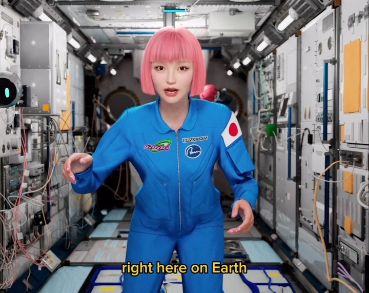
みなさん、宇宙に行きたいですか?
近々、宇宙行かなくても体験できるかも!?
ということで、AwwとSPACEDATAが提携発表し、バーチャルヒューマンとデジタルツインの融合を加速させていくとのことですっ🚀
これは未来をまたひとつ新しくするかもしれません。
今後の活動楽しみにしていてくださいっ🚀🌏
Do you all want to go to space? ✨
Not everyone can go, but what if we can experience something similar on Earth?
The fusion of a virtual human like me and a digital twin—this could be another step toward a new future🧠
Stay tuned for what’s coming next! 🚀🌏
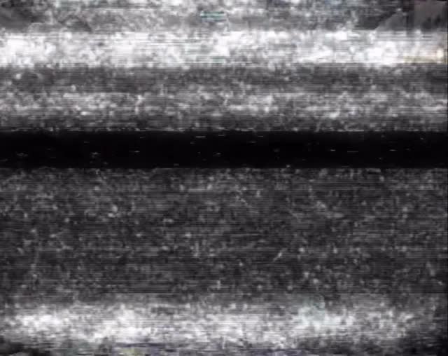
The CRT Static: How imma.gram Built This AI Signal Art
At first glance this looks like a broken frame, but that is exactly why it can work in social feeds. Most posts compete with polished beauty and predictable composition. A monochrome interference plate interrupts that rhythm immediately, forcing the viewer to ask a question: is this an error, a code, or a teaser? Curiosity is a stronger hook than decoration when your audience is already saturated with perfect visuals.
What makes this specific frame usable is structure. It is not random noise; it has controlled horizontal hierarchy: bright top turbulence, a heavy dark divider, and a second bright band near the bottom. That layered rhythm feels like a transmission moment, which aligns naturally with future-tech narratives such as virtual humans, digital twins, and space-themed storytelling. In other words, the texture itself becomes message scaffolding.
The growth angle is sequencing. A frame like this is most effective when paired with context in caption or carousel: "signal detected," "incoming update," "from earth to orbit," and then reveal. As a standalone artwork it is niche, but as a narrative hinge between announcement beats, it can dramatically increase retention and comment speculation.
Signal Table
Signal
Evidence (from this image)
Mechanism
Replication Action
Pattern interruption
No character, no product, just analog-like interference
Breaks feed expectations and triggers instant curiosity pause
Insert one deliberate "non-beauty" frame inside a polished content sequence
Transmission metaphor
Horizontal noisy bands resemble unstable broadcast signal
Viewers infer "something is incoming," boosting anticipation
Pair glitch frame with future-facing copy and a timed reveal in next post/story
Low-information tension
Ambiguous abstract texture with no explicit subject
Audience fills narrative gaps, creating comments and guesses
Keep ambiguity high in visual, but give one directional clue in caption
Where This Style Fits and Where It Does Not
Teaser campaigns for launches: excellent because uncertainty creates speculation. Change only the caption clue each time.
Virtual influencer / AI identity storytelling: strong fit with "signal," "sync," and "digital twin" narratives.
Music, sci-fi, and tech drops: works as an interlude frame between hero visuals.
Story-based carousel pacing: useful as a chapter break before the reveal slide.
Not Ideal
Direct conversion ads: no product clarity, weak for immediate purchase intent.
Portfolio-first art grids: can reduce perceived craft if used too often without context.
Brand systems requiring cheerful tone: grayscale interference may feel too cold or ominous.
Three Transfer Recipes
Recipe 1 Keep: monochrome interference base, horizontal band hierarchy. Change: caption narrative and CTA timing. Slot template (EN): {glitch_density} analog signal frame, {narrative_hint} copy, reveal in {next_touchpoint}
Recipe 2 Keep: no-subject ambiguity, high grain texture. Change: brightness distribution and emotional tone. Slot template (EN): {tone_word} grayscale interference with {top_band_intensity}, {mid_band_depth}, {bottom_band_glow}
Recipe 3 Keep: CRT-like realism and degraded texture. Change: platform format and sequence position. Slot template (EN): {format} pre-reveal glitch plate for {campaign_theme}, placed at step {sequence_index}
Aesthetic Read: Controlled Noise Is Still Design
This frame works because noise is organized, not accidental. The strongest visual decision is horizontal stratification: bright turbulence at the top, dark compression in the center, and a lifted base band. That gives the image directional flow even without a subject. Viewers subconsciously read it as a scanning or syncing event.
The grayscale-only palette is another quality signal. Removing color eliminates distraction and makes luminance contrast the main storytelling tool. Grain size is also important: the speckles are fine enough to feel analog, but dense enough to avoid looking like empty blur. Together, those choices create a tactile texture that feels archived, technical, and slightly cinematic.
Most creators underestimate transitional visuals. They focus on hero frames but ignore pacing frames. This kind of controlled interference can reset viewer attention between two polished shots, increasing perceived narrative depth. In short, the craft here is not "beauty rendering" but rhythm engineering across a content sequence.
Prompt Technique Breakdown
Prompt chunk
What it controls
Swap ideas (EN, 2-3 options)
"monochrome analog interference, no figurative subject"