🎉 ✨ THE WAIT IS OVER! ✨🎉
Hari ini kami dengan bangga mempersembahkan GRAND LAUNCHING KOLABORASI RESMI FANTECH x hololive INDONESIA! 🌟
💡 Apa yang spesial di kolaborasi ini?
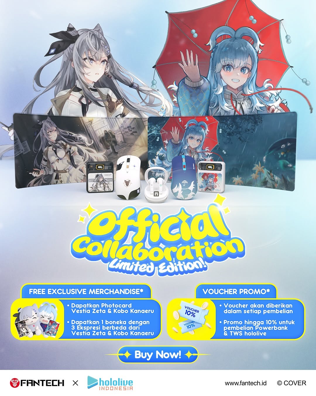
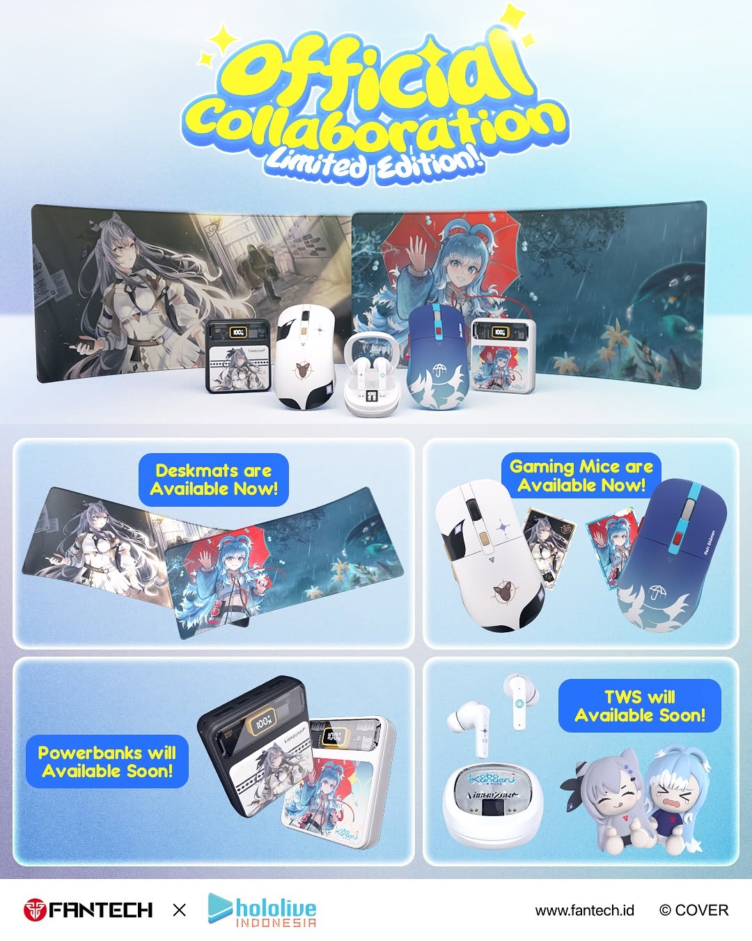
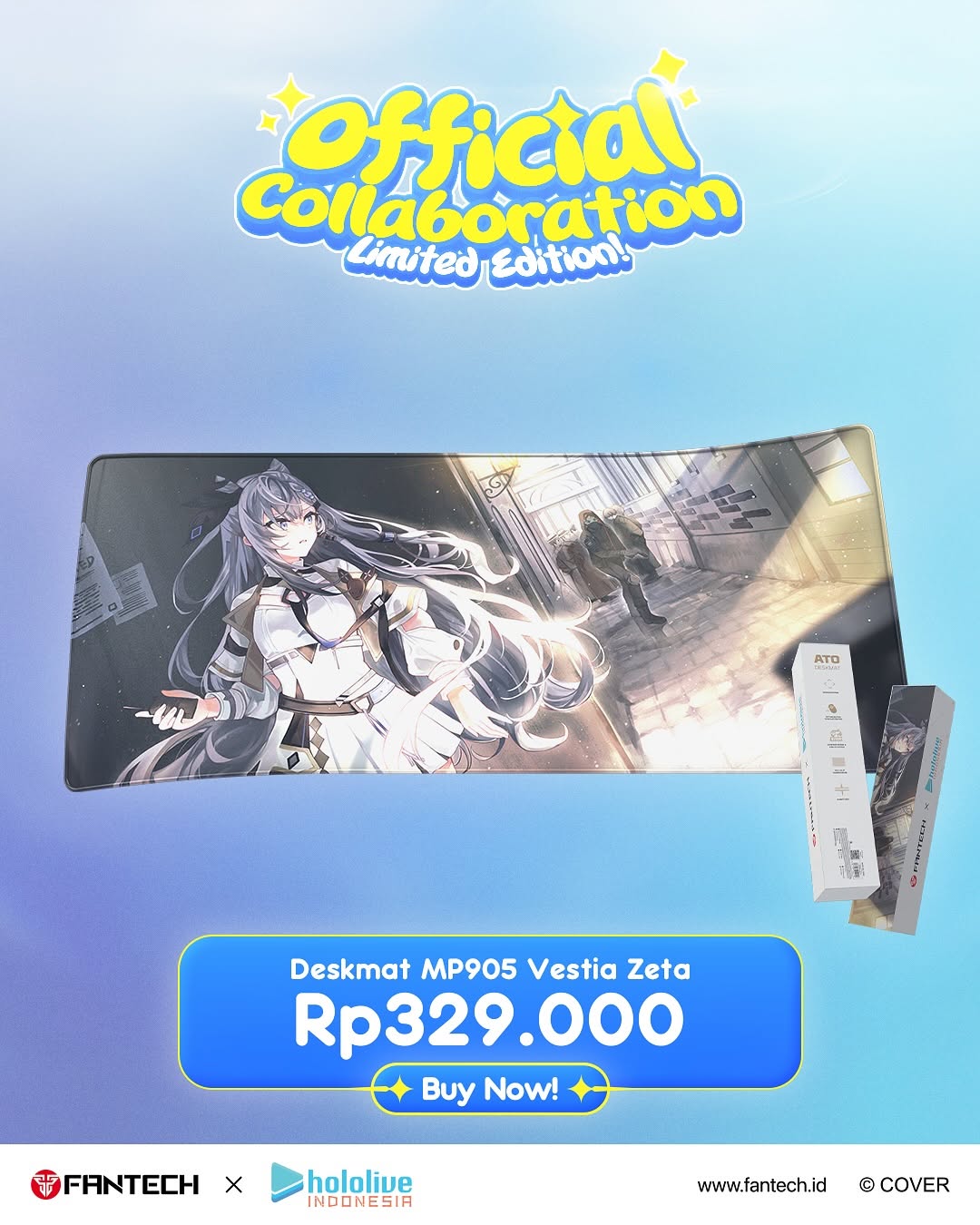
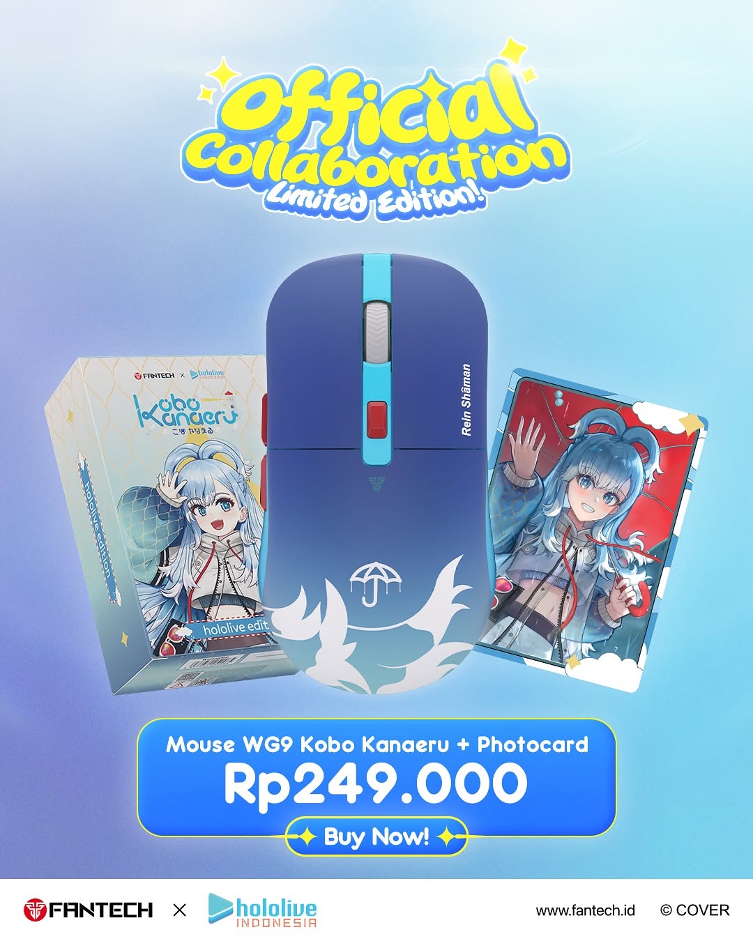
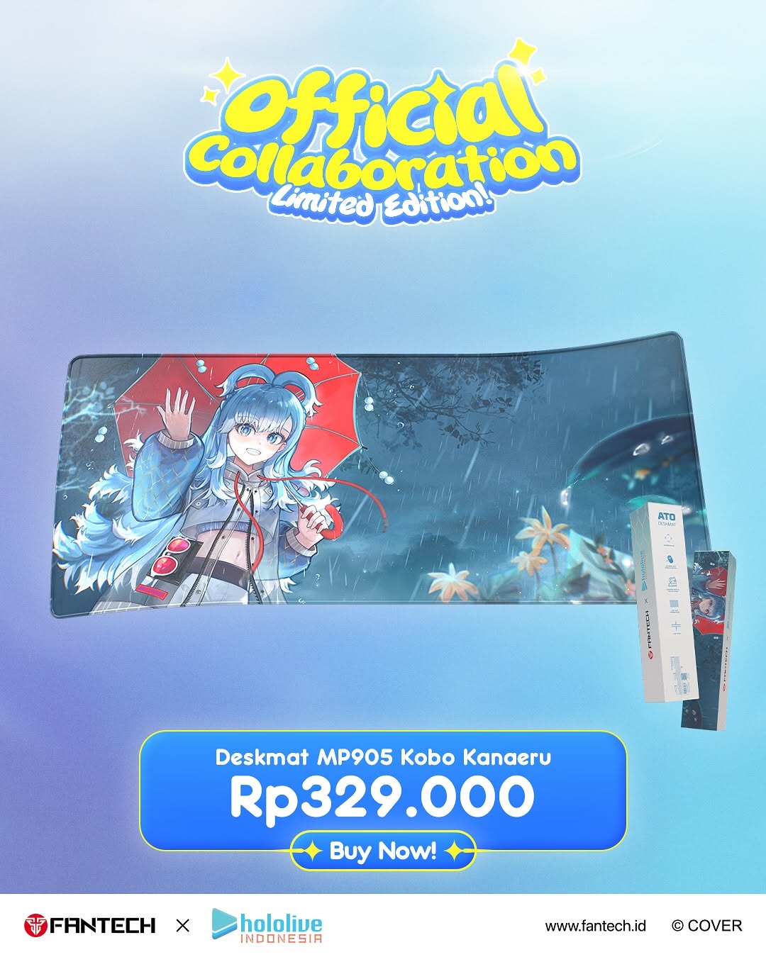
✅ Produk-produk Fantech favorit kini hadir dengan sentuhan eksklusif Vestia Zeta dan Kobo Kanaeru dari hololive Indonesia.
✅ Desain, kualitas, dan performa yang dirancang untuk gamer, kreator, dan para fans sejati.
✅ Limited Edition yang hanya tersedia pada periode launching ini!
#Fantech #hololiveindonesia #FantechXhololiveID #VestiaZeta #KoboKanaeru #GrandLaunching #OfficialCollaboration
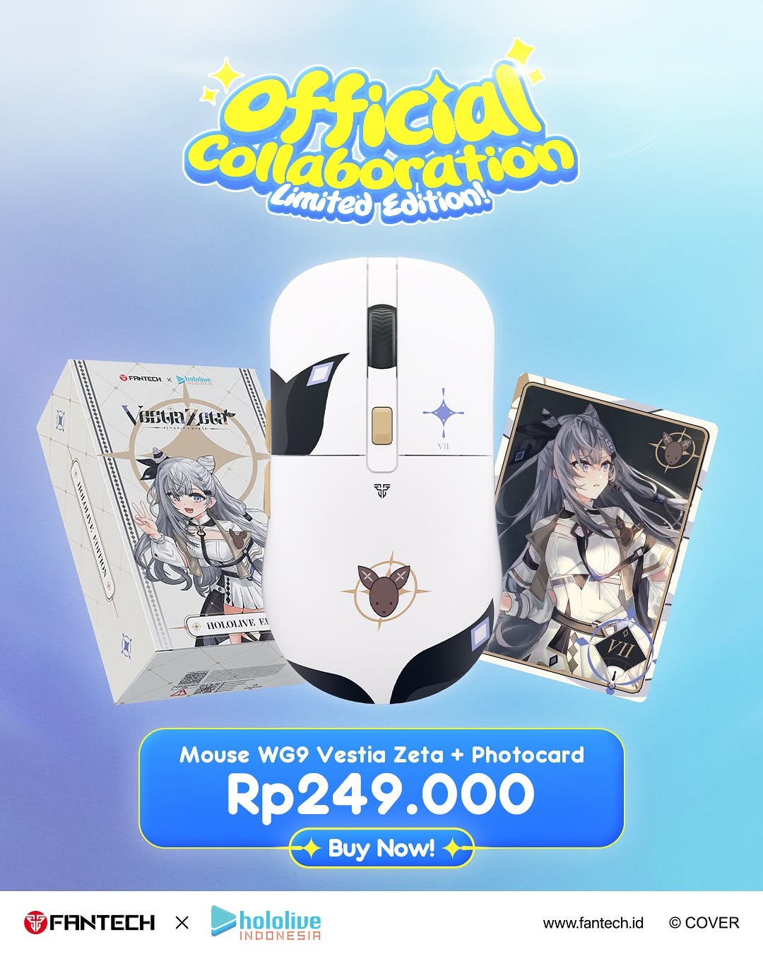
The Fantech Hololive Indonesia Mouse Collab: How kobokanaeru Built This AI Art
This visual is built like a conversion funnel, not just an illustration. The top headline confirms scarcity and legitimacy (“Official collaboration”, “Limited Edition!”), the center object cluster shows what you get, and the bottom price card removes decision friction immediately. The user does not need to scroll to understand offer, value, and action.
Another strong move is object triangulation: mouse in the center, packaging on one side, photocard on the other. That arrangement communicates “bundle completeness” in one glance. It also keeps attention inside the frame because each object points back to the center hero product.
Signal Table: Viral + Conversion Mechanics
Signal
Evidence (from this image)
Mechanism
Replication Action
Instant offer clarity
Product name + bundle mention + price visible above fold
Reduces cognitive delay and increases click intent
Always surface bundle contents and final price in main frame
Collab credibility cue
Top headline and partner logos at footer
Brand association increases trust and urgency
Place collaboration proof in both header and footer zones
Visual bundle proof
Mouse + box + photocard shown together
Physical completeness increases perceived value
Show all included items in one composition, not separate slides
CTA hierarchy
Large price block with Buy Now button directly beneath
Eye naturally descends from desire to action
Use one dominant CTA block in lower third with strong contrast
Best-fit Use Cases and Transfers
Limited merch drops: ideal when urgency and collectible value matter.
Gaming peripheral launches: works because function + fandom can be shown together.
Anime collaboration announcements: especially strong when character art is a key purchase trigger.
D2C campaign ads: great for paid social where one-frame clarity is critical.
Not ideal:
Luxury minimal brands that avoid loud typography and badge-style graphics.
Music Artist Merch Variant — Keep: bundle proof and scarcity language. Change: character card to signed photo card. Slot template: {limited_drop_header}, {main_product}, {collector_bonus}, {clear_price_cta}
Aesthetic Read: What to Lock First
The aesthetic is cheerful commercial clarity. Blue gradient creates trust and calm, yellow headline accents signal excitement, and white product body keeps the center clean. Typography is intentionally playful at the top but serious at the price level, which balances hype and transaction logic.
Observed
How to recreate
Top playful headline with subtitle
Use rounded high-contrast display type plus one small scarcity subline
Center hero object dominance
Make the main product 20-30% larger than side objects
Bundle objects framing hero
Angle left/right items inward to direct attention to center
Bottom conversion block
Combine offer text, price, and CTA in one bold rounded panel