The Kobo Kanaeru Collaboration: How kobokanaeru Built This AI Art
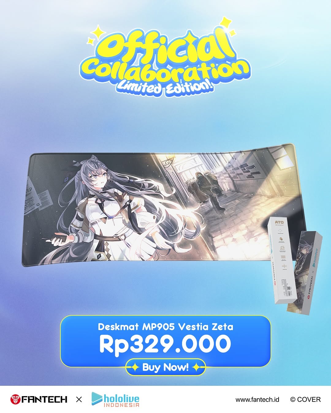
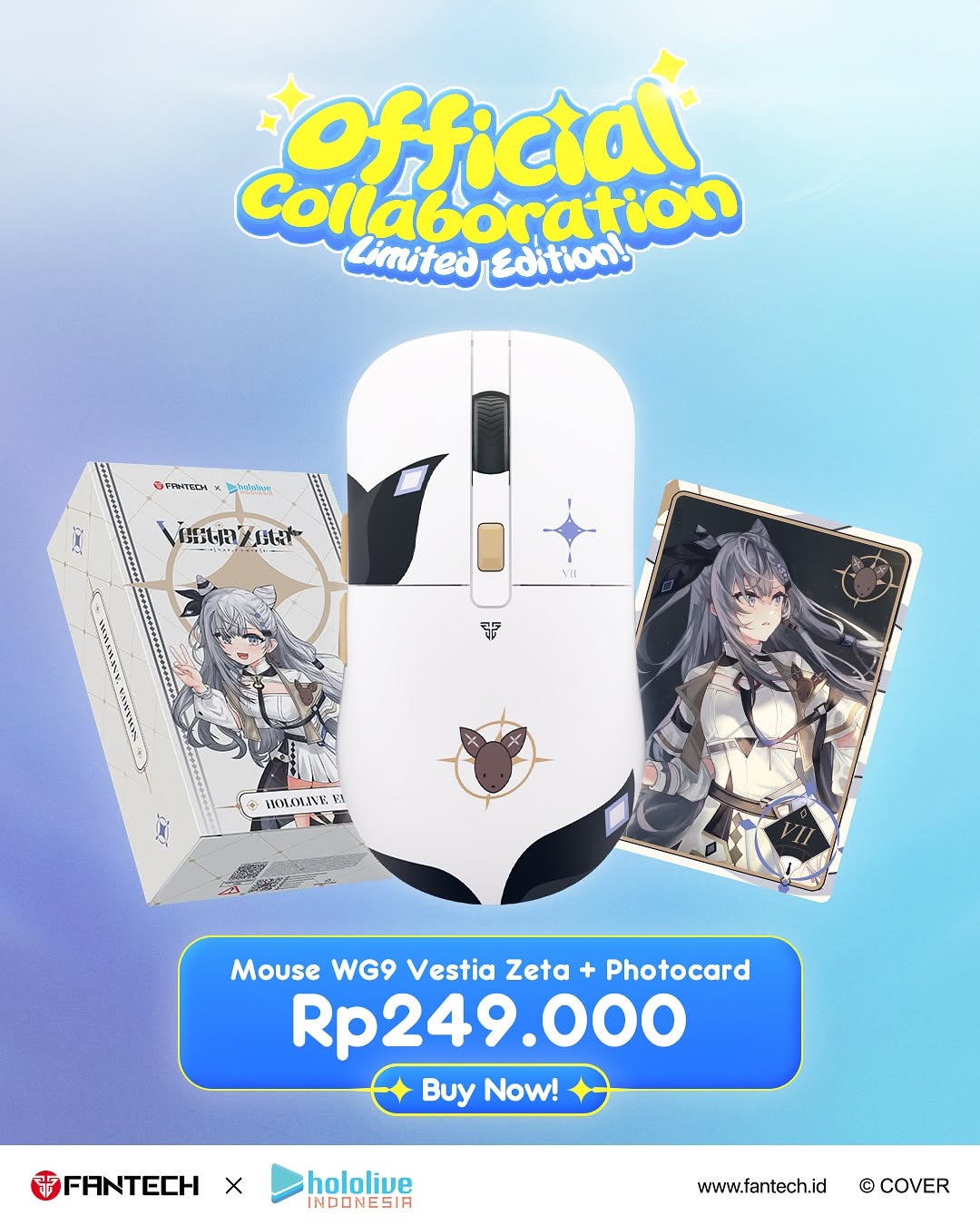
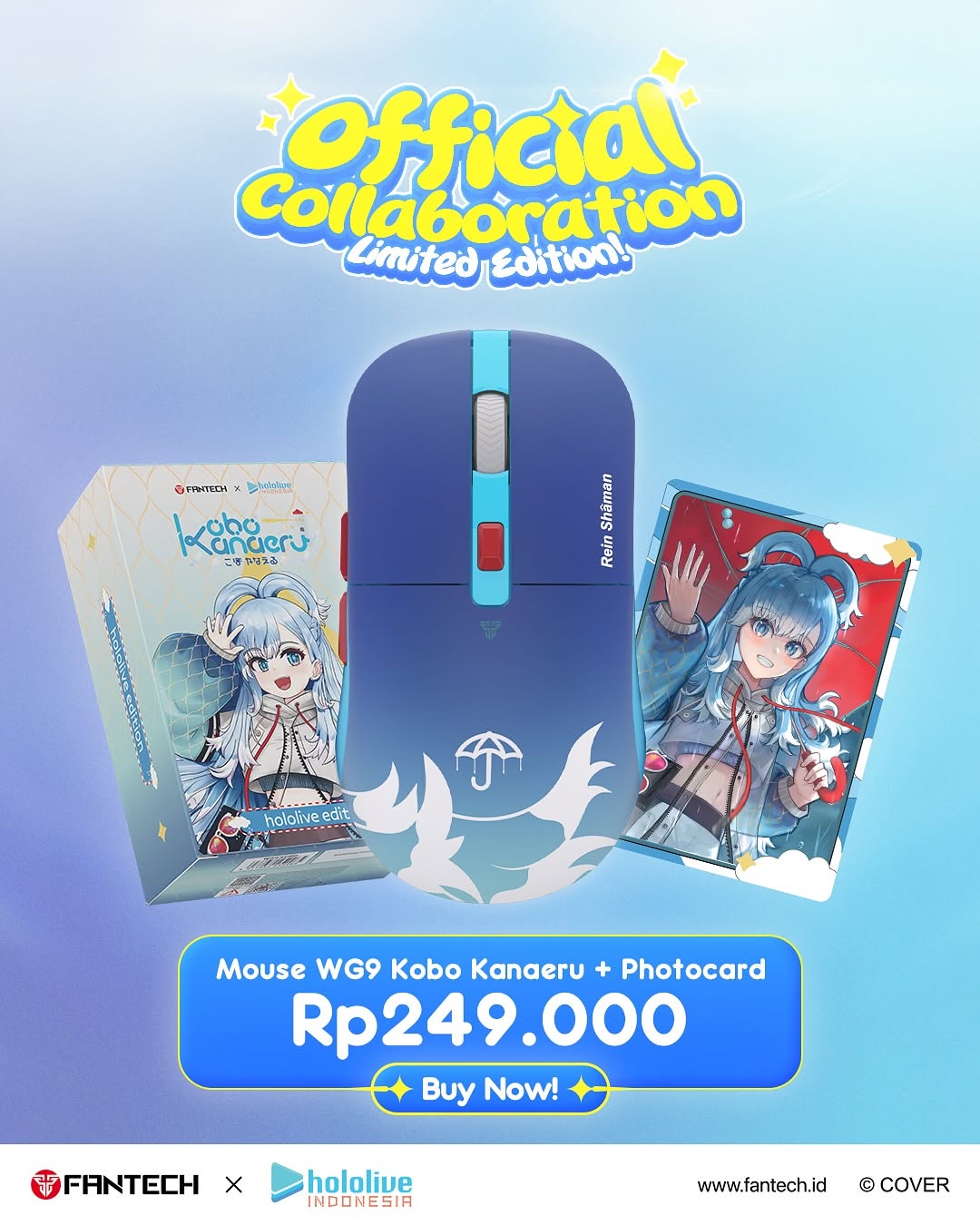
This creative works because it is built for immediate shopping comprehension. In one vertical frame, the viewer gets the collaboration headline, hero product visual, exact product name, clear price, and direct CTA. There is almost zero ambiguity, which is critical during launch windows when attention is short.
The design also balances fandom and commerce. Anime artwork drives emotional interest, while clean price/CTA blocks drive action. Many collab posts lean too far toward hype visuals and hide buying details. This card avoids that mistake by keeping the funnel visible end-to-end.
Signal Table
| Signal | Evidence (from this image) | Mechanism | Replication Action |
|---|
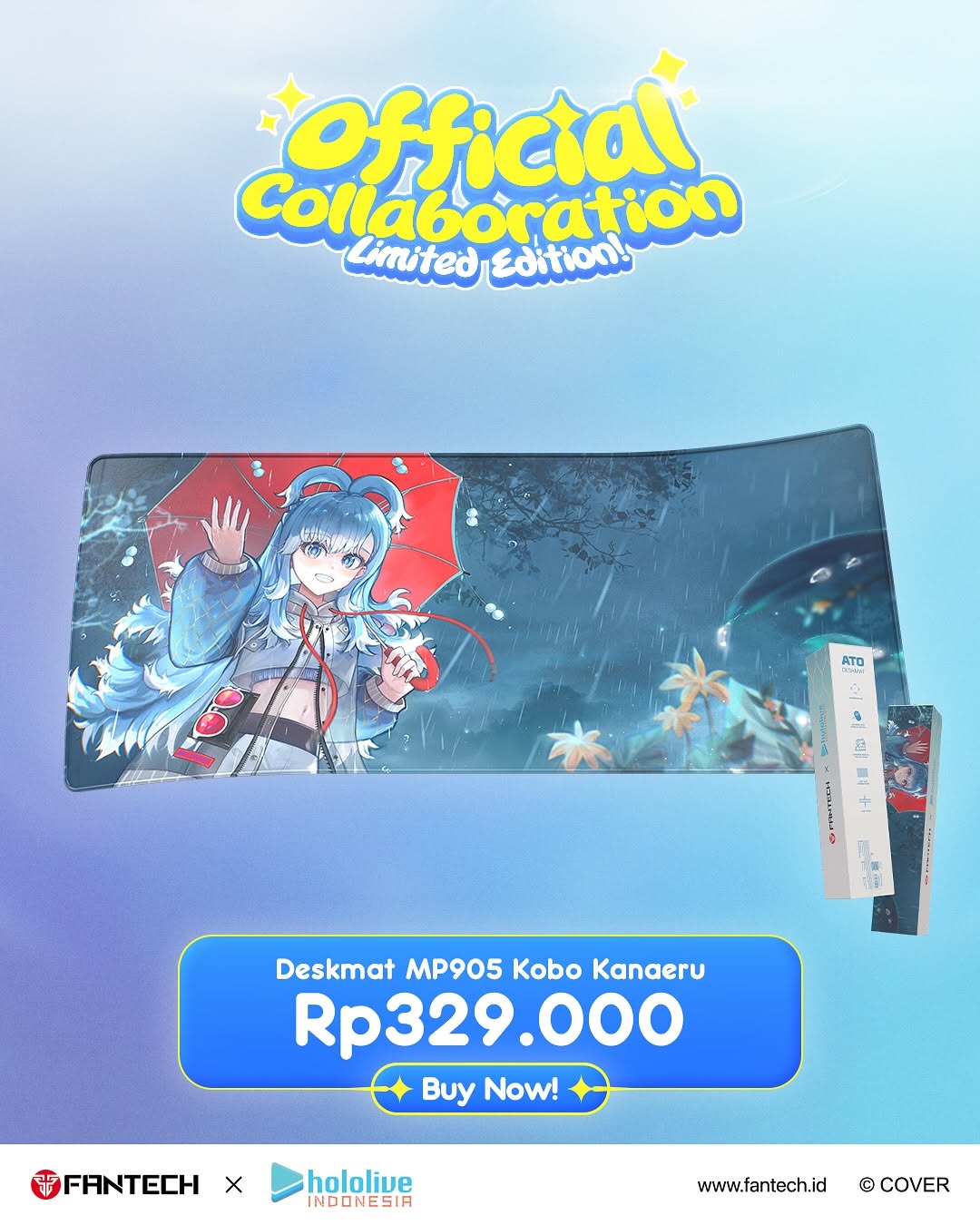
| Complete funnel in one frame | Headline, product, price, CTA, and logos all visible | Reduces decision friction and speeds purchase intent | Always include core purchase fields in launch hero cards |
| Fandom anchor visual | Deskmat artwork features recognizable anime character styling | Emotional pull increases stop-rate and saves | Lead with character art before technical details |
| Price clarity | Large "Rp329.000" in dedicated block | Transparent pricing improves trust and click readiness | Use one oversized local-currency price block above CTA |
| Brand reassurance | Footer includes collaboration logos and website | Official marks reduce counterfeit skepticism | Keep partner logos and destination URL visible on launch cards |
Use Cases and Transfers
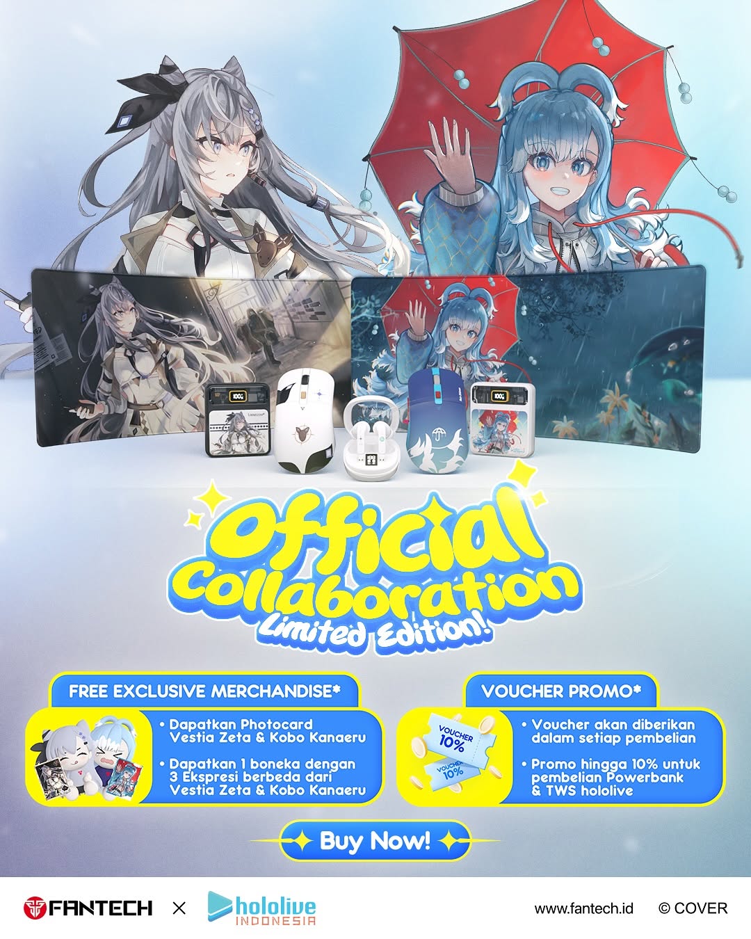
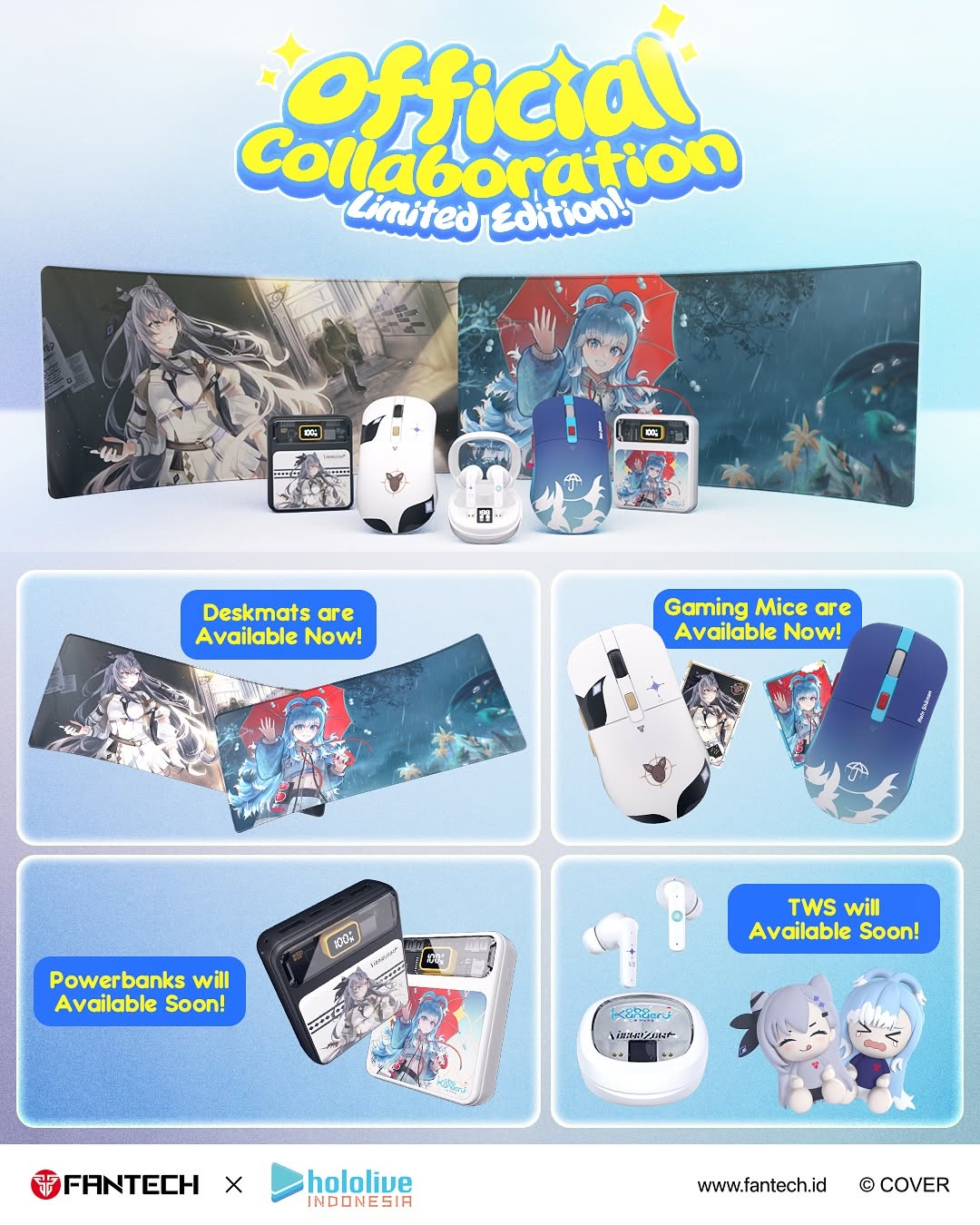
- Limited-edition merch drops: ideal for short launch periods with high urgency.
- Gaming accessory promotions: strong for desk setups, peripherals, and collab skins.
- Creator x brand release posts: useful when balancing fan hype and buying action.
- Paid social conversion creatives: effective as direct-response ad format.
Not Ideal
- Story-rich documentary posts: commercial hierarchy can feel too sales-heavy.
- Premium minimalist branding: dense informational blocks may clash with sparse systems.
- Long-form technical explainers: single card cannot carry deep product spec narrative.
Three Transfer Recipes
- Keyboard collab transfer
Keep: top collab badge + center product hero + bottom price CTA.
Change: deskmat to mechanical keyboard hero shot.
Slot template (EN): {collab_title_top} + {hero_product_center} + {local_price_cta_bottom} - Apparel drop transfer
Keep: clear funnel structure and partner logo footer.
Change: product image to tee/hoodie with character print.
Slot template (EN): {limited_label} with {apparel_visual} and {price_button_block} - Digital asset transfer
Keep: readability-first poster architecture.
Change: physical packaging image to digital pack preview tiles.
Slot template (EN): {official_drop_header} + {asset_preview} + {pricing_and_access_cta}
Aesthetic Read
The card uses bright gaming-commerce language without becoming noisy. A soft blue gradient creates depth and friendliness, while yellow title accents signal excitement. The deskmat sits as a wide horizontal slab in the center, giving the eye a stable product anchor. Below it, the large numeric price provides practical clarity. This is a good example of commercial design that still preserves fandom energy.
Prompt Technique Breakdown
| Prompt chunk | What it controls | Swap ideas (EN, 2-3 options) |
|---|
| Collaboration badge headline | Launch authority | "Official Collaboration", "Limited Edition", "Grand Launch" |
| Hero product placement | Visual focus | "center floating deskmat", "angled product hero", "main SKU showcase" |
| Price block scale | Purchase clarity | "large local-currency text", "bold pricing panel", "high-contrast cost label" |
| CTA prominence | Action conversion | "Buy Now button", "Shop Now", "Get Yours" |
| Footer trust strip | Legitimacy | "brand partner logos", "official website", "copyright mark" |
| Palette mood | Audience fit | "blue gaming gradient", "pastel tech glow", "high-energy collab colors" |
Remix Steps
Baseline Lock: 1) full funnel visibility, 2) central hero product, 3) clear local-price and CTA hierarchy.
One-change rule: change one variable per version.
- Run 1: Build baseline with current top badge, deskmat hero, Rp price block, and CTA.
- Run 2: Keep layout, change only CTA label wording for click-through testing.
- Run 3: Keep CTA winner, change only product angle to improve detail readability.
- Run 4: Keep angle, change only headline color contrast to optimize stop-rate.