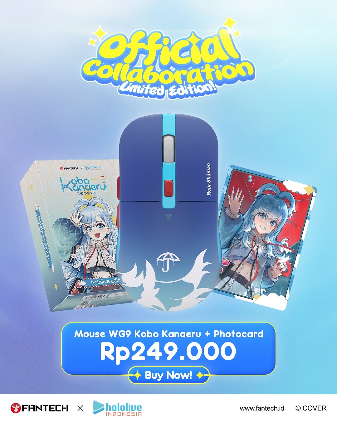
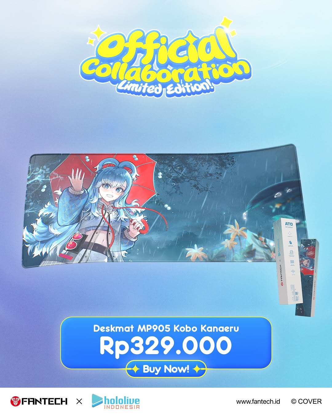
How kobokanaeru Built This Fantech Hololive Indonesia Collaboration AI Art
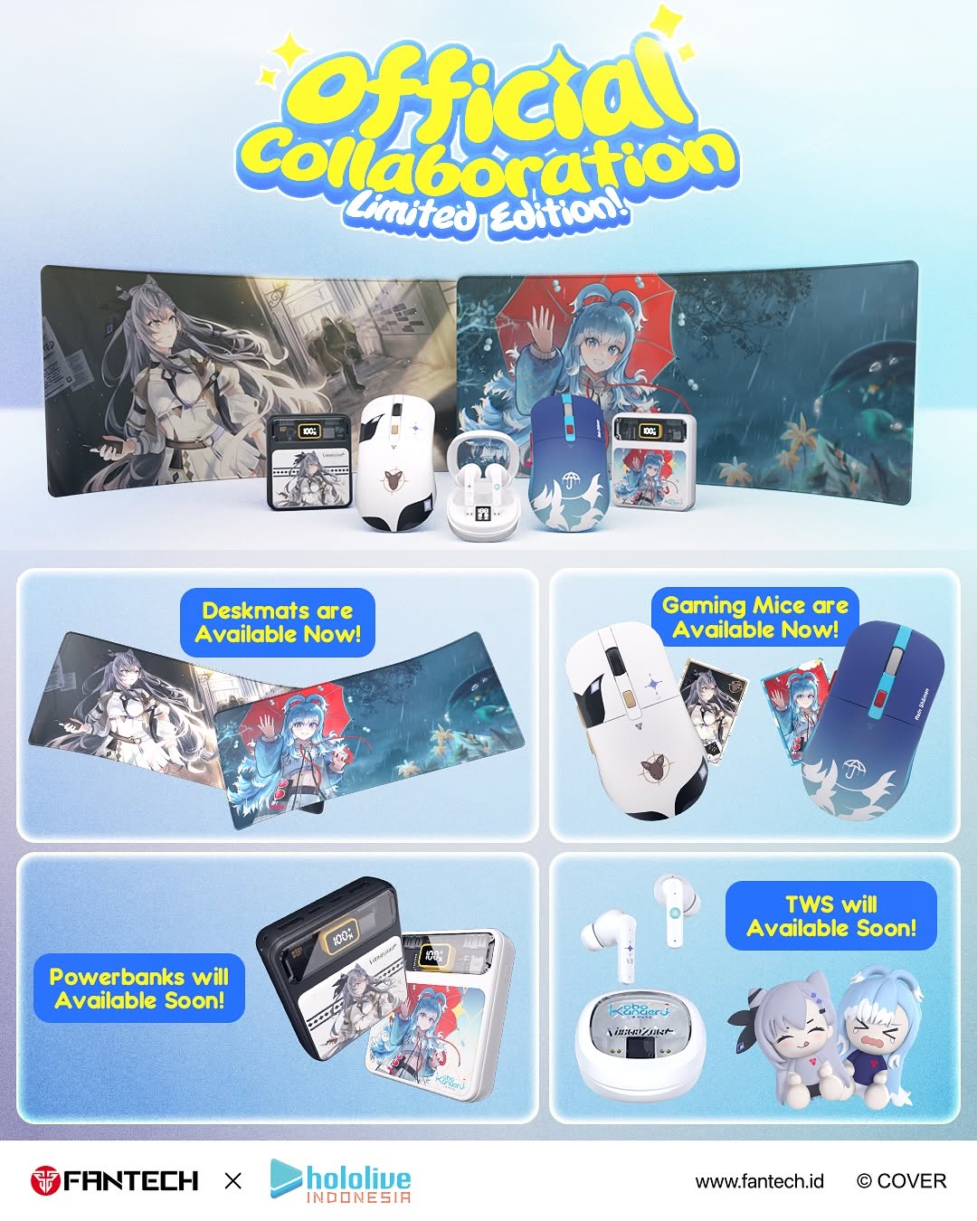
This campaign graphic works because it combines fandom visuals and purchase clarity in one frame. The design does not just say "collaboration"; it shows exactly what categories are available now and what is coming soon. That roadmap structure reduces friction and increases conversion intent.
For creators and brands, this is a practical launch template: top attention hook, middle hero lineup, lower category segmentation, footer credibility. It is especially effective when audiences care about collectible product ecosystems.
Signal Table: Why This Launch Layout Performs
| Signal | Evidence (from this image) | Mechanism | Replication Action |
|---|
| Immediate collaboration cue | Large "Official Collaboration" headline at top | Fast relevance detection increases stop rate | Lead with one unmistakable collab headline above products |
| Availability clarity | "Available Now" vs "Available Soon" labels per category | Timeline clarity improves purchase planning | Segment SKUs by release status in separate blocks |
| Category chunking | Four panel boxes for deskmat, mice, powerbanks, TWS | Chunked information lowers cognitive load | Group products into 3-5 clear category modules |
| Brand trust footer | Collab logos + website + rights line | Clear attribution boosts legitimacy and click confidence | Always reserve a footer zone for official brand credentials |
Best-Fit Scenarios and Limits
- Collab launch announcements: Great fit for multi-SKU drops with phased availability. Change: keep four-block status layout.
- E-commerce social teasers: Great fit when you need both hype and shopping clarity. Change: highlight one hero SKU in center row.
- Community fandom campaigns: Great fit for collectible-themed merchandise bundles. Change: keep character art visible in every category panel.
- Retail partner assets: Great fit for storefront repost consistency. Change: retain official footer and URL for trust continuity.
Not ideal:
- Single-product premium campaigns that need minimal visual noise.
- Storytelling-first brand films where narrative tone outweighs catalog detail.
- High-end luxury visuals that avoid cartoon/fandom styling.
Three Transfer Recipes
- Tech Accessory Drop Variant — Keep: top headline + center hero + four category cards. Change: fandom IP and product mix. Slot template:
{collab_title} + {hero_product_strip} + {category_status_grid} + {official_footer} - Fashion Capsule Variant — Keep: available-now/soon split and modular layout. Change: peripherals to apparel accessories. Slot template:
{capsule_headline} + {lookbook_preview} + {sku_modules} + {brand_credentials} - Creator Tool Bundle Variant — Keep: structured product roadmap design. Change: gaming items to creator gear (mic, cam, lights, software). Slot template:
{launch_banner} + {bundle_preview} + {release_phase_boxes} + {cta_footer}
Aesthetic Read: Why It Feels Commercially Effective
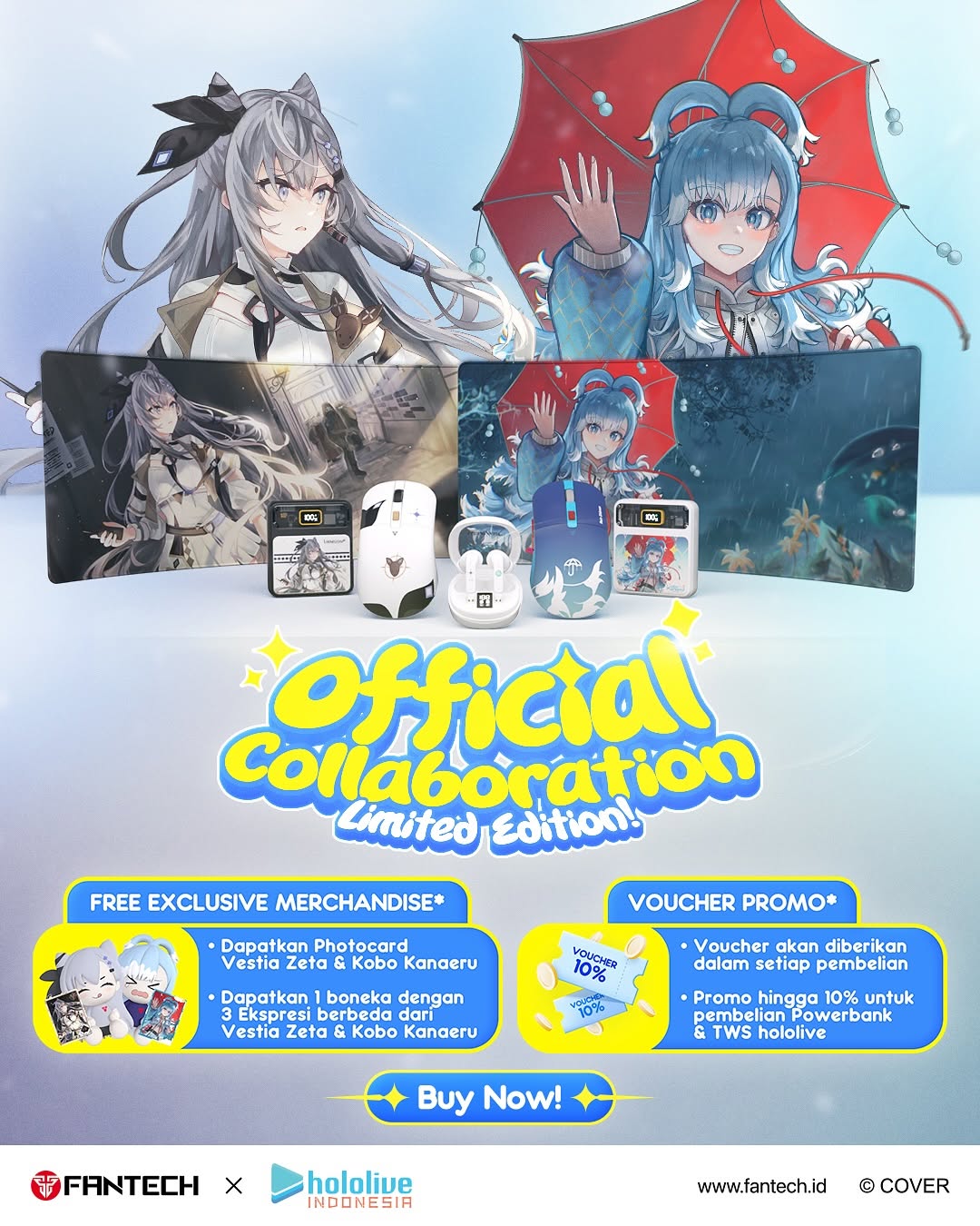
The poster uses visual hierarchy exactly as conversion design should: excitement first, products second, logistics third, trust fourth. This order mirrors user decision flow in social commerce. The light blue palette keeps the page cohesive while colorful product art provides excitement.
Rounded boxes and badge-like labels make the information feel approachable rather than technical. For creators designing launch graphics, this is a useful formula: make buying steps obvious without losing fandom personality.
Prompt Technique Breakdown
| Prompt chunk | What it controls | Swap ideas (EN, 2-3 options) |
|---|
| "top collab headline in playful bold font" | Attention and campaign context | neon sport font; clean tech sans; retro bubble lettering |
| "middle hero row with primary SKUs" | Product desirability focus | single hero product; trio lineup; carousel-like strip |
| "four rounded category panels with availability tags" | Information clarity and roadmap utility | three-panel version; two-tier module grid; timeline row cards |
| "anime-themed product art integration" | Fandom appeal and visual identity | minimal icon graphics; character silhouettes; abstract pattern skins |
| "official footer logos and URL" | Credibility and conversion readiness | QR code footer; retailer list footer; preorder CTA footer |
Remix Steps
Baseline lock: lock hierarchy (headline-hero-grid-footer), lock availability labels, lock logo footer.
- Iteration 1: Build structure and panel zoning first.
- Iteration 2: Keep structure fixed, refine product render placement.
- Iteration 3: Keep products fixed, test one label wording optimization.
- Iteration 4: Keep labels fixed, test one background color theme.
One-variable testing clarifies whether readability or visual hype is driving click-through.