🎉 ✨ THE WAIT IS OVER! ✨🎉
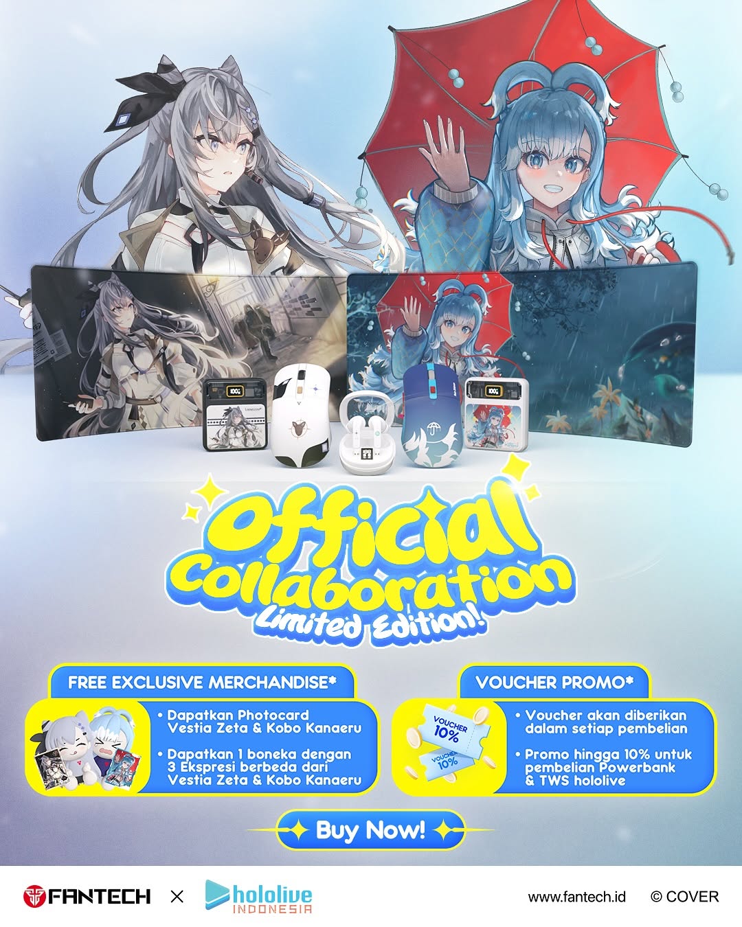
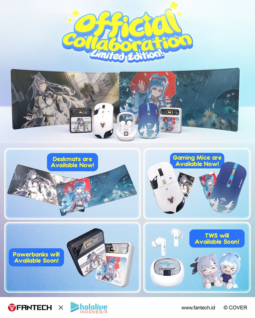
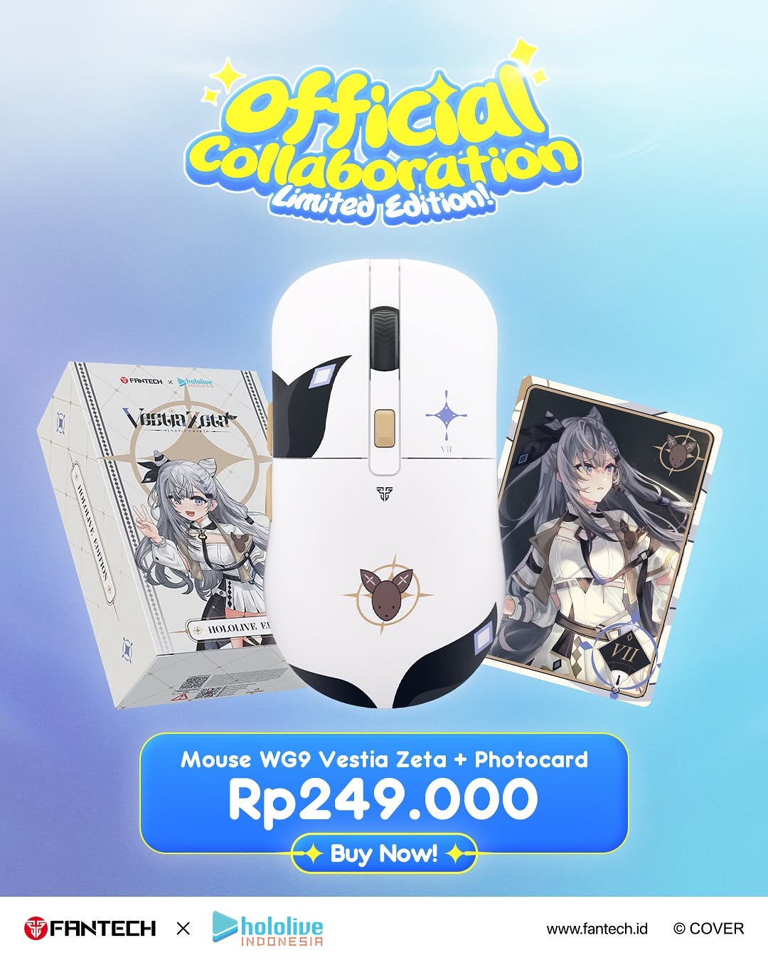
Hari ini kami dengan bangga mempersembahkan GRAND LAUNCHING KOLABORASI RESMI FANTECH x hololive INDONESIA! 🌟
💡 Apa yang spesial di kolaborasi ini?
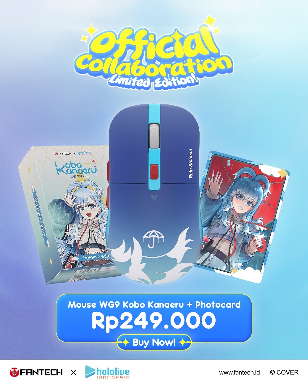
✅ Produk-produk Fantech favorit kini hadir dengan sentuhan eksklusif Vestia Zeta dan Kobo Kanaeru dari hololive Indonesia.
✅ Desain, kualitas, dan performa yang dirancang untuk gamer, kreator, dan para fans sejati.
✅ Limited Edition yang hanya tersedia pada periode launching ini!
#Fantech #hololiveindonesia #FantechXhololiveID #VestiaZeta #KoboKanaeru #GrandLaunching #OfficialCollaboration
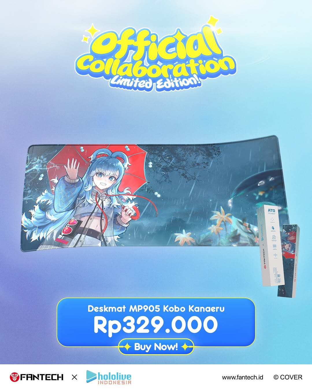
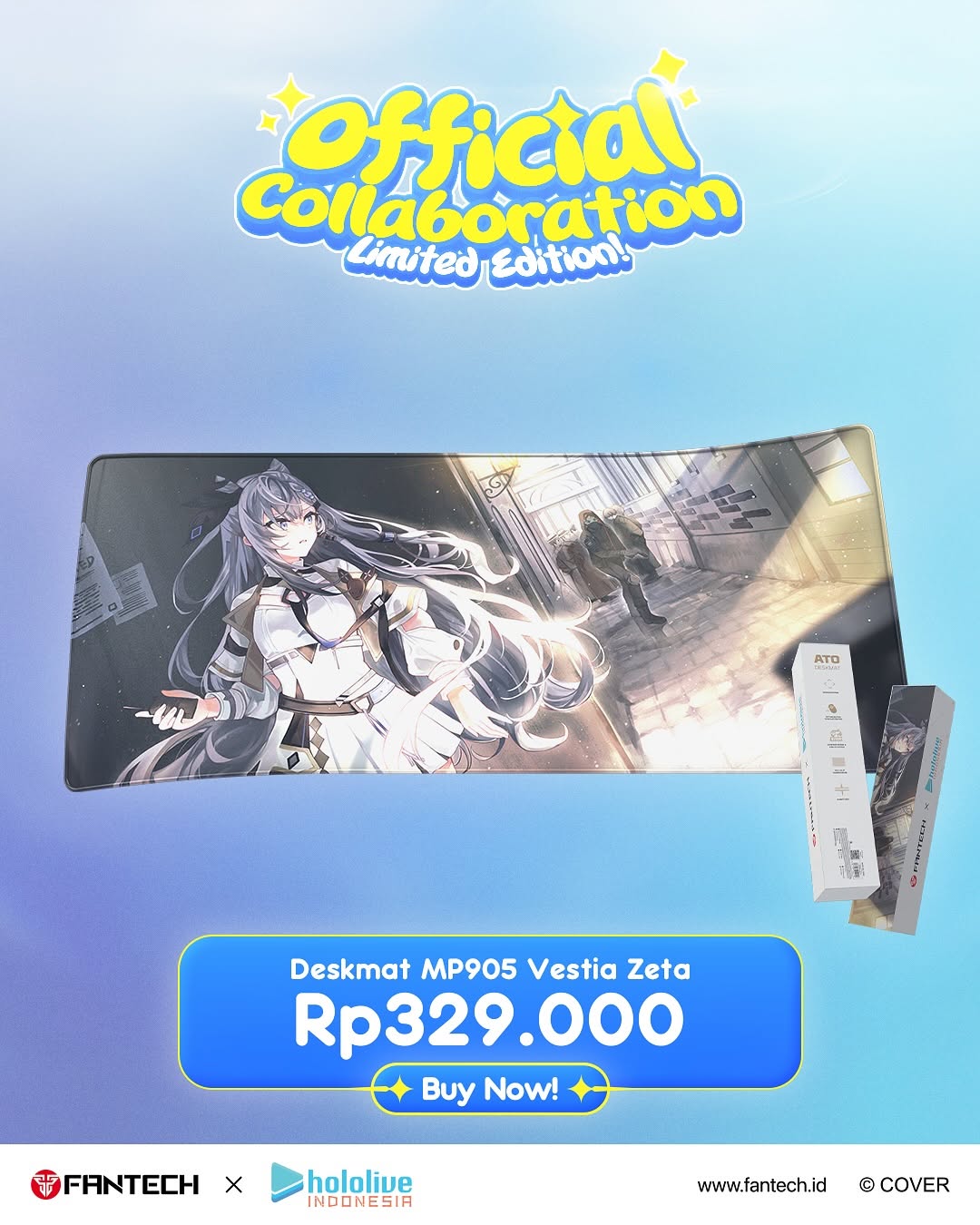
The Kobo Kanaeru Deskmat: How kobokanaeru Built This AI Art
This creative blends fandom emotion and purchase clarity in one frame. It works because users can immediately read what the product is, how much it costs, and why it feels special.
Why this visual can drive both hype and action
The strongest mechanic is structured clarity. The card gives viewers a strict reading path: collaboration badge, product hero, price, buy button, logos. That sequence minimizes confusion and reduces decision delay, especially on mobile feeds.
The second mechanic is exclusivity signaling. The "Official Collaboration" and "Limited edition" language activates urgency while still feeling celebratory. Fans of either brand immediately understand this is a collectible moment, not a standard catalog listing.
The third mechanic is fandom-product fusion. The anime character art on the deskmat is not treated as decoration; it is the product itself. This closes the gap between fan identity and purchase intent, which is a key conversion lever in creator collaborations.
Signal
Evidence (from this image)
Mechanism
Replication Action
Reading-Flow Architecture
Top headline, center product, lower price CTA, bottom logos
Sequential clarity improves conversion speed
Design launch cards in fixed top-middle-bottom modules
Scarcity Trigger
"Limited edition" called out near headline
Rarity framing increases urgency
State scarcity near the first visual touchpoint
Price Transparency
Large currency value in high-contrast panel
Removes friction from purchase consideration
Display price prominently, not hidden in caption
Co-Brand Trust
FANTECH x hololive Indonesia lockup at bottom
Shared authority reduces buyer hesitation
Always anchor collaboration logos in final frame zone
Where this template fits best
Best-fit scenarios
Limited-edition merch drops: Ideal for fan-driven urgency moments.
Creator x hardware partnerships: Great for product + fandom crossovers.
Launch-day social ads: Clear enough for paid and organic channels.
Price-first commerce posts: Works when immediate transaction clarity matters.
Not ideal scenarios
Storytelling-only brand films: This layout is transactional, not narrative.
Premium minimalist brands: Dense promo modules may feel too loud.
Complex multi-product bundles: Single-hero structure can become overloaded.
Transfers (exactly 3)
Keyboard Drop Variant
Keep: same module order (badge → hero → price → CTA → logos).
Change: deskmat hero to keyboard hero and update spec line.
Aesthetic read: why this stays promotional without feeling messy
The design uses one dominant background gradient and one product hero, then layers typography modules with clear spacing. This prevents clutter even with multiple information blocks. The playful bubble headline attracts fans, while the rectangular pricing panel signals commerce seriousness. The product art itself carries emotional fandom appeal, so the rest of the design can stay functional. It is a good example of balancing excitement and legibility.
Observed
Concrete evidence
Recreate move
Top emotional hook
Bright playful collaboration headline
Put fan-excitement message at first read position
Center product proof
Large deskmat visual and side packaging
Show both product usage view and packaging confirmation
Bottom conversion stack
Price + Buy button + logos
Separate transaction module from decorative headline zone
Color coherence
Blue gradient base with yellow accent title
Choose one cool base + one warm accent for hierarchy
Prompt technique breakdown
Prompt chunk
What it controls
Swap ideas (EN, 2-3 options)
"official collaboration limited edition headline"
Hype and exclusivity framing
"grand launch" / "special drop" / "first edition"
"center hero product with anime artwork"
Fandom-product connection
"keyboard skin" / "mousepad alt art" / "headset shell art"