How kobokanaeru Built This Fantech hololive Indonesia Collab AI Art — and How to Recreate It
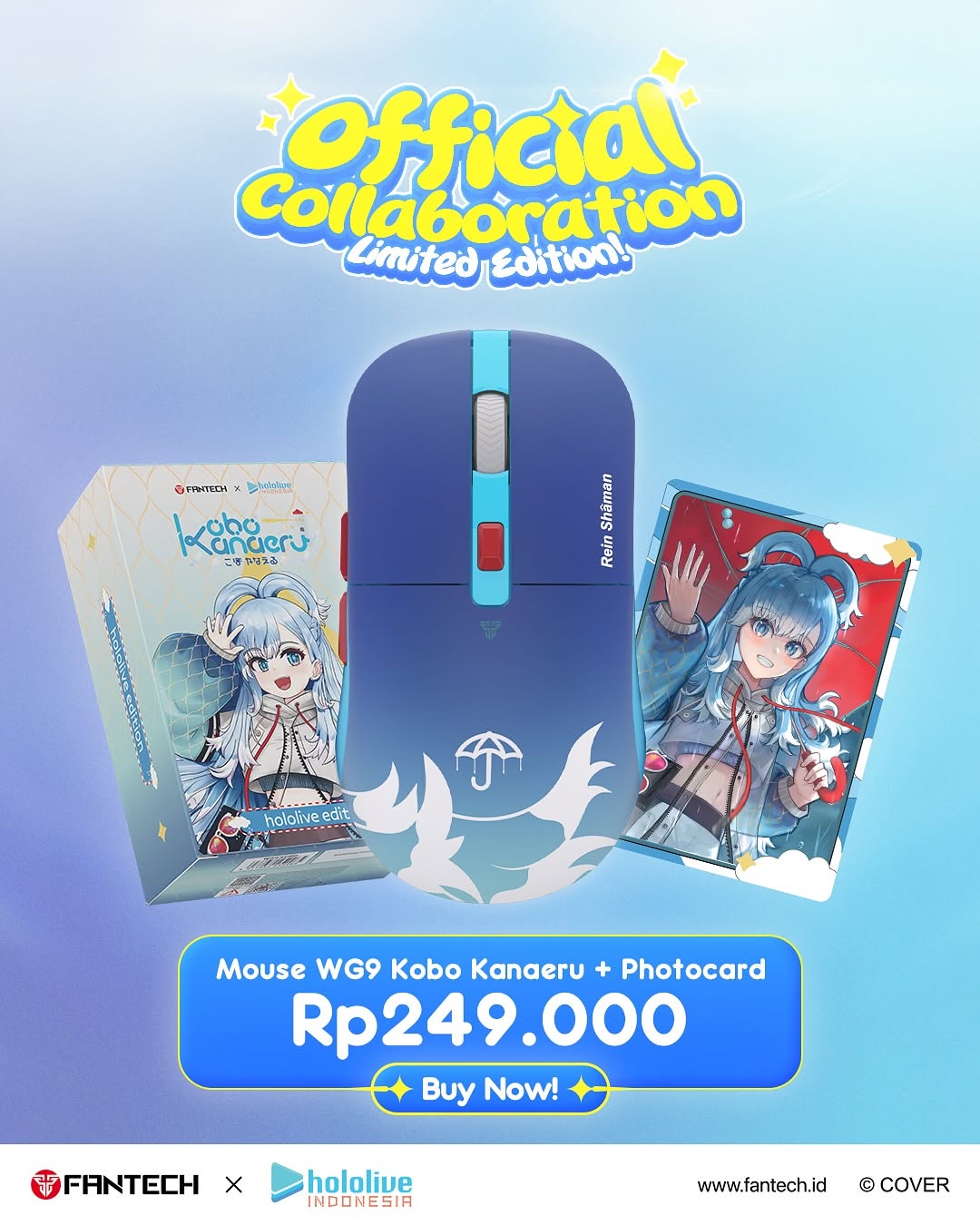
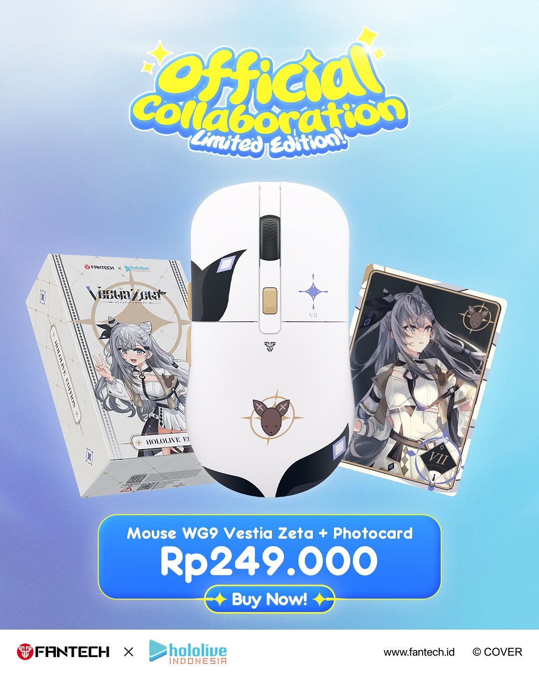
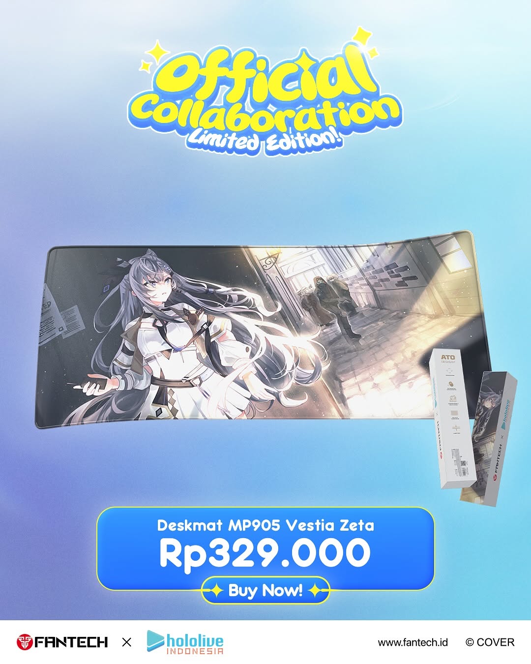
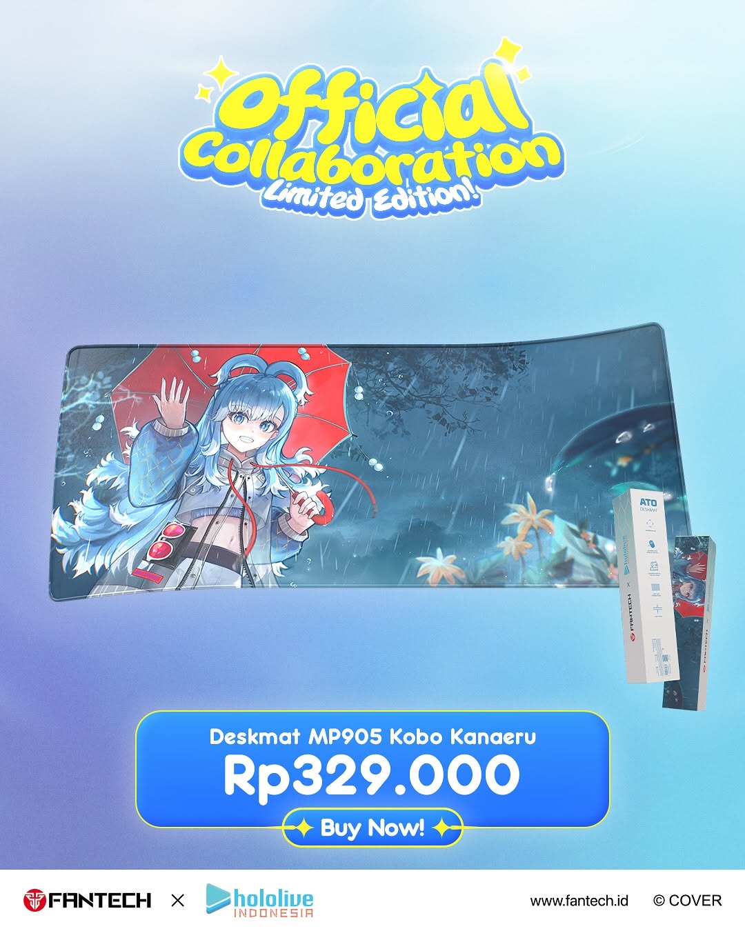
This creative works because it compresses the purchase decision into one screen: what the product is, what bonus you get, how much it costs, and where to click. There is no ambiguity. The visual hierarchy supports direct action while still preserving fandom appeal through character artwork.
For creators and ecommerce teams, this is a strong single-SKU conversion template. It keeps the emotional draw (collab identity) and transactional clarity (price + buy button) in balance.
Signal Table: Why This Product Poster Performs
| Signal | Evidence (from this image) | Mechanism | Replication Action |
|---|
| Hero product focus | Mouse centered and largest visual element | Single focal object improves product recall | Scale the main SKU 1.5-2x larger than supporting elements |
| Bundle incentive clarity | Photocard shown and named in bundle line | Bonus visibility increases perceived value | Always show and label the included bonus item |
| Price immediacy | Large "Rp249.000" in dedicated panel | Clear pricing reduces friction and hesitation | Use one high-contrast price block near CTA |
| Action path certainty | Visible "Buy Now!" button under price | Direct CTA shortens decision-to-click journey | Place CTA immediately below value proposition |
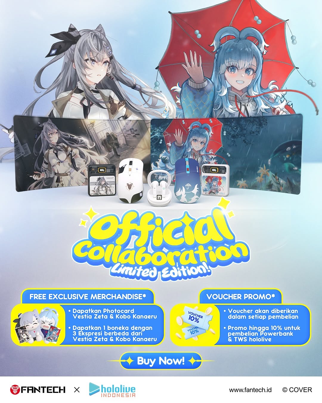
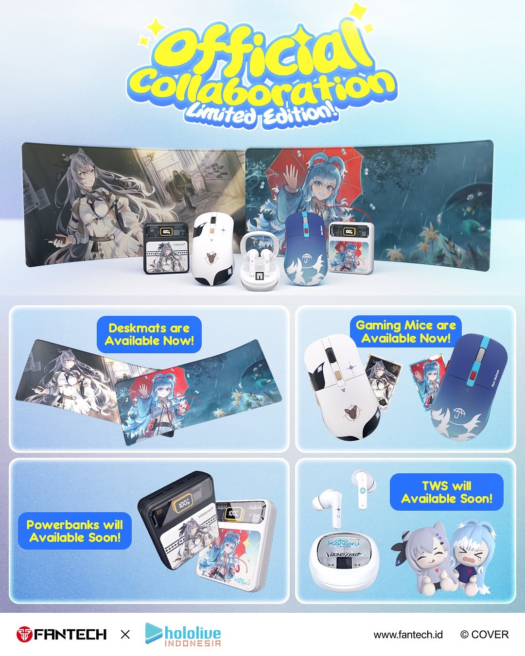
Best-Fit Scenarios and Limits
- Drop-day single SKU ads: Great fit for immediate conversion pushes. Change: keep same hierarchy, replace hero product only.
- Limited edition reminders: Great fit for scarcity storytelling with clear purchase path. Change: add "limited stock" tag near price card.
- Retargeting creatives: Great fit when audience already knows the collab. Change: simplify headline and emphasize urgency.
- Affiliate distribution assets: Great fit for partner repost consistency. Change: retain footer logos and official marks.
Not ideal:
- Brand manifesto content without transactional intent.
- Multi-category launch pages that need comparative layouts.
- Narrative short-film teasers where CTA should stay soft.
Three Transfer Recipes
- Keyboard Bundle Variant — Keep: centered hero, side bonus visual, strong price card. Change: mouse to keyboard SKU. Slot template:
{hero_sku_center} + {bonus_item_visual} + {price_panel} + {buy_cta} - Headset Promo Variant — Keep: top collab title and footer trust strip. Change: hero object and bundle copy only. Slot template:
{collab_headline} + {single_product_focus} + {bundle_text} + {brand_footer} - Flash Sale Variant — Keep: same structure. Change: add crossed original price + countdown badge. Slot template:
{hero_product} + {promo_price_block} + {urgent_cta} + {official_logo_row}
Aesthetic Read: Why It Feels Commercially Clean
The design uses a classic conversion stack: emotional hook at top, product proof in center, decision info at bottom, trust seal in footer. This sequence aligns with how users scan shopping posts on mobile. The blue gradient background keeps visual noise low while amplifying product readability.
Character art is present but controlled, so fandom energy supports the sale rather than overshadowing it. For creators, this is the key takeaway: in collab commerce, hype elements should feed into clarity, not compete with it.
Prompt Technique Breakdown
| Prompt chunk | What it controls | Swap ideas (EN, 2-3 options) |
|---|
| "centered blue gaming mouse hero render" | Primary purchase focus | white mouse variant; keyboard hero; controller hero |
| "left box + right photocard bonus visuals" | Bundle value communication | sticker set bonus; keychain bonus; mousepad bonus |
| "price card with Rp amount and Buy Now CTA" | Conversion readiness | discount badge + CTA; preorder CTA; limited stock CTA |
| "top collaboration headline in playful font" | Campaign context and hype | drop now title; collab wave 2 title; exclusive edition title |
| "footer logos and website strip" | Trust and authenticity | retailer logos row; QR code footer; warranty badge footer |
Remix Steps
Baseline lock: lock hierarchy (headline-product-price-CTA-footer), lock SKU center focus, lock pricing visibility.
- Iteration 1: Build structural zones and product proportions.
- Iteration 2: Keep structure fixed, refine typography legibility.
- Iteration 3: Keep text fixed, test one CTA style variation.
- Iteration 4: Keep CTA fixed, test one background hue variant.
One-variable tests help identify whether pricing emphasis or CTA styling drives higher clicks.