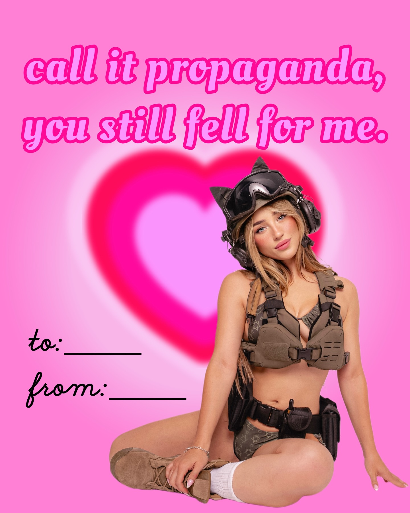
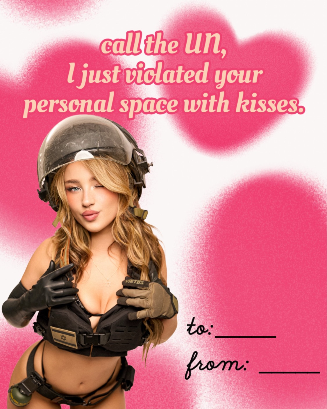
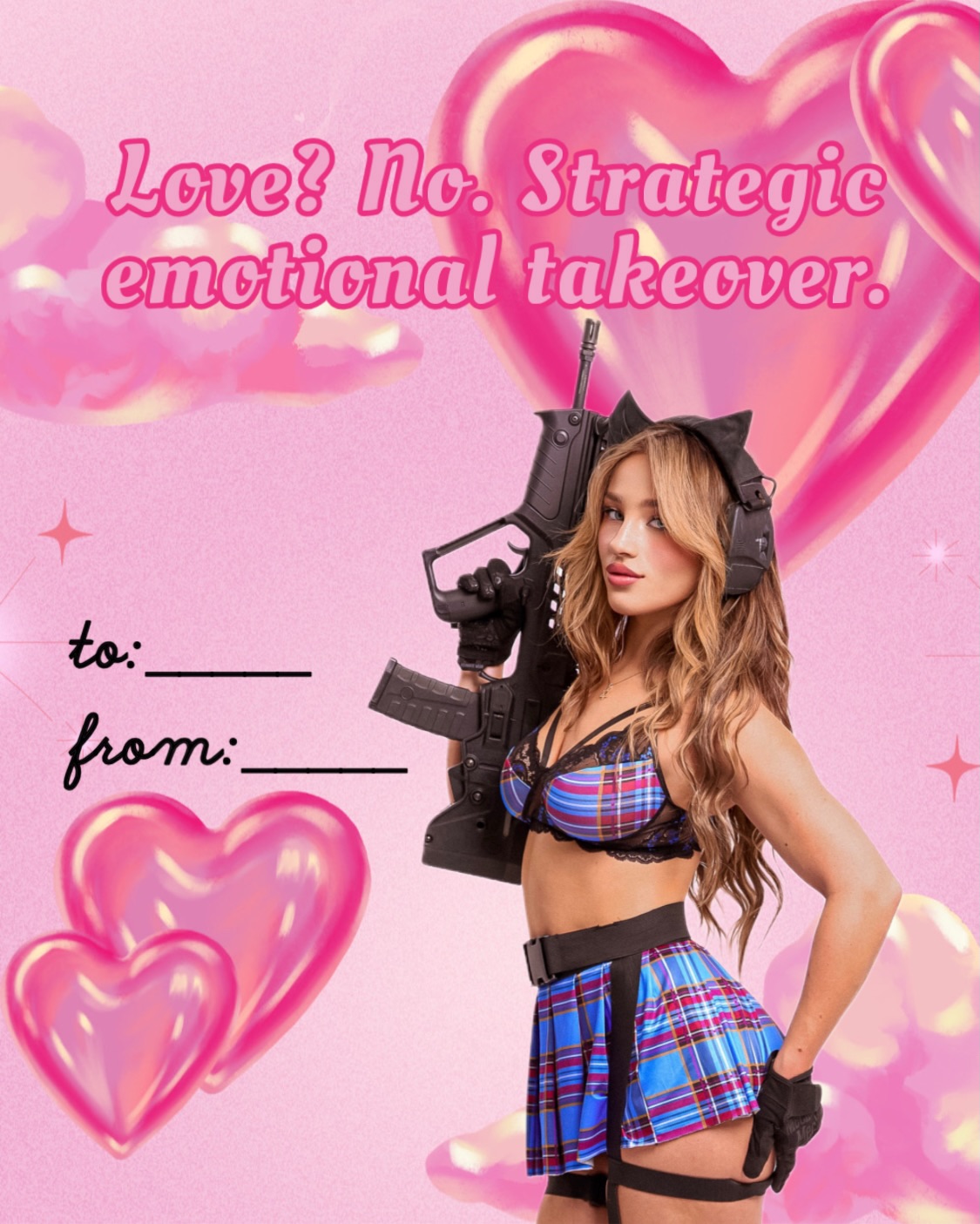
make love not war ✨💌 💝💘
make love not war ✨💌 💝💘
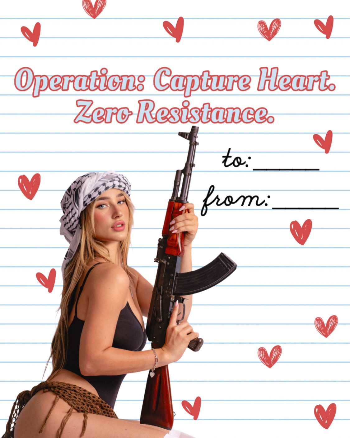
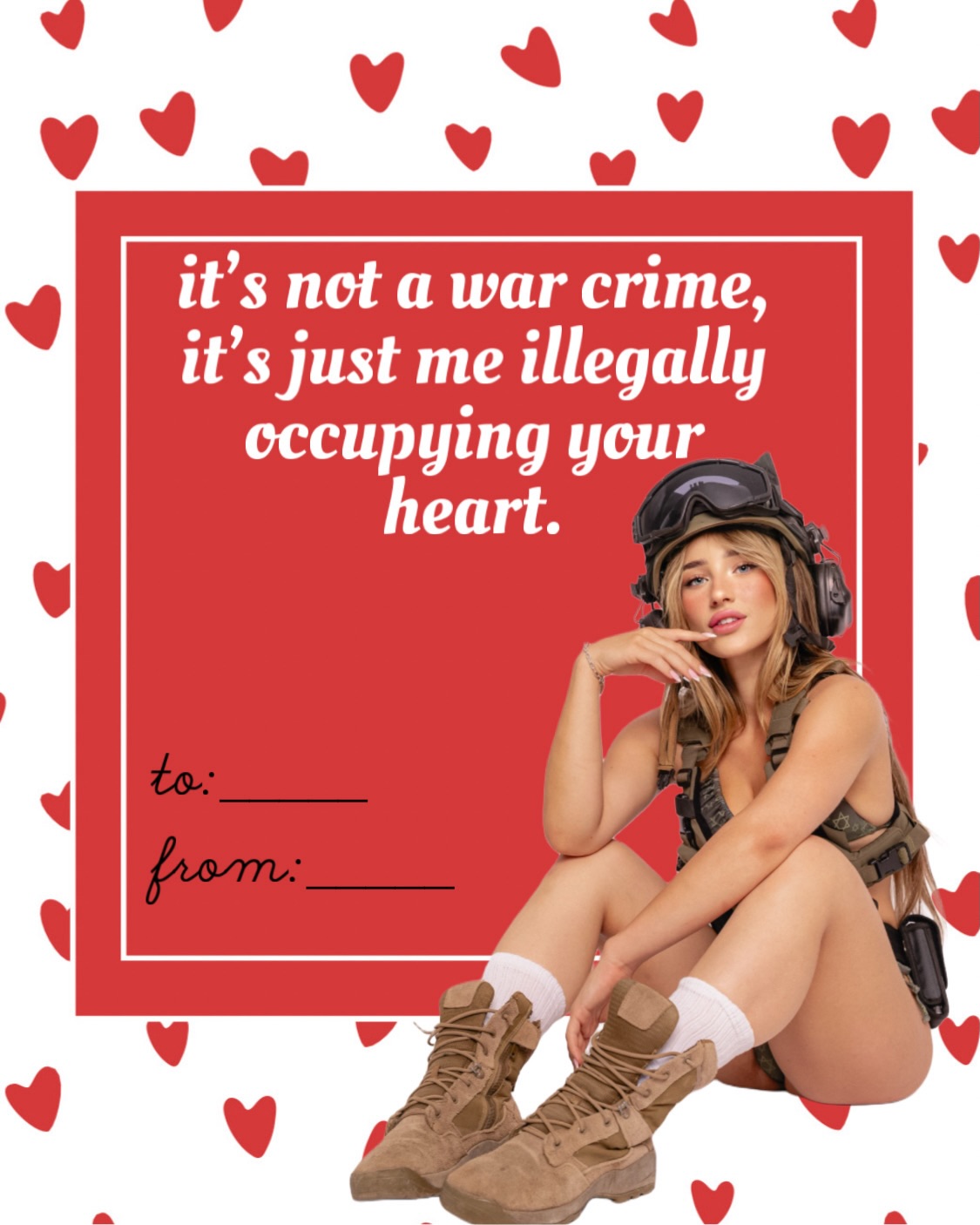
This image works because it is built on a collision the viewer can read instantly. Hearts, notebook paper, and handwritten gift-note lines all signal romance. The weapon, headscarf, and confrontational stance signal danger, militancy, or at least aggressive symbolism. Put those languages together in one frame and the result becomes less about either element alone and more about the shock of their overlap. That is what makes the poster sticky.
The design is also smart in the way it keeps the background childish and flat. The lined paper and doodled hearts make the message look almost school-note innocent. That innocence is exactly what sharpens the irony. If the background were darker or more realistic, the image would become much heavier. By keeping it graphic and clean, the composition stays satirical and poster-like rather than documentary.
For creators, this is a strong reminder that contrast is one of the fastest ways to generate attention. When two visual codes that should not belong together are forced into the same frame, the audience stops to resolve the tension.
| Signal | Evidence (from this image) | Mechanism | Replication Action |
|---|---|---|---|
| Immediate contradiction | Romantic hearts and valentine wording are paired with a weapon and militant styling. | The brain has to reconcile two conflicting emotional signals, which increases pause time. | Combine two visual languages that normally do not coexist, but make both of them obvious at first glance. |
| Strong poster hierarchy | The headline sits large at the top while the subject anchors the lower half. | Clear information order helps a bold concept remain readable instead of chaotic. | Build a strong top-copy plus hero-subject layout when the idea itself is already provocative. |
| Flat playful background | The lined paper and doodle hearts keep the frame graphic and approachable. | A softer visual container makes a harsh symbolic prop feel more satirical than literal. | Use simplified graphic backgrounds when you want irony, not realism, to drive the message. |
| Single focal figure | Only one subject appears, cleanly cut out against the paper backdrop. | Reducing clutter keeps the viewer locked on the central contradiction. | Limit the image to one strong protagonist and one clear symbolic object. |
The strongest aesthetic choice here is not the prop. It is the paper. The notebook background makes the whole image read like a hand-made holiday card or a mischievous high-school note scaled up into a poster. That framing turns what could have been a heavy image into something more like pop satire. The result feels designed for reaction, not realism.
The typography helps too. It is decorative, oversized, and positioned almost sweetly, which contrasts with the hard diagonal of the weapon. That top-versus-bottom tension gives the poster visual rhythm. The subject itself is lit cleanly and simply so the composition can stay legible from a distance. Nothing is muddy. You see the joke immediately.
| Observed | Why it matters for recreation |
|---|---|
| Lined notebook-paper background with doodled hearts | Creates the satirical valentine-card language. |
| Large slogan headline at the top | Sets the ironic tone before the eye reaches the subject. |
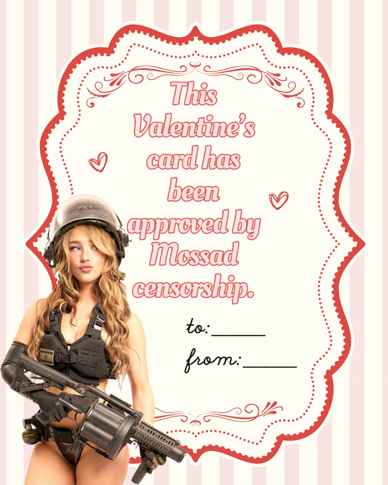
| Single cutout figure in black bodysuit and headscarf | Keeps the poster clean and high-contrast. |
| Weapon held as a symbolic visual element rather than in action | Preserves the poster’s tension without turning it into a literal combat image. |
| “To” and “from” note lines on the right | Reinforces the valentine format and makes the concept more specific. |
{sweet graphic format} colliding with {hard symbolic subject}{romantic stationery design} mixed with {rebellious style language}{cute communication format} paired with {unexpected power-coded iconography}| Prompt chunk | What it controls | Swap ideas (EN, 2-3 options) |
|---|---|---|
| single woman in black bodysuit and patterned headscarf holding a rifle | Locks the central symbolic figure and silhouette. | leather jacket version; glam campaign styling; different scarf wrap |
| ruled notebook-paper background with red doodle hearts | Creates the sweet, school-note valentine format. | graph-paper note; pastel stationery; postcard paper texture |
| large ironic romantic headline plus “to” and “from” lines | Defines the poster as a themed card rather than a standalone portrait. | gift-tag wording; love-letter caption; cheeky holiday slogan |
| clean studio cutout composited into flat graphic design | Keeps the image in pop-poster territory instead of realism. | magazine cover cutout; sticker-like collage; postcard montage |
| satirical tension between love iconography and hard symbolism | Protects the concept from collapsing into either romance or violence alone. | sweet-vs-punk contrast; pastel-vs-hardcore contrast; cute-vs-threatening poster tone |
This style only works if the contradiction stays readable in one second. First lock the valentine format, then lock the symbolic prop, then make sure the subject remains cleanly separated from the graphic background. If any of those pieces weakens, the poster loses its sting.
If the image starts feeling random, simplify the subject and strengthen the background format. The satire works when the visual codes are clean, not crowded.