make love not war ✨💌 💝💘
make love not war ✨💌 💝💘
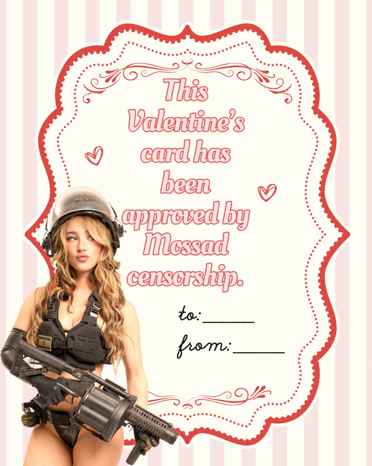
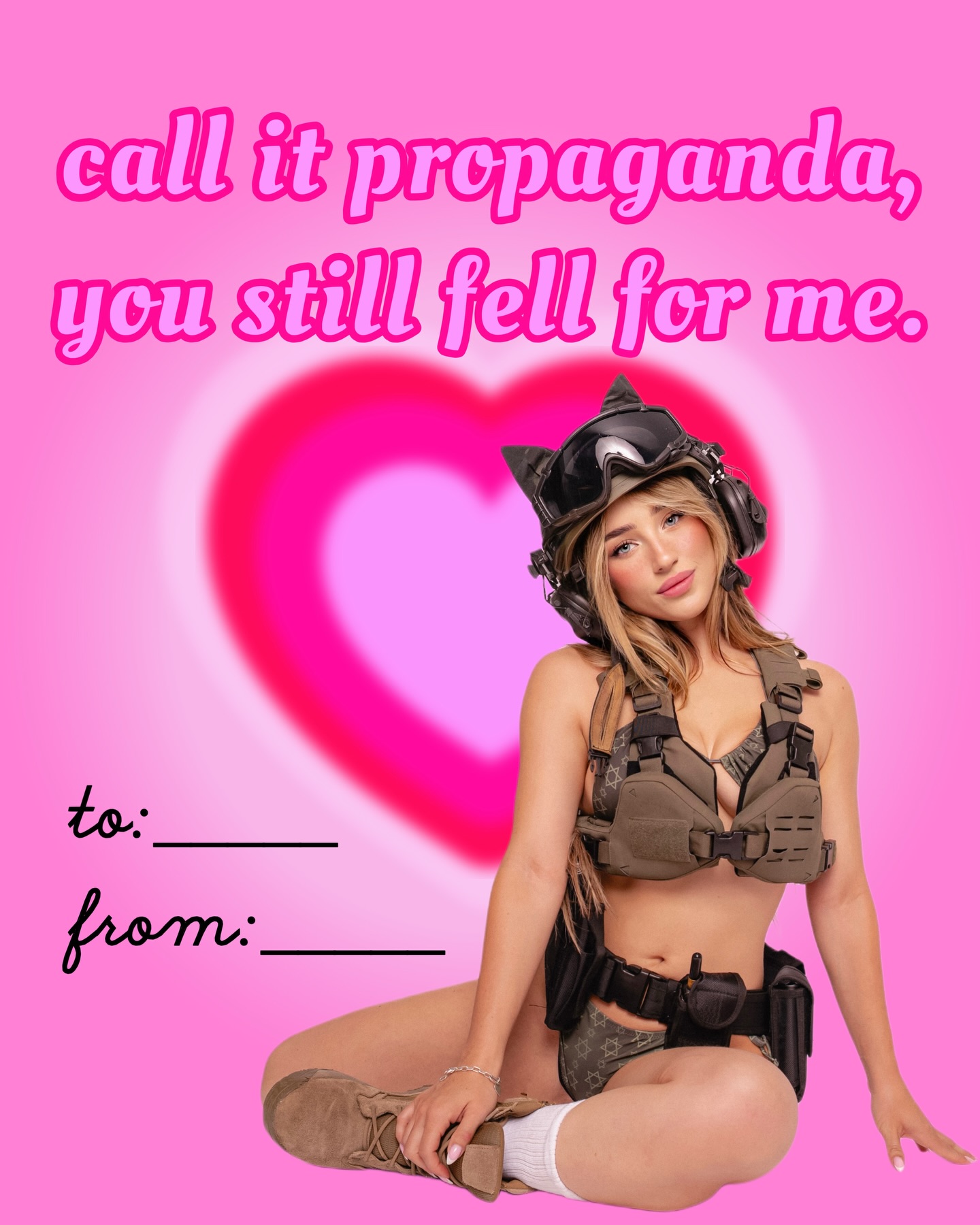
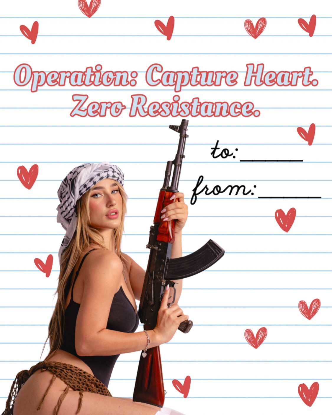
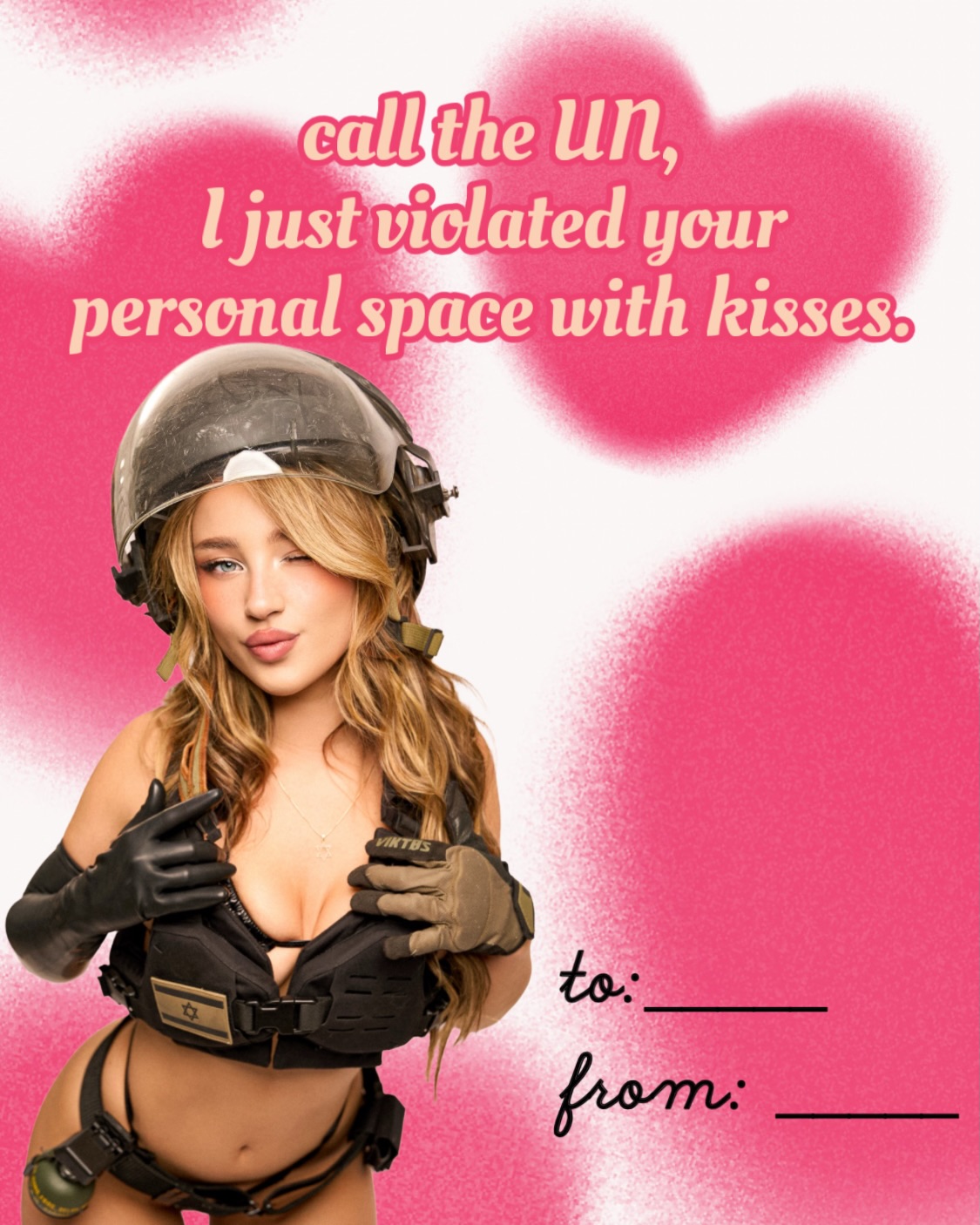
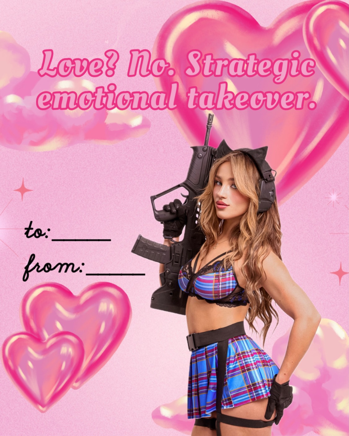
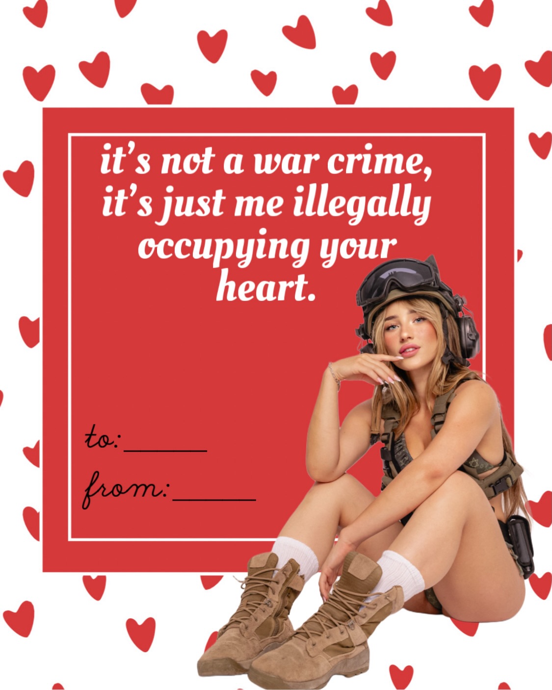
This image works because it fuses two systems that normally live far apart: soft, nostalgic Valentine card design and a hyper-specific internet persona. The pink stripes, scalloped frame, and handwritten “to/from” lines tell your brain this is a sweet printable card. Then the military-styled blonde cutout and the “approved by Mossad censorship” line break that expectation in one beat. That tension is the hook. The post is not asking viewers to admire realism. It is asking them to instantly understand the joke, then share it as identity humor.
For creators, that is the useful lesson. Meme-style images spread when they compress contradiction into a format people already recognize. Here, the creator borrowed the language of Valentine stationery, kept the layout extremely readable, and inserted a character archetype that already carries lore. The joke lands in less than a second because the frame is familiar even before the text is fully read.
The card is visually simple enough to read on a phone, but specific enough to feel authored instead of generic. The striped background and oversized central label create a clean container for text. The composited figure in the lower-left adds personality without destroying legibility. Most importantly, the caption and image are aligned: this is not random decoration around a joke, it is a joke told through design choices.
| Signal | Evidence (from this image) | Mechanism | Replication Action |
|---|---|---|---|
| Fast pattern recognition | Pink vertical stripes, ornate red frame, “to/from” lines | Viewers instantly identify the Valentine-card template before reading the punchline | Start from a culturally familiar card, flyer, certificate, or invitation layout before adding the joke |
| Identity-based humor | The military-glam cutout and “Mossad censorship” phrase point to a very specific online persona | Specificity makes the meme feel native to a real creator brand rather than a disposable text graphic | Use one unmistakable persona cue: wardrobe, prop, slogan, or recurring character type |
| High mobile readability | Large centered headline, sparse background, only one composited figure | Low visual clutter lets the gag land in-feed without requiring zoom | Protect the center text block and limit decorative elements to borders and corners |
| Contrast as a hook | Cute Valentine aesthetics collide with militarized styling | Unexpected pairings trigger curiosity and screenshot behavior | Combine one “sweet / soft / domestic” frame with one “hard / tactical / serious” subject layer |
What makes the image feel polished is not realism. It is layout discipline. The palette is narrow: blush pink, cream, red linework, black wardrobe, warm blonde hair. The frame is symmetrical and decorative, so the page feels stable. Then the cutout breaks the symmetry just enough to keep the card from looking sterile. That asymmetry is important. A perfectly centered meme card would feel static. The lower-left character adds story, motion, and a visual entry point.
The typography also does more than deliver the punchline. It softens the aggression of the reference by keeping the wording inside a candy-card visual system. Rounded decorative lettering makes the meme read as cheeky rather than threatening. For creators building shareable graphic humor, that balance matters: if the design gets too harsh, the joke feels heavy; if it gets too soft, the contrast disappears.
| Observed | Why It Matters | How To Recreate It |
|---|---|---|
| Full-frame pale stripe background | Instantly establishes greeting-card grammar | Use 2-color vertical stripes with low contrast so they support the text instead of competing with it |
| Large scalloped center frame | Creates a clean reading zone and makes the asset screenshot-friendly | Build one oversized cream label with red ornamental contour and dotted inner line |
| One lower-corner character cutout | Adds brand personality without blocking the message | Place the figure in one bottom corner and let it overlap the frame slightly |
| Pastel palette plus black tactical contrast | Produces the sweet-versus-hard tension that powers the joke | Keep background pastel and reserve black for outfit and prop only |
This design is strongest when the creator already has a recognizable persona or recurring visual joke. It works for holiday posts, fandom humor, niche political irony, character branding, or community in-jokes where the audience already understands the reference layer. It can also work for merch mockups, carousel closers, and screenshot bait inside Instagram or X.
It is less ideal for broad educational content, product explainers, or serious social commentary. Those formats need trust and clarity more than tonal collision. If you use this style in the wrong context, the audience may remember the joke but not the message.
You do not need to clone the exact joke to reuse the mechanic. You need to preserve the format logic: recognizable template, one persona layer, one contradiction, clean central text block.
| Prompt chunk | What it controls | Swap ideas (EN, 2-3 options) |
|---|---|---|
| Valentine striped background | Template recognition and softness | pastel stripes; tiny heart wallpaper; lace paper texture |
| Ornate scalloped center label | Reading zone and printable-card feel | vintage certificate frame; candy-shop plaque; romantic stationery label |
| Lower-left glam tactical cutout | Persona specificity and visual tension | pop-star soldier; fantasy warrior pin-up; office siren with prop |
| Centered playful typography | Immediate meme readability | bubble script; retro Valentine lettering; handwritten marker font |
| Pastel versus black contrast | The joke mechanism itself | soft pink vs chrome; cream vs camouflage; baby blue vs leather black |
Lock three things first: the familiar template, the text readability, and the corner placement of the character. Once those are stable, change only one or two levers per version. A clean sequence looks like this:
That order matters. Most creators fail this format by changing the wording, character, border, and palette all at once. Then they cannot tell whether the meme lost clarity because of the joke or because of the layout. Treat it like a design system first and a punchline vehicle second.