make love not war ✨💌 💝💘
make love not war ✨💌 💝💘
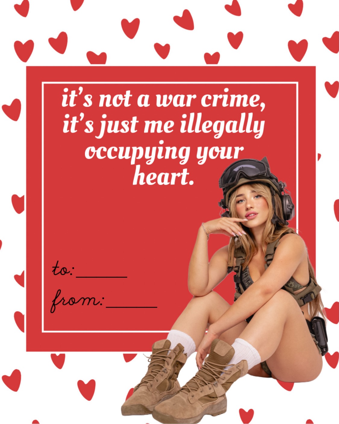
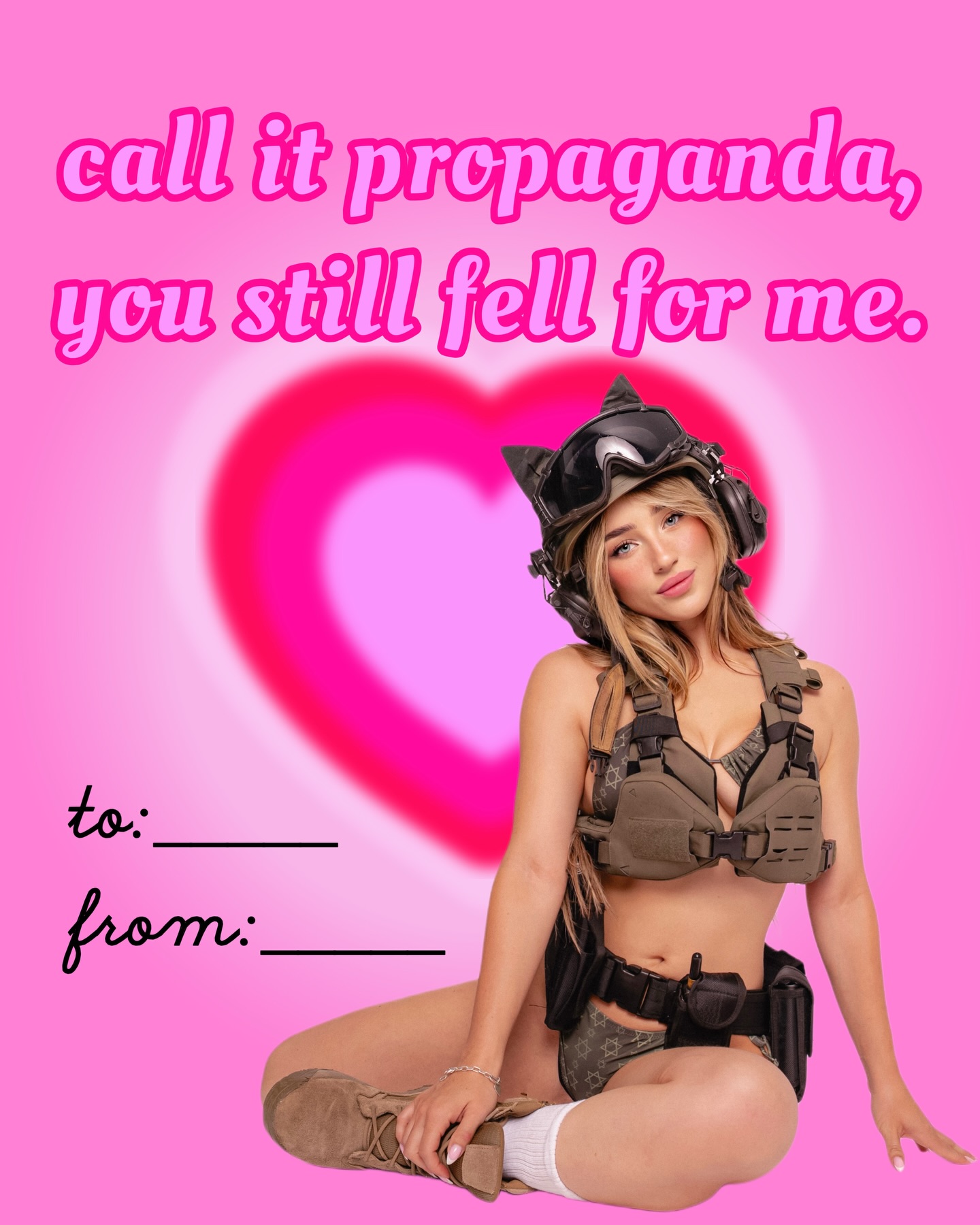
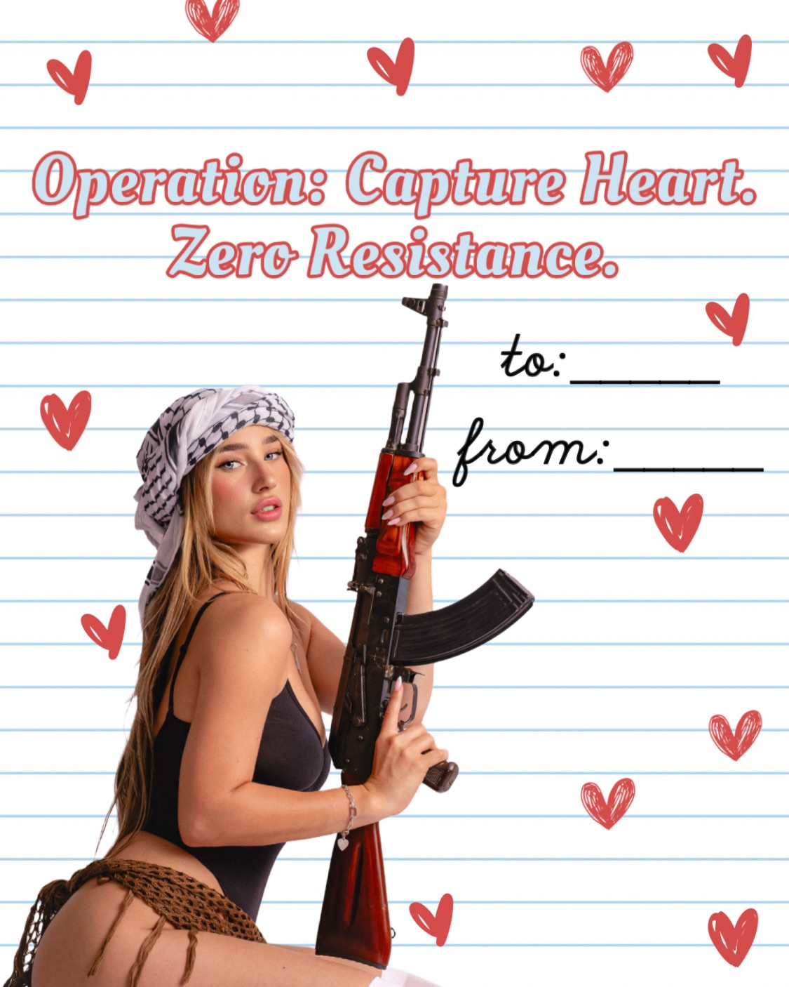
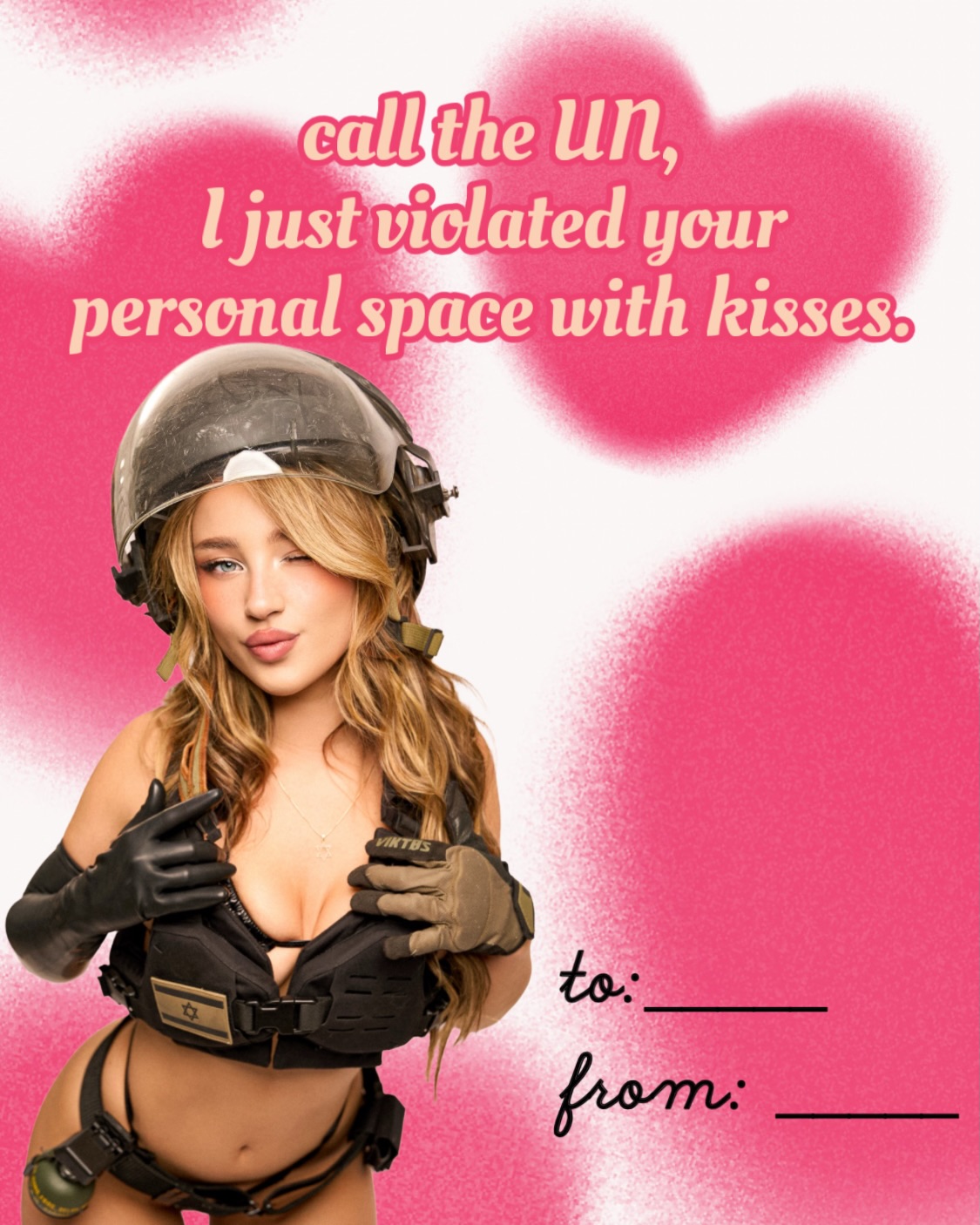
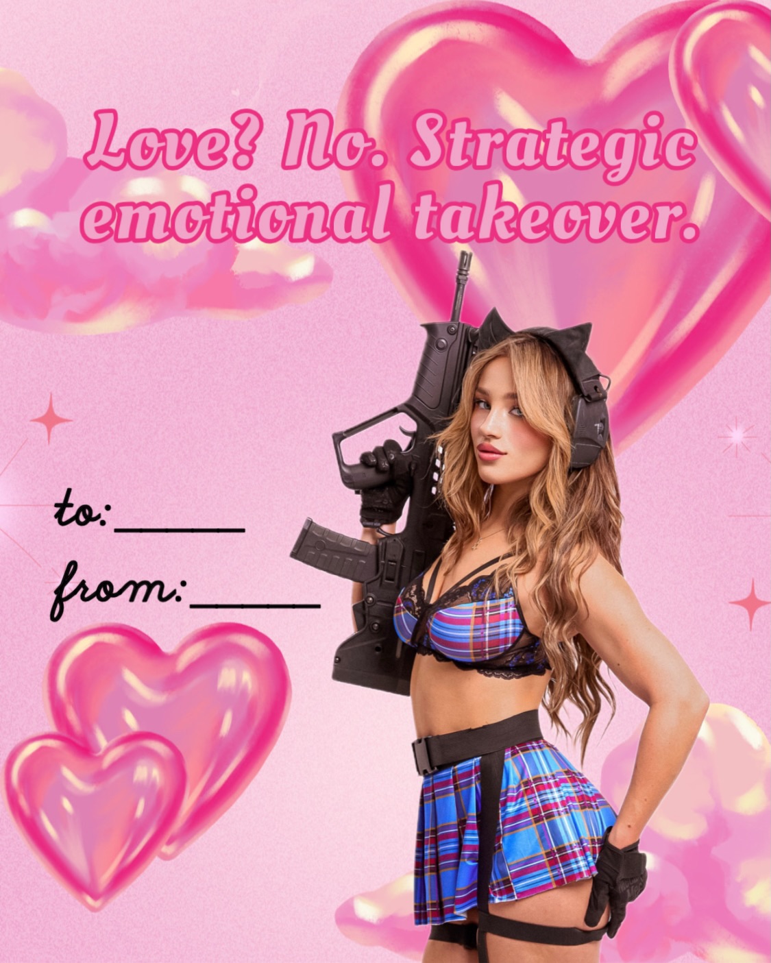
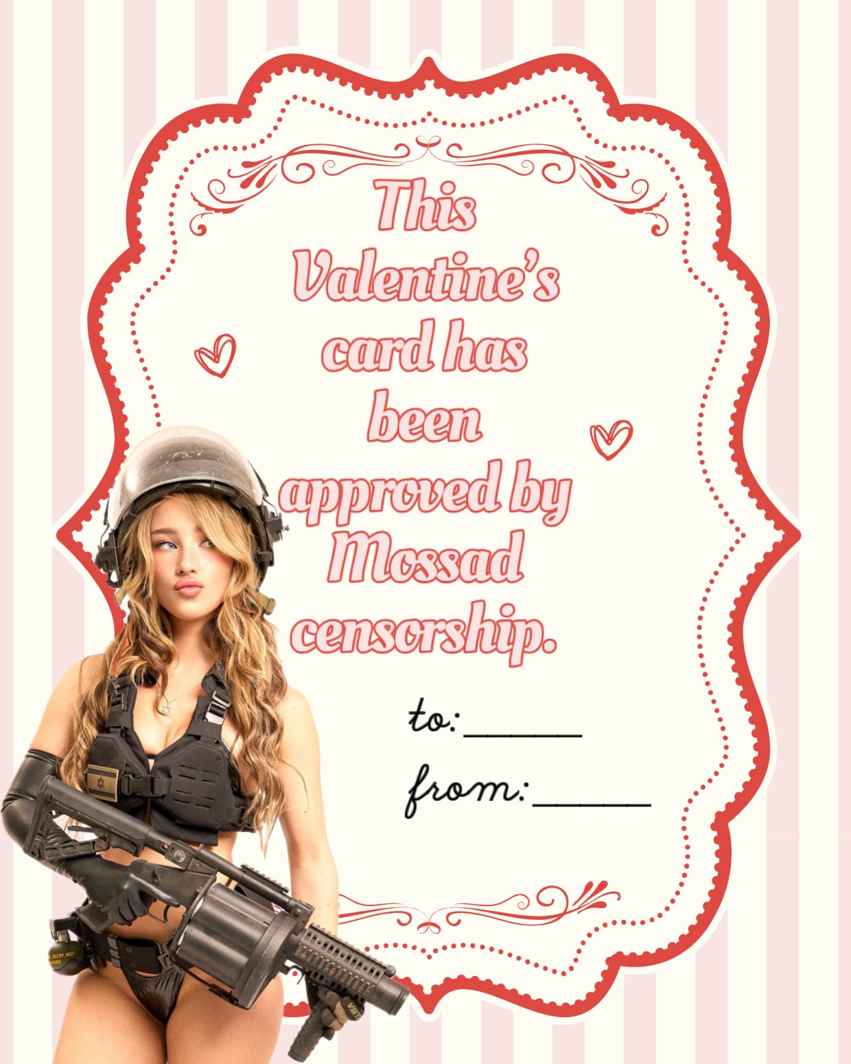
This image lands because it combines three things that usually live in different corners of the internet: flirtation, military-coded character styling, and clean valentine-card design. The result is more than a joke post. It is a highly legible graphic with personality. The red card, white background, scattered hearts, and handwritten gift-note lines make the valentine format instantly recognizable. Then the seated blonde figure adds a whole second layer of identity and attitude.
The contrast is the real engine here. The text plays with war language, but the presentation stays cute and giftable. The subject styling hints at toughness, while the pose stays soft and playful. That tension makes the graphic feel modern instead of generic. It can be read as a meme, a flirt post, a themed poster, or even a template someone wants to remake with their own message. Content that offers multiple uses tends to travel farther because more people can imagine sharing it in their own context.
The card works at thumbnail size because the visual structure is simple. Big red block. White lettering. Red hearts. One attractive figure. No extra clutter. That gives the post a low-friction entry point. Then the copy adds the hook. Even people who are not invested in the creator still stop to read the line because the format suggests a joke, a confession, or a meme template. That is an important growth principle: humor performs better when the design makes the punchline easy to consume.
| Signal | Evidence (from this image) | Mechanism | Replication Action |
|---|---|---|---|
| Instant format recognition | Red card, white border, hearts, to/from lines | Viewers understand the template before they even read the message | Use a familiar object format like a greeting card, note, sticker, or poster as the base layout |
| High-contrast irony | Cute valentine design paired with war-coded joke language | Unexpected tone contrast increases memorability and shares | Mix one soft visual system with one harder conceptual reference |
| Character anchor | Seated blonde figure in tactical-inspired styling | The post feels authored and branded instead of like anonymous typography | Add one persona figure that visually explains the joke without overwhelming the layout |
| Template potential | Blank to/from fields and repeatable structure | People can imagine adapting it, which increases save value | Leave some editable-looking space so the design feels reusable |
This approach is less suitable for realism-first photography pages or luxury minimalist branding. Its power comes from playful design logic and internet-native humor.
{holiday card format} {repeat icon background} {cutout persona figure} {humorous oversized message}{clean poster base} {playful repeated motifs} {character cutouts} {shareable meme text}{romantic template graphic} {niche-coded character styling} {bold copy} {cute symbolic background}The visual win here is discipline. The palette does not wander. It stays inside red, white, tan, olive, and skin tones. The hearts are repeated enough to build a pattern, but not so much that they obscure the message. The large red rectangle creates a strong stage for the text, while the cutout figure breaking the edge of the card prevents the graphic from feeling stiff. That overlap is important. It gives the design depth without needing a real environment.
| Observed | Why It Matters |
|---|---|
| Large central red card panel | Creates instant hierarchy and makes the text impossible to miss |
| Repeated red hearts on white background | Builds festive tone with almost no visual complexity |
| Cutout seated figure overlapping the layout | Adds personality and breaks template rigidity |
| Military-inspired styling in a romantic card | Creates the tension that makes the post memorable |
| Blank to/from lines | Make the design feel personalized and reusable |
| Prompt chunk | What it controls | Swap ideas (EN, 2-3 options) |
|---|---|---|
| large red valentine card with white border on a white heart-pattern background | Base graphic system | pink birthday card, black-and-white note card, scrapbook-style holiday panel |
| photorealistic blonde woman cutout in tactical-inspired styling seated at the corner | Character branding and mood contrast | biker girl cutout, gamer girl cutout, pin-up pilot cutout |
| ironic romantic slogan in big white serif lettering | Hook and meme readability | playful apology line, teasing compliment line, mock-danger love note |
| to and from handwritten note fields | Template feel and shareability | checklist boxes, blank signature area, stamp-like label lines |
| clean digital collage with limited palette | Overall polish | scrapbook collage, sticker-sheet design, retro poster card |
Lock three things first: the card format, the core color palette, and the contrast between sweet design and edgy character coding. Those are the pillars. After that, change only one layer at a time.
If the image becomes too busy, reduce the heart count and simplify the figure overlap. If it becomes too flat, make the cutout character slightly larger or let the pose interact more clearly with the card edge. The image works best when the design stays clean and the character carries the attitude.