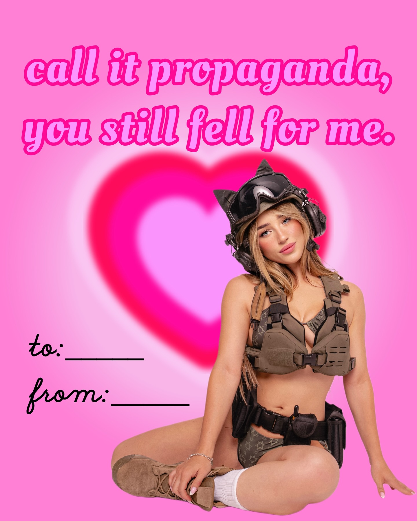
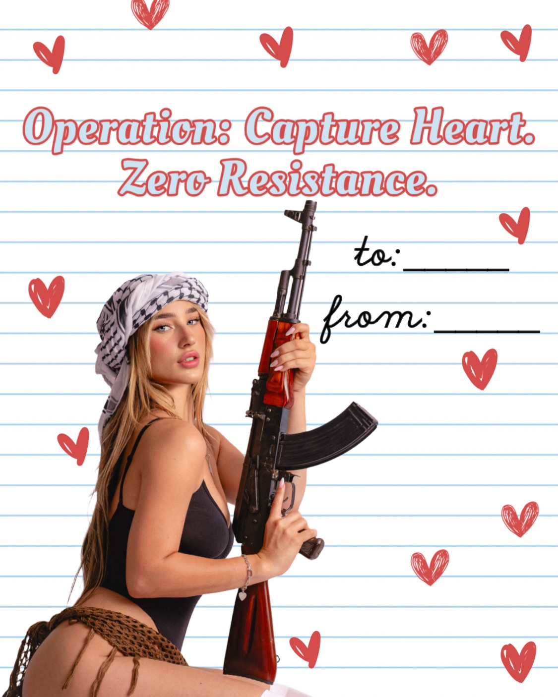
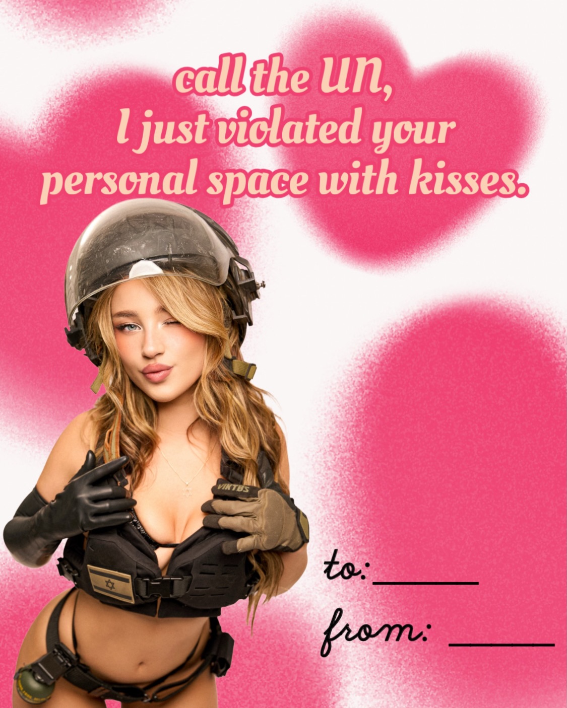
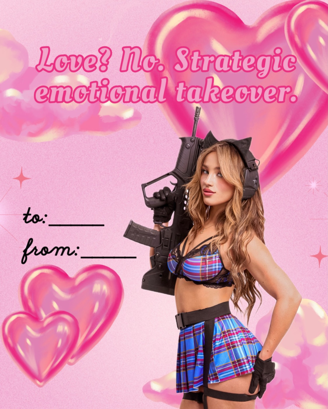
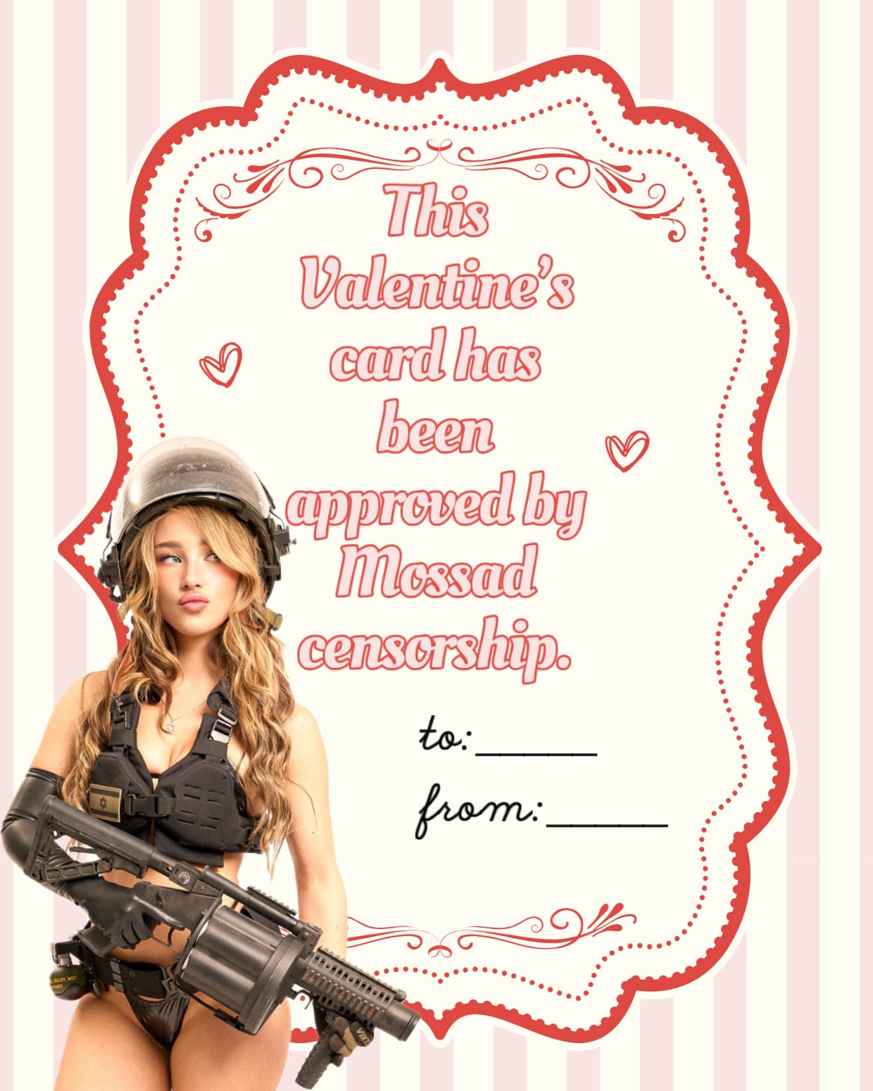
This image works because it fuses three formats that normally do not belong together: a candy-colored Valentine card, an internet meme caption, and a stylized tactical portrait. The pink backdrop and oversized heart immediately signal romance and kitsch, while the top line reframes the whole composition as an inside joke aimed at people who already understand the creator's online persona. That mismatch is the hook. Viewers are not just looking at a portrait; they are reacting to the tension between sweetness, sarcasm, and militarized styling.
The text placement matters as much as the subject. By putting a short, punchy sentence at the top and leaving the "to" and "from" fields blank, the image becomes a reusable template rather than a static post. People can repost it as a reaction image, send it ironically, or use it as a niche holiday meme. The seated pose, direct eye contact, and centered heart keep the composition simple enough to read in a fraction of a second, which is exactly what helps this kind of content travel on fast-scrolling feeds.
From a creator strategy angle, this is a strong example of identity branding through visual contradiction. The image does not rely on technical complexity; it relies on a clear, remixable premise. If you want to make something in this lane, focus on one strong background symbol, one legible headline, and one subject styling choice that clashes with the expected tone. The more instantly the audience can explain the joke to themselves, the more likely they are to save it, send it, and turn it into a reference point for the creator's persona.