ready for a zombie apocalypse? 😈 #zombieapocalypse #thewalkingdead #militarywomen
ready for a zombie apocalypse? 😈 #zombieapocalypse #thewalkingdead #militarywomen
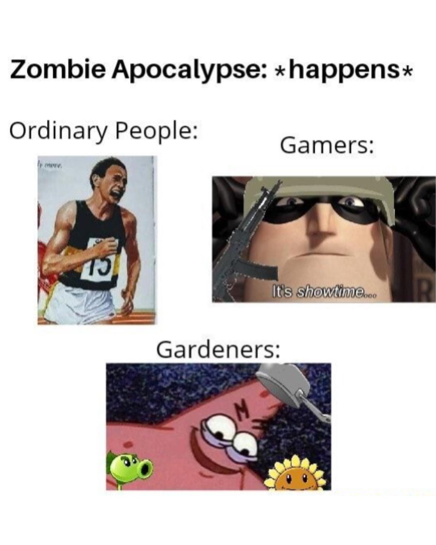
This meme lands because it uses a structure everyone already knows: one situation, multiple audience types, three reactions. That format removes friction. Viewers do not need to learn how to read it. They instantly look at the headline, compare the categories, and decide which panel is funniest. That speed is exactly why templates like this spread so well.
The second advantage is cultural stacking. “Zombie apocalypse” is already a familiar fantasy scenario. Then the meme maps that scenario onto gamers and gardeners, two groups with strong internet stereotypes and built-in fictional references. The joke does not depend on originality alone. It depends on shared recognition. For creators, that is a practical reminder: meme reach often comes from recombining known ingredients in a clean readable structure.
| Signal | Evidence (from this image) | Mechanism | Replication Action |
|---|---|---|---|
| Instant format recognition | Headline plus three labeled audience reactions on a plain white background | People understand the meme in under a second and keep reading | Use a familiar comparison template when the joke depends on fast comprehension |
| High cultural recall | Gaming and Plants vs. Zombies references are already known internet shorthand | Recognition lowers explanation cost and increases shareability | Pick references your audience can identify without needing lore paragraphs |
| Escalation through contrast | Ordinary people panic, gamers are excited, gardeners get a specialized joke payoff | The humor builds as the viewer moves down the meme | Arrange panels so the final category delivers the strongest or most unexpected twist |
| Low-production authenticity | The image looks like a casual repost meme rather than branded content | Memes often spread better when they feel native to internet culture instead of overdesigned | Do not over-style template memes; keep them close to platform-native humor language |
This format is useful when the topic already has a strong scenario and your audience can supply the stereotypes themselves. It works for gaming, fandom, hobby communities, platform culture, and creator niches that enjoy quick in-group recognition. The mistake would be using it for ideas that require too much setup. The whole point is speed.
Keep: one broad scenario and three group labels.
Change: the audience types and reaction images.
{scenario_happens} / {group_1}: {reaction_1} / {group_2}: {reaction_2} / {group_3}: {reaction_3}Keep: white background and plain black text for instant readability.
Change: the final panel so it delivers the deepest inside joke.
{headline} + simple label stack + strongest niche punchline in the bottom panelKeep: culture-first image references.
Change: medium from zombies to exams, breakups, outages, launches, or holidays.
{shared_scenario}: {general_public} vs {niche_audience_1} vs {niche_audience_2}Meme aesthetics are different from lifestyle aesthetics. Here the goal is not beauty but speed, hierarchy, and recognition. The white background strips away distraction. The black text tells you exactly how to read the frame. The embedded images then do the emotional work. This is efficient visual writing, not decorative design.
The bottom panel matters most. By placing “Gardeners” last, the meme uses downward reading momentum to reward the viewer with the most specific joke at the end. That is a useful structure for creators making templates: save your most community-specific payoff for the final panel so the meme feels like it escalates instead of repeating itself.
| Observed | How to Recreate |
|---|---|
| White background keeps the reading path obvious | Use minimal layout styling and let text plus reaction images do the work |
| Three labeled groups create a clean comparison ladder | Keep the number of groups small enough that the joke remains fast to parse |
| Mixed-source images signal internet-native repost humor | Use recognizable reaction frames rather than polished original artwork |
| Bottom panel delivers the most niche payoff | Order the reactions so specificity increases as the viewer reads downward |
| Prompt chunk | What it controls | Swap ideas (EN, 2-3 options) |
|---|---|---|
| scenario headline at top | Core joke setup | "exam season hits" / "power outage happens" / "AI tools go down" |
| three labeled audience categories | Comparison framework and reading rhythm | "students / parents / teachers" / "designers / developers / marketers" / "fans / critics / collectors" |
| recognizable reaction images from internet culture | Emotional shorthand and shareability | "reaction GIF stills" / "cartoon screenshots" / "game character images" |
| plain white background with black meme text | Speed and readability | "off-white background" / "simple meme font" / "clean cropped repost style" |
| bottom panel with the strongest niche punchline | Escalation and retention | "inside joke payoff" / "unexpected specialist angle" / "hyper-specific fandom reference" |
That workflow lets you scale the template without stripping away the quick-read humor that makes it spread.