
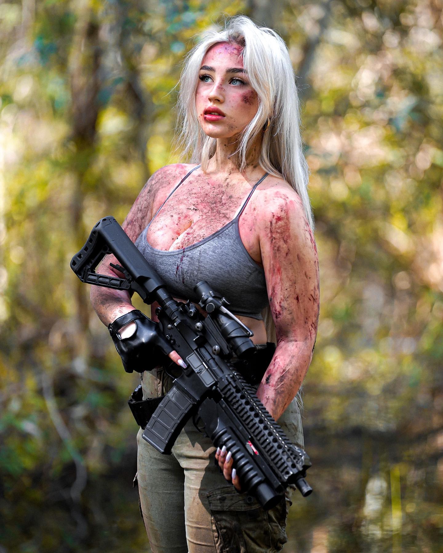

ready for a zombie apocalypse? 😈 #zombieapocalypse #thewalkingdead #militarywomen
ready for a zombie apocalypse? 😈 #zombieapocalypse #thewalkingdead #militarywomen
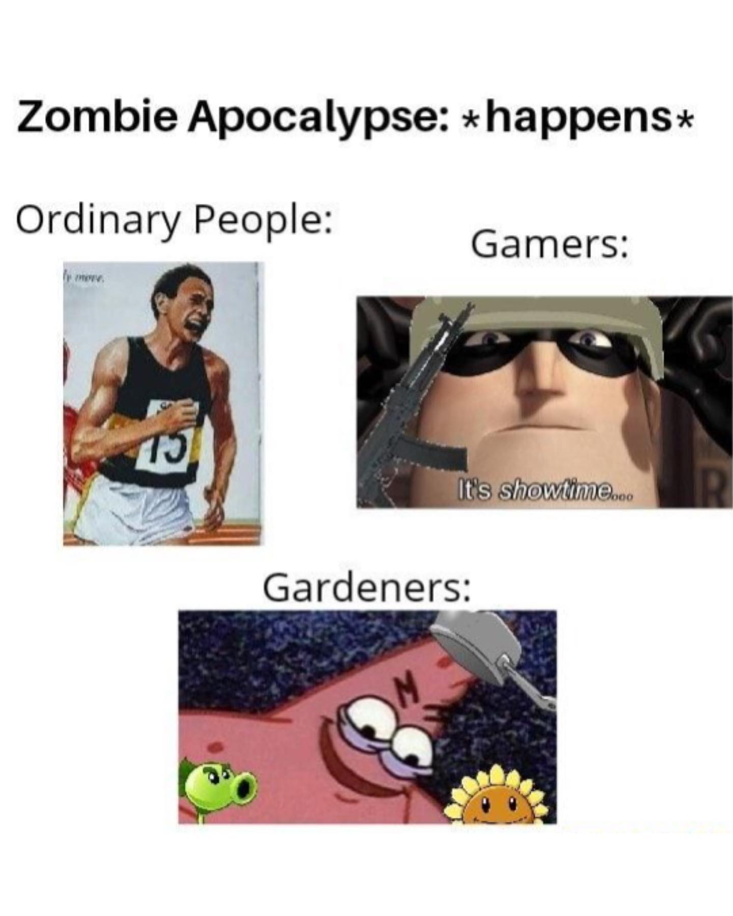
This image works because it uses a very old but very reliable internet mechanic: exaggerated certainty delivered through a recognizable reaction face. The joke is simple, but the format is doing a lot of work. The serious expression, the direct stare, and the all-caps text make the punchline feel louder than it actually is. That is exactly how many durable image macros spread.
The structure is also efficient. The top line sets up a question, and the bottom line answers it with mock frustration. This call-and-response pattern is one of the reasons classic meme templates remain reusable for years. It gives the viewer a setup and payoff in seconds.
The meme is effective because it combines three familiar components: a recognizable reaction template, a hyperbolic scenario, and a blunt payoff line. The character’s face does not need to change much because the text carries the escalation. That makes the template easy to remix across topics. Once the audience recognizes the emotional tone, the wording can do the rest.
| Signal | Evidence (from this image) | Mechanism | Replication Action |
|---|---|---|---|
| Recognizable reaction face | Direct, serious animated stare from a known meme-able character type | Provides emotional framing before the viewer reads the text | Use a face that already implies annoyance, authority, or certainty |
| Top-bottom caption structure | Setup line on top, payoff line on bottom | Makes the joke readable in under two seconds | Keep the setup short and let the bottom line carry the escalation |
| All-caps impact styling | Large white outlined text dominates the frame | Gives the joke immediate urgency and meme recognizability | Use high-contrast meme typography when the format itself is part of the humor |
| Hyperbolic scenario | “Zombie apocalypse” as the exaggerated consequence | Makes the complaint feel absurd enough to be funny | Escalate the consequence beyond what the original behavior logically deserves |
The image feels classic because it does not over-design itself. It is just a screenshot, one face, and two text blocks. That simplicity is important. Many newer meme attempts fail because they add too many layers, edits, arrows, or interface clutter. This format trusts the template. The reaction image is stable, and the words do the variation work.
The office background also helps more than it first appears. It keeps the image grounded in a mundane, almost corporate setting, which makes the phrase “zombie apocalypse” feel even more disproportionate. That contrast amplifies the joke.
| Observed | Why It Matters | How To Recreate |
|---|---|---|
| One centered reaction face | Keeps all attention on the emotional tone | Pick one still image that reads clearly even when cropped tightly |
| Top question / bottom answer layout | Creates instant comedic structure | Build the meme so the bottom line reframes the top line |
| Plain background from the original scene | Supports the reaction without distracting from it | Leave the background intact instead of over-editing the frame |
| Large outlined uppercase text | Signals “classic image macro” immediately | Use meme-native typography if you want broad recognizability |
| Prompt chunk | What it controls | Swap ideas (EN, 2-3 options) |
|---|---|---|
| Archer-style animated male reaction face in an office | Main template identity | 'reaction cartoon still', 'office screenshot meme', 'animated deadpan close-up' |
| top line asks a question, bottom line gives the consequence | Joke structure | 'setup and punchline captions', 'question-answer macro', 'complaint escalation meme' |
| large bold white uppercase text with black outline | Meme-native typography | 'classic image macro text', 'Impact-style captioning', 'bold all-caps meme font' |
| serious expression contrasted with absurd wording | Tone mismatch that fuels the joke | 'deadpan face with extreme statement', 'stern look with ridiculous consequence', 'calm image, loud copy' |
| simple square screenshot composition | Format recognizability | 'square reaction crop', 'image macro layout', 'minimal meme screenshot' |
Lock three things first: the reaction face, the caption structure, and the bold meme typography. Those are the core anchors. Then iterate one variable at a time. First version: get the setup and payoff wording tight. Second version: refine the crop so the face remains dominant. Third version: make sure the text remains readable at feed size. Fourth version: only then test alternate consequences or characters. That sequence keeps the meme reusable and recognizable instead of overcomplicating the template.