
ready for a zombie apocalypse? 😈 #zombieapocalypse #thewalkingdead #militarywomen
ready for a zombie apocalypse? 😈 #zombieapocalypse #thewalkingdead #militarywomen
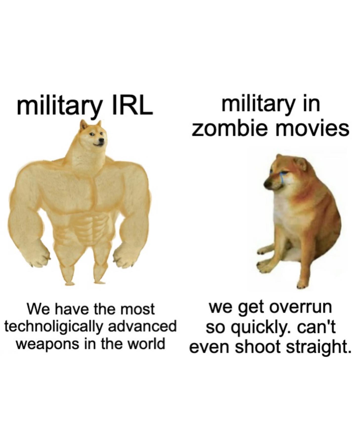
This image is not winning through visual polish. It wins through compression and speed. In one glance, the viewer gets the entire joke: real-world military competence versus fictional zombie-movie incompetence. The strong Doge and weak Doge template does almost all of the cognitive work before the smaller text is even read.
That is exactly why formats like this travel so well. They are cheap to decode, instantly remixable, and emotionally legible across fandoms, politics, sports, gaming, and pop culture. The white background also helps. There is no visual friction, so the joke reaches the viewer faster than a dense graphic ever could.
| Signal | Evidence (from this image) | Mechanism | Replication Action |
|---|---|---|---|
| Known template | The meme uses the buff Doge versus weak Doge comparison structure | Template familiarity reduces interpretation time | Use a recognizable meme skeleton before adding your custom topic |
| Fast text hierarchy | Short headline above, longer punchline below on each side | Lets the viewer understand the setup before reading details | Keep top labels short and reserve the bottom block for the actual joke |
| Blank background | There is only white space behind the dogs and text | Removes distractions and improves meme readability on mobile | Do not add decorative backgrounds or extra meme stickers |
| Binary contrast | Left side is strong, right side is incompetent | Conflict is instantly visible even before language is processed | Build the joke around a clean two-state contrast, not a nuanced comparison |
This structure works best for opinion memes, fandom criticism, satire, “real life vs fiction” takes, and any post where the punchline depends on an easy contrast. It is especially useful when the creator wants shareability over polish, because the barrier to understanding is almost zero.
It is less suitable for nuanced educational content or brand-safe marketing. The format pushes exaggeration and flattening by design, which is exactly why it spreads but also why it can oversimplify.
| Observed | Recreate evidence |
|---|---|
| Two-column comparison | Keep the canvas visibly split into a left and right claim |
| Image-first joke | Use reaction figures that already imply strength versus weakness |
| Typography simplicity | Use plain black sans-serif with no styling gimmicks |
| Mobile readability | Preserve large white margins and centered text blocks |
| Topic injection | Swap only the labels and subtext while keeping the meme skeleton intact |
{strong version} vs {weak version}{idealized claim} / {messy reality}{real thing} vs {fictional version}| Prompt chunk | What it controls | Swap ideas (EN, 2-3 options) |
|---|---|---|
| Meme template block | Keeps the output in graphic-template territory instead of scene generation | buff vs weak doge meme, side-by-side comparison meme, internet meme layout |
| Canvas block | Controls cleanliness and mobile readability | plain white background, blank meme canvas, empty white layout |
| Character block | Creates the emotional contrast without extra explanation | muscular standing Doge, weak seated Doge, strong-vs-sad dog contrast |
| Typography block | Keeps the joke understandable in feed format | black sans-serif headline, centered meme text, short label plus longer caption |
| Topic block | Adapts the template to a new niche | real life vs movies, expectation vs reality, ideal vs actual |
Lock the template, the white background, and the strong-vs-weak contrast first. Those are the non-negotiable foundations. After that, change only the labels and subtext.
The main mistake is overdesigning it. This format works because it looks disposable. Once it feels too art-directed, it loses the speed that makes it shareable.