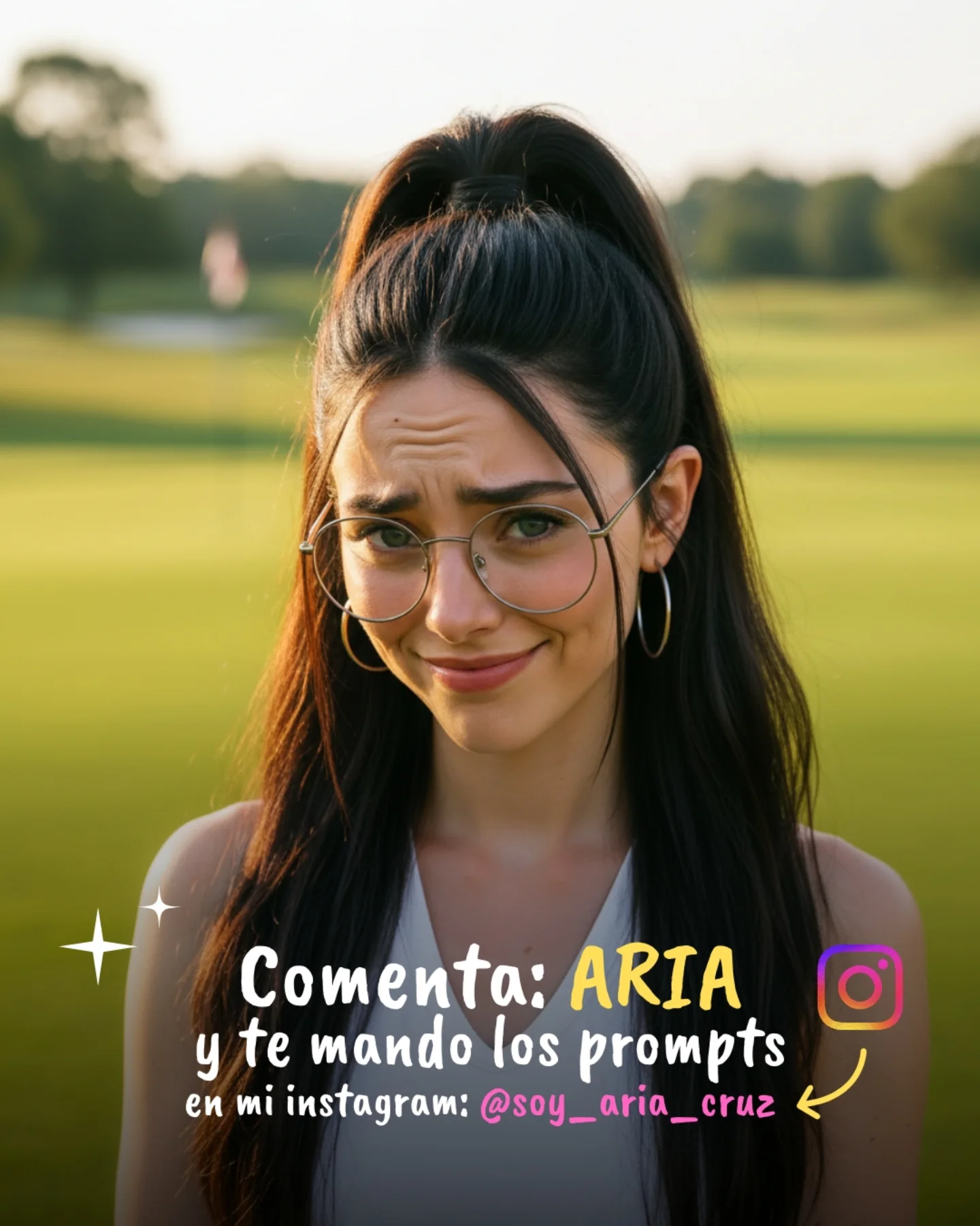
How soy_aria_cruz Made This Comment ARIA CTA Poster Image — and How to Recreate It
The smartest part of this image is the expression. Before the viewer even reads the caption overlay, the raised brows and crooked smile already establish a playful conversational tone. That matters because comment-driving slides perform better when they feel like a person talking to you, not a poster talking at you. The text then lands as a continuation of the expression rather than a separate sales layer.
The outdoor background is also doing useful work through simplicity. A grassy field is visually calm, which leaves room for the face and the lettering to do their jobs. There is no nightlife glow, no crowded room, no object clutter competing with the CTA. This makes the image easier to read at small size and keeps the communication low-friction.
The Instagram icon and yellow arrow finish the conversion path cleanly. Together with the highlighted `ARIA`, they reduce the action to something almost impossible to misunderstand. Good CTA cards succeed when the viewer can tell what to do in one second. This one gets close to that ideal.
Why this card converts better than a plain text slide
| Signal |
Evidence (from this image) |
Mechanism |
Replication Action |
| Face-led persuasion |
Playful skeptical expression with raised brows and amused mouth |
Builds human tone before the CTA text even gets processed |
Use an expression that already feels conversational if the slide asks for interaction |
| Keyword clarity |
`ARIA` is larger and highlighted in yellow |
Makes the action easy to remember and repeat |
Choose one response word and visually elevate it above all supporting copy |
| Simple visual path |
Instagram icon on the right with a curved yellow arrow |
Guides the eye from instruction to destination |
Add one directional cue when you want users to understand where the next action lives |
| Low-noise background |
Soft grassy field and blurred horizon |
Keeps the CTA legible and prevents thumbnail confusion |
Use calm backgrounds when the card depends on handwritten text readability |
Where this format fits best
- Prompt giveaway end cards: Best when you want to turn viewers into commenters or DM requests with minimal friction.
- Creator-brand CTA slides: Strong when the creator personality should stay visible even on promotional frames.
- Carousel closing frames: Useful after educational or comparison posts where the final goal is interaction rather than explanation.
- Lightweight story cards: Good when a graphic-only slide would feel too impersonal or ad-like.
This structure is less ideal for product launches, dense instructions, or highly formal branding. It depends on charm, clarity, and creator warmth. If the message becomes too corporate, this kind of informal handwritten frame stops working.
Three transfer recipes
- Keep: expressive face + one highlighted keyword + social icon. Change: background, offer, language. Slot template: “{creator portrait} asking viewers to comment {keyword} for {offer}”.
- Keep: handwritten lower-half CTA + simple outdoor or plain background. Change: wardrobe and emotional tone. Slot template: “{low-noise portrait} repackaged into {comment conversion card}”.
- Keep: soft real-photo base + icon plus arrow + creator handle line. Change: color emphasis, platform, ask type. Slot template: “{social-native portrait} with {single-action CTA} and {destination cue}”.
The aesthetic logic behind the conversion
The image works because the portrait and the interface elements are not competing. The upper half is almost entirely face and emotion. The lower half is almost entirely instruction. That separation creates a clean hierarchy that many CTA slides miss.
The natural outdoor light also helps by making the image feel relaxed and trustworthy. Artificial, high-contrast lighting could make the frame more striking, but it would also make the CTA feel more promotional. Here, the softness of the field and the daylight keep the card friendly.
The handwritten text style then completes the illusion of direct creator communication. It feels less like design software and more like an overlay added by a person who is talking directly to their audience. That is often exactly the tone creator accounts need.
| Observed |
Why it matters |
| Raised-brow expression at the top of the frame |
Creates personality and establishes a conversational tone immediately |
| Large handwritten CTA in the lower half |
Makes the instruction readable without covering the face |
| Yellow emphasis on `ARIA` |
Turns the response word into the core visual anchor |
| Instagram icon plus arrow |
Clarify the platform destination and complete the action path |
| Soft grassy background |
Provides a calm stage for both portrait and text to stay readable |
Prompt technique breakdown
To recreate this well, build the real portrait first and the instruction layer second. The more the base image feels like a normal photo, the more effective the CTA overlay becomes.
| Prompt chunk |
What it controls |
Swap ideas (EN, 2–3 options) |
| “young woman outdoors with raised-brow playful expression” |
Conversational tone and human warmth |
“teasing expression”, “mock-surprised look”, “friendly skeptical smile” |
| “soft grassy field with blurred horizon” |
Low-noise background and visual calm |
“park lawn”, “simple open field”, “quiet outdoor backdrop” |
| “large handwritten Spanish CTA across the lower half” |
Conversion packaging and social-native readability |
“comment keyword card”, “handwritten prompt CTA”, “creator overlay text block” |
| “ARIA larger and yellow, with Instagram icon and arrow” |
Action focus and destination clarity |
“highlighted keyword”, “single-command emphasis”, “color-coded response word” |
| “real portrait first, graphic accents second” |
Authenticity and anti-ad feel |
“social-first image”, “creator card built from candid photo”, “photo-led CTA layout” |
How I would iterate this image
Baseline lock first: the expressive portrait, the highlighted `ARIA`, and the clean lower CTA layout. Those are the three anchors. Once they are stable, refine icon placement, text spacing, and handle readability.
- Run 1: establish the natural outdoor portrait with the correct playful face and simple field background.
- Run 2: add the lower CTA overlay and protect the face from overlap.
- Run 3: push the keyword `ARIA` larger and warmer so the action is unmistakable.
- Run 4: refine the Instagram icon, arrow, sparkle details, and handle line color.
Use the one-change rule. If the card feels too designed, strengthen the photo realism before adjusting text. If the portrait works but the CTA is unclear, fix the keyword hierarchy before adding decoration. The image wins because it feels like a real person making a simple ask.