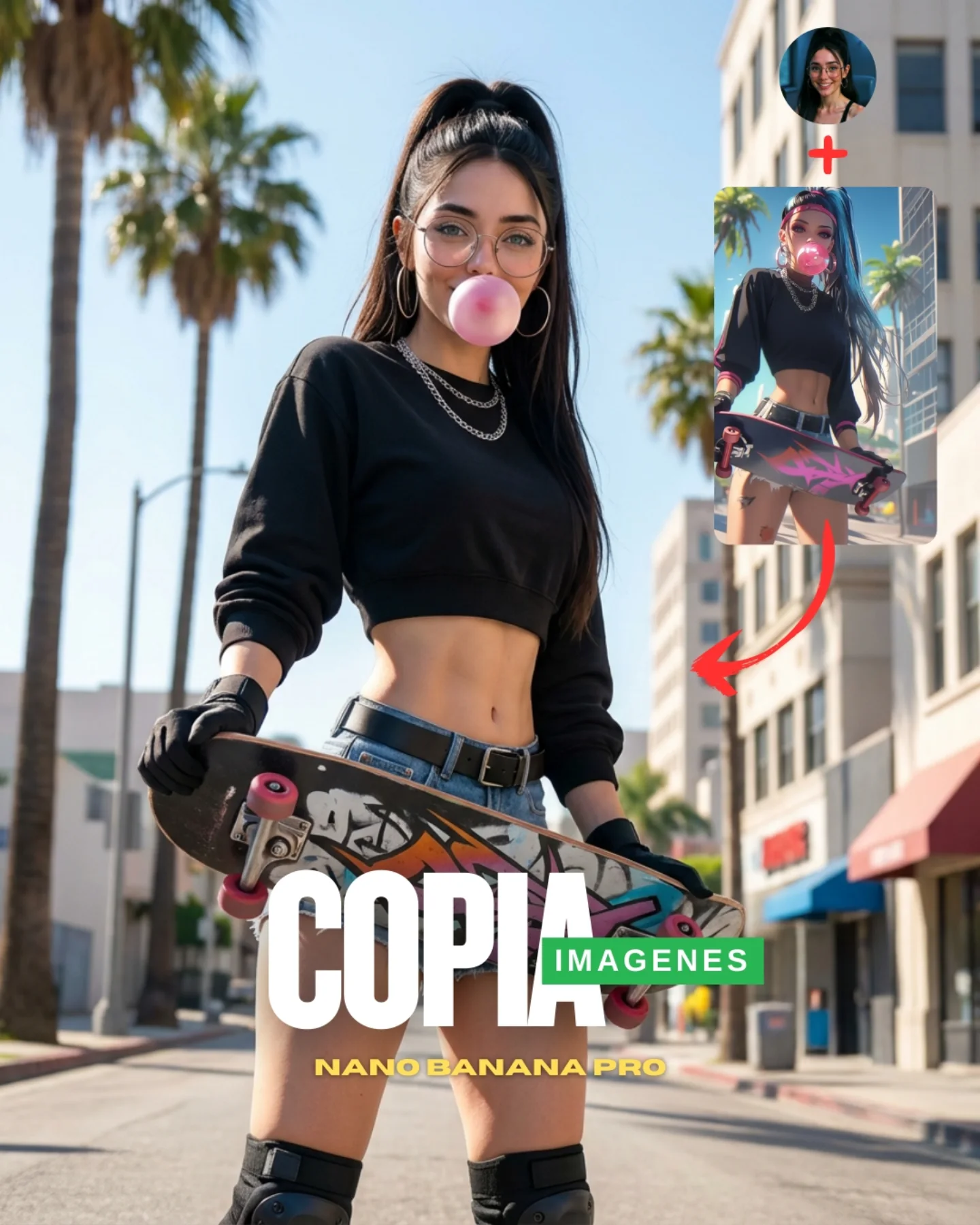
How soy_aria_cruz Made This Palm Street Skate CTA Image — and How to Recreate It
This image works because it is not trying to hide that it is a conversion graphic. Instead of dressing the sales layer up as a neutral lifestyle photo, it embraces the language of social growth content: bold headline text, a directional arrow, a reference inset, and a creator avatar. That clarity is important. The viewer understands immediately that the post is offering a tactic, not just a mood.
What keeps it from feeling cheap is the strength of the base image. The palm-lined street, the low-angle skate stance, the black crop top, and the bubblegum gesture give the graphic real visual energy. The promotional packaging works because the underlying photo is already scroll-worthy on its own. For creators, this is the useful lesson: good CTA graphics still need strong content underneath the text.
Why This Social CTA Stops the Scroll
The strongest thing here is the hierarchy. First you see the skater figure. Then the bubblegum bubble and skateboard. Then the large typography. Then the inset reference and arrow. The frame guides the eye through its pitch naturally instead of dumping all information at once. That matters a lot on crowded feeds.
Another reason it works is that the setting reinforces the aspirational lifestyle. Palm trees, bright sun, and an open street create a strong aspirational backdrop that suggests freedom, style, and creator confidence. For prompt-oriented content, that is useful because the environment makes the educational message feel desirable rather than dry.
| Signal | Evidence (from this image) | Mechanism | Replication Action |
|---|
| Immediate CTA structure | Large headline text, arrow, inset image, and profile badge are all visible | Clear packaging tells viewers this is an actionable post, not passive inspiration | Use overt content framing when the goal is conversion or instruction |
| Strong base visual | The skater pose, bubblegum, and low-angle body stance are already compelling | Compelling imagery earns attention before the instructional layer is read | Make sure the hero image could work even without text |
| Aspirational location cue | Palm trees and sunny street imply a stylish, open urban lifestyle | Environmental desirability makes educational content feel more emotionally attractive | Choose locations that signal a lifestyle people want to copy |
| Reference logic | The inset image and red arrow visually explain what is being copied or transformed | Visual explanation reduces friction faster than text-only instruction | Show source or inspiration imagery directly when teaching image replication |
Where This Visual Formula Fits Best
- Prompt-growth posts: ideal for creators teaching how to replicate a visual result quickly.
- Instagram carousel covers or story promos: strong because the design reads instantly on mobile.
- Creator-marketing posts: useful when the goal is to blend style aspiration with a direct offer.
- Prompt-library education content: effective because it shows image logic, not just text claims.
This setup is less ideal for quiet brand storytelling, cinematic editorials, or evergreen blog hero images. Its strength comes from explicit conversion energy. If the goal is subtlety, the same directness that makes it effective here will feel too loud.
Transfer recipe one: Keep the large CTA text, one aspirational hero image, and one inset reference. Change the niche from skating to fashion, gym, travel, or interiors while preserving the same educational packaging. Slot template: {hero lifestyle image} {reference inset} {arrow direction} {big CTA headline}.
Transfer recipe two: Keep the bright daylight and bold social layout. Change the outfit and prop while preserving a single strong attitude pose and mobile-first readability. Slot template: {strong pose} {single prop} {clear overlay system} {scroll-stop objective}.
Transfer recipe three: Keep the avatar-plus-reference formula. Change the emotional tone from playful skater confidence to luxury, fitness, or tutorial seriousness while preserving the same hierarchy. Slot template: {creator avatar} {reference sample} {hero visual} {instructional headline}.
What Makes the Graphic Feel Effective Instead of Cheap
The reason this graphic works is that the promotional layer is integrated into the composition instead of pasted on as an afterthought. The text sits where the lower body and skateboard already create a strong base. The inset lives in unused sky and building space. The arrow connects the two visual ideas clearly. Good social packaging is often just good spatial design.
The bubblegum and glasses also matter more than they seem to. They give the subject a distinct personality, which makes the CTA feel attached to a real creator identity instead of an anonymous template. For creators, that is a practical takeaway: even in high-conversion graphics, the human signature should stay visible.
| Observed | Recreate |
|---|
| Hero image remains strong beneath all overlays | Start with a base image that already has attitude, shape, and location appeal |
| Inset reference and arrow explain the point visually | Use graphics to teach transformation or copying logic instead of writing everything in text |
| Palm-street setting adds lifestyle aspiration | Match the environment to the kind of visual result you want people to desire |
| Creator-specific details like bubblegum and glasses personalize the ad | Keep one or two memorable identity cues so the graphic feels authored |
Prompt Technique Breakdown
| Prompt chunk | What it controls | Swap ideas (EN, 2–3 options) |
|---|
| skater girl standing on a sunny palm-lined street with a skateboard | Core lifestyle fantasy and prop logic | surfer by the boardwalk; biker on a city corner; dancer in an alley |
| large CTA text, profile avatar, reference inset, and red arrow | Instructional packaging and conversion clarity | carousel cover layout; story promo layout; tutorial-thumbnail structure |
| black crop top, denim shorts, gloves, bubblegum, glasses | Identity cues and youth-culture styling | hoodie and sneakers; sporty set; minimal streetwear with chain details |
| bright midday palm-city light | Aspirational location mood | golden-hour boardwalk; rooftop daylight; bright downtown sidewalk |
| slightly low-angle hero stance | Confidence and visual dominance | eye-level stance; crouched skate pose; motion-ready walk pose |
| mobile-first high-energy promo design | Overall social usability | cleaner educational version; bolder ad version; more creator-diary variant |
How to Iterate Without Losing the Conversion Power
Lock three things first: the strong hero image, the obvious reference mechanism, and the large readable CTA text. Those are the load-bearing parts. If any one weakens, the graphic becomes either too generic or too confusing.
- Start with the exact formula: hero skater portrait, reference inset, red arrow, bold bottom headline, and creator avatar.
- Change only the niche or prop, keeping the same overall layout and conversion logic intact.
- Change only the location mood, moving from palm street to downtown, beach path, or rooftop while preserving the same daylight clarity.
- Change only the tone of the CTA, from copy-this-image to tutorial, prompt-drop, or before-after reveal without changing the graphic hierarchy.
The repeatable takeaway is simple: social CTA images work best when the design explains the offer instantly and the hero visual still feels worth copying.