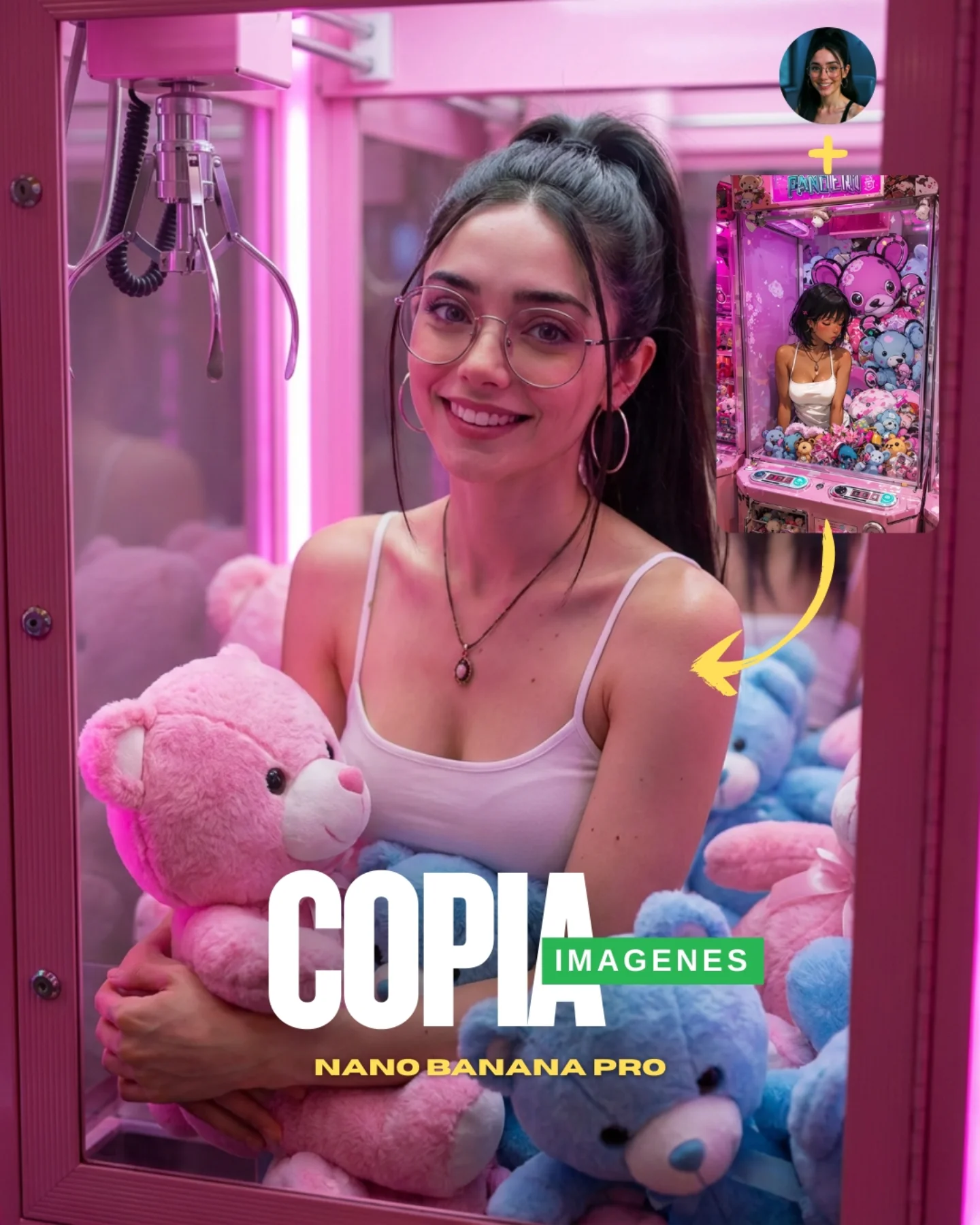
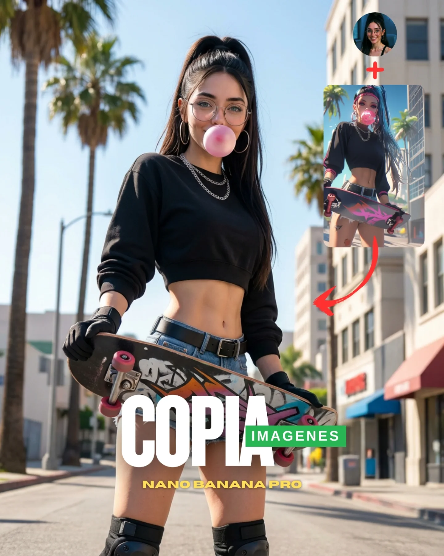
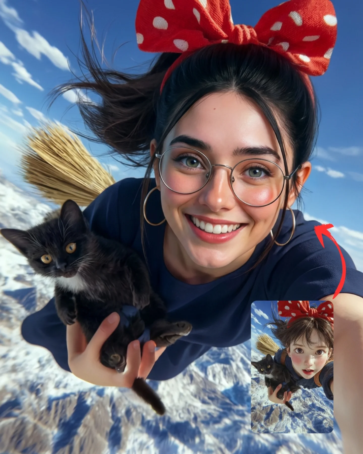
😍Copia cualquier imagen con Nano Banana Pro
Antes, con Nano Banana se podían copiar imágenes, pero no con todas funcionaba bien (había que gastar muchísimos créditos y generaciones fallidas) para conseguir un resultado medio medio. 😅
Ahora, con Nano Banana Pro todo se vuelve mucho más fácil!! Lo volví a poner a prueba, pero esta vez intentando copiar o replicar una imagen de dibujos animados para conseguir un resultado hiperrealista. 🥹
La verdad es que no me esperaba estos resultados taaaan buenos… A veces me ha pasado que falla, pero estoy casi segura de que, adaptando el prompt un poquito, lo haría perfecto.🙊
💌 Si quieres que te pase los prompts que usé y las imágenes de referencia, comenta "ARIA�" y te los mando por DM 💕
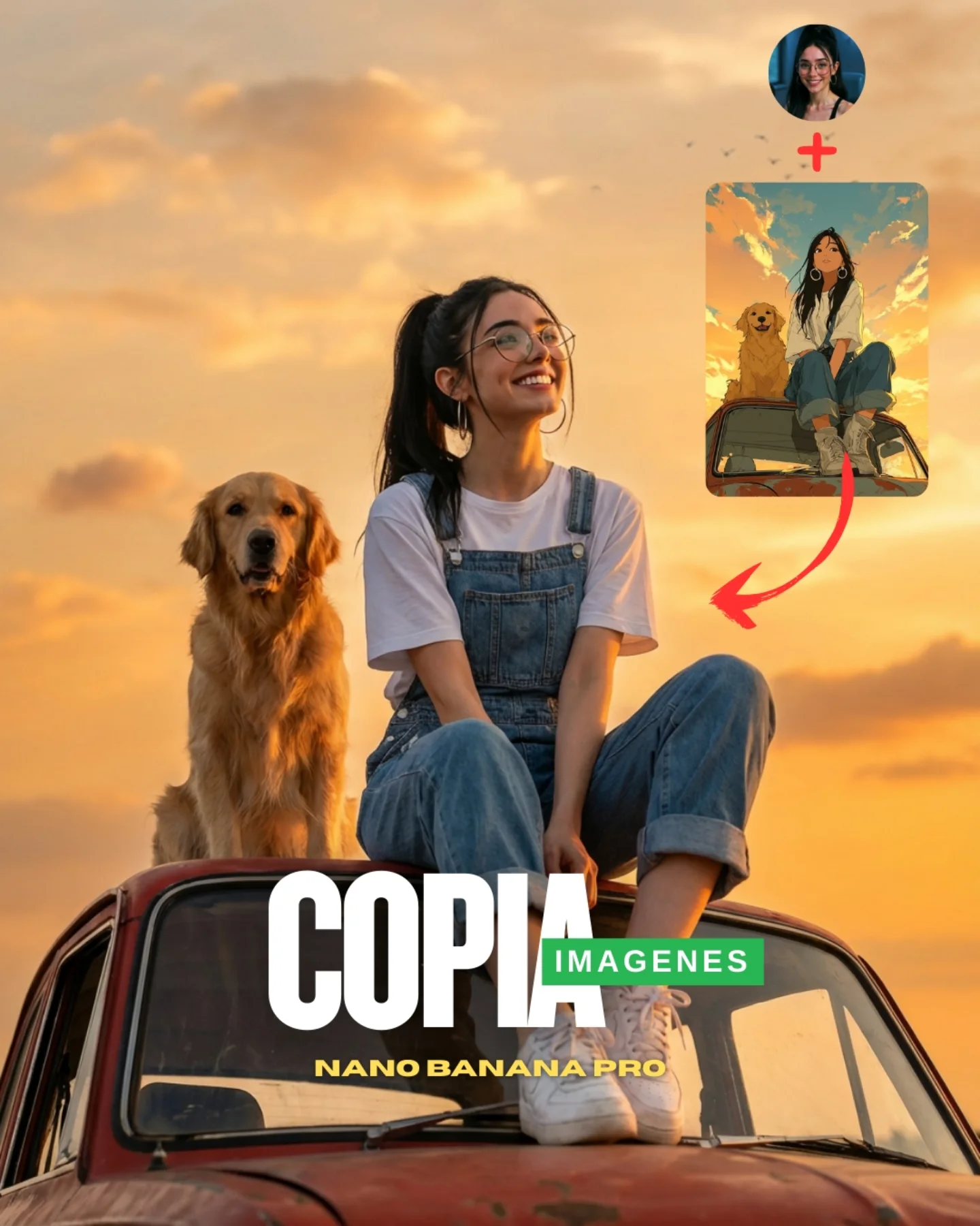
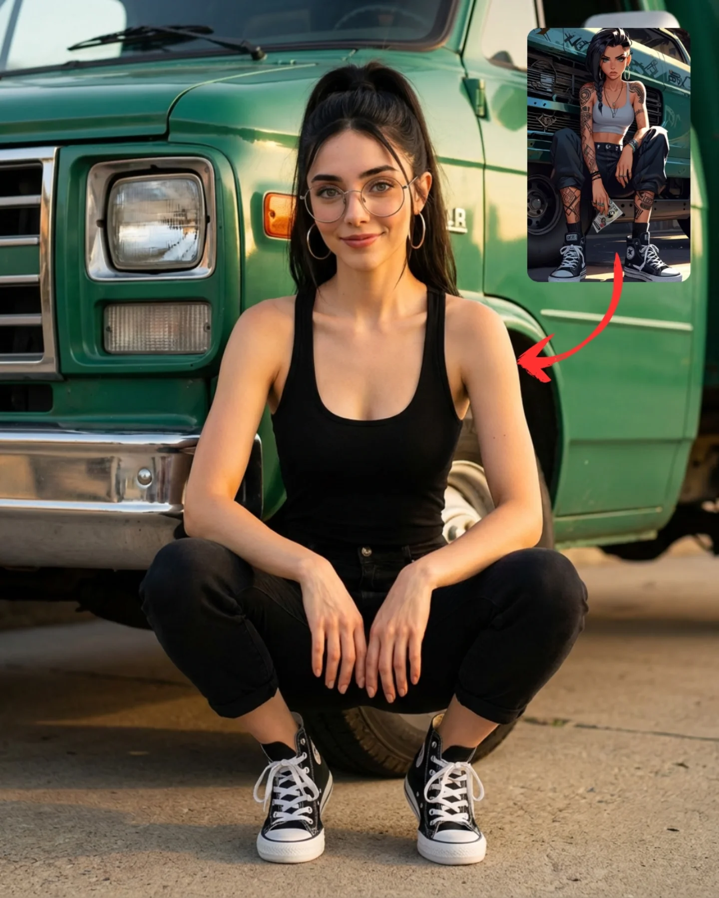
Why soy_aria_cruz's Copy Any Image Sunset Car Roof Golden Retriever Guide Went Viral — and the Formula Behind It
This image is doing more than showing a nice sunset portrait. It is selling a transformation. The frame keeps the final realistic scene large and emotionally appealing, but it also leaves the evidence of the source idea in the corner: profile image, plus sign, anime-style reference card, and a red arrow guiding the eye from inspiration to output. That is why the post works as creator content. It is not only beautiful; it is educational at a glance.
For small creators, that matters. Audiences often engage harder with images that contain visible process. The realistic sunset scene gives them the payoff, but the upper-right graphic cluster explains the trick immediately: start with an illustrated idea, then translate it into something hyperreal. This kind of visual teaching lowers friction. The viewer does not need a long caption to understand why the post is useful.
The emotional core is still strong on its own. A smiling woman in denim overalls sitting on an old car with a golden retriever at sunset is already a proven internet-friendly formula. It combines nostalgia, softness, companionship, and a highly readable silhouette. The tutorial overlay simply turns a warm lifestyle image into a prompt-conversion case study.
Why This Post Format Performs
The first reason this works is emotional familiarity. Dog plus golden-hour sky plus old car equals instant softness. The image feels safe, warm, and aspirational without demanding much explanation. Those are strong ingredients for saves and shares, especially among lifestyle and AI-creation audiences who respond well to cinematic comfort.
The second reason is transformation proof. The little inset reference image adds a narrative layer: this final result came from somewhere. That matters because prompt content usually gets stronger when people can compare “before” and “after” mentally. Even if the audience never reads the caption, they understand that a cartoon-like concept was turned into a photoreal scene.
The third reason is clear value hierarchy. The main scene dominates the center. The overlay explains method. The text overlay delivers the promise. Nothing is hidden, and nothing competes too aggressively. The image is designed to be decoded in one second and appreciated for longer after the stop.
Signal
Evidence (from this image)
Mechanism
Replication Action
Instant warmth
Golden retriever, smiling subject, sunset light, nostalgic car roof
Comfort-driven imagery broadens shareability and reduces resistance
Pair one human subject with one emotionally trusted animal and a warm time of day
Visible transformation
Anime-style inset card and arrow toward the final realistic output
Audiences engage more when the method is implied visually
Keep a small “source idea” inset instead of explaining the workflow only in text
Readable layout
Main scene centered, tutorial overlay top right, bold headline text bottom
Clear information order improves scroll-stop efficiency
Design covers with one dominant image, one proof element, and one short promise
Nostalgic simplicity
White tee, denim overalls, old car, open sky
Low-complexity styling makes the scene feel relatable and reproducible
Favor familiar wardrobe and one iconic prop over heavily styled clutter
Where This Aesthetic Fits Best
This format is ideal for AI-image comparison posts, prompt-teaching covers, creator tutorial reels, family-friendly lifestyle concepts, pet-friendly content, and nostalgic summer moodboards. It is especially useful when your goal is to prove that a source image or cartoon reference can be pushed into believable realism without losing charm.
Best fit: before-and-after AI prompt covers. The image already teaches the concept before anyone opens the post.
Best fit: lifestyle creator branding. The denim, dog, and sunset combination feels friendly and easy to trust.
Best fit: pet-centered prompt experiments. Animal companionship adds emotional lift with very little complexity.
Best fit: nostalgia-led social campaigns. The old car and open sky create a timeless internet-friendly softness.
Best fit: educational thumbnails. The graphic overlay turns the scene into an obvious lesson, not just a pretty image.
It is less suitable for luxury fashion, minimal design feeds, or highly serious technical demos. The frame is intentionally warm, broad, and internet-friendly. Its strength is accessibility, not exclusivity.
Transfer Recipes
Beach van version. Keep: transformation overlay, warm sky, pet companion. Change: vehicle type, wardrobe, color palette. Slot template: {sunset location} realistic photo, {subject outfit}, {pet}, old {vehicle}, small illustrated reference inset in upper right
Mountain pickup version. Keep: main scene realism plus source-card proof. Change: terrain, dog breed, pose. Slot template: {golden-hour mountain scene}, subject sitting on {vehicle roof}, {dog breed}, tutorial cover layout with reference card and arrow
City rooftop version. Keep: transformation logic and warm emotional styling. Change: environment, pet position, wardrobe material. Slot template: {urban sunset setting}, realistic lifestyle photo, {companion animal}, creator tutorial graphic overlay, social cover composition
The Aesthetic Logic of the Image
The central scene works because it is visually calm. The sky is broad and uncluttered, the wardrobe is simple, and the subjects are posed cleanly against open space. That calmness makes room for the overlay graphics without overwhelming the frame. If the background were busy, the teaching elements in the corner would feel messy instead of useful.
The denim overalls are also a smart choice. They read as youthful, nostalgic, and non-threatening. Combined with the golden retriever, they create a soft Americana-adjacent mood that many audiences instantly understand. This is a reminder that wardrobe does not need to be fashionable to be effective. It only needs to support the emotional story.
The car roof is the other key device. It elevates the subjects against the sky and turns an otherwise ordinary pose into a graphic silhouette. The old car also supplies texture and character. Without it, the scene could become generic “girl and dog at sunset.” With it, the image gains a stronger identity.
Observed
Why it matters
How to recreate it
Subjects elevated on the car roof
Separates them cleanly from the sky and improves silhouette readability
Use one prop that lifts the subjects into open background space
Simple nostalgic wardrobe
Keeps the tone warm and relatable
Choose denim, basics, and familiar shapes over trend-heavy styling
Golden retriever beside the subject
Adds immediate emotional trust and softness
Use one animal companion that supports the mood rather than complicates it
Upper-right source-card overlay
Turns a beautiful image into an educational case
Show the source inspiration inside the cover when teaching transformation
Warm peach-orange sky
Creates comfort and broad appeal
Favor gentle golden-hour gradients instead of dramatic storm skies
Prompt Technique Breakdown
To recreate this kind of content well, you need to prompt two layers separately: the main realistic scene and the teaching overlay. Most creators focus only on the photoreal scene, but the educational overlay is what turns the image into a high-performing social asset. Without it, you merely have a nice lifestyle picture.
Prompt chunk
What it controls
Swap ideas (EN, 2-3 options)
Main emotional scene
Warmth, nostalgia, and broad appeal
girl and dog at sunset; golden-hour lifestyle photo; nostalgic road-trip portrait
Elevation prop
Silhouette quality and image identity
old car roof; van top; pickup truck hood
Wardrobe language
Relatability and tonal softness
denim overalls; white tee and jeans; simple casual summer outfit
Animal companion
Emotional accessibility
golden retriever; labrador; fluffy family dog
Tutorial overlay
Process visibility and educational value
reference image inset; before-to-after arrow; creator profile plus source card
Cover typography
Promise clarity and social performance
bold white keyword; green label tag; short product line at bottom
The most likely drift point is the overlay system. Models often optimize toward a clean photograph and erase the explanatory pieces. If you want a real tutorial-cover feel, you need to explicitly request the source card, plus sign, arrow, and bold text layout.
How to Iterate Without Losing the Teaching Value
Lock three things first: the central sunset scene, the reference inset, and the text hierarchy. Once those are stable, refine styling, sky color, or car age. If you adjust everything at once, you risk losing the very feature that makes the image useful: the visible transformation story.
Use a one-change rule. If the main image feels too generic, improve the car and dog positioning. If the post no longer reads as educational, strengthen the upper-right overlay. If the mood becomes too dramatic, soften the sky and reduce contrast. Small shifts keep the cover effective without breaking the balance between beauty and explanation.
Run 1: Solve the main realistic sunset scene with the girl and dog on the car roof.
Run 2: Add the instructional overlay in the upper right with the source card and arrow.
Run 3: Refine denim texture, dog fur, and the worn vintage-car surface.
Run 4: Tune text placement and overall color warmth while preserving the same composition.
If the output becomes too much like an ad banner, reduce graphic clutter but keep the source-card logic. If it becomes too much like a pure photo, reintroduce the overlay more assertively. The strength of the image is the combination of emotional scene and visible method.