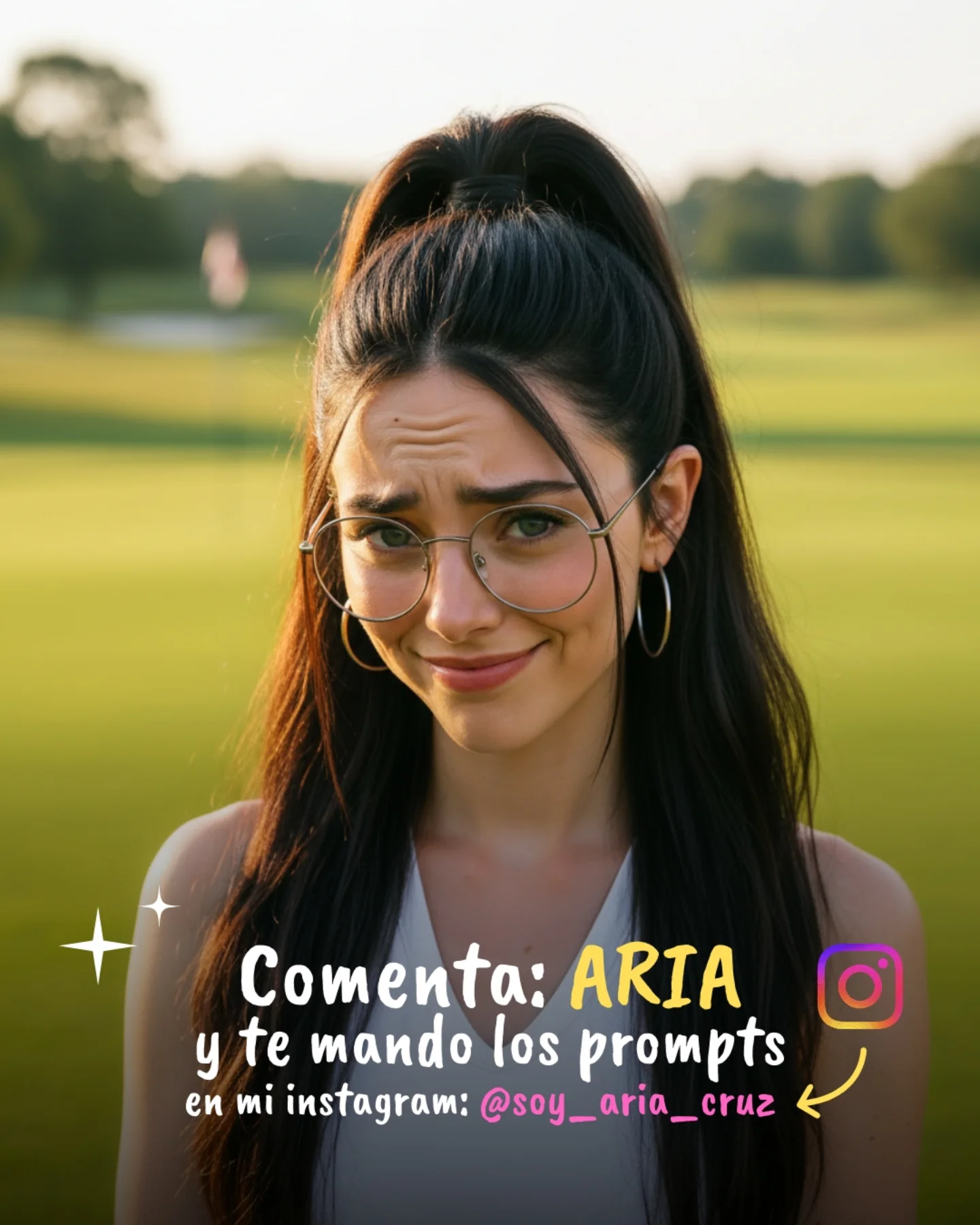
Why soy_aria_cruz's Copy Cartoon Image to Realistic Claw Machine Guide Went Viral — and the Formula Behind It
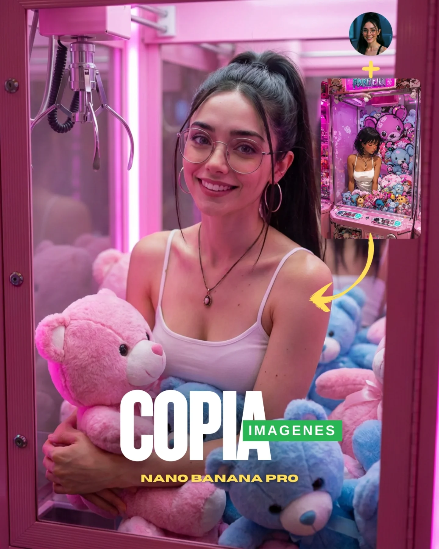
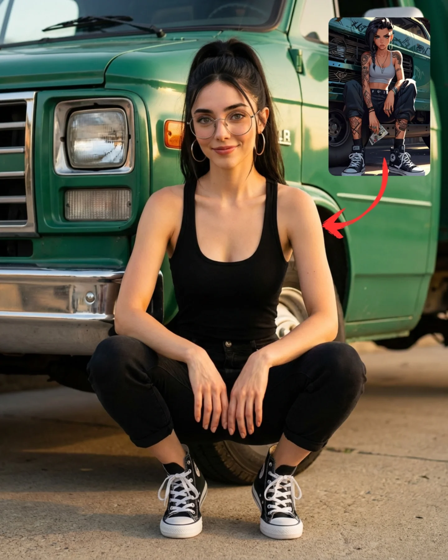
The strongest part of this cover is that it teaches through layout. You do not need to decode a long caption to understand the pitch. There is a stylized reference in the corner, a yellow arrow, and a polished realistic result dominating the frame. That visual chain tells the whole story: take one image language, convert it into another. For prompt education, that is extremely efficient.
The second smart move is choosing a claw-machine scene as the test case. It is already visually loaded with recognizable shapes: pastel bears, pink acrylic, metal claw, candy lighting. That means the audience can quickly judge whether the “copy” worked. If the subject had chosen a plain face against a blank wall, the transformation would feel more abstract. Here, the environment itself becomes evidence.
The main portrait is also warm and commercially friendly. The woman smiles, the plush toys feel tactile, and the color palette is soft rather than technical. This matters because educational AI content performs better when the lesson is wrapped in an image people would have wanted to save anyway. It is not only a demo. It is a visually desirable result.
Why the image converts curiosity into clicks
| Signal |
Evidence (from this image) |
Mechanism |
Replication Action |
| Visual process explanation |
Inset reference image plus arrow pointing to the realistic main result |
Teaches the concept instantly without relying on caption text |
Show both source and transformed output in the same frame when teaching image replication |
| High-contrast demo subject |
Cartoon-like claw machine translated into a glossy realistic scene |
Makes the before/after jump obvious and satisfying |
Choose source images with strong shape language and surface variety |
| Save-worthy aesthetics |
Pink glow, plush bears, soft smile, clean beauty portrait |
Turns a tutorial cover into an aspirational image as well |
Wrap educational content inside visually attractive palettes and textures |
| Clear title packaging |
`COPIA IMAGENES` and `NANO-BANANA PRO` overlay at the bottom |
Makes the value proposition visible at thumbnail scale |
Use one simple outcome-focused headline instead of describing the full workflow |
Where this format fits best
- Prompt tutorial covers: Best when you need to communicate a transformation mechanic in one image. Keep the source and result visible in the same frame.
- Reference-image demos: Strong for showing how a stylized, cartoon, or low-detail input can be pushed toward realism.
- Creator education content: Useful when the post has to teach and still look like something worth saving or sharing.
- Model capability showcases: Good for proving a generator’s control over composition, props, and material translation.
This structure is less ideal for subtle realism improvements where the difference is hard to spot. It depends on a dramatic enough shift that the audience can understand the claim in a glance. If the before/after gap is too small, the layout loses power.
Three transfer recipes
- Keep: inset source image + arrow + polished main result. Change: theme, color palette, subject matter. Slot template: “{reference style} transformed into {target realism level}”.
- Keep: strong environment textures + cute or memorable props + simple explanatory headline. Change: genre and target engine. Slot template: “{source image type} copied into {realistic scene} with {clear cover text}”.
- Keep: one large central subject + one small explanatory inset. Change: transformation goal, branding strip, visual tone. Slot template: “{AI demo card} where {source} becomes {result}”.
The aesthetic logic behind the demonstration
The image works because every design choice supports the same idea: softness made real. Plush toys, pink glow, rounded glasses, a gentle smile, and the claw-machine shell all belong to a cute synthetic world. The AI demonstration then becomes convincing because it does not fight that softness. It simply translates it into more tactile, more believable surfaces.
The second key decision is keeping the main result visually aspirational. The central woman is attractive, approachable, and cleanly lit. The scene is not technical-looking. That matters because educational AI posts often underperform when they look like diagrams. This one looks like a cover image first and an explanation second.
The yellow arrow is also more important than it seems. It adds movement and direction, which helps the viewer understand not only that there are two images, but that one leads to the other. Simple directional graphics can drastically improve how fast a social image teaches.
| Observed |
Why it matters |
| Upper-right reference inset |
Explains the source material without needing extra slides |
| Yellow arrow pointing into the main image |
Visually clarifies the transformation direction |
| Pink claw machine filled with pastel bears |
Provides a texture-rich scene where replication quality is easy to judge |
| Central smiling portrait with glasses and white tank top |
Keeps the result attractive, human, and save-worthy |
| Large bottom title lockup |
Packages the image as a prompt demo instead of a random portrait |
Prompt technique breakdown
To recreate this well, you need to think in two layers: the result scene and the explanation layer on top. Most failures happen because creators generate only the pretty main image and forget to package the transformation visually.
| Prompt chunk |
What it controls |
Swap ideas (EN, 2–3 options) |
| “hyper-realistic woman inside a pink claw-machine booth holding plush bears” |
Main result scene and tactile realism |
“realistic arcade booth portrait”, “plush-machine beauty scene”, “pastel claw-machine realism” |
| “small reference inset in the upper-right with arrow pointing to the main result” |
Transformation explanation and teaching clarity |
“before-and-after inset”, “source image thumbnail”, “reference card plus directional arrow” |
| “large COPIA / IMAGENES / NANO-BANANA PRO cover text” |
Value proposition and thumbnail readability |
“copy image headline”, “reference-to-real headline”, “prompt-demo title block” |
| “soft pink glow, glossy acrylic, plush texture” |
Visual sweetness and tactile appeal |
“candy arcade lighting”, “pastel machine reflections”, “cute commercial color palette” |
| “young woman with glasses, pendant necklace, white tank top” |
Human anchor and continuity with the creator identity |
“friendly model portrait”, “soft realism lead subject”, “creator-style central figure” |
How I would iterate this image
Baseline lock first: the realistic claw-machine scene, the source inset with arrow, and the title lockup. Those are the three anchors. Once they are in place, refine plush textures, face realism, and exact text placement.
- Run 1: build the pink claw-machine environment with visible claw hardware and stuffed toys.
- Run 2: lock the main portrait with warm smile, glasses, white tank top, and clean realism.
- Run 3: add the upper-right reference inset and the yellow transformation arrow.
- Run 4: refine the lower title hierarchy, plush detail, and glossy acrylic reflections.
Use the one-change rule. If the transformation concept is unclear, fix the inset and arrow before touching the face. If the concept reads clearly but the result is not attractive enough, refine the central portrait before editing typography. The image wins because explanation and desirability stay balanced.