How tapewarp Made This Higgsfield Soul V2 Texture Poster AI Art - and How to Recreate It
Most prompt-promo posts make one familiar mistake: they treat prompts as a shortcut to a final image. This poster takes a smarter route. It sells texture. That shift changes everything. Instead of saying “here is one result,” it says “here is a family of moods, surfaces, styling cues, and everyday realism that you can build from.” For creators, that is much more useful and much more seductive.
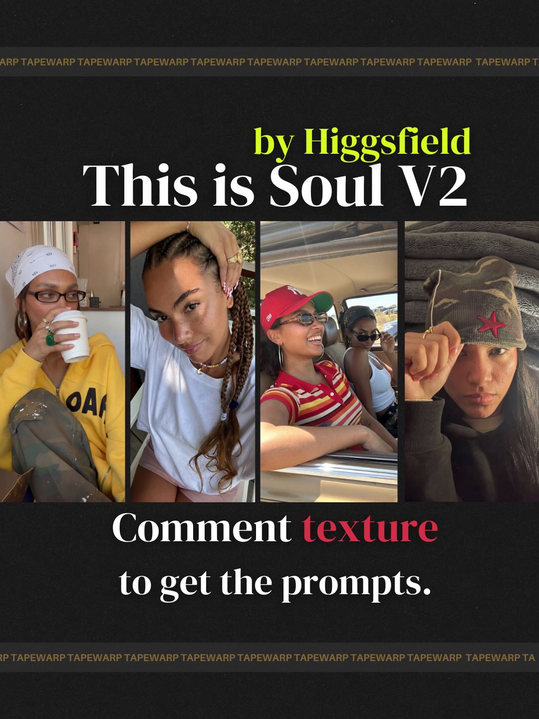
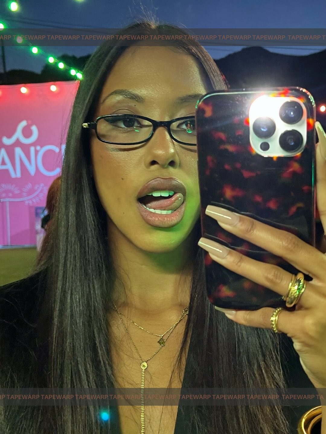
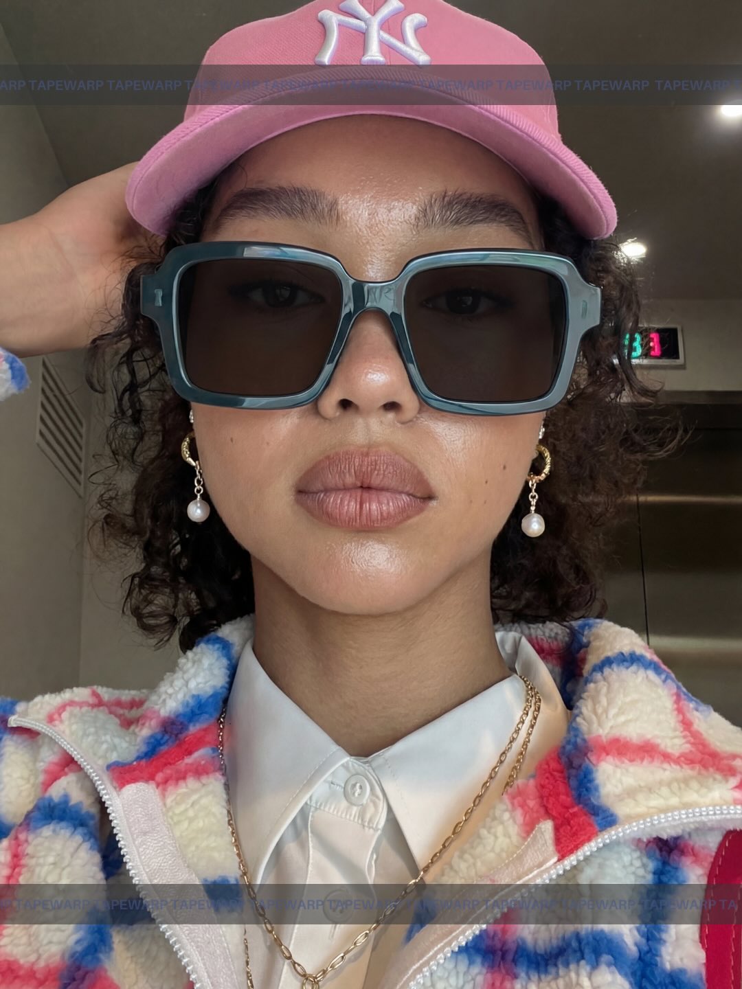
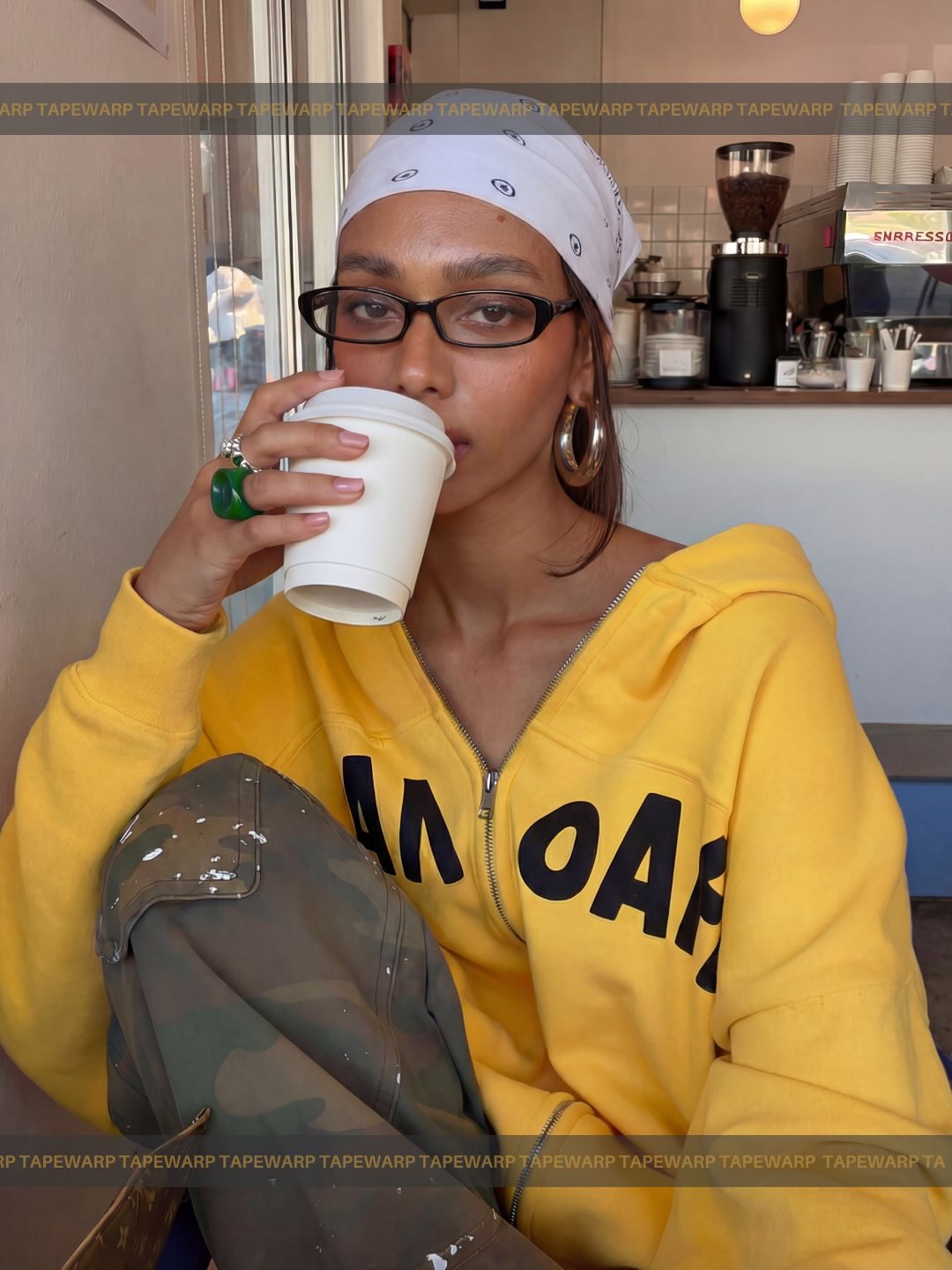
The key difference is that the collage is not trying to show one perfect photo. It is showing a range of lived-in visual identities: bandana-and-hoodie softness, braid-and-jewelry intimacy, car-window laughter, beanie-and-hoodie streetwear edge. That range gives the post more save value because viewers can map themselves onto at least one panel, and often more than one.
Why this style of post gets attention
The first hook is recognition. These portraits do not feel like inaccessible fashion-editorial fantasy. They feel close to the kind of images people already like, share, and imitate in everyday internet culture. That familiarity lowers resistance. The audience immediately understands the aesthetic category being offered.
The second hook is curation. Four images framed as one “Soul V2” world feels bigger than a single sample. The post suggests there is a prompt system underneath, not just one lucky render. That perceived system is what makes the CTA stronger. Commenting for prompts feels more worthwhile when the viewer believes they are getting access to a repeatable taste framework rather than one isolated trick.
| Signal | Evidence (from this image) | Mechanism | Replication Action |
|---|
| Texture-board logic | Four different casual portrait references sit inside one branded frame | A range of examples suggests breadth and makes the offer feel richer | Show several adjacent mood references when selling a prompt pack or model style |
| Cultural familiarity | Bandana, hoodie, braids, cap, beanie, car snapshots, casual jewelry | Recognizable styling codes feel instantly usable and aspirational | Build prompt promos around everyday style signals people already read fluently |
| Systemized packaging | Unified headline, collage strip, and CTA create a productized visual container | Brand structure makes the prompt offer feel curated and more valuable | Use one strong poster system to package multiple visual examples together |
| Keyword CTA | The word “texture” is highlighted in red inside the instruction line | Single-word CTAs reduce friction and increase comment compliance | Give the audience one specific keyword to comment instead of a vague ask |
Best-fit use cases for this format
This approach is strongest for prompt packs, aesthetic model releases, mood-set launches, creator-style libraries, and community engagement posts where you want people to opt in by commenting. It is especially effective when your value lives in taste clustering rather than technical novelty. If the product is “I know how to get this vibe,” this layout is doing the right kind of selling.
- Prompt pack drops: ideal because the collage implies variety while the headline unifies the aesthetic; keep the four-up texture board format.
- Model-style launches: strong fit because side-by-side references show style breadth; vary wardrobe and setting while preserving the mood family.
- Community engagement posts: strong fit because the CTA can focus on one keyword and feel playful instead of pushy.
- Taste curation branding: strong fit because the post positions the creator as a selector of vibes, not just a maker of outputs.
It is less useful for detailed tutorials, workflow breakdowns, or one-image cinematic flex posts. This format is about grouping and naming a visual feeling.
Three transfer recipes
- Keep: four-image texture board, headline, keyword CTA. Change: texture family from casual portraits to interiors, food, nightlife, or travel snapshots. Slot template (EN): “branded poster featuring four curated {texture family} references under one style headline and one keyword CTA”.
- Keep: black poster background and editorial type hierarchy. Change: the collage contents and accent colors. Slot template (EN): “moodboard-style prompt promo with 3-5 reference panels and a single highlighted call-to-action word”.
- Keep: idea of selling a vibe system, not a single result. Change: use case from prompt giveaway to newsletter, course, or LUT pack launch. Slot template (EN): “curated references presented as a cohesive style universe with a clear opt-in CTA”.
The aesthetic read
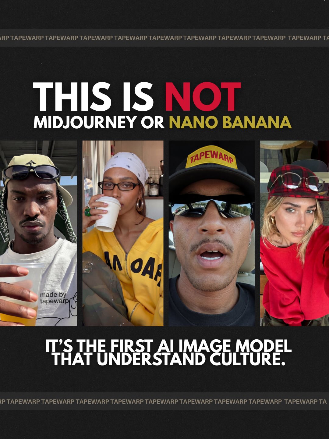
The visual intelligence here comes from contrast. The black poster frame creates seriousness and focus, which makes the everyday portraits inside feel more elevated. Without the black surround and typography, these images would read as casual internet snapshots. Inside this container, they become references. Framing is doing the value upgrade.
The second aesthetic strength is variety within coherence. The women do not all look the same, the lighting is not identical, and the settings shift from interior to car to selfie. But the total feeling still holds together because the images share an informal realism and an internet-native sense of texture. That is the sweet spot for moodboard-based creator branding: enough variation to feel alive, enough unity to feel intentional.
The red-highlighted word “texture” is also doing more than emphasis. It names the product category. That naming matters. It tells the viewer what to want. Great creator promos often work because they give language to a taste people already desire but have not neatly described yet.
| Observed | Why it matters for recreation |
|---|
| Four portraits are shown as a row rather than as separate posts | Grouping turns scattered examples into a coherent style offering |
| Poster background is flat black with restrained accents | Dark framing increases perceived value and keeps focus on the references |
| Headline uses classic serif typography with one bright accent line | Editorial type helps casual images feel curated and premium |
| Each panel shows a different casual styling signal | Variety suggests a larger prompt library underneath the post |
| The CTA uses one highlighted keyword | A specific keyword makes participation easier and more likely |
Prompt technique breakdown
If you want to build this kind of post, think in terms of clusters. The goal is not to maximize image quality in one frame. The goal is to define the visual perimeter of a style family.
| Prompt chunk | What it controls | Swap ideas (EN, 2–3 options) |
|---|
| four-panel lifestyle texture collage | Format, variety, moodboard logic | “four-image style board”; “multi-panel mood collage”; “curated lifestyle reference strip” |
| casual internet-native portrait textures | Styling category and realism level | “everyday cool-girl references”; “streetwear and natural beauty textures”; “soft snapshot portrait moods” |
| black poster background with editorial serif headline | Packaging, perceived value, hierarchy | “dark branded poster frame”; “minimal black promo layout”; “editorial-style moodboard poster” |
| highlight the keyword CTA in red | Engagement behavior and scan path | “single colored CTA keyword”; “one accent word in the instruction line”; “red-highlighted opt-in trigger” |
| repeating top and bottom wordmark strips | Brand continuity and border rhythm | “repeating logo bands”; “wordmark border strips”; “subtle repeated brand text edges” |
Execution playbook
Lock three things first: the collage format, the editorial packaging, and the keyword-based CTA. Those are the structural parts that make the post feel like a system instead of a random set of screenshots.
Then use the one-change rule. Adjust only one or two variables at a time.
- Run 1: choose 4 references that feel related in texture even if they differ in styling details.
- Run 2: keep the references fixed and refine the poster system: headline spacing, accent color, border strips, and panel rhythm.
- Run 3: keep the layout fixed and improve the CTA: simplify the phrase, highlight one keyword, and make the ask feel light.
- Run 4: preserve the whole packaging logic and test one controlled variation such as a different style family or a different keyword trigger.
Fast takeaway
If you are selling prompts, do not just show a result. Show the perimeter of a taste universe and give the audience one easy word to use when they want in.