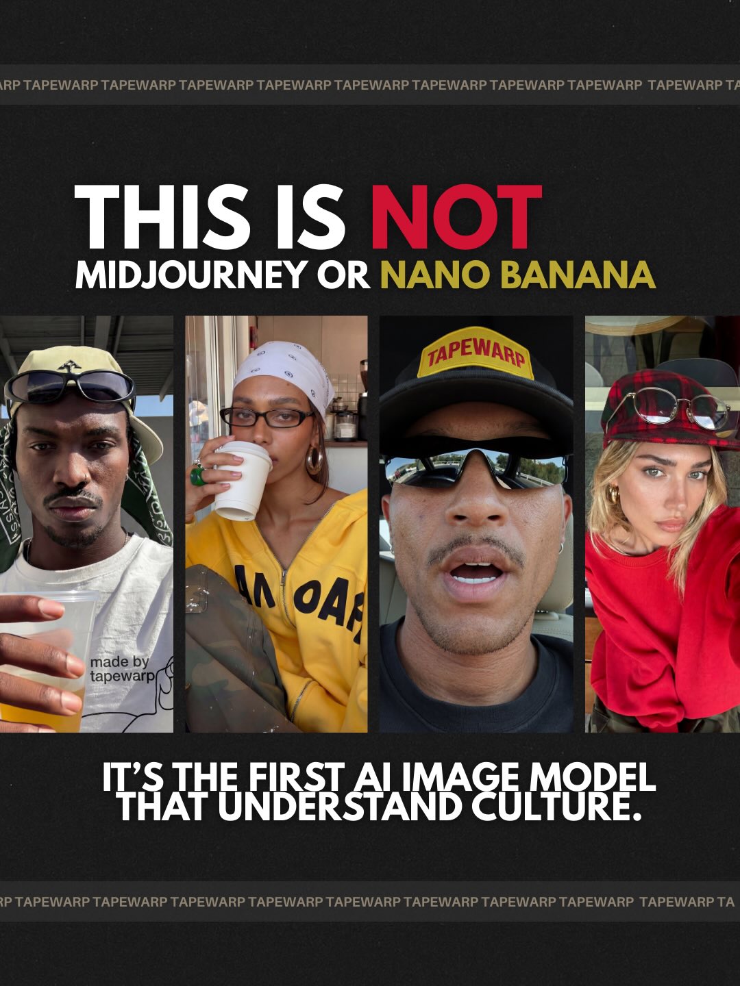
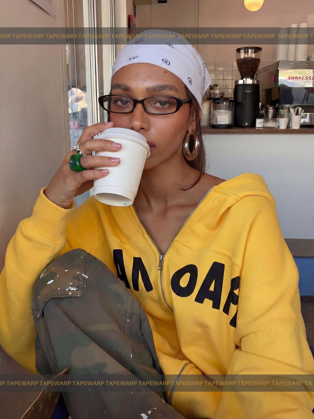
AI image models used to struggle with one thing: taste.
They could render faces. They could copy lighting. But they didn’t understand culture. The poses felt stiff. The fashion felt costume-like. The vibe was close, but never right.
That gap is disappearing.
These images weren’t shot on a DSLR. They weren’t pulled from a campaign. They were generated with Higgsfield Soul V2.
Soul 2.0 i a foundation model built for creatives. It understands fashion eras, internet aesthetics, editorial cues, camera references. When you say Y2K street, subtle flash, old smartphone, editorial street style, it doesn’t guess. It interprets.
The biggest shift is this: it recreates aesthetics without cloning them.
The workflow is simple:
Start in Soul 2.0
Refine in Nano Banana Pro
Animate with your video model of choice.
Strong base. Better downstream results.
We’re at the point where AI doesn’t just make images. It builds visuals that feel shot, styled and culturally aware.
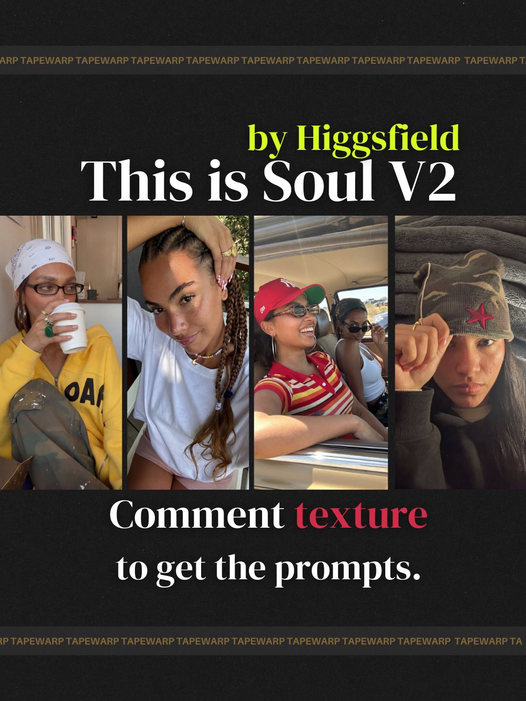
If you want the prompts I used, comment texture.
#higgsfieldsoul #higgsfieldpartner
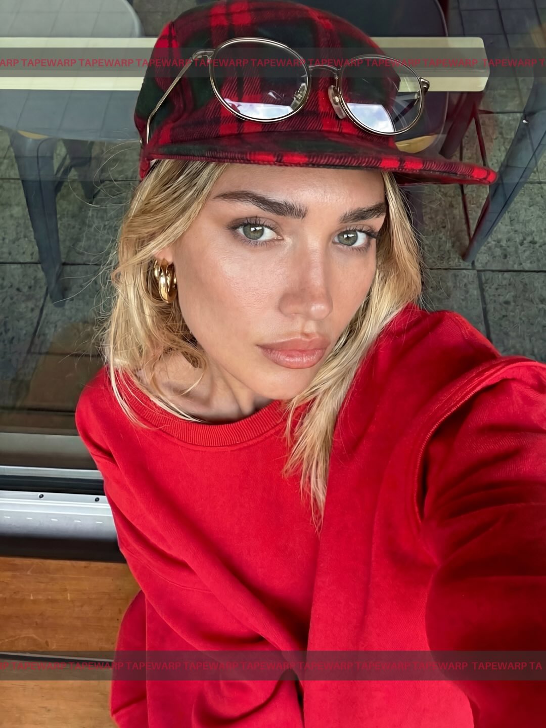
How tapewarp.ai Created This Red Sweatshirt Plaid Cap Selfie Style Breakdown AI Portrait — and How to Recreate It
At first glance this looks like a simple close-up selfie, but the image works because almost every visible choice is carrying style information. The red sweatshirt is loud, the plaid cap adds pattern, the sunglasses on the brim create a layered accessory move, and the expression refuses to perform too hard. That mix is what gives the image its hold. It feels casual, but not accidental.
That balance is especially useful for creators. A lot of lifestyle selfies fail because they are either too undone to feel memorable or so polished that they lose human closeness. This one sits in a better middle zone. It keeps the intimacy of a phone-camera angle while quietly stacking enough visual signals to feel branded.
Why this image works in a feed
The strongest mechanism here is near-field clarity. The face is close, the eyes are sharp, and the styling reads instantly. That matters because selfies are competing at extremely small thumbnail sizes. If the key identity markers are visible in one second, the viewer has a reason to stop. Here, the red palette does a lot of that work. The sweatshirt and cap create a color block that anchors the frame before the viewer even studies the face.
The second mechanism is accessory layering. The hat alone would already give the image direction. The sunglasses perched on the brim turn the look from ordinary to considered. That tiny extra layer is exactly the kind of detail that makes a selfie feel styled without becoming costume-like. Viewers may not consciously name the reason, but they feel the difference between “I put something on” and “I composed a look.”
Signal
Evidence (from this image)
Mechanism
Replication Action
Strong color anchor
Bright red sweatshirt dominates the lower half of the frame
One strong color helps the selfie remain memorable and legible in a crowded feed
Choose one saturated garment color and let it occupy a large part of the frame
Accessory stacking
Plaid cap plus round sunglasses resting on top
Layered accessories signal intention and fashion awareness without needing many items
Add one secondary accessory on top of the main one instead of wearing many pieces at once
Direct eye contact
The subject looks straight into the phone camera
Eye contact raises retention because the viewer feels addressed immediately
Keep the eyes sharp and the gaze stable when the frame is this close
Minimal background noise
Muted tiles, glass, and furniture shapes stay secondary
A quiet setting keeps the face and styling as the core event
Use neutral surroundings when the subject and outfit are the story
Where this style fits best
This image language works best for personal brand posts, outfit close-ups, casual beauty content, day-in-the-life cover frames, and creator feeds that want polish without losing intimacy. It is especially effective when the audience is following for taste, mood, or persona rather than for hard information.
Personal brand selfies: strong fit because the image feels close and recognizable; keep the expression natural and let one color dominate.
Streetwear or casual styling posts: strong fit because the cap and sweatshirt already do subtle outfit storytelling; swap the palette but keep the layered accessory logic.
Beauty-adjacent content: strong fit because the face is central without becoming a full glam shot; maintain natural light and reduce background clutter.
Story cover or pinned intro post: strong fit because the direct gaze makes the creator immediately identifiable; preserve the closeness and visual consistency.
It is less ideal for scenic travel posts, product-centric shots, or cinematic editorial work where the environment needs to do more storytelling. This image is built around person-first identification.
Three transfer recipes
Keep: close selfie angle, direct gaze, minimal background. Change: garment color and cap style. Slot template (EN): “close natural-light selfie of a woman in {statement top} with {one layered accessory detail}, looking directly into the camera”.
Keep: strong brows, clean skin texture, soft serious expression. Change: use case from fashion to beauty, wellness, or music persona. Slot template (EN): “intimate smartphone portrait with a calm expression, minimal environment, and one strong styling anchor”.
Keep: color block garment plus accessory stacking. Change: hat-and-sunglasses combo to jacket-and-chain, scarf-and-glasses, or beanie-and-headphones. Slot template (EN): “casual selfie where one main garment color and one layered accessory define the whole look”.
The aesthetic read
The image is strongest when you read it as controlled simplicity. The styling is not complex, but it is precise. There is one main color story, one pattern moment, one metallic detail, and one facial expression held with confidence. That is enough. It is a good reminder that strong selfies often come from disciplined subtraction rather than from adding more visual ideas.
The second interesting choice is that the background is not attractive in a conventional sense. It is practical, architectural, and a little cold. That actually helps. It pushes all the warmth into the face, hair, and red clothing. In other words, the subject is carrying the softness while the setting stays neutral. That is a useful contrast system for creators working with ordinary locations.
The camera angle matters too. Slightly overhead phone framing is familiar, but here it is controlled enough to feel flattering and deliberate. The subject does not look surprised or caught mid-motion. The selfie still feels authored. That is an important distinction for social imagery with strong retention.
Observed
Why it matters for recreation
Face fills most of the frame and eyes are near the visual center
This creates fast recognition and emotional contact
Red sweatshirt and plaid cap create a coordinated warm palette
Color repetition makes the look feel intentional
Sunglasses rest on the cap rather than being worn
This adds an extra styling layer without hiding the eyes
Background is muted glass and stone rather than scenic decor
Neutral surroundings keep the selfie from splitting attention
Expression stays calm and unsmiling
The low-drama face gives the image confidence and restraint
Prompt technique breakdown
If you want to recreate this image class, write the prompt around identity clarity, one strong color, and one accessory stack. The selfie works because the visual hierarchy is clean.
Prompt chunk
What it controls
Swap ideas (EN, 2–3 options)
close-up smartphone selfie from slightly above
Camera feel, intimacy, perspective
“natural front-camera portrait”; “slightly overhead phone selfie”; “tight close selfie with mild wide-angle perspective”
young blonde woman with strong brows and direct gaze
Identity anchors and facial presence
“blonde woman with defined brows”; “close portrait with sharp hazel eyes”; “natural beauty selfie with direct eye contact”
oversized red sweatshirt and plaid cap
Main style silhouette and color memory
“bright red oversized crewneck”; “casual red top with patterned cap”; “streetwear-inspired close-up look”
round sunglasses resting on the brim
Accessory layering and fashion cue
“metal sunglasses on hat brim”; “glasses perched on cap”; “layered headwear accessory detail”
minimal terrace background with glass and gray tile
Environmental quiet and realism
“neutral tiled outdoor background”; “subtle glass railing and stone floor”; “ordinary architectural setting kept out of focus”
Execution playbook
Lock three things first: the close selfie angle, the red garment as the main color block, and the cap-plus-glasses accessory stack. Those are the identity carriers. If one of them changes too much, the image quickly becomes a generic beauty selfie.
Then use the one-change rule. Move only one or two variables per run.
Run 1: lock the face framing, direct gaze, red top, and cap before refining anything else.
Run 2: keep framing fixed and tune texture: hair strands, sweatshirt folds, cap plaid, and skin realism.
Run 3: keep subject styling fixed and refine environment subtlety: softer background, clearer glass edge, cleaner tile geometry.
Run 4: preserve the same hierarchy and test one controlled variation, such as changing the main garment color or swapping the cap for another strong accessory.
Fast takeaway
If you want a selfie to feel intentional, build the frame around one clear color story and one memorable accessory detail, then keep everything else quiet.