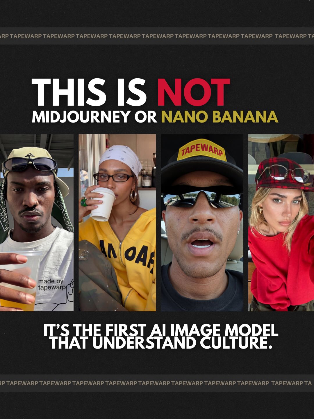
How tapewarp Made This Coffee Shop Lifestyle Portrait AI Art - and How to Recreate It
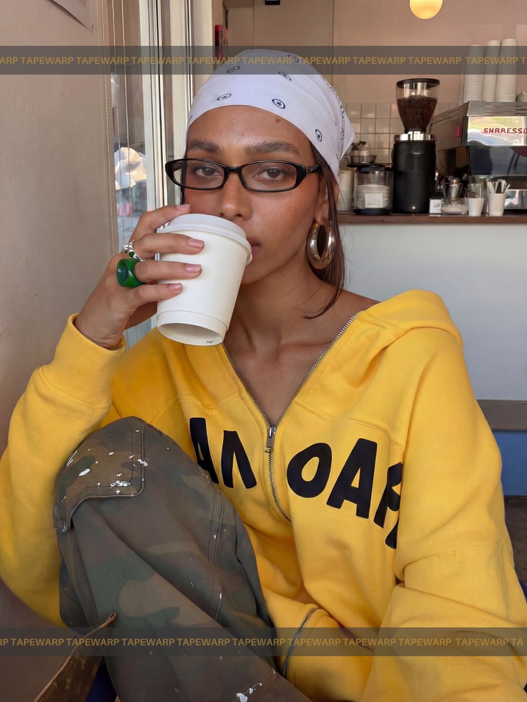
This image works because it captures a highly recognizable kind of modern visual confidence. The subject is seated in a café, holding a takeaway coffee, dressed in a bright yellow hoodie with a white bandana, black rectangular glasses, and silver hoop earrings. The portrait feels polished, but it does not feel staged in a traditional commercial way. It reads like a social-native editorial image: contemporary, relaxed, and deeply aware of how style communicates identity. That combination is what makes it a strong reference for prompt writing, image curation, and creator-brand content.
What makes the image especially valuable is that its fashion energy is carried through ordinary behavior. The woman is not standing on a set or striking a highly theatrical pose. She is simply seated, holding a cup, looking outward with self-possession. That everyday action is one of the reasons the image feels believable. The styling is strong, but the behavior stays casual. For creators and prompt writers, that is an important lesson: lifestyle portraits often become more powerful when they preserve real-world gestures instead of forcing visual drama.
The image also demonstrates how wardrobe can organize a frame. The yellow hoodie functions as a bold color anchor, while the monochrome accessories shape the subject’s identity without overwhelming the viewer. The café environment stays legible in the background, but it does not distract from the face, cup, and raised knee composition. The whole portrait feels contemporary because it understands how editorial polish and documentary realism can coexist in the same frame.
Why the Styling Carries the Whole Portrait
The strongest visual decision in this image is the hoodie color. Bright yellow immediately gives the portrait memorability and a clear mood. It pulls the viewer’s eye to the subject while also establishing a streetwear energy that feels current rather than generic. If the hoodie were neutral, the portrait would still be pleasant, but it would lose much of its visual authority. Strong lifestyle prompts often depend on one anchor color that defines the reading of the image from the first second.
The accessories make the color choice smarter rather than louder. The white bandana, black glasses, and silver hoops create a controlled counterbalance to the saturated hoodie. They provide contrast in shape, tone, and texture while keeping the image coherent. In prompt writing, these are the details that should be treated as identity-supporting signals. They are not random additions. They are what push the portrait from generic café scene into a more intentional fashion-lifestyle register.
That balance is important because too many style details can easily make a portrait feel over-designed. Here, the accessories remain legible and distinctive, but they do not become costume clutter. This is one of the clearest reasons the image feels usable for social editorial applications. It is stylish enough to feel curated, but simple enough to feel real.
How the Cafe Setting Supports Rather Than Dominates
The café background is doing exactly the right amount of work. It establishes a clear environment with coffee equipment, stacked cups, and a believable urban interior, but it does not attempt to become a dramatic interior design statement. That restraint is crucial. The setting gives the portrait social context, yet the person remains the message. In many weaker prompts, the background either disappears into generic blur or becomes so detailed that it competes with the subject. This image avoids both problems.
For prompt writing, that means the café should be described as supportive context rather than as a scenic showcase. The espresso station, cups, and neutral walls help the viewer understand the space, but they should remain secondary to the portrait. The goal is not “beautiful café photography.” The goal is a lifestyle portrait happening inside a believable coffee environment. That difference shapes how the prompt should be written.
The subtle TAPEWARP border framing also adds a branded social-editorial feel without turning the image into overt advertising. This is another useful reminder: light touches of graphic framing can help an image feel creator-native and platform-ready while still preserving realism. If handled carefully, those elements increase modernity without harming the authenticity of the scene.
What the Pose Does for the Composition
The seated pose with one knee raised is one of the most effective parts of the image. It gives the portrait asymmetry, depth, and an immediate sense of physical reality. The raised knee shapes the foreground, which helps the composition feel layered instead of flat. At the same time, the upper body remains calm and direct, which keeps the subject’s expression readable and authoritative. This balance between relaxed posture and compositional control is exactly what many lifestyle prompts are trying to achieve.
The coffee cup near the face is equally important. It gives the hands something natural to do and introduces a familiar lifestyle gesture. Without it, the image might feel too much like a fashion editorial. With it, the portrait becomes more believable and more socially grounded. In creator-oriented content, these small behaviors often matter more than elaborate styling because they make the image feel lived instead of merely styled.
From a prompt perspective, the writer should not just mention that the subject is sitting. The prompt should describe how the body occupies space, how the knee shapes the lower frame, how the cup sits near the mouth, and how the eye line engages the viewer over the rim. Those relationships are what make the pose feel editorial rather than generic.
Why This Feels Social-Native Instead of Traditional Advertising
One reason this portrait feels modern is that it avoids excessive polish. The lighting is soft and flattering, but not glamorous. The skin remains clean without looking plastic. The café looks real rather than luxurious. These choices make the image more compatible with creator branding, social storytelling, and documentary-style fashion content. It feels close to how people actually want to appear online: confident, intentional, and stylish without becoming unreachable.
This social-native quality is important for prompt writers because it reflects a broader change in visual culture. Many viewers now respond more strongly to images that feel adjacent to real life than to images that look like classical ad campaigns. That does not mean poor quality or accidental composition. It means the polish is hidden inside realism. This image is a strong example of that strategy.
It also shows that editorial value can come from attitude rather than luxury. There is nothing extravagant about the scene, but the portrait still feels premium because the style, framing, and expression are coherent. That is often a better target for creator-focused prompts than trying to imitate high-budget advertising aesthetics that may not fit the intended audience.
Prompt Construction Strategy
A strong prompt for this type of portrait should begin with the subject’s style identity: warm brown skin, narrow black rectangular glasses, white paisley bandana, large silver hoop earrings, and a vivid yellow zip hoodie. Then it should define the action and framing: seated in a café, holding a white takeaway cup near the mouth, one knee raised into the foreground, medium close-up vertical composition, direct eye contact over the cup. These elements form the core of the image.
After that, the setting should be described with care: cozy coffee shop interior, visible espresso equipment and stacked cups, soft indoor daylight, neutral walls, and a socially current urban atmosphere. This creates enough context for realism without cluttering the image. Then the rendering style can be layered in: warm documentary realism, social-editorial photography, contemporary streetwear portraiture, and polished but natural color handling.
Negative constraints should be explicit. Avoid luxury café excess, harsh flash, over-retouched skin, costume-like styling, warped hands, cluttered backgrounds, or cartoon simplification. Those exclusions matter because the image’s strength comes from balance. It should feel stylish, but still plausible. It should feel premium, but still grounded. The prompt must protect that balance.
What Creators Can Learn from This Image
This portrait is a useful example for creators because it demonstrates how personal style can become content structure. The image does not require a complex concept to feel strong. It relies on good clothing contrast, recognizable accessories, natural posture, and an environment that reinforces rather than steals attention. That is a repeatable formula for social portraits that need to feel both modern and sincere.
For bloggers and educators, the image can support topics like café portrait prompts, streetwear lifestyle photography, color-led portrait styling, or social-native editorial composition. It is versatile because the visual logic is clear. The image is not carrying ten ideas at once. It is carrying one strong identity and a few deliberate supporting cues. That makes it easier to write around and easier for an audience to remember.
For prompt libraries, this image is useful because it teaches how to combine fashion and realism without leaning fully into either fashion-campaign artifice or everyday snapshot looseness. The portrait sits in a productive middle ground. That is often where the most useful creator-facing visuals live.
Common Mistakes to Avoid
A common mistake would be losing the hoodie’s role as the primary color anchor. If the yellow becomes dull or the frame becomes visually busier elsewhere, the portrait loses much of its punch. Another mistake would be turning the café into a decorative destination rather than a believable context. The coffee background should feel lived-in and functional, not like a luxury set piece.
Another issue would be over-styling the subject. If the image becomes too posed, too glamorous, or too clean, it stops feeling like social-editorial realism and starts feeling like conventional advertising. Likewise, if the accessories disappear, the portrait becomes generic. The bandana, glasses, and hoops are part of the visual identity system and should be preserved clearly.
Finally, avoid flattening the composition. The raised knee, cup placement, and asymmetrical seated structure are essential to the image’s depth and character. If the pose is simplified too much, the portrait may still look good, but it will lose the layered body language that gives it modern editorial credibility.
Final Takeaway
This image succeeds because it understands how to turn everyday behavior into style-rich portraiture. The coffee, the hoodie, the bandana, the glasses, and the café environment all contribute to one coherent visual identity. Nothing feels random. That is why the portrait reads as both authentic and editorial at the same time. It feels lived-in, but it also feels intentional.
For prompt writers, the lesson is direct: start with one strong visual anchor, support it with meaningful accessory signals, place the subject in a believable environment, and protect the natural behavior that makes the image relatable. If you do that well, you get a portrait that feels current, social-native, and genuinely memorable rather than merely fashionable.