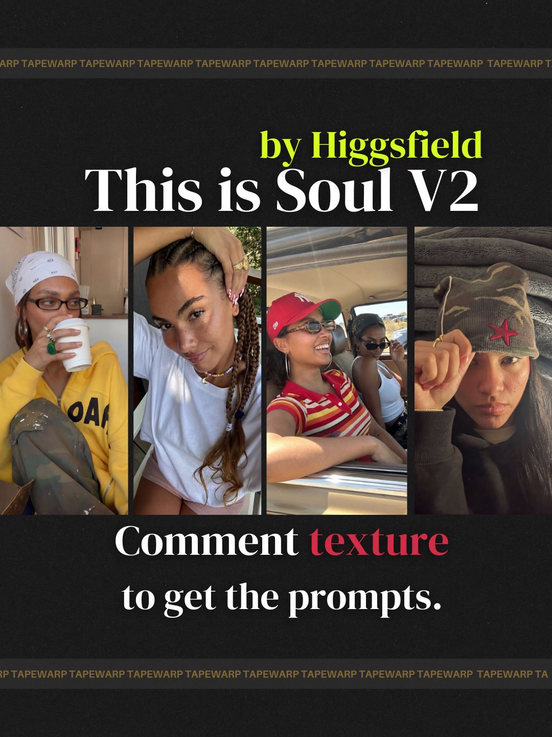
How tapewarp Made This AI Image Model Culture Poster AI Art - and How to Recreate It
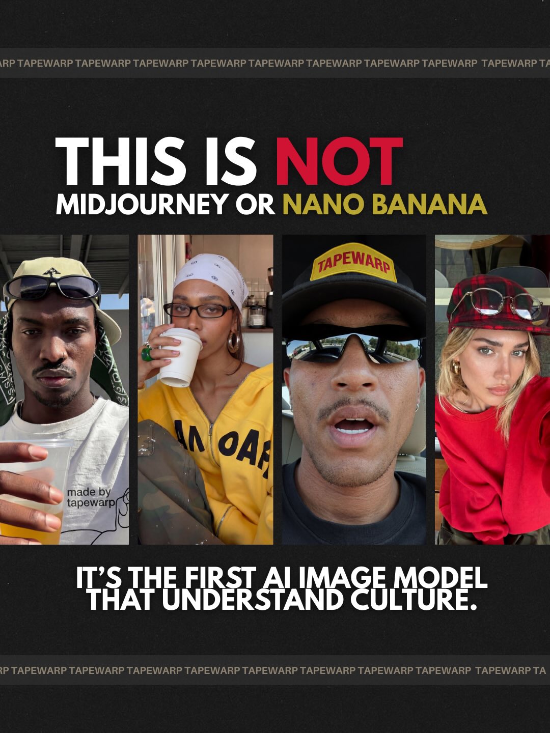
This prompt is strong because it merges startup positioning, editorial collage design, and street-culture image language into one coherent poster format. The core image is a black campaign-style layout with four vertically cropped portrait panels, oversized headline typography, and a bold claim about an AI image model positioned as culturally fluent and trend-aware. Rather than functioning as a simple announcement, the poster reads like a manifesto. It uses creator-facing visual language to make a technical message feel current, social, and culturally situated. That transformation is what gives the prompt its value.
The best part of the composition is that it is not trying to look neutral. It is deliberately high-contrast, bold, and assertive. The matte black background, white headline, accent colors, repeated border text, and portrait strip all reinforce the feeling of a confident launch poster designed for a fast-moving digital audience. This is not a quiet product sheet. It is a campaign image meant to communicate attitude, relevance, and contemporary literacy. For prompt-writing purposes, that makes it particularly useful for AI branding, product storytelling, and culture-adjacent visual direction.
Why the Four-Panel Portrait Structure Matters
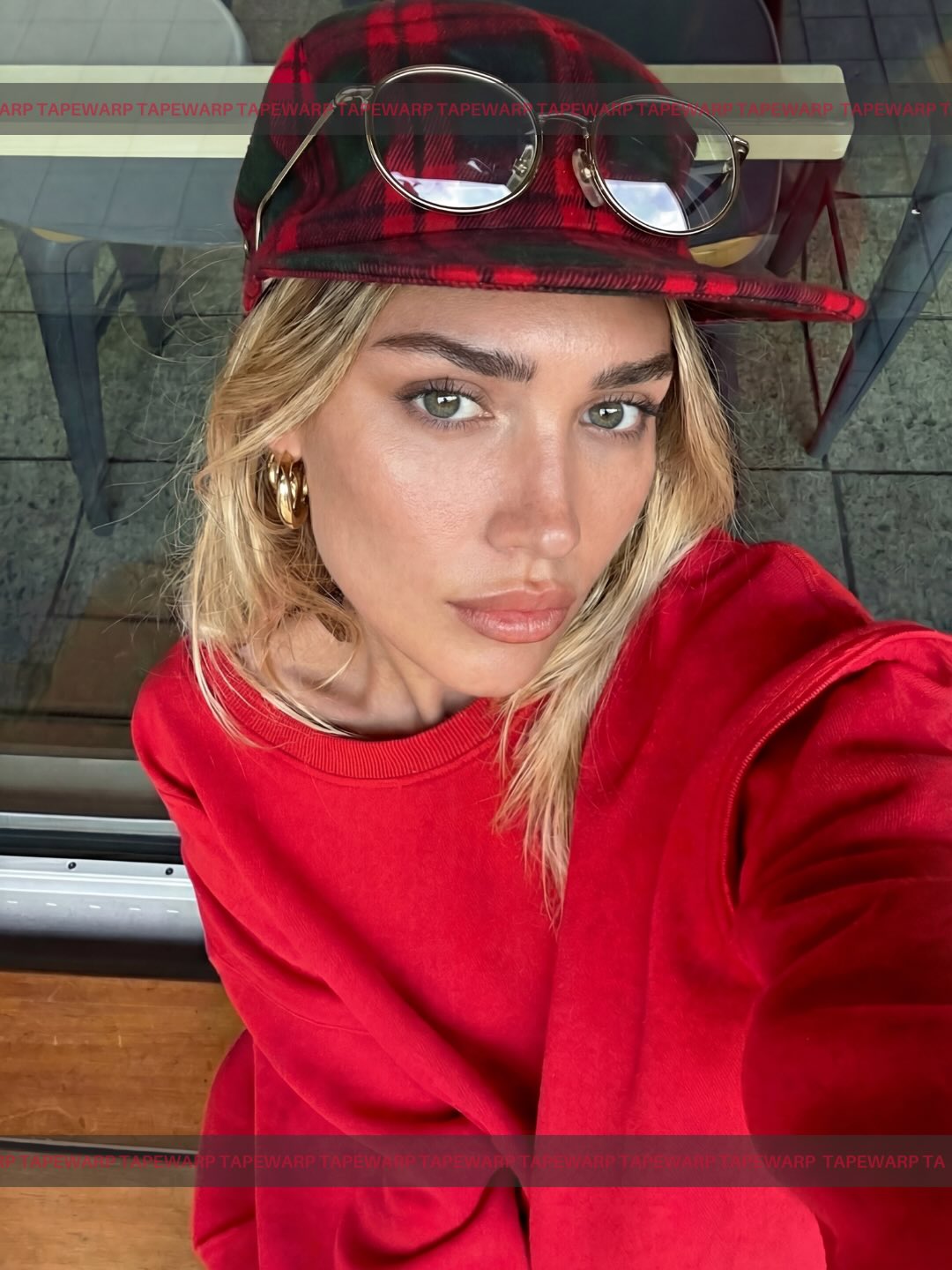
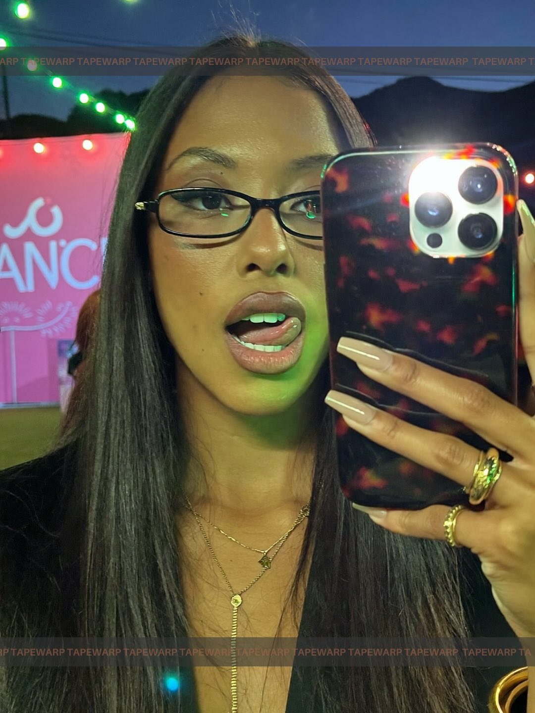
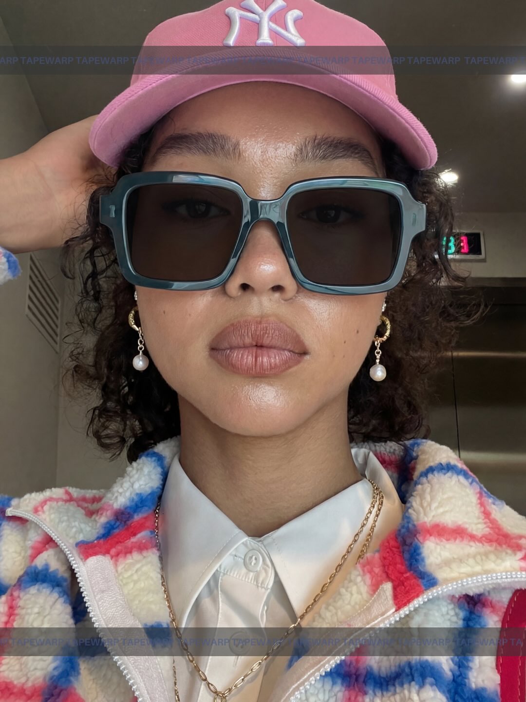
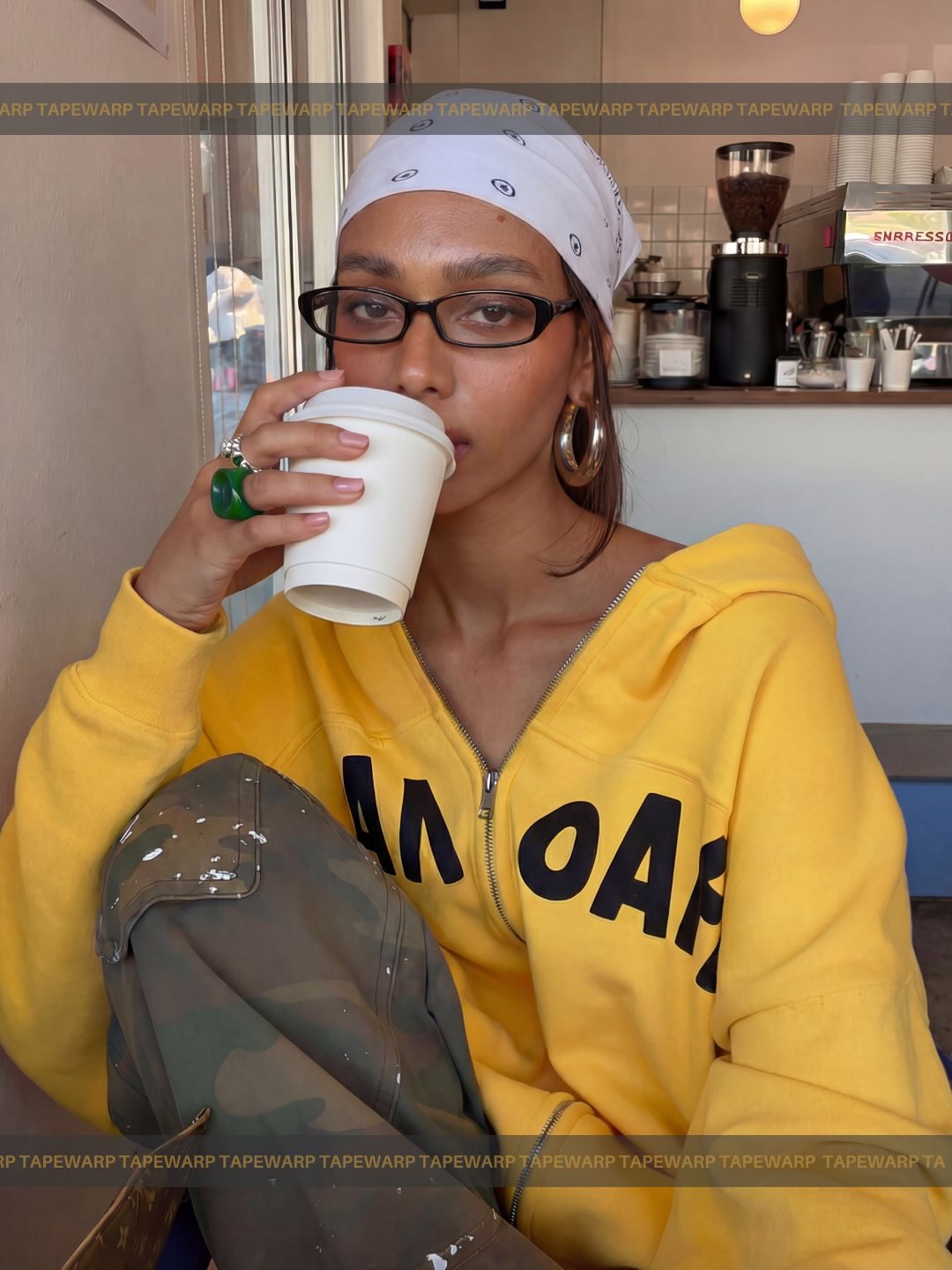
The four vertical portrait slices are essential because they create human context for an otherwise abstract claim. If the poster consisted only of typography, it would risk becoming a generic startup announcement. If it leaned too heavily on portrait photography without strong type, it would lose its manifesto energy. The four-panel structure solves that problem by allowing multiple faces and creator-coded aesthetics to signal range, audience, and relevance while keeping the layout compact and highly legible.
These portrait columns should feel coordinated but not identical. Their slight differences help communicate cultural breadth, while their shared crop language keeps the overall design disciplined. This is one of the strongest lessons in the prompt: variation works best when it is controlled by layout. The faces can differ in styling, but the framing should remain consistent enough that the poster still reads as one campaign object instead of four separate images pasted together.
Poster Hierarchy and Manifesto Energy
The graphic hierarchy of this prompt is unusually clear. A dominant headline sits at the top, the portrait band occupies the center, and a manifesto-style supporting line anchors the lower section. This arrangement makes the image behave like a statement poster rather than an advertisement with too many competing parts. Hierarchy is the entire engine of the composition. The poster succeeds because the viewer instantly knows where to look first, what to read second, and how the image panels relate to the claim being made.
This clarity is especially important when the topic is AI branding. Technical products often struggle visually because their messages are either too abstract or too overloaded with corporate explanation. Here, the structure avoids both problems. It uses directness instead of density. The prompt teaches a practical lesson: if the message is supposed to feel culturally sharp, the poster must prioritize confidence in structure, not just novelty in language.
The Importance of the Matte Black Field
The matte black background is more than a neutral setting. It is what gives the entire image its seriousness, its premium feel, and its graphic force. On black, white headline text becomes louder, color accents become more selective, and portrait crops feel sharper. The black field also suppresses visual noise, making the poster feel more intentional. That is why the prompt should preserve a clean, uncluttered black surface instead of adding extra effects or decorative gradients.
A restrained black background also supports the manifesto quality of the piece. It makes the poster feel like an announcement that expects to be read closely. Combined with the portrait slices and border text, the black field acts almost like a stage. It isolates the visual claims and lets the image communicate power through reduction. This is a strong strategy for product campaigns trying to look culturally aware without becoming visually chaotic.
Typography as the Main Character
This prompt depends heavily on typography, which means the words must feel oversized, confident, and intentional. Bold sans-serif type is the right direction because it signals clarity, modernity, and campaign authority. Decorative fonts would immediately weaken the image. The type should look like something meant for public attention, not private reading. It needs to hold the same visual weight as the portraits. That is what makes the poster feel like a real campaign rather than a mood board.
Spacing matters just as much as font choice. The strongest versions of this image give the headline room to breathe while still letting it dominate. Tight but controlled layout, strong line breaks, and disciplined vertical stacking all contribute to the image’s authority. Prompt writers often underestimate typography when describing posters, but in layouts like this, type is not support material. It is one of the primary image objects.
Street-Culture Signals Without Visual Chaos
One of the smartest things about the prompt is the way it borrows from street-style and creator culture without losing order. The portraits imply social media authenticity, contemporary fashion cues, and creator individuality. But the design refuses to become messy. That balance is difficult to get right. Too much cultural signaling and the image becomes trend collage. Too little and the claim of cultural fluency feels empty. The layout succeeds by keeping the portraits energetic while binding them inside a very clean system.
This is especially useful for AI-related branding, where credibility can collapse if the campaign looks out of touch or overdesigned. A prompt like this works because it understands that culture-facing design does not mean maximalism. It means selecting the right human signals and arranging them with clarity. The portraits must feel current, but the poster must still feel deliberate. That distinction is where most of the value lies.
Color Restraint and Accent Strategy
The black, white, red, and yellow palette is one of the prompt’s strongest constraints. It helps the image feel campaign-ready and prevents the design from drifting into generic colorful collage aesthetics. White does the heavy lifting for readability, black supplies structure, and red or yellow accents provide urgency, emphasis, or directional energy. Restricting the palette this way is a smart move because it increases consistency across all poster elements.
Color restraint also gives the design more longevity. Posters built around too many hues often feel trend-bound and less authoritative. A narrow palette makes the piece sharper and easier to reproduce across formats. For prompt-building, this is a reminder that color discipline is not about limitation for its own sake. It is about protecting hierarchy, contrast, and campaign identity.
How to Keep the Poster From Feeling Generic
The main risk with this prompt is that it could slide into stock startup visual territory if the portraits become bland or the text loses conviction. To avoid that, the writing should continue to emphasize assertive campaign intent, equal-width portrait rhythm, repeated brand-strip elements, and a clear manifesto structure. These are the features that make the image feel authored rather than assembled. The prompt should not ask for “modern poster” in a vague way. It should ask for a very specific kind of launch poster built around culture-aware confidence.
Another way to preserve originality is to keep the central claim emotionally sharp. The image should feel like it is saying something consequential about image models and culture, not just advertising a feature release. When the concept remains pointed, the visuals feel more necessary. The portraits stop being decoration and start becoming evidence for the campaign’s positioning.
Prompt Refinement Strategies
If the poster becomes cluttered, reinforce equal-width panel rhythm, strong centered hierarchy, and disciplined spacing. If the faces feel too inconsistent, clarify that the portraits should be unified by crop logic and tonal treatment even if the styling differs. If the typography lacks authority, specify oversized bold sans-serif lettering with campaign-grade readability. If the design becomes too corporate, restore street-culture energy through authentic portrait styling rather than through random graphic noise.
It can also help to restate the poster’s identity explicitly: this is an AI launch image that behaves like a cultural manifesto rather than a conventional ad. That single directional idea can keep the layout from drifting. In prompt design, strong intent often matters more than additional objects. When the image knows what it is trying to say, the structure tends to become clearer as well.
What This Prompt Teaches About AI Brand Visuals
This prompt is a useful lesson in how to give AI product branding an actual point of view. Instead of hiding behind abstract gradients or sterile interface fragments, it connects the product claim to people, culture, and visual language that feels socially legible. That shift matters. When AI posters are too clean and too vague, they often feel interchangeable. This one avoids that by turning the campaign into a statement about cultural awareness and image fluency.
It also shows that technology branding can borrow from magazine covers, music posters, and fashion manifestos without losing clarity. The key is to keep the hierarchy strong enough that the design still feels intentional. That is what this prompt gets right. It combines human texture and startup ambition in a way that feels both current and organized.
Final Takeaway
The AI culture campaign poster prompt works because it treats product messaging as visual rhetoric. Four portrait panels, a matte black field, bold headline typography, and a limited accent palette all work together to make the image feel like a real campaign object with cultural intent. The poster is not just announcing a tool. It is making an argument about how that tool understands style, trends, and creator-facing visual language.
If you keep refining prompts in this category, hold on to the essentials: strict hierarchy, bold type, portrait-based social relevance, restrained color, and a black field strong enough to support the entire layout. Those choices are what transform a launch graphic into a statement piece. That is why this prompt stands out as a genuinely useful template for AI brand communication.