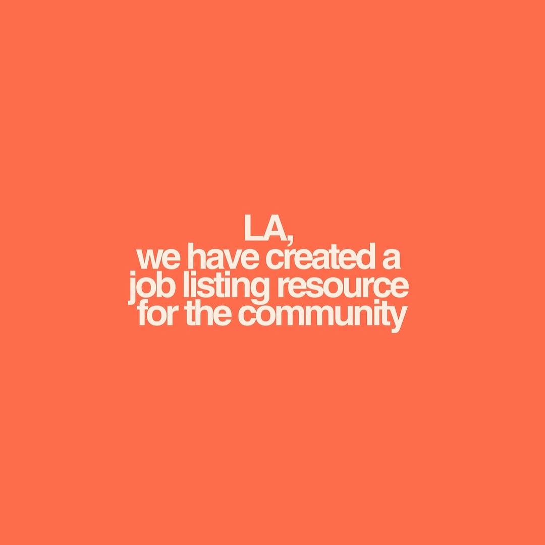
The LGBTQ Health Resources: How lilmiquela Built This AI Art
This image is not entertainment-driven. It is utility-driven. That is exactly why it can travel: when people find a post that might help someone they love, they save it and forward it quickly. In support-resource content, usefulness is the growth engine.
For creators, this format is important because it builds trust capital. If your page occasionally publishes clear, actionable resources, audiences learn that your content can be emotionally valuable, not just visually attractive.
Why This Slide Works
The design is intentionally plain: high-contrast text, clear heading, minimal visual decoration, and direct actionable information. The rainbow accent signals community relevance without distracting from readability.
| Signal | Evidence (from this image) | Mechanism | Replication Action |
|---|
| Immediate utility | Hotline numbers and websites listed directly | Drives saves and forwards | Put action info on-slide, not hidden only in caption |
| High readability | White text on black with clear spacing | Reduces friction in stressful moments | Prioritize contrast and line spacing over decorative style |
| Clear framing | Title “HEALTH RESOURCES” at top | Helps users understand purpose instantly | Use explicit top-line framing language in first 2 words |
| Community signal | Rainbow accent bar under title | Contextual relevance without visual overload | Add one subtle identity cue tied to intended audience |
Best Use Cases
- Mental health support roundups and crisis-response resource posts.
- Community awareness campaigns during difficult news cycles.
- Creator “helpful carousel” series that blend care and education.
- Nonprofit collaboration content that needs rapid social forwarding.
Not ideal for highly visual product marketing, humor-first feeds, or contexts where citations cannot be verified.
Three Transfer Recipes
- Keep: high-contrast text and direct actions. Change: topic area. Template: “{TOPIC} RESOURCES + hotline/action list + official links”.
- Keep: minimal design and clear title. Change: audience cue color. Template: “plain utility slide with one subtle identity accent and verified support info”.
- Keep: list-first layout. Change: post structure (single card vs carousel). Template: “card 1: urgent resources, card 2: how to help a friend, card 3: local directory links”.
Aesthetic Read
The aesthetic is functional clarity. The black background carries seriousness, the white typography ensures accessibility, and the rainbow strip adds contextual warmth. In care-focused content, this “quiet design” is often more effective than expressive visuals because it reduces cognitive load when users may already feel overwhelmed.
Prompt Technique Breakdown
| Prompt chunk | What it controls | Swap ideas (EN, 2-3 options) |
|---|
| Header block | Topic framing speed | “HEALTH RESOURCES”, “MENTAL HEALTH SUPPORT”, “CRISIS HELP NOW” |
| Typography block | Legibility and trust | “bold sans-serif white text”, “accessibility-first line spacing”, “plain left-aligned copy” |
| Identity cue block | Audience relevance | “rainbow accent line”, “single color strip”, “small icon marker” |
| Content block | Actionability | “phone + text + website per line”, “resource name + one action”, “verified org list” |
| Layout block | Share performance | “square IG slide”, “carousel-first text card”, “mobile-readable safe margins” |
Remix Steps
Baseline lock: title clarity, contrast ratio, and verified action lines.
- Run 1: draft list with verified organization names and contact methods.
- Run 2: set typography hierarchy (title, body, spacing) for mobile readability.
- Run 3: add one subtle identity accent color and remove extra decoration.
- Run 4: QA every number/link and publish with caption encouraging saves/shares.
This process prioritizes safety, clarity, and real-world usefulness.