LA 🌆, you never stop showing up —
This city is built on love, care, and action. And I’m forever grateful for you ✨
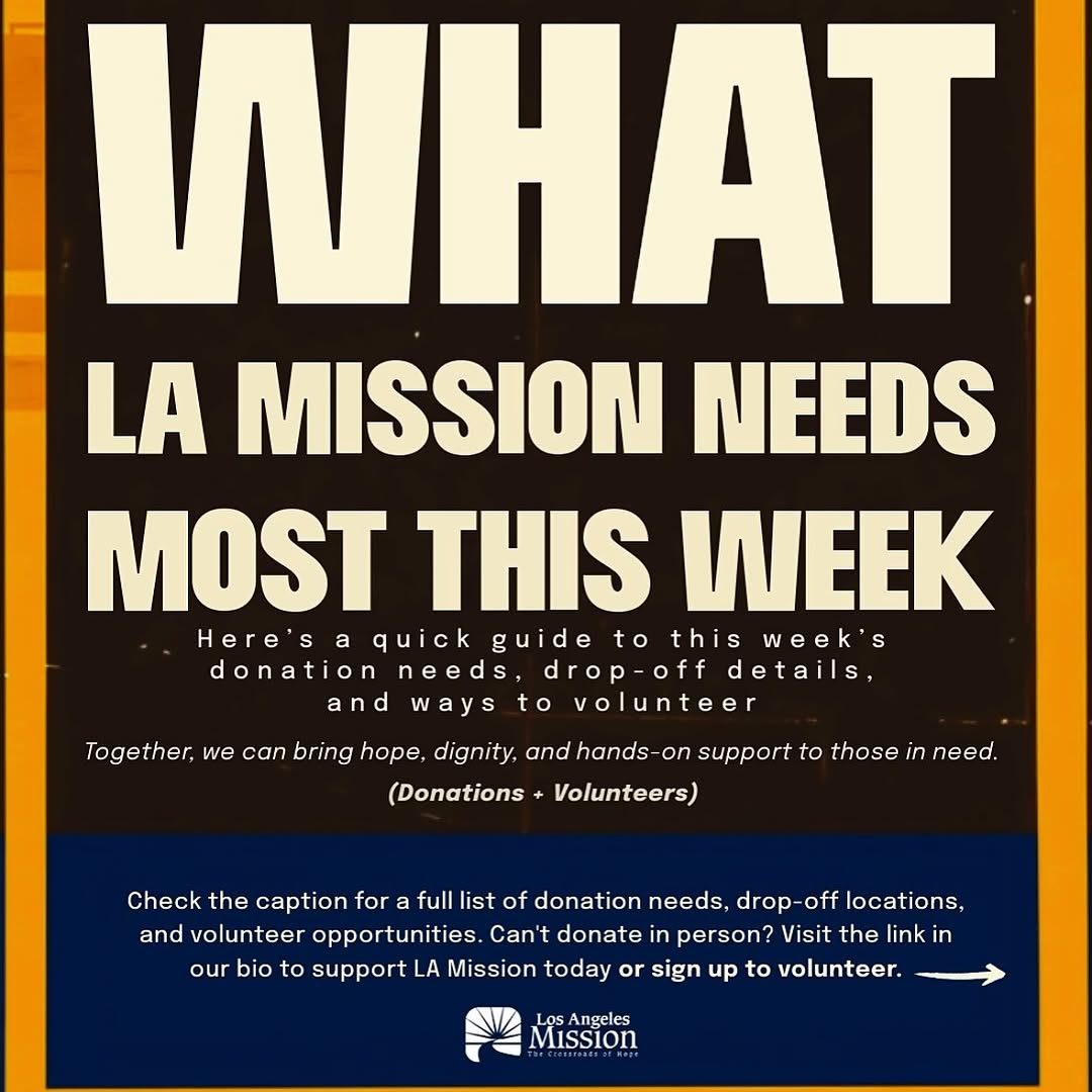
- few resources (slide 4- @filipinaontherise slide 5- @thelamission , slide 6- @walkgoodla, slide 7- @laclimateweek, slide 10- @lalgbtcenter) 🫂
How lilmiquela Framed This LA Community Support AI Portrait — and How to Recreate It
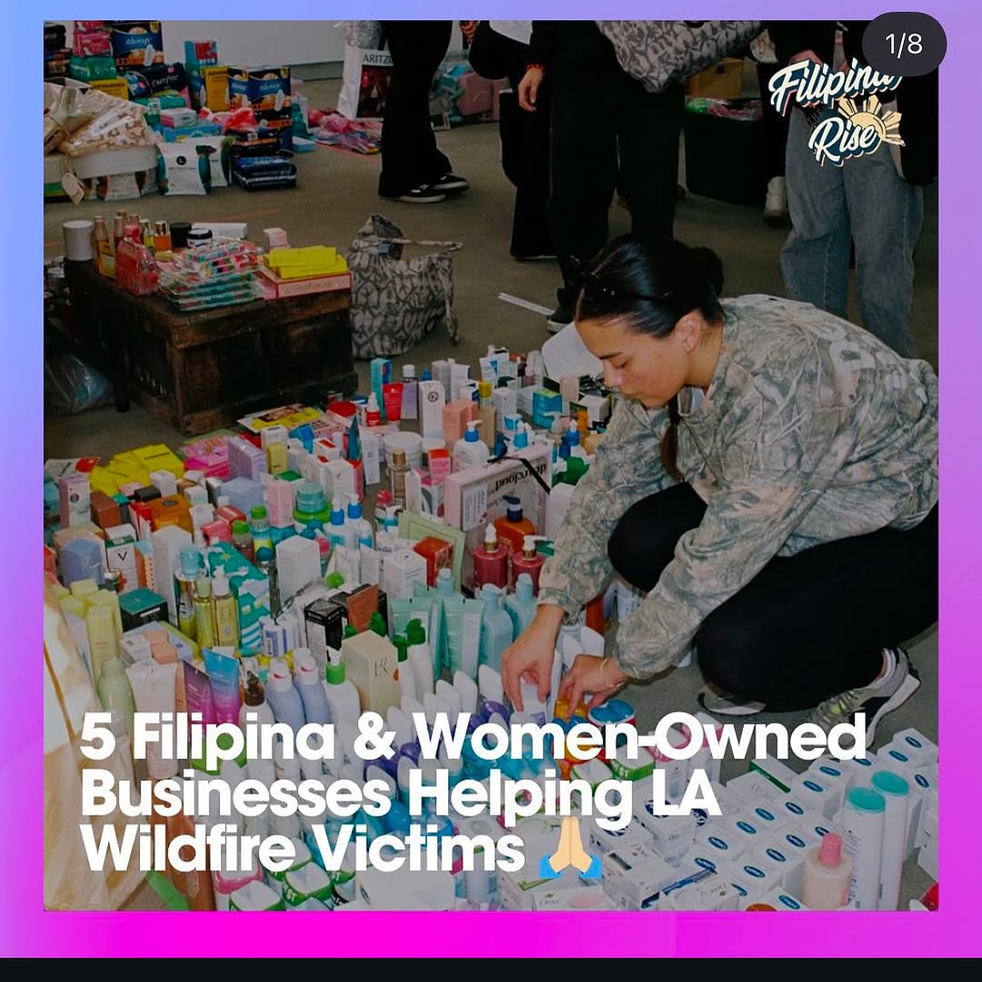
This post format works because it combines evidence and instruction in one frame. You can see real supplies on the ground, real volunteer labor, and a clear headline about who is helping and why. That combination reduces skepticism and increases click-through intent.
For creators doing impact content, this is critical: do not rely on abstract awareness language. Show tangible logistics and pair it with direct, readable context.
Signal Table
Signal
Evidence (from this image)
Mechanism
Replication Action
Proof-first storytelling
Visible large volume of aid products being sorted
Tangible proof increases trust and share intent
Include concrete evidence of action (items, packing, distribution process)
Clear social framing
Headline states women-owned businesses helping wildfire victims
Specific framing helps audiences understand relevance fast
State who is helping + whom they help in one line
Carousel onboarding cue
“1/8” marker signals multi-slide informational format
Users anticipate more value and continue swiping
Add clear slide indicators and strong first-slide promise
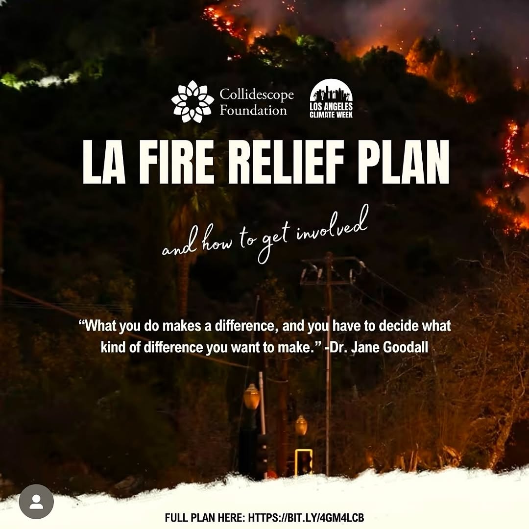
Best-Fit Scenarios
Crisis relief updates: Ideal for rapid public mobilization posts.
Community resource directories: Great for highlighting trusted local helpers.
Nonprofit collaborations: Useful for partner visibility and accountability.
Cause-led brand campaigns: Strong when linking businesses to measurable support.
Not Ideal
Lifestyle-only feeds with no advocacy context.
Luxury campaigns where dense text overlays hurt brand tone.
Food Bank Support Carousel Keep: documentary action photo + bold first-slide headline + slide indicator.
Change: toiletries to food packs and distribution scenes.
Slot template (EN): {proof_photo} {who_is_helping_line} {cause_target_line} {carousel_index}
Emergency Supply Drive Variant Keep: volunteer-in-action foreground and dense aid evidence.
Change: category from personal care to blankets/medical kits.
Slot template (EN): {volunteer_action_shot} {visible_supply_volume} {urgent_context_headline} {org_mark}
Local Business Impact List Keep: “Top N helpers” title format and evidence-led imagery.
Change: disaster context to neighborhood recovery initiatives.
Slot template (EN): {list_count_headline} {community_support_photo} {beneficiary_context} {swipe_prompt_structure}
Aesthetic Read
The visual strength here is operational density. The frame is busy, but purposefully so. Every bottle and box adds credibility. The crouching volunteer gives a clear human anchor in the middle of logistical complexity. Typography is large and direct, which is appropriate for urgency-driven content. The design does not chase elegance; it prioritizes legibility and trust. For impact creators, this is often the right tradeoff. If people cannot understand what is happening in two seconds, they will not act.
Observed
Recreate
Evidence
Action evidence field
Show many real items being sorted or packed
Audience sees scale of support immediately
Human anchor placement
Place one active volunteer in visible foreground
Story gains emotional and procedural focus
Headline-first overlay
Use large white type over lower third
Message remains readable on mobile
Social UI context
Add carousel cues and campaign mark
Users understand this is an informational series
Prompt Technique Breakdown
Prompt chunk
What it controls
Swap ideas (EN, 2-3 options)
Evidence chunk
Credibility level
“rows of donated toiletries”; “stacked food packs”; “sorted emergency kits”