The Los Angeles Mission Needs Card: How lilmiquela Built This AI Art
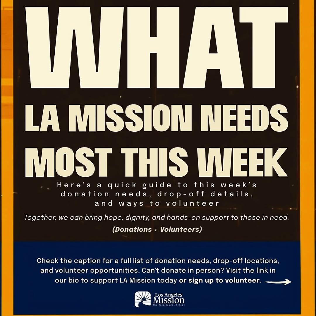
This asset is pure communication design: no faces, no lifestyle scene, just a clear ask. That is exactly why it can perform. In urgent community campaigns, legibility and action clarity often beat visual complexity.
For creators and nonprofit teams, this format is useful when the goal is behavior change, not aesthetic admiration.
What Makes This Card Effective
The hierarchy is decisive. The headline states urgency, the middle explains context, and the bottom gives the next step. Each section has one job, so users can scan and act quickly.
| Signal | Evidence (from this image) | Mechanism | Replication Action |
|---|
| Urgency framing | "NEEDS MOST THIS WEEK" in main headline | Time-bounded language prompts faster response | Anchor each card to a clear timeframe |
| Dual action path | Donations + Volunteers both highlighted | More participation options increase conversion | Always offer at least two action types |
| Legibility priority | Bold off-white text on dark background | Readable in-feed without zooming | Use high contrast and large headline size |
| Operational clarity | Caption/link-in-bio instruction in bottom block | Reduces uncertainty about next step | End every card with one specific action instruction |
Best-Fit Scenarios
- Weekly needs updates: ideal for recurring donation cycles.
- Volunteer recruitment pushes: strong for event-week mobilization.
- Emergency support windows: useful when clarity is more important than visual storytelling.
- Community partner repost kits: easy for others to share without context loss.
Not ideal for: awareness-only brand films, long narrative storytelling, or heavily visual product campaigns.
Three Transfer Recipes
- Keep: high-contrast text hierarchy. Change: campaign topic. Template: "WHAT {ORG} NEEDS MOST THIS {TIMEFRAME}".
- Keep: top urgency + bottom CTA structure. Change: action channels. Template: "{need statement} + {how to help now}".
- Keep: utility-first design. Change: palette tied to brand kit. Template: "brand colors + clear action block + contact path".
Aesthetic Read (Observed to Recreate)
| Observed | Impact | Recreate Move |
|---|
| Oversized uppercase headline | Immediate message capture | Use condensed bold type at large scale |
| Three-zone layout | Fast cognitive navigation | Divide into headline, context, and CTA blocks |
| Limited color system | Consistency and recall | Use 2-3 brand colors only |
| Explicit action instruction | Improves conversion | State where to click/read next |
| Logo lockup at base | Trust and attribution | Always include organization ID in footer area |
Prompt Technique Breakdown
| Prompt chunk | What it controls | Swap ideas (EN) |
|---|
| "bold uppercase urgency headline" | Attention capture | "THIS WEEK" / "TODAY" / "NOW" |
| "donations + volunteers dual CTA" | Action flexibility | "donate + share" / "register + attend" |
| "black/off-white high contrast" | Readability | "navy/white" / "dark green/cream" |
| "blue footer action bar" | Navigation cue | "red action bar" / "amber action bar" |
| "nonprofit logo footer" | Credibility and source clarity | "partner logo row" / "seal + URL lockup" |
Remix Steps (Execution Playbook)
- Lock baseline: same three-zone structure and headline scale.
- Run 1: update only weekly need copy.
- Run 2: keep copy length stable, test CTA wording variants.
- Run 3: keep structure fixed, test one alternate accent color for accessibility.
- Run 4: track click-through and volunteer sign-up conversion weekly.
For nonprofit growth, consistency plus clear instructions creates stronger long-term participation than one-off creative experimentation.